1. Here's where we stand as of June 2 on the two @CDCgov measures of county-level risk.

LEFT: hospitalization-based measure

RIGHT: transmission-based measure

A recap 🧵 on how things are changing nationally and then in my home state, FL.

I finally remembered to use #alttext! Two county-level maps are shown of the US. On the left shows
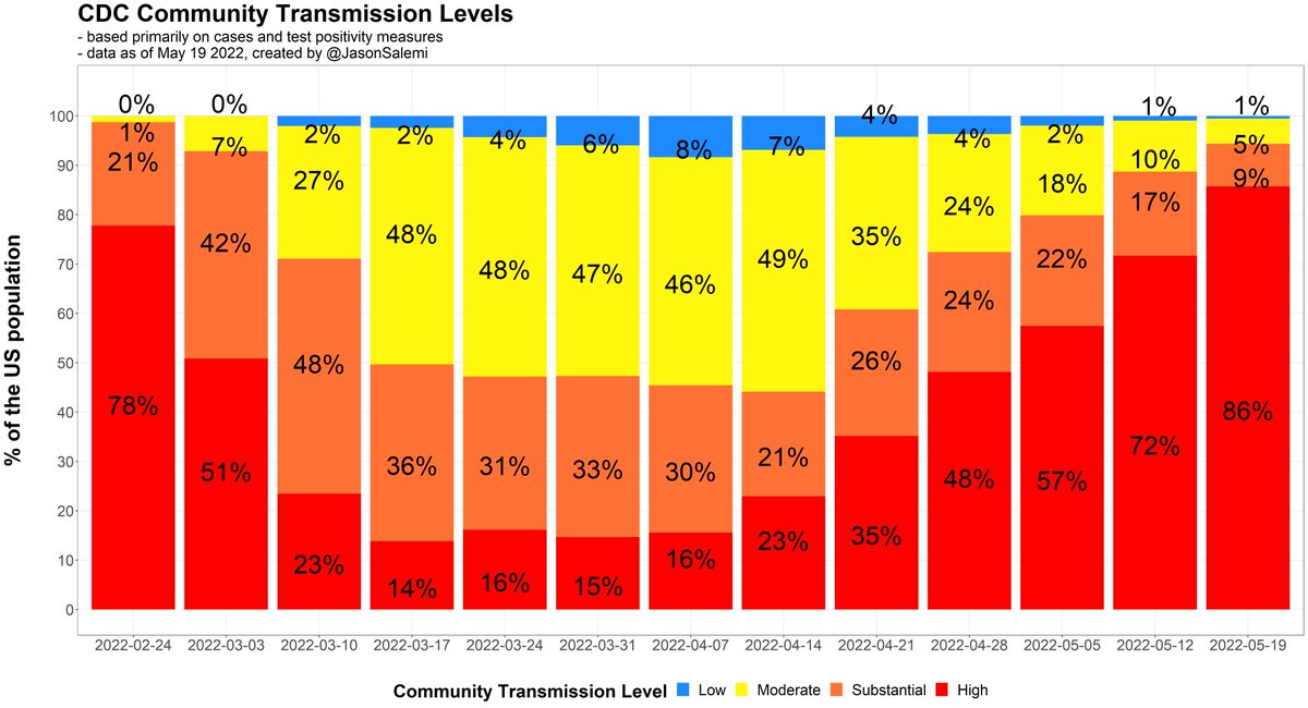
2. Transmission is still pronounced with only 2% of Americans living in a county that is not classified as "substantial" or "high" level of transmission. This is a series of vertical bars showing the distribution o
3. Here are those same weekly trends, but instead of national totals, this is by state (% of population living in various level transmission areas) This is a series of vertical bars showing the distribution o
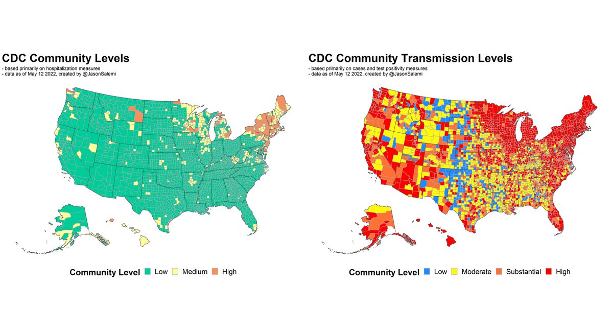
4. Here's the national story concerning the hospitalization-based measure.

At this level of granularity, no real change from last week - 55% of people live in counties classified as "medium" or "high" risk levels.

But, there are definite regional patterns that are different. This is a series of vertical bars showing the distribution o
5. This map focuses on how counties have CHANGED regarding their risk level according to the hospitalization-based measure.

Blue is an improvement, red a worsening.

Finally, the NE is showing improvement, but other areas (NC, FL, CA, midwest, etc) worsening. This is a county-level map of the US. Counties are colored b
6. Here are those weekly trends in the hospitalization-based measure, by state (% of state population living in various risk levels) This is a series of vertical bars showing the distribution o
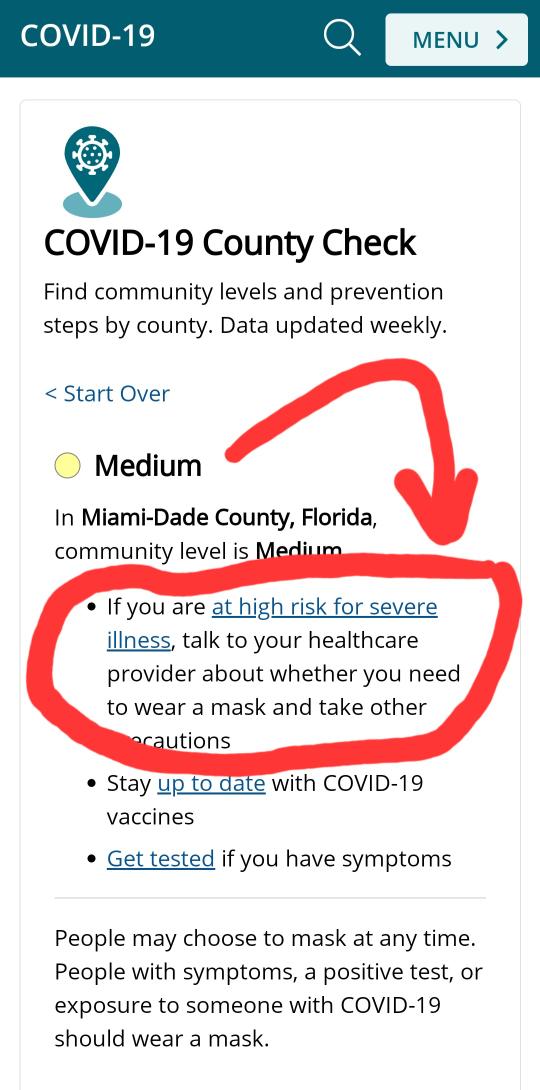
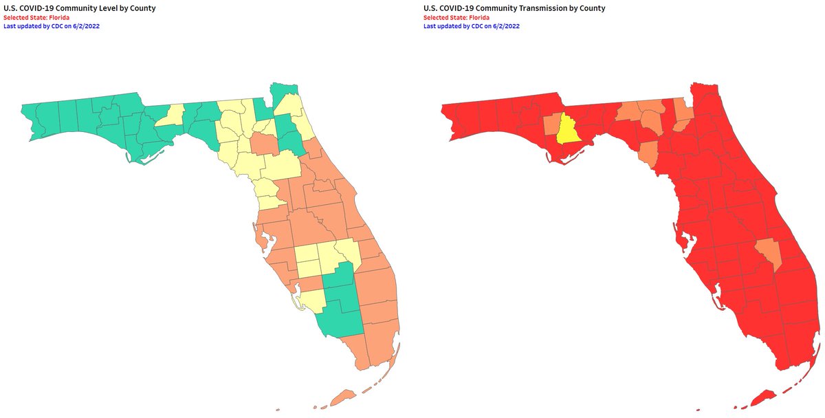
7. Unfortunately, in Florida this week, 3 in 4 people live in a county classified as a "high" level, according to the hospitalization-based measure. You can see the pronounced increase over the past 4 weeks. This is a series of vertical bars showing the distribution o
8. Transmission in Florida did not change much because pretty much every medium or large sized county is classified as high transmission. This is a series of vertical bars showing the distribution o
9. Here are Florida's metrics, side by side Two county-level maps are shown of Florida. On the left show
10. How transmission has changed over the past 3 months...
11. How hospitalization-based risk has changed over the past 3 months...

You can begin to see the expansion of the high-risk levels from the northeast to, well, "elsewhere"
12. Here are the actual hospitalization rates by state, based on data released yesterday.

Notice that downturn in many areas in the northeast...

...unfortunately increases in many other states This is a series of line graphs showing trends in adult admi
13. And trends in reported cases by state.

Again, notice that downturn in the northeast... This is a series of line graphs showing trends in average da
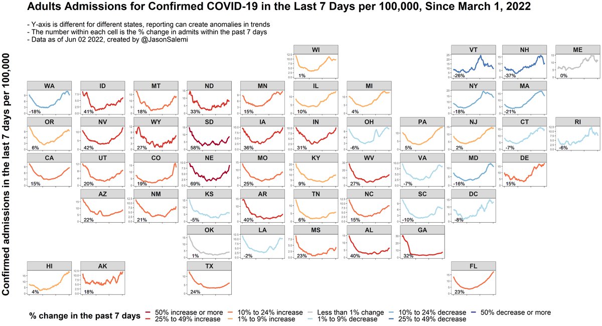
14. Here is some perspective on adult admissions rates for "confirmed COVID-19", by state, compared to nearly the entire pandemic timeline. This is a series of overlaid line graphs showing trends in a
15. Below are also age-specific COVID-19 mortality rates, by state, for all age groups 35+. State-level rates for younger age groups were less statistically reliable to calculate rate ratios (mainly for smaller states).

Dark blue & rank close to 1 = good.
Red & high # = bad. There are 6 state-level maps displayed, one for each of 6 ag
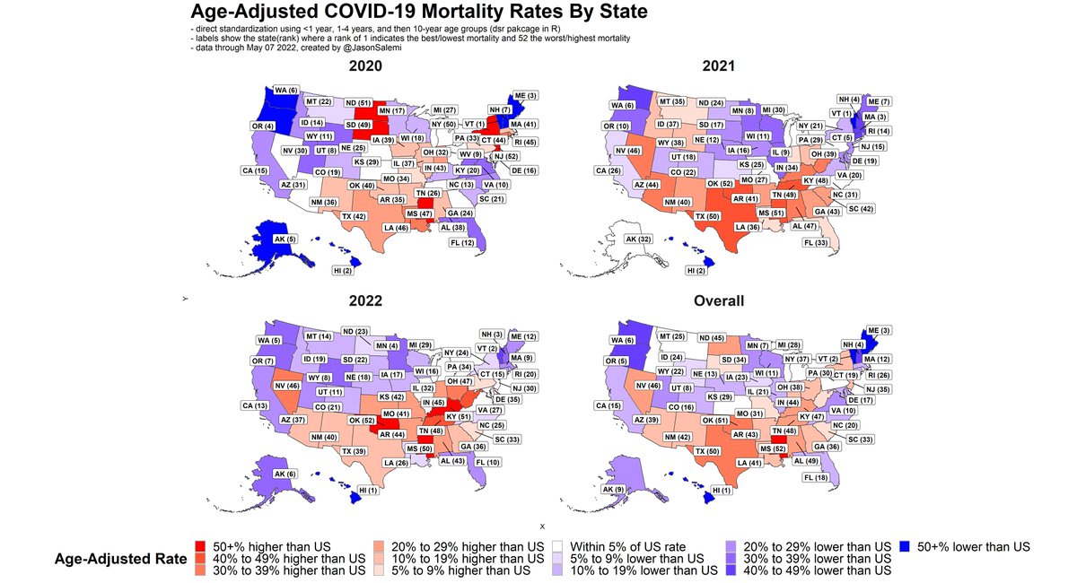
16. And here are age-adjusted mortality rates, by state, for each year of the pandemic (and overall).

Dark blue & rank close to 1 = good.
Red & high # = bad. There are 4 state-level maps displayed, one for each of the
17. In summary:

- Improvement in hospitalization-based risk level in many counties in the northeast

- In other areas (including FL, CA, NC, MO) had their risk levels worsen.

- Still other states had a blend of improving and worsening counties
18. We will learn more granular, county-level info about FL on this evening's release of the @HealthyFla biweekly report.

In the meantime, feel free to visit my dashboard for the data covered in this thread.

covid19florida.mystrikingly.com
Head back to the beginning of this thread 👇

Feel free to share/retweet!

• • •

Missing some Tweet in this thread? You can try to force a refresh
 

Keep Current with Jason L. Salemi, PhD, FACE

Jason L. Salemi, PhD, FACE Profile picture

Stay in touch and get notified when new unrolls are available from this author!

Read all threads

This Thread may be Removed Anytime!

PDF

Twitter may remove this content at anytime! Save it as PDF for later use!

Try unrolling a thread yourself!

how to unroll video
  1. Follow @ThreadReaderApp to mention us!

  2. From a Twitter thread mention us with a keyword "unroll"
@threadreaderapp unroll

Practice here first or read more on our help page!

More from @JasonSalemi

Jun 1
1. Quick 🧵 looking at age distribution of COVID-19 deaths.

The goal of fig below is to compare the SHAPE of the death curve over time across age groups.

Peak deaths for all age groups 65+ occurred prior to widespread vax uptake.

Peak deaths for younger groups occurred after.
2. All groups experienced a big decrease coming off the Winter 2020-21 surge, with an increase during the delta surge.

BUT, the increase in younger age groups was much more pronounced compared to older age groups.
3. Now notice the monthly age distribution of COVID-19 deaths (left) and of all-cause deaths (right).

The skinny black line reflects the national number of deaths among all age groups.

The thicker black line (hand-drawn) reflects the % of deaths to people 65+.

What do we see?
Read 6 tweets
May 27
1. Try to act surprised.

@CDCgov county-level measures were updated today.

Let's start with the hospital-based measure.

Last week - 17% of people lived in high level areas, 45% in medium or high.

Now, nearly 1 in 4 people live in a "high" level area.
2. Less than 4% of Americans live in a county that is not classified by @CDCgov as a substantial or high transmission area.

In 6 weeks, from 23% high transmission to 91%.
3. Here's where we are now based on both @CDCgov
measures.
Read 13 tweets
May 21
1. The more I think about this, the more infuriating it is.

3 in 10 people in Florida live in Dade, Broward, or Palm Beach county.

3 in 10.

A person in any of these counties would currently see this recommendation based on their medium "county level".

cdc.gov/coronavirus/20…
2. But, the actual recommendation for all 3 counties - for 3 in 10 people in Florida - should look like this.

Why?

Because their risk level is not "medium".

It is "high".
3. This is not because of my disagreement in how the measure is used to make recommendations.

These are just what the data actually show for these counties.

A "high" risk level for counties in which 3 in 10 people in Florida reside.

Yet the Florida map shows...
Read 6 tweets
May 20
1. Based on this week's @CDCgov transmission levels, it's not getting better.

Last week - 72% of people lived in high transmission areas, 89% in substantial or high.

Now, those numbers are 86% and 94%, respectively.

A quick 🧵
2. Approaching half of the population living in an area with medium or high risk (based on hospital capacity and COVID hospital admission rates).

15% of the US population now lives in a "high" level area in which the CDC recommends masking in public indoor settings.
3. Here's where we are now based on both @CDCgov measures.
Read 11 tweets
May 13
1. Based on this week's @CDCgov transmission levels, 89% of the US population lives in a county classified as "substantial" or "high".

This is compared to 46% 4 weeks prior.

A quick recap 🧵 of the transmission and hospital-based measures.
2. Nearly 1 in 3 people now live in an area with medium or high risk (based on hospital capacity and COVID hospital admission rates).

We had more than a doubling in the number of people in a "high" level area in which the CDC recommends masking in public indoor settings.
3. Here's where we are now based on both @CDCgov measures.
Read 9 tweets
May 12
1. As we approach the grim marker of #COVID19 #deaths in the US, but hopefully have much brighter days ahead, I looked at the most current NCHS data thru May 7.

Below are age-adjusted COVID-19 mortality rates by state, with rankings and state comparisons to the national total.
2. Here's what those data look like by year. Obviously some dramatic diffs depending on time of the surge.

Many of the NE states had comparatively higher rates in 2020 (NY, NJ, CT, MA) due to the early pandemic surge, whereas the SE was hit hard in 2021 with a bad delta surge.
3. Below are age-specific mortality rates by age group. States can have very different results depending on the age group in question.

For example, #Florida is in the top 10 (best) for people 75 or older, but have comparatively worse rankings for younger age groups.
Read 5 tweets

Did Thread Reader help you today?

Support us! We are indie developers!


This site is made by just two indie developers on a laptop doing marketing, support and development! Read more about the story.

Become a Premium Member ($3/month or $30/year) and get exclusive features!

Become Premium

Don't want to be a Premium member but still want to support us?

Make a small donation by buying us coffee ($5) or help with server cost ($10)

Donate via Paypal

Or Donate anonymously using crypto!

Ethereum

0xfe58350B80634f60Fa6Dc149a72b4DFbc17D341E copy

Bitcoin

3ATGMxNzCUFzxpMCHL5sWSt4DVtS8UqXpi copy

Thank you for your support!

Follow Us on Twitter!

:(