Jason L. Salemi, PhD, FACE Profile picture
Proud husband & dad • Tenured associate professor of epidemiology, head of PhD program @usfcoph🤘 • Fellow of the American College of #Epidemiology 🇺🇲
JLW Profile picture 1 subscribed
Sep 26, 2023 11 tweets 4 min read
Brief COVID update

When speaking with NPR last week, I said the plateauing of hospitalizations for 3 weeks made me feel like a downturn was coming.

In FL, the data are suggestive of improvements in the # of people being hospitalized w/ COVID.

1/ Image The state-specific trends in the COVID hospital census since June 1 also suggest we are seeing a recent decrease in FL (dk purple), the US as a whole (black), and a number of states.

Yes, FL still has among the highest rates, but we also have one of the oldest populations.

2/ Image
May 29, 2023 14 tweets 8 min read
Sorry for the delay everyone, a lot going on personally. But I have modified my dashboard to accommodate the CDC reporting changes.

My site focuses on:
1) Hospitalization-based county risk levels
2) Detailed hosp trends
3) Deaths

with links out for wastewater, variants, vax

1/
The "Risk Indicators" page is similar to the older page, but the data upon which indicators are based has changed. There are no longer "risk levels" and "transmission levels", rather levels based exclusively on "confirmed" COVID hospital admission rates over the prior 7 days.

2/ ImageImageImageImage
Feb 24, 2023 12 tweets 4 min read
It's been a while since I've done a #COVID update.

These are national weekly @CDCgov "community levels" based primarily on hospitalization rates.

This past week has been the "best" since April of last year with <1% of the population living in a high-level county.

1/ Image Of course, this comes with the following caveats according to the CDC, with likely underestimation of levels in Hawaii and Mississippi, and overestimation in several counties in Georgia and Arizona.

2/ Image
Dec 2, 2022 11 tweets 4 min read
1/ Updated my #COVID19 dashboard - wanted to do a quick thread on some clearly emerging trends.

covid19florida.mystrikingly.com 2/ Below are adult inpatient hospital census rates for each state since May 1, 2022. Only "confirmed" (as opposed to suspected) COVID hospitalizations are included.

The orange and red coloring suggests recent increases over the past week. Image
Oct 16, 2022 12 tweets 4 min read
1/ I've continued to see graphics like the one below served as evidence that COVID vaccines do not work.

Why? Because the NUMBER of COVID-19 deaths among vax people is nearly the same (or even more than) among unvaccinated people.

Quick 11-tweet thread on why this is misleading 2/ I'm going to keep this SIMPLE. This is NOT about infection-acquired immunity vs. vax-acquired immunity. This is just about counts vs. rates.

Assume that vax efficacy is 90% in people 65+.

Monthly COVID mortality rates:
- not vaccinated (20 per 100k)
- vaccinated (2 per 100k)
Oct 14, 2022 6 tweets 2 min read
@cmzimmer1803 - a few thoughts

1/ We absolutely should be concerned with the changing proportions of variants that are ESTIMATED to be circulating in recent weeks.

Due to their characteristics and increasing make-up of new cases, the pose a threat. 2/ Clearly, part of our genomic surveillance efforts are to have TIMELY information when more concerning variants are increasing in relative prevalence. In this case, it appears we lost some time (I was wondering why those variants were not yet showing up).
Oct 13, 2022 6 tweets 2 min read
1/ I've done over 10 interviews in the last 3 days related to the recent FL study.

I wanted to boil down my questions simply.

Question 1: I agree with the underlined portion below. Was an analysis done to explore the risk associated with COVID-19 infection? It should have been. Image 
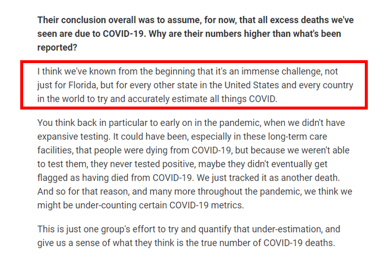
2/ Question 2: This was a big limitation - that the study cannot determine the causative nature of a person's death.

For at least these ~70 deaths in young men, can the medical records be reviewed to rigorously assess the cause of death & whether it was truly vaccine-related? Image
Aug 30, 2022 19 tweets 7 min read
1/ Please forgive the rushed presentation of information. I'm swamped but wanted to share an update. These are snapshots from my weekly report to my college. This is just a screenshot from a presentation I prepare for 
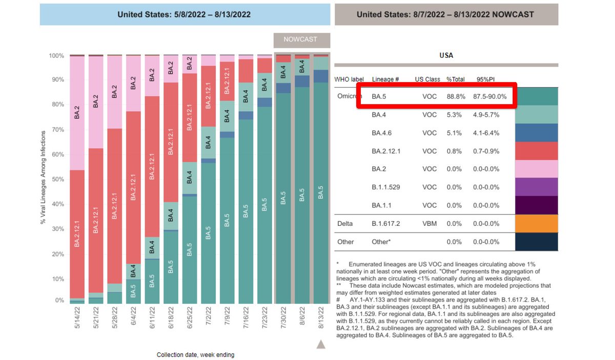
2/ VARIANT PROPORTIONS

BA.5 continues to represent ~9 in 10 new cases
A new variant, BA.4.6, is slowly making up a higher proportion of new cases, but is currently only at 7.5%.

One concern is that we are doing a lot less genomic surveillance. BA.5 continues to represent ~ 9 in 10 new cases A new varian
Aug 17, 2022 10 tweets 5 min read
1/ Here's a quick #COVID update - I prepare a weekly report for my college so I thought I should share a broad overview (with #AltText)

VARIANTS: BA.5 continues to have increasing dominance over other variants, representing ~ 9 in 10 new cases This is a CDC image that should variant distributions over t 2/ REPORTED CASES: Though a significant underestimate of actual circulating infections, it is clear that reported cases are down in most areas in the US.

Florida is down 31% relative to two weeks ago (now to ~7,000 cases per day). This is a series of trend lines in the shape of a US map, cl
Jul 21, 2022 6 tweets 3 min read
I'm positive I have COVID.

[let's say that differently]

I'm positive, I have COVID.

So a quick 🧵 with the new @CDCgov county measures. Unsurprisingly, not great news.

61% of the country lives in a high-level county, based on the hospitalization risk measure.

1/ Stacked bar chart of CDC risk levels in the country. The per 
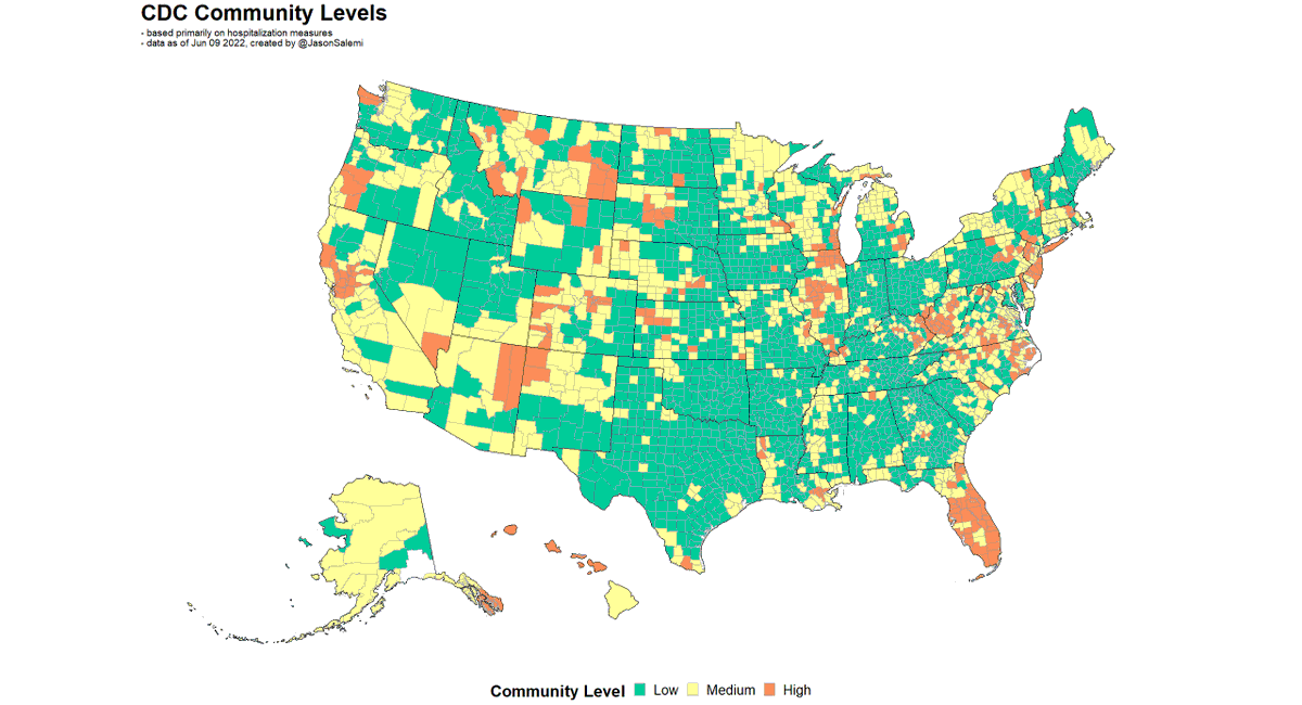
Here's your updated map.

I'm used to saying whoa...Florida.

This week I said whoa...California.

2/ This is a county map of the United States, with the color of
Jul 14, 2022 27 tweets 9 min read
1. Will add more later when the transmission levels get updated, but @CDCgov has their new levels out.

55% of the US population lives in a county classified as high risk based on a HOSPITALIZATION-based measure.

By far the highest % in months. Image 
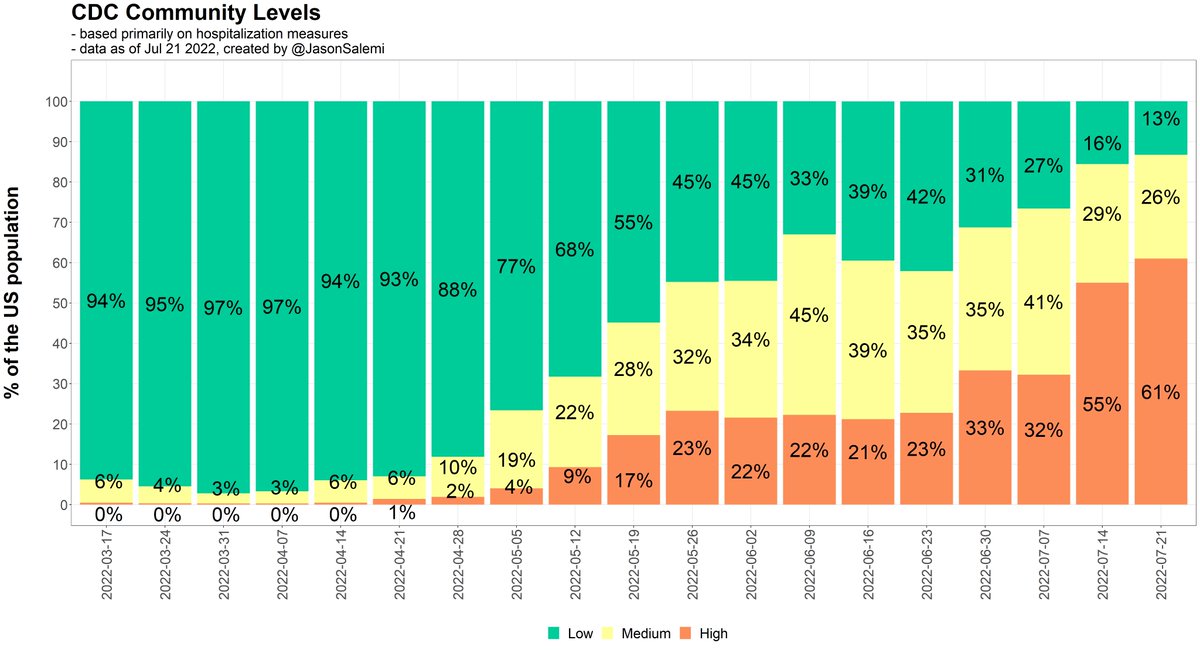
2. Last week, there were 4 states with 75% or more of its population in a high risk level.

Now it's 14 states.

Last week, there were 12 states with 50% or more of its population in a high risk level.

Now it's 23 states. Image
Jul 11, 2022 12 tweets 4 min read
1. Despite the current weakness of officially-reported case counts, the @CDCgov county "transmission levels" are problematic.

Virtually everywhere is "high" transmission, without any additional granularity.

So, I modified it, adding two levels to the "high" transmission end. 🧵 Image The current "high" transmission level reflects 100 or more new cases per 100,000 persons in the past 7 days.

Revision:
- "high" is 100-199 per 100k
- "high-200" is 200-299 per 100k
- "high-300" is 300+ per 100kup
Jul 1, 2022 13 tweets 5 min read
1. Here's the more complete 🧵 after the CDC update

My how things have changed in just weeks

On May 19, 17% of the US population lived in a "high" level, mostly in the northeast.

On June 30, 33% of the US population lived in a "high" level, almost everywhere but the northeast. 2. In my home state, during that 6 week time period, we went from "high" levels, based on CDC's hospitalization-based measure, in our 3 largest counties in the south

...to 99% of the population living in a county classified as a "high" level
Jun 30, 2022 4 tweets 2 min read
1/4
New @CDCgov community levels are out.

More later (when I get the transmission data update), but a 4-tweet thread so serve as a brief snapshot in pictures.

Your current county-level look. 2/4
1 in 3 people in the US now lives in a county classified as "high" based on @CDCgov hospitalization-based measure.

That's the highest % in months.
Jun 29, 2022 11 tweets 5 min read
1. It's been a while, but I finally added state-level #COVID19 vaccination data to my dashboard.

For a date you select, it allows you to query various milestones (primary series, 1st booster, 2nd booster) & age groups.

I also allow various denominators to be used.

Quick 🧵 2. Let's say you want the most current data on everyone 18 years and older in terms of receipt of their first booster.

Well, we can calculate the vax rate using the entire population 18+ 👇 to get overall scope of getting first boosters in arms. Image
Jun 9, 2022 6 tweets 2 min read
1. I'm still waiting for an update of the Community Transmission levels needed to run my typical risk levels analysis, but here's where we'll be with the hospital-based measures. 2. Here's how things have changed from last week.

Blue is improvement

Red is worsening

Gray is no change
Jun 9, 2022 9 tweets 4 min read
1. My goodness - the @nytimes story by David Leonhardt this morning

"Covid has killed a smaller percentage of Black, Latino or Asian Americans over the past year than white Americans. TO DENY THAT REALITY is to miss an important part of the Covid story."

nytimes.com/2022/06/09/bri… 2. Depending on what race/ethnic-specific population estimates you use, if you look at COVID deaths from May 1, 2021 to April 30, 2022 ("the past year")

You could actually find a higher crude mortality rate among NH-Whites compared to NH-Blacks and Hispanics.

But...why?
Jun 8, 2022 6 tweets 3 min read
1. Due to popular request, I have added two tabular visualizations to my dashboard that facilitates assessment of the relative position of your state/jurisdiction on case-based and hospitalization-based COVID-19 measures over time.

covid19florida.mystrikingly.com 2. Screenshot is hard to read, but this viz (#7) shows state rankings from 1 (best) to 52 (worst) on cases per capita over the most recent 7-day window.

NY state & NYC appear separately since that's how they are reporting for cases.

Can select any combo of states to view.
Jun 7, 2022 10 tweets 10 min read
1. I've been reporting on #Florida #COVID19 data for >2 years.

The data on all metrics have been FAR FROM PERFECT.

We should constantly STRIVE to get BETTER.

But IMO we so often lack CONTEXT in reporting deficiencies & underappreciate @HealthyFla epidemiologists achievements. @HealthyFla 2. This also happened ~1 yr ago when the @IHME_UW provided estimates on underreporting of #COVID19 #deaths.

Many headlines focused on FL's whopping 41% underreporting of COVID deaths early in the pandemic.

Luckily @Steph_Colombini allowed for context.

wusfnews.wusf.usf.edu/health-news-fl…
Jun 3, 2022 19 tweets 7 min read
1. Here's where we stand as of June 2 on the two @CDCgov measures of county-level risk.

LEFT: hospitalization-based measure

RIGHT: transmission-based measure

A recap 🧵 on how things are changing nationally and then in my home state, FL.

I finally remembered to use #alttext! Two county-level maps are shown of the US. On the left shows 2. Transmission is still pronounced with only 2% of Americans living in a county that is not classified as "substantial" or "high" level of transmission. This is a series of vertical bars showing the distribution o
Jun 1, 2022 6 tweets 2 min read
1. Quick 🧵 looking at age distribution of COVID-19 deaths.

The goal of fig below is to compare the SHAPE of the death curve over time across age groups.

Peak deaths for all age groups 65+ occurred prior to widespread vax uptake.

Peak deaths for younger groups occurred after. 
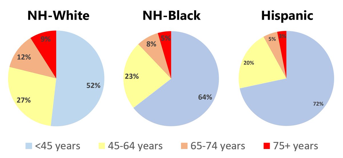
2. All groups experienced a big decrease coming off the Winter 2020-21 surge, with an increase during the delta surge.

BUT, the increase in younger age groups was much more pronounced compared to older age groups.