1. I've been reporting on #Florida #COVID19 data for >2 years.
The data on all metrics have been FAR FROM PERFECT.
We should constantly STRIVE to get BETTER.
But IMO we so often lack CONTEXT in reporting deficiencies & underappreciate @HealthyFla epidemiologists achievements.
The data on all metrics have been FAR FROM PERFECT.
We should constantly STRIVE to get BETTER.
But IMO we so often lack CONTEXT in reporting deficiencies & underappreciate @HealthyFla epidemiologists achievements.
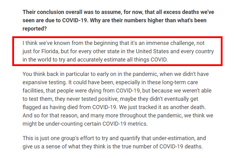
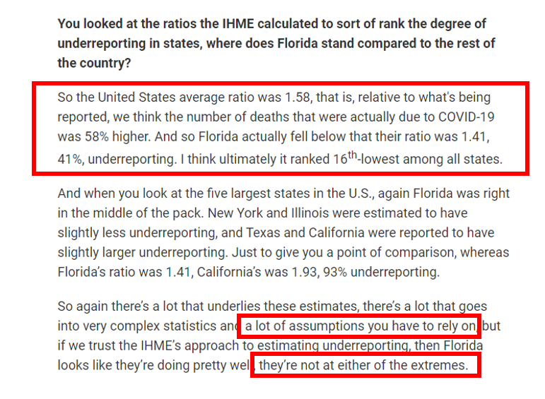
@HealthyFla 2. This also happened ~1 yr ago when the @IHME_UW provided estimates on underreporting of #COVID19 #deaths.
Many headlines focused on FL's whopping 41% underreporting of COVID deaths early in the pandemic.
Luckily @Steph_Colombini allowed for context.
wusfnews.wusf.usf.edu/health-news-fl…
Many headlines focused on FL's whopping 41% underreporting of COVID deaths early in the pandemic.
Luckily @Steph_Colombini allowed for context.
wusfnews.wusf.usf.edu/health-news-fl…
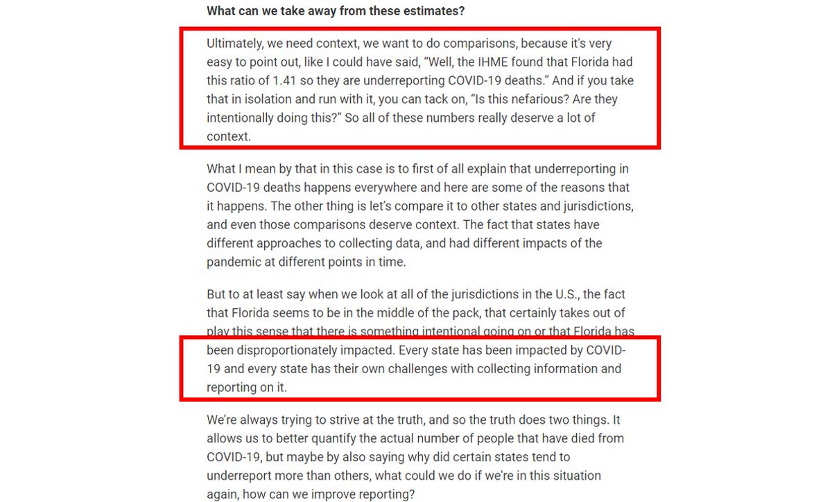
@HealthyFla @IHME_UW @Steph_Colombini 3. First, we should understand the immense challenge facing epidemiologists (and others) at county and state health departments.
Underreporting of cases, inadequate testing, missing COVID deaths...were universal problems.
Underreporting of cases, inadequate testing, missing COVID deaths...were universal problems.
@HealthyFla @IHME_UW @Steph_Colombini 4. Often, the evidence to provide meaningful context is available.
Context does not absolve anyone from the problems that existed, but it improves understanding, and ultimately avoids the deleterious mischaracterization of root causes/motivations for why issues arose.
Context does not absolve anyone from the problems that existed, but it improves understanding, and ultimately avoids the deleterious mischaracterization of root causes/motivations for why issues arose.
@HealthyFla @IHME_UW @Steph_Colombini 5. Too often, we project too much of how we feel about the extent to which an overall jurisdictional response meets our expectations onto everything that has to do with the activities of agencies within those jurisdictions.
We assume damn hard-working scientists are bad actors.
We assume damn hard-working scientists are bad actors.
@HealthyFla @IHME_UW @Steph_Colombini 6. For those of you who have [for some odd reason] been paying attention to me for a while now, this perspective is nothing new for me.
Below is a link to a video from just over 1 yr ago where I express some of these sentiments and why it matters to me.
Below is a link to a video from just over 1 yr ago where I express some of these sentiments and why it matters to me.
@HealthyFla @IHME_UW @Steph_Colombini 7. Look, this is not to in any way ignore or lessen the challenges we've had with understanding the state of the pandemic in Florida OR ANYWHERE ELSE, whether it's data availability, accuracy, completeness, or timeliness.
We can, should, and [hopefully] will do better.
We can, should, and [hopefully] will do better.
@HealthyFla @IHME_UW @Steph_Colombini 8. But I am now very familiar with the amazing accomplishments of public health (and other) professionals in underfunded, underappreciated, oft-criticized state agencies.
When we address the results of the challenges they've faced, in any jurisdiction, they just deserve CONTEXT.
When we address the results of the challenges they've faced, in any jurisdiction, they just deserve CONTEXT.
@HealthyFla @IHME_UW @Steph_Colombini 9. I, for one, am immensely impressed with the epidemiology team at @HealthyFla, am thankful for them addressing my MANY questions during the pandemic, which has allowed me to provide service to people of Florida and elsewhere, whether by my dashboard, research, or media efforts.
@HealthyFla @IHME_UW @Steph_Colombini 10. That's all - despite all there is to legitimately grumble about - I get a bit frustrated when I feel there is a singling out despite something being a more widespread issue.
Thank you for entertaining (or ignoring) my brief Tuesday morning semi-rant.
covid19florida.mystrikingly.com
Thank you for entertaining (or ignoring) my brief Tuesday morning semi-rant.
covid19florida.mystrikingly.com
• • •
Missing some Tweet in this thread? You can try to
force a refresh