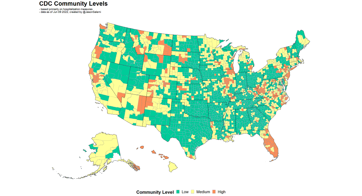
1. I'm still waiting for an update of the Community Transmission levels needed to run my typical risk levels analysis, but here's where we'll be with the hospital-based measures.
2. Here's how things have changed from last week.

Blue is improvement

Red is worsening

Gray is no change
3. Another way of looking at the change in levels from last week
4. A national look at the levels over time
5. And here's Florida
6. Sorry to be so brief and without #alttext

In a hurry...

More later!

covid19florida.mystrikingly.com

• • •

Missing some Tweet in this thread? You can try to force a refresh
 

Keep Current with Jason L. Salemi, PhD, FACE

Jason L. Salemi, PhD, FACE Profile picture

Stay in touch and get notified when new unrolls are available from this author!

Read all threads

This Thread may be Removed Anytime!

PDF

Twitter may remove this content at anytime! Save it as PDF for later use!

Try unrolling a thread yourself!

how to unroll video
  1. Follow @ThreadReaderApp to mention us!

  2. From a Twitter thread mention us with a keyword "unroll"
@threadreaderapp unroll

Practice here first or read more on our help page!

More from @JasonSalemi

Jun 9
1. My goodness - the @nytimes story by David Leonhardt this morning

"Covid has killed a smaller percentage of Black, Latino or Asian Americans over the past year than white Americans. TO DENY THAT REALITY is to miss an important part of the Covid story."

nytimes.com/2022/06/09/bri…
2. Depending on what race/ethnic-specific population estimates you use, if you look at COVID deaths from May 1, 2021 to April 30, 2022 ("the past year")

You could actually find a higher crude mortality rate among NH-Whites compared to NH-Blacks and Hispanics.

But...why?
3. You see, just as you shouldn't compare crude rates among states with different age distributions (e.g., FL vs. Utah)...

...you shouldn't do it when comparing race/ethnic groups with SUBSTANTIALLY different age distributions.

How different?
Read 9 tweets
Jun 8
1. Due to popular request, I have added two tabular visualizations to my dashboard that facilitates assessment of the relative position of your state/jurisdiction on case-based and hospitalization-based COVID-19 measures over time.

covid19florida.mystrikingly.com
2. Screenshot is hard to read, but this viz (#7) shows state rankings from 1 (best) to 52 (worst) on cases per capita over the most recent 7-day window.

NY state & NYC appear separately since that's how they are reporting for cases.

Can select any combo of states to view.
3. This viz (#11) shows state rankings from 1 (best) to 51 (worst) on 13 hospital metrics over the most recent 7-day window.

NY state & NYC are combined since that's how they are reporting for hospitalizations.

Can view any combo of states. I've selected the 4 largest below.
Read 6 tweets
Jun 7
1. I've been reporting on #Florida #COVID19 data for >2 years.

The data on all metrics have been FAR FROM PERFECT.

We should constantly STRIVE to get BETTER.

But IMO we so often lack CONTEXT in reporting deficiencies & underappreciate @HealthyFla epidemiologists achievements.
@HealthyFla 2. This also happened ~1 yr ago when the @IHME_UW provided estimates on underreporting of #COVID19 #deaths.

Many headlines focused on FL's whopping 41% underreporting of COVID deaths early in the pandemic.

Luckily @Steph_Colombini allowed for context.

wusfnews.wusf.usf.edu/health-news-fl…
@HealthyFla @IHME_UW @Steph_Colombini 3. First, we should understand the immense challenge facing epidemiologists (and others) at county and state health departments.

Underreporting of cases, inadequate testing, missing COVID deaths...were universal problems. Image
Read 10 tweets
Jun 3
1. Here's where we stand as of June 2 on the two @CDCgov measures of county-level risk.

LEFT: hospitalization-based measure

RIGHT: transmission-based measure

A recap 🧵 on how things are changing nationally and then in my home state, FL.

I finally remembered to use #alttext! Two county-level maps are shown of the US. On the left shows
2. Transmission is still pronounced with only 2% of Americans living in a county that is not classified as "substantial" or "high" level of transmission. This is a series of vertical bars showing the distribution o
3. Here are those same weekly trends, but instead of national totals, this is by state (% of population living in various level transmission areas) This is a series of vertical bars showing the distribution o
Read 19 tweets
Jun 1
1. Quick 🧵 looking at age distribution of COVID-19 deaths.

The goal of fig below is to compare the SHAPE of the death curve over time across age groups.

Peak deaths for all age groups 65+ occurred prior to widespread vax uptake.

Peak deaths for younger groups occurred after.
2. All groups experienced a big decrease coming off the Winter 2020-21 surge, with an increase during the delta surge.

BUT, the increase in younger age groups was much more pronounced compared to older age groups.
3. Now notice the monthly age distribution of COVID-19 deaths (left) and of all-cause deaths (right).

The skinny black line reflects the national number of deaths among all age groups.

The thicker black line (hand-drawn) reflects the % of deaths to people 65+.

What do we see?
Read 6 tweets
May 27
1. Try to act surprised.

@CDCgov county-level measures were updated today.

Let's start with the hospital-based measure.

Last week - 17% of people lived in high level areas, 45% in medium or high.

Now, nearly 1 in 4 people live in a "high" level area.
2. Less than 4% of Americans live in a county that is not classified by @CDCgov as a substantial or high transmission area.

In 6 weeks, from 23% high transmission to 91%.
3. Here's where we are now based on both @CDCgov
measures.
Read 13 tweets

Did Thread Reader help you today?

Support us! We are indie developers!


This site is made by just two indie developers on a laptop doing marketing, support and development! Read more about the story.

Become a Premium Member ($3/month or $30/year) and get exclusive features!

Become Premium

Don't want to be a Premium member but still want to support us?

Make a small donation by buying us coffee ($5) or help with server cost ($10)

Donate via Paypal

Or Donate anonymously using crypto!

Ethereum

0xfe58350B80634f60Fa6Dc149a72b4DFbc17D341E copy

Bitcoin

3ATGMxNzCUFzxpMCHL5sWSt4DVtS8UqXpi copy

Thank you for your support!

Follow Us on Twitter!

:(