Back-testing of some candlestick patterns 🧵
I hv back-tested patterns shown below on 500 stocks (Nifty 500 stock group as on today) since inception on daily timeframe charts.
Below is some interesting information.
I hv back-tested patterns shown below on 500 stocks (Nifty 500 stock group as on today) since inception on daily timeframe charts.
Below is some interesting information.
I was doing to design multi-chart setups. But the information in the thread can be useful for people practicing candlestick chart patterns. There are many patterns & we keep coming across more. The data can give you a rough idea about the past performance of patterns.
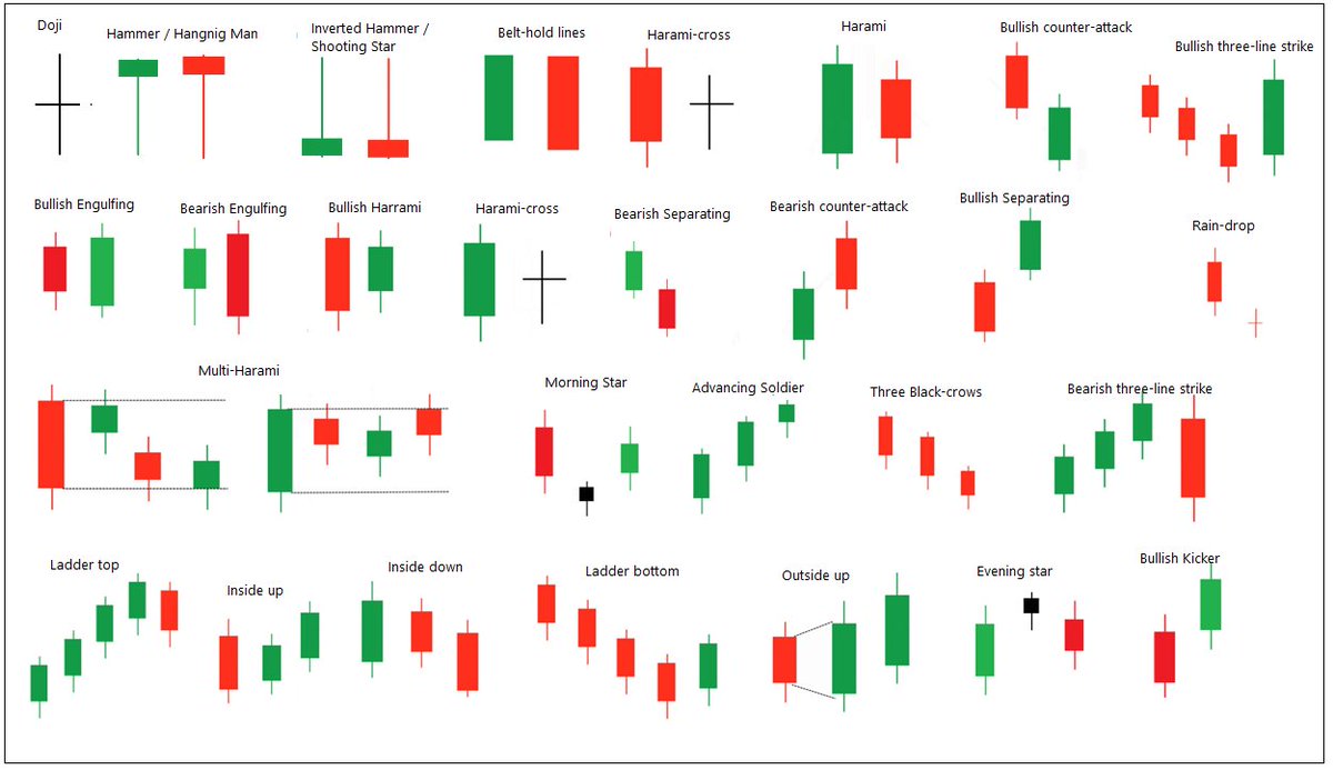
Patterns are defined based on the popular rules of identifying them. I have also tested bearish patterns for bullish trades and vice versa (Contra approach).
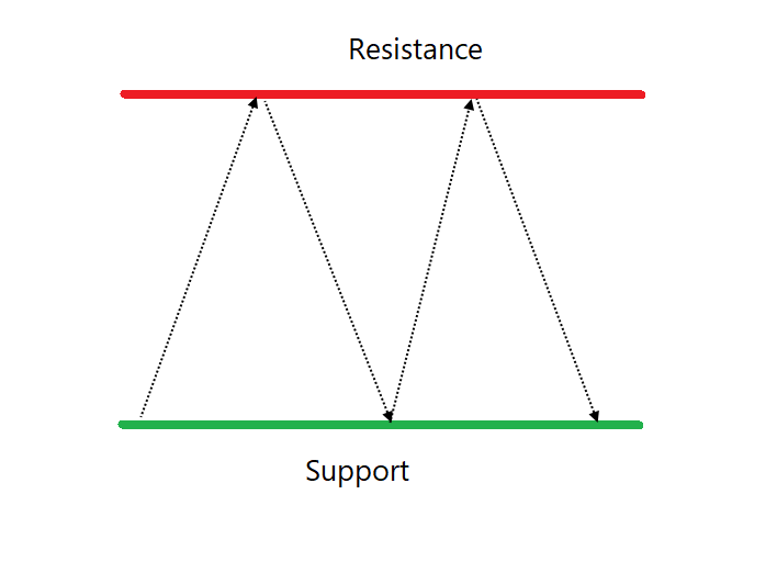
Criteria: Hit ratio & returns of pattern giving 1:1 risk-reward if the entry is at the closing price of the pattern.
Criteria: Hit ratio & returns of pattern giving 1:1 risk-reward if the entry is at the closing price of the pattern.
Some top bullish patterns have below hit ratio:
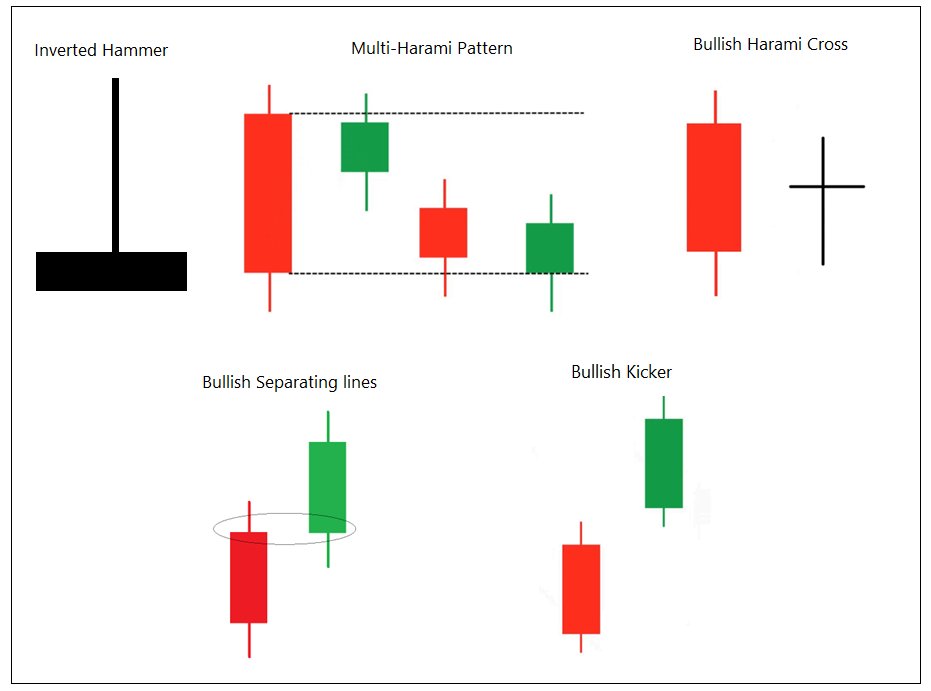
Inverted Hammer or Shooting Star – 74.72%
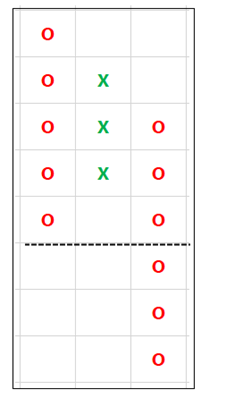
Multi-Harami breakout - 65.23%
Bullish Harami cross – 64.6%
Bullish Kicker – 63.53% (Got better returns)
Bullish separating line – 61.69% (It has got better returns)
Inverted Hammer or Shooting Star – 74.72%
Multi-Harami breakout - 65.23%
Bullish Harami cross – 64.6%
Bullish Kicker – 63.53% (Got better returns)
Bullish separating line – 61.69% (It has got better returns)
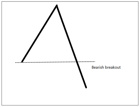
Doji breakout hit ratio is decent (63.71%) but occurrences are v high so need more confirmation.
Engulfing and Harami patterns have got better returns when traded at next candle of confirmation.
Engulfing and Harami patterns have got better returns when traded at next candle of confirmation.
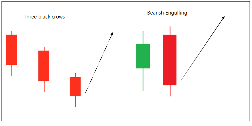
Interestingly, Some bearish patterns have got better performance for bullish trades.
Black crows – 77.69%
Bearish Engulfing – 73.5%
Evening star – 65.19%
Black crows – 77.69%
Bearish Engulfing – 73.5%
Evening star – 65.19%
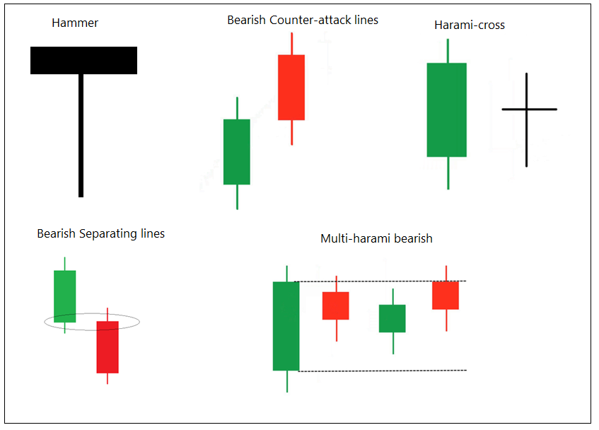
Bearish patterns:
Hammer or Hanging man – 67.82% (Average returns are good)
Bearish Harami cross – 54.33%
Bearish separating lines – 53.77% (Average returns are good)
Multi-harami bearish – 53.45%
Bearish counter-attack lines – 53.42%
Hammer or Hanging man – 67.82% (Average returns are good)
Bearish Harami cross – 54.33%
Bearish separating lines – 53.77% (Average returns are good)
Multi-harami bearish – 53.45%
Bearish counter-attack lines – 53.42%
As we increase the Risk-reward ratio, the hit-ratio will be reduced but return and expectancy increases (more money can be made). The performance of bearish patterns will get affected in that case. It is mainly because the undertone of Indian mkt has been bullish.
I will share the performance of all the patterns (also on weekly & intra) in a separate blog page - that's too much for a thread.
It did not take me much to do all these in TradePoint.
It did not take me much to do all these in TradePoint.
These statistics are just to give the idea. If you are using the patterns with other studies the performance can improve.
I will also share data of more patterns and filtration with trend and indicators. I am also planning to share similar thing for other chart patterns. <end>
I will also share data of more patterns and filtration with trend and indicators. I am also planning to share similar thing for other chart patterns. <end>
• • •
Missing some Tweet in this thread? You can try to
force a refresh