1/Like a bad piano player in a run down bar--I take requests! By popular demand, a🧵on how I make those illustrations for my #tweetorials--all in #PowerPoint!
This one shows how to create shadow & highlights to give a 3D effect
#medtwitter #MedEd #FOAMed #powerpointpresentation
This one shows how to create shadow & highlights to give a 3D effect
#medtwitter #MedEd #FOAMed #powerpointpresentation

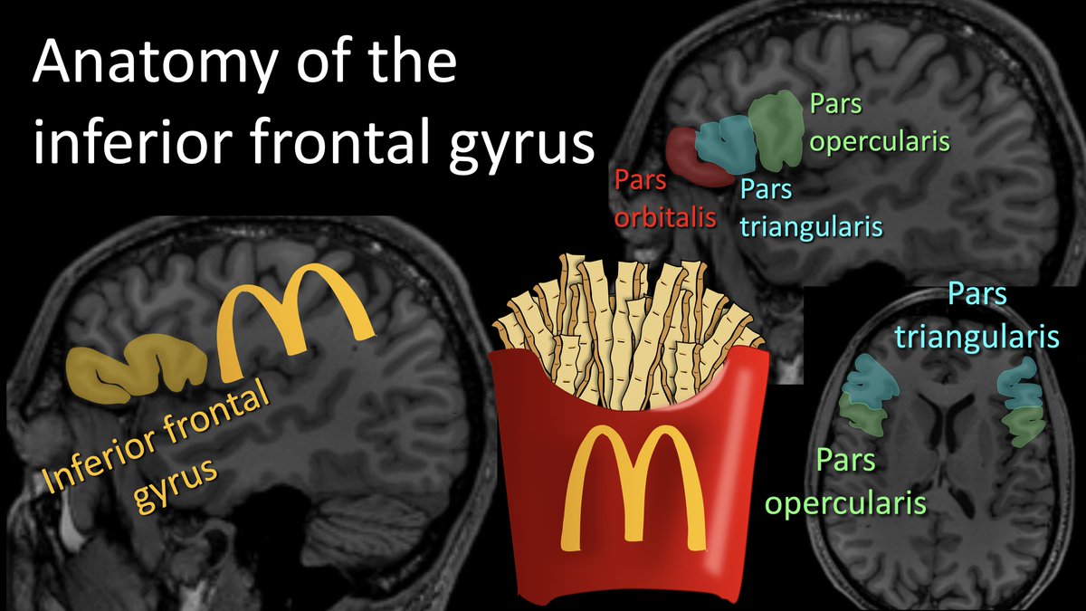
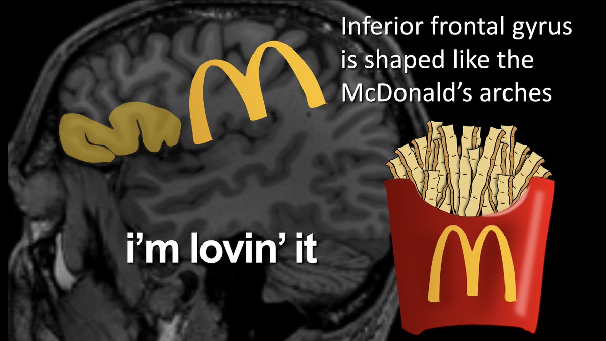
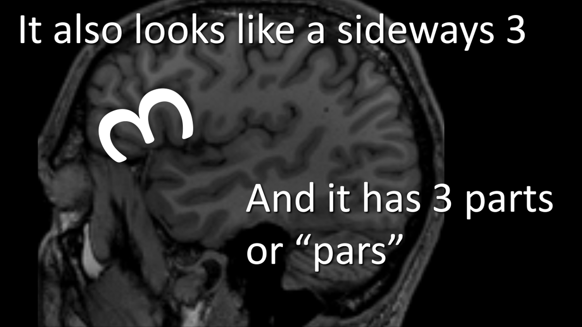
2/Let's use this french fry illustration I used for my varices🧵
I use the curve function to create shapes. It has the most control for drawing--the freeform function causes uneven lines.
After drawing the shape, I use the shape fill function to fill it in it w/the color I need
I use the curve function to create shapes. It has the most control for drawing--the freeform function causes uneven lines.
After drawing the shape, I use the shape fill function to fill it in it w/the color I need

3/ 3D effects begin w/the gradient fill. I use the gradient fill that powerpoint offers for my selected color--it knows how to chose them so that the gradient is smooth

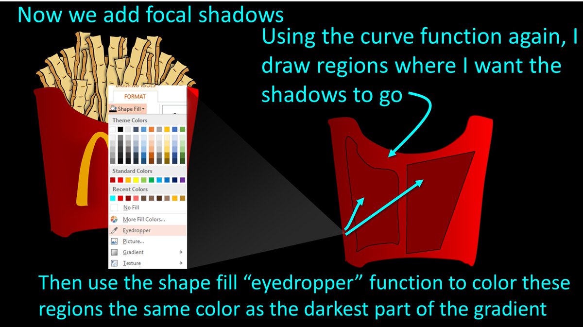
4/ Now to get more advanced w/focal shadows. Using the curve function, I draw shapes where I want shadows. Then I fill these in using the eyedropper function on the Shape Fill menu. I touch the eyedropper to the darkest part of the gradient to fill them in w/a nice dark shadow.
5/ Now these shapes need to be blurred so they look more like shadows. I select them and go to the "Shape Effects" menu & select "Soft Edges." I⬆️the size of the soft edge until they look like good shadows. It is different for every shape, but usually you need at least 5 point

6/Now for highlights. I use the curve function to draw shapes where I want highlights. Similar to shadows, I use the eyedropper function to fill in the shapes--but instead of putting the eyedropper on the darkest part of the gradient, I put it in the lightest part of the gradient

7/However, for highlights, the lightest part of the gradient isn't light enough. So I select the shape, go to shape fill color & select "More colors." This brings up a box where you can lighten the shade of that color--the same way light would lighten it if it was shining on it.

8/Now it is time to blur these highlights the same way we blurred the shadows--using the soft edges function, increasing the soft edge until you get desired look of your highlight.

9/Now we add details. First, I drew the McDonalds logo using the curve function. Then I used the curve function to draw a single fry. I took that fry & copied & pasted it over &over again--each time rotating it & stretching it to make it look like there were many different fries

10/Voila! That is how you make a very professional illustration using only PPT & in only a few easy steps! Excited to see what you will create w/these new skills!
I post more of my tips for creating these illustrations in PPT--so if interested click to follow me @teachplaygrub
I post more of my tips for creating these illustrations in PPT--so if interested click to follow me @teachplaygrub

• • •
Missing some Tweet in this thread? You can try to
force a refresh