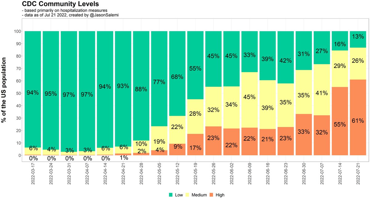
There's a reason behind the rise in #COVID19 #hospitalizations.

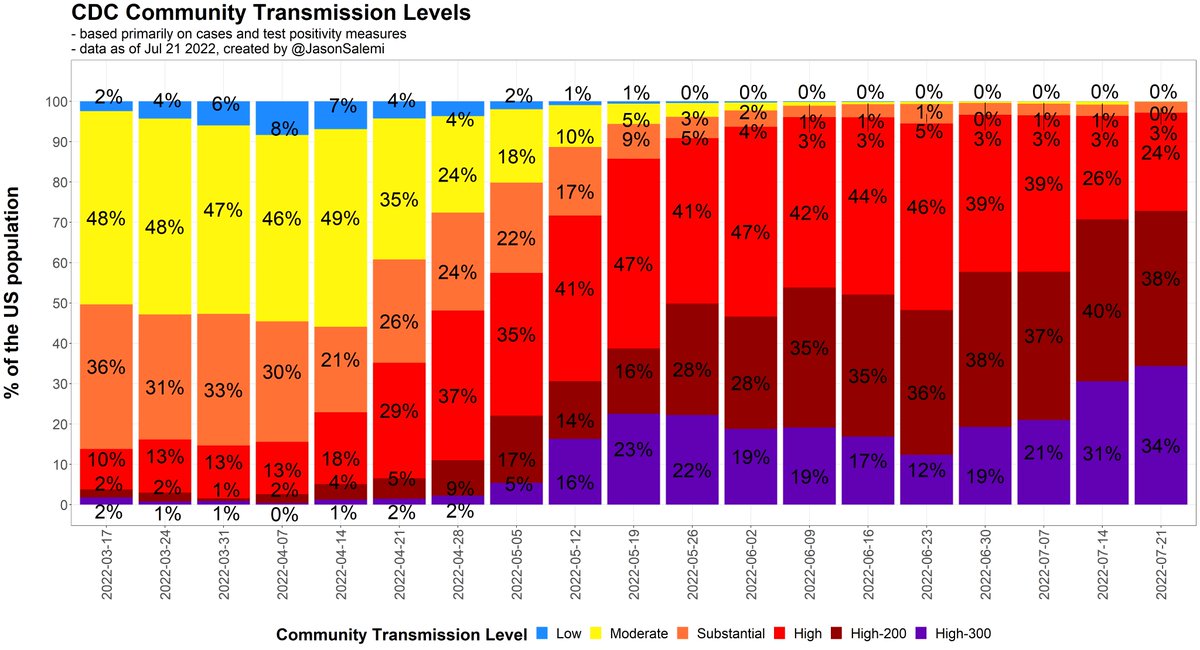
Transmission, based on the officially reported #cases, continues to increase in many places.

Hard to tell on the current @CDCgov map how pronounced #transmission is becoming.

1/
Up to 34% of the US population live in a county with 3 times the "high" threshold for the officially reported case rate - and we know what a pronounced underascertainment we have...

2/ These are bar graphs show the growing % of the US population
Here's that animated map of county-level transmission.

3/

• • •

Missing some Tweet in this thread? You can try to force a refresh
 

Keep Current with Jason L. Salemi, PhD, FACE

Jason L. Salemi, PhD, FACE Profile picture

Stay in touch and get notified when new unrolls are available from this author!

Read all threads

This Thread may be Removed Anytime!

PDF

Twitter may remove this content at anytime! Save it as PDF for later use!

Try unrolling a thread yourself!

how to unroll video
  1. Follow @ThreadReaderApp to mention us!

  2. From a Twitter thread mention us with a keyword "unroll"
@threadreaderapp unroll

Practice here first or read more on our help page!

More from @JasonSalemi

Jul 21
I'm positive I have COVID.

[let's say that differently]

I'm positive, I have COVID.

So a quick 🧵 with the new @CDCgov county measures. Unsurprisingly, not great news.

61% of the country lives in a high-level county, based on the hospitalization risk measure.

1/ Stacked bar chart of CDC risk levels in the country. The per
Here's your updated map.

I'm used to saying whoa...Florida.

This week I said whoa...California.

2/ This is a county map of the United States, with the color of
You can really see the rapid rise in the % of people living in high-risk areas in places like California, Illinois, Kentucky, West Virginia...and even a resurgence in NY and NJ. Other places have remained high.

3/ Stacked bar charts for each state showing community risk lev
Read 6 tweets
Jul 14
1. Will add more later when the transmission levels get updated, but @CDCgov has their new levels out.

55% of the US population lives in a county classified as high risk based on a HOSPITALIZATION-based measure.

By far the highest % in months. Image
2. Last week, there were 4 states with 75% or more of its population in a high risk level.

Now it's 14 states.

Last week, there were 12 states with 50% or more of its population in a high risk level.

Now it's 23 states. Image
3. Here is the county-level change over the past week.

62% of the population was in a county that stayed at the same level

4% of the pop was in a county that improved their level (e.g., high to medium)

35% of the pop was in a county that worsened (e.g., medium to high) Image
Read 27 tweets
Jul 11
1. Despite the current weakness of officially-reported case counts, the @CDCgov county "transmission levels" are problematic.

Virtually everywhere is "high" transmission, without any additional granularity.

So, I modified it, adding two levels to the "high" transmission end. 🧵 Image
The current "high" transmission level reflects 100 or more new cases per 100,000 persons in the past 7 days.

Revision:
- "high" is 100-199 per 100k
- "high-200" is 200-299 per 100k
- "high-300" is 300+ per 100kup
3. Based on last Friday's data, we can already see improved ability to distinguish between "high" transmission areas compared to the all red map. Image
Read 12 tweets
Jul 1
1. Here's the more complete 🧵 after the CDC update

My how things have changed in just weeks

On May 19, 17% of the US population lived in a "high" level, mostly in the northeast.

On June 30, 33% of the US population lived in a "high" level, almost everywhere but the northeast.
2. In my home state, during that 6 week time period, we went from "high" levels, based on CDC's hospitalization-based measure, in our 3 largest counties in the south

...to 99% of the population living in a county classified as a "high" level
3. Here's the current county-level snapshot of where we are today on the hospitalization-based measure with the less intimidating color scheme (left) to the original transmission-based measure (right)
Read 13 tweets
Jun 30
1/4
New @CDCgov community levels are out.

More later (when I get the transmission data update), but a 4-tweet thread so serve as a brief snapshot in pictures.

Your current county-level look.
2/4
1 in 3 people in the US now lives in a county classified as "high" based on @CDCgov hospitalization-based measure.

That's the highest % in months.
3/4
In Florida, 99% of the population now lives in a "high" level county.
Read 4 tweets
Jun 29
1. It's been a while, but I finally added state-level #COVID19 vaccination data to my dashboard.

For a date you select, it allows you to query various milestones (primary series, 1st booster, 2nd booster) & age groups.

I also allow various denominators to be used.

Quick 🧵
2. Let's say you want the most current data on everyone 18 years and older in terms of receipt of their first booster.

Well, we can calculate the vax rate using the entire population 18+ 👇 to get overall scope of getting first boosters in arms. Image
3. Or we can calculate the vax rate using the population 18+ WHO COMPLETED A PRIMARY SERIES 👇 to assess how well we are doing in getting first boosters to those who at least came in to get that initial series.

Obviously this will be a higher rate that using the entire pop. Image
Read 11 tweets

Did Thread Reader help you today?

Support us! We are indie developers!


This site is made by just two indie developers on a laptop doing marketing, support and development! Read more about the story.

Become a Premium Member ($3/month or $30/year) and get exclusive features!

Become Premium

Don't want to be a Premium member but still want to support us?

Make a small donation by buying us coffee ($5) or help with server cost ($10)

Donate via Paypal

Or Donate anonymously using crypto!

Ethereum

0xfe58350B80634f60Fa6Dc149a72b4DFbc17D341E copy

Bitcoin

3ATGMxNzCUFzxpMCHL5sWSt4DVtS8UqXpi copy

Thank you for your support!

Follow Us on Twitter!

:(