Today, we'll discover how you can use the power of #rstats to create an interactive #shinyapp β¨
π‘ What is a ShinyApp?
Shiny is a framework that allows you to create web applications - ShinyApps βΊοΈ You can use them for multiple purposes - to visualize data π¨ (for instance the Scottish Household Survey by @ViktErik, bit.ly/3TqZevY, ...
The user interface (or short UI) is like the body of your app π€ It allows you to define how it looks and where the components (such as text, visualizations, or tables) are placed. It defines the outer appearance of your app. The code works as follows:
The server is the brain - here's where all the computing happens π§ You can dump (more or less) all your typical functions (such as plotting something with π¦ {ggplot2}) in here π€
It can look like this:
@ViktErik@Shel_Kariuki@rstudio But now it's your turn - are there any plans on turning a project into a #ShinyApp? Or did you already do it? Tell us about it! β¨
@quarto_pub First step for me in doing something like this: Figma. It's a really useful tool for playing around with a layout before you try to implement it in code.
Here's the basic layout I built to figure out where everything should go.
@quarto_pub Next, fonts. For this one, I was looking for something that says "I know what I'm doing but I'm also approachable" as that was the vibe I got from folks at the @NHSrCommunity a few weeks ago.
I went with Nunito Sans, and found a "slab" font with a similar shape: Zilla Slab.
Day 5: A worked example pulling all this together to build an Rmd-to-pdf template (usingπ¦ {pagedown}) for @R_Girls_School!
There will be very little code in this one, because we're eagerly awaiting the Quarto-to-pdf equivalent, so I'm focusing instead on the principles I used.
@R_Girls_School Rewind. I first heard about @R_Girls_School at the @NHSrCommunity conference, where the head teacher of Green Oak Academy, Dr Razia Ghani, came to share how they'd been teaching #rstats skills as part of lessons based on key subject of the curriculum (maths, geography, etc).
@R_Girls_School@NHSrCommunity Dr Ghani shared some quotes from the pupils about the hugely positive impact these lessons had on their interest in the subjects and on their confidence in their own ability to learn. There was quite a crowd around her at the coffee break keen to offer help and encouragement!
Day 3: Writing functions to create parameterised graphs
So, we've picked our colours and set up a nice theme. We already know we want to apply this to all our plots but what if we could reuse the same plot code across different bits of the data?
Easy, let's make a function!
First, let's set up our plot. We're going to plot the number of penguins from each species within our dataset. We're using ggchicklet::geom_chicklet(), an anchor colour which is a blend of the blue and purple I mentioned on Day 1 and theme_rladiesdemo() which we built on Day 2.
Now let's add some labels, so we can state the number of penguins in each species, along with the mean body mass.
To do this, I'm using my go-to #rstats annotation package {ggtext}, which allows us to apply some CSS to create the text hierarchy principles from Day 2.
2) Fonts. Picking fonts can be really tricky, but there are some really great resources out there (see below, where we're back to our "let others help you" mantra!).
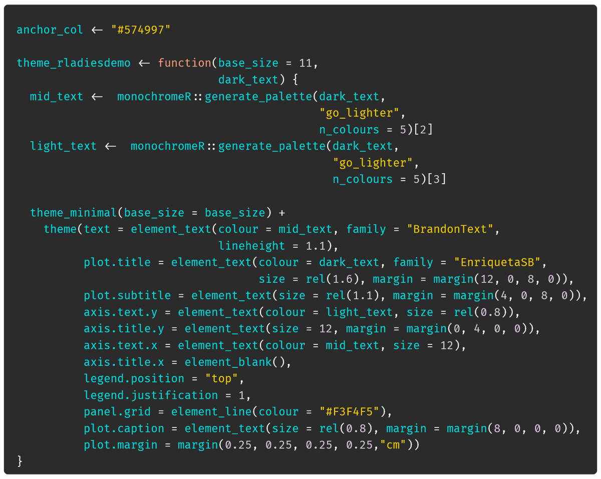
Here, I've simply applied the fonts from my own website, changing the family element of element_text().
3) Text size. You can manipulate text size within theme() either by setting absolute sizes (e.g. size = 16), or relative sizes (e.g. size = rel(1.2)).
The relative size is a good idea if you're going to reuse this theme: change the base size as needed and everything follows!
At this point, we've done most of the work, but we can still make our data story easier to take in by giving everything a bit more space to breathe.
First, let's move the legend to reduce unnecessary eye movements, fade the grid, and remove an unnecessary axis title.
Here are three reasons why I think you should do this:
- Help orient your readers with text hierarchy
- Give everything some space to breathe
- Achieve effortless consistency with one extra line of code
Sound good? Let's dig in!
My starting point for creating a custom theme is typically theme_minimal(). It has sensible defaults such as relative text size and margins that we can build on, by just replacing some elements.
π€« I'm going to let you in on a secret... I find picking colours really tricky! Thankfully, I've found few ways round that.
My top tip is to let others help you! But first, a broad principle...
When picking colours for story telling, I try to make the colours as intuitive as possible.
Here's the adventure I took the Palmer Penguins on in a recent talk involving the #GreatPenguinBakeOff. See if you can guess the details. (The next tweet should give you a few clues!)
It's not about making your plots into a guessing game. It's about reducing cognitive load by making it easy to remember what's what.
And this allows me to illustrate one way to let others help you: photos! All of the colours in the previous plots were taken from these photos.