
How do we show mutation? A #sciart thread…🧵
I’ve illustrated the #SARSCoV2 spike protein a lot over the last few years, including its mutations. In the process, I made many decisions about how to show mutations, and wanted to share my rationale. (1/12)
I’ve illustrated the #SARSCoV2 spike protein a lot over the last few years, including its mutations. In the process, I made many decisions about how to show mutations, and wanted to share my rationale. (1/12)

First, it’s important to review how we describe mutations - they’re identified in reference to an original, un-mutated reference sequence. (2/12)
So, for example, D614G means: “The amino acid at position 614 that was a D (aspartic acid) is now a G (glycine) in the mutated spike.”
D614del would mean: “The amino acid at position 614 that was a D is now missing in the mutated spike.” (3/12)
D614del would mean: “The amino acid at position 614 that was a D is now missing in the mutated spike.” (3/12)
This poses a challenge - do we show the structure of the mutated spike? Or the structure of the original, un-mutated spike? For my illustrations, I chose to show the un-mutated spike. This allowed me to place markers for mutations that were deletions. (4/12)

This is also consistent with how we think about mutation. We want to know - where are the changes on this variant’s spike, relative to the original virus? Before the development of updated boosters, vaccines were all based on the original virus’ spike. (5/12)
If these had been very detailed illustrations for researchers, I would have used both the original and mutated structure, and shown them in comparison. However these were for an interested and educated lay audience - the readers of Science News & Scientific American. (6/12)
To visually mark the location of each mutation, I showed a sphere for the location of the alpha carbon. Why not show the whole side chain? Again, we run into the question - do we show the original side chain or the mutation? (7/12)


Side chains may also mislead the lay viewer - a big amino acid like tyrosine would look like a “big” mutation, whereas an amino acid like alanine would look like a “small” mutation, but the size does not equate to significance. (8/12)


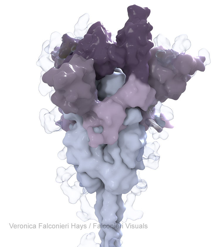
In my @ScienceNews illustration, I highlighted just one copy of the three S protein copies that make up one whole spike protein. This was because we were labeling each mutation, and annotating with their theorized functional impact. (9/12)


However, in the @sciam illustration of Omicron, I highlighted the mutations in all three copies of the S protein. The graphic wasn’t going into individual detail on the mutations, just showing the striking density of mutation in the RBD and NTD regions. (10/12)

There were countless other subjective decisions made for each of these (color, conformation, surface contouring, ribbon diagram or not, glycans or not, etc.) As always, #medicalillustration is both a science and an art! (11/12)
(12/12) This thread as a blog post: falconierivisuals.com/?p=1193
• • •
Missing some Tweet in this thread? You can try to
force a refresh


