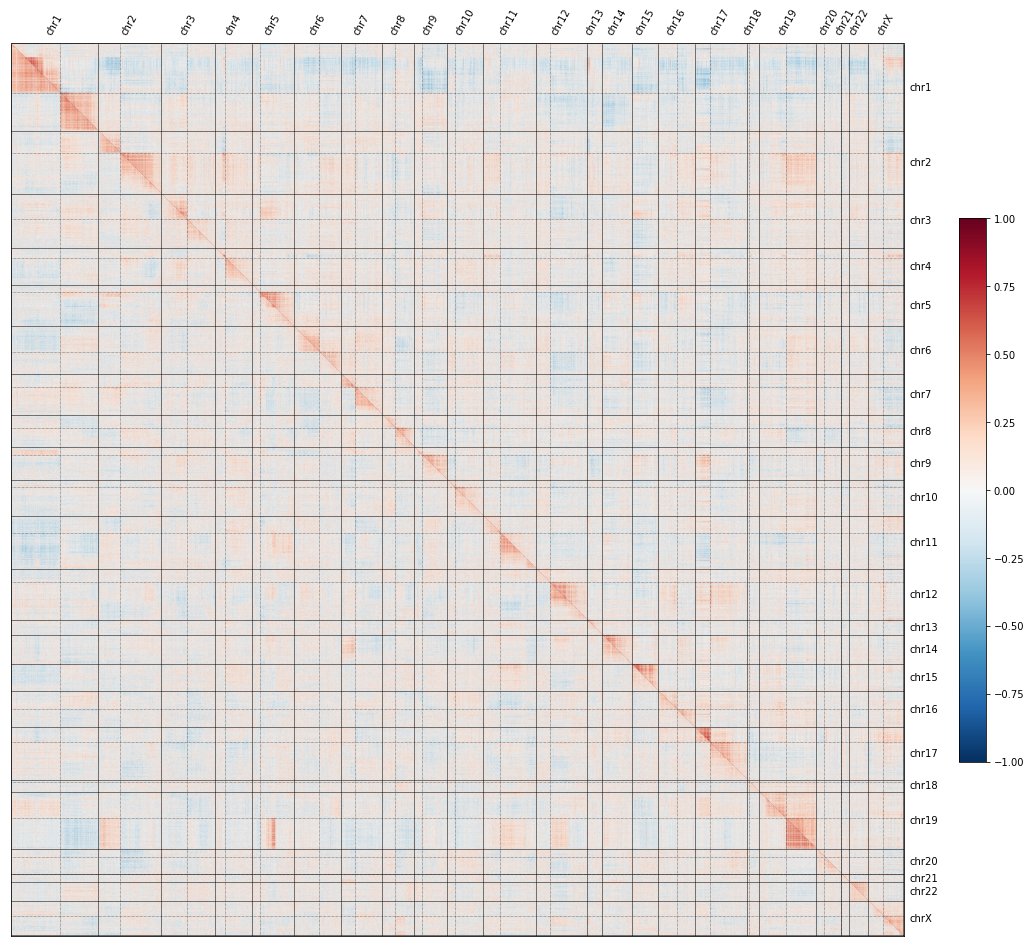
More tweetorial! Let’s dig into the “proximity bias” we found @RecursionPharma confounding #CRISPR screens, what it means, and where it comes from.
You can always read along in the preprint here: biorxiv.org/content/10.110…
You can always read along in the preprint here: biorxiv.org/content/10.110…

If you missed the first tweetorial in the series, click here to understand what the red-and-blue heatmaps here mean, and how we use them to map the functions of genes at a genome-wide level:
https://twitter.com/ImranSHaque/status/1650911267530629120
To recap: if you knock out each gene in the genome, plot all their pairwise similarities, and sort by genomic position, a curious pattern emerges in which #CRISPR knockouts look more similar to KOs on the same chromosome arm than to KOs on other arms.
In fact, the image shows TWO maps: the @RecursionPharma #RxRx3 map in HUVEC (above the diagonal) and the cpg0016 map in U2OS made by the JUMP-CP consortium led by @DrAnneCarpenter and @shantanuXsingh (below): the effect reproduces across labs, protocols, cell types, etc. 

We call this “proximity bias,” as KO sims reflect genomic proximity, not just gene function.
Cool tidbit: this bias even reflects non-canonical genome struc. There’s a known fusion in U2OS between chr5q and chr19q & we see that patch of proximity bias in U2OS but not in HUVEC.
Cool tidbit: this bias even reflects non-canonical genome struc. There’s a known fusion in U2OS between chr5q and chr19q & we see that patch of proximity bias in U2OS but not in HUVEC.

We also noticed that the strength of proximity bias fell off going from centromere-to-telomere, suggesting a model in which this bias was caused by chromosomal truncations: lose more genes in common, get stronger similarity. 


Searching an internal database of 25k RNA-seq samples, jackpot: strong evidence for specific losses from cut-site to telomere in a number of samples!
(Yeah, we do a lot of sequencing @RecursionPharma, too.)
(Yeah, we do a lot of sequencing @RecursionPharma, too.)

Bulk RNA-seq doesn’t tell us whether this is a weak effect in many cells, or a strong effect in a few cells. So we searched #CRISPR datasets in @sandercbio awesome scperturb.org collection, and sure enough: clear evidence of truncations in rare subpopulations of cells!
The first image shows data from nature.com/articles/s4158… by @epic_genetix in the @satijalab; the second from nature.com/articles/s4158… by @FrangiehChris working with @BizarMd. Across labs and cell types, the conclusion holds: #CRISPR editing creates truncations. 


In tomorrow’s thread, I’ll continue to explain how proximity bias affects a broad range of #CRISPR functional genomics datasets and confounds the community’s efforts to decode #biology, by looking closely at the @CancerDepMap.
• • •
Missing some Tweet in this thread? You can try to
force a refresh


