Ever heard of logistic regression? Or Poisson regression? Both are generalized linear models (GLMs).
They're versatile statistical models. And by now, they've probably been reframed as super hot #MachineLearning.
Brush up on their math with this thread. #rstats
They're versatile statistical models. And by now, they've probably been reframed as super hot #MachineLearning.
Brush up on their math with this thread. #rstats
Let's start with logistic regression. Assume you want to classify a penguin as male or female based on its
* weight,
* species and
* bill length
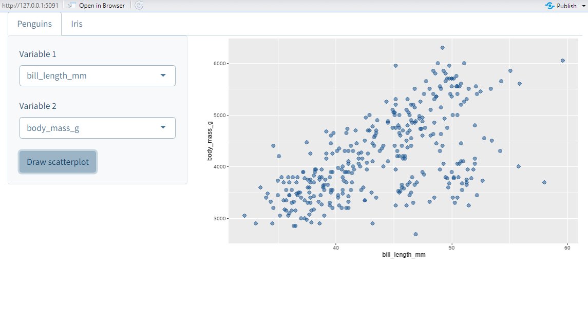
Better yet, let's make this specific. Here's a dataviz for this exact scenario. It is based on the {palmerpenguins} data set.
* weight,
* species and
* bill length
Better yet, let's make this specific. Here's a dataviz for this exact scenario. It is based on the {palmerpenguins} data set.

As you can see, the male and female penguins form clusters that do not overlap too much.
However, regular linear regression (LR) won't help us to distinguish them. Think about it. Its output is something numerical. Here, we want to find classes.
However, regular linear regression (LR) won't help us to distinguish them. Think about it. Its output is something numerical. Here, we want to find classes.
How about trying to predict a related numerical quantity then? Like a probability that a penguin is male. Could we convert the classes to 0 and 1 and then run a LR?
Well, we could. But this won't give us probabilities either. Why? Because predictions are not restricted to [0, 1]
Well, we could. But this won't give us probabilities either. Why? Because predictions are not restricted to [0, 1]

I suspect you're REALLY determined to use LR. After all, what have you learned ordinary least squares (OLS) for if not for using it everywhere?
So, what saves you from huge predictions? That's the glorious logistic function (applied to LR's predictions).
So, what saves you from huge predictions? That's the glorious logistic function (applied to LR's predictions).

I've applied this strategy to our data to "predict" probabilities. Then, I used a 50% threshold for classification (Note that 50% is in general not a good threshold but that's beside the point here.)
So, does this yield good results? Have a look for yourself.
So, does this yield good results? Have a look for yourself.


The predictions for male and female penguins overlap quite much. This leads to many incorrect classifications.
Not bueno. At this point, you may as well have trained a model that answers "Is this a male penguin?" with "Nope, just Chuck Testa".
Not bueno. At this point, you may as well have trained a model that answers "Is this a male penguin?" with "Nope, just Chuck Testa".
Our classification is bad and I have hopefully convinced you that OLS isn't the way to go here. What now?
Well, it wasn't all bad. The idea of linking a desired quantity (like a probability) to a linear predictor is actually what GLMs do.
To make it work, take a step back.
Well, it wasn't all bad. The idea of linking a desired quantity (like a probability) to a linear predictor is actually what GLMs do.
To make it work, take a step back.
Usually, we model our response variable Y by decomposing it into
1️⃣ deterministic function f(X_1,..., X_n) dependent on predictors
2️⃣ random error term
Thus, regression is nothing but finding a fct describing the AVERAGE outcome. A change in notation makes this clearer.
1️⃣ deterministic function f(X_1,..., X_n) dependent on predictors
2️⃣ random error term
Thus, regression is nothing but finding a fct describing the AVERAGE outcome. A change in notation makes this clearer.

In linear regression, this deterministic function is given by a linear predictor. It depends on a parameter beta (that's a vector here).

Alright, we've emphasized that we're really trying to model an expectation. Now, think about what we're trying to predict. We're looking for probabilities, are we not?
And do we know a distribution whose expectation is a probability? Bingo! We're thinking about Bernoulli.
And do we know a distribution whose expectation is a probability? Bingo! We're thinking about Bernoulli.
Therefore, let us assume that our response variable Y is Bernoulli-distributed (given our predictors).
And now we're back with our idea to link the average outcome to a linear predictor via a suitable transformation (the same one as before). This sets up our model.
And now we're back with our idea to link the average outcome to a linear predictor via a suitable transformation (the same one as before). This sets up our model.

You're thinking we've tried this already, aren't you? How will we get different results?
Isn't this new setup just semantics? Theoretic background is useless in practice, right?
(I've actually heard someone say that to a speaker at a scientific workshop. A shitshow ensued 😆)
Isn't this new setup just semantics? Theoretic background is useless in practice, right?
(I've actually heard someone say that to a speaker at a scientific workshop. A shitshow ensued 😆)
Previously, we used the OLS estimator to find the linear predictor's parameter beta. But with our new model setup comes a new way of estimating beta.
Take a look. Compare the results of using the OLS estimator with what we get when we "maximize the likelihood".
Take a look. Compare the results of using the OLS estimator with what we get when we "maximize the likelihood".


Much better results, right? And that's despite having used the same 50% threshold once I predicted probabilites.
This means that maximizing the likelihood delivers a way better estimator. Let's see how that works.
This means that maximizing the likelihood delivers a way better estimator. Let's see how that works.
The likelihood function is the product of the densities of the assumed distribution of Y given the predictors (here Bernoulli) . This makes it the joint probability of the observed data.
We find beta by maximizing this function or equivalently (but easier) its logarithm.
We find beta by maximizing this function or equivalently (but easier) its logarithm.

How do we find this maximum? By using the same strategy as for any other function that we want to maximize:
Compute the first derivative and find its root.
In this context, this derivative is also known as score fct.
Compute the first derivative and find its root.
In this context, this derivative is also known as score fct.

Here, finding a root is not easy as no analytical solutions exist. Thus, we'll rely on numerical methods.
A well-known procedure is Newton's method. In each iteration it tries to get closer to a function's root by moving along its gradient. Have a look at this GIF from Wikipedia
A well-known procedure is Newton's method. In each iteration it tries to get closer to a function's root by moving along its gradient. Have a look at this GIF from Wikipedia
Congrats! You've brushed up on ONE example of GLMs, namely logistic regression. But GLMs wouldn't be general if that were all.
Depending on the assumed distribution and the function that links linear predictor and expectation, GLMs have many names. Here's one more.
Depending on the assumed distribution and the function that links linear predictor and expectation, GLMs have many names. Here's one more.
Poisson regression is a GLM which assumes that Y follows a Poisson distribution (who would have seen that coming?). A suitable link function is the exponential fct.
This model is used when you try to estimate count data and the formulas looks very similar to logistic regression.
This model is used when you try to estimate count data and the formulas looks very similar to logistic regression.


This begs two questions 🤔
1️⃣ Does this work with any distribution?
2️⃣ How in the world do we choose the link function?
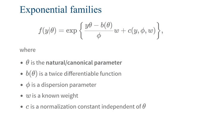
The secret ingredient that has been missing is a concept known as exponential families. It can answer BOTH questions. Isn't that just peachy?
1️⃣ Does this work with any distribution?
2️⃣ How in the world do we choose the link function?
The secret ingredient that has been missing is a concept known as exponential families. It can answer BOTH questions. Isn't that just peachy?
Exponential families are distributions whose density can be rewritten in a *very* special form.
Honestly, this curious form is anything but intuitive. Yet, it is surprisingly versatile and the math just works. If you ask me, that's quite mathemagical. ✨
Honestly, this curious form is anything but intuitive. Yet, it is surprisingly versatile and the math just works. If you ask me, that's quite mathemagical. ✨
It probably doesn't come as a surprise that Bernoulli and Poisson distributions are exp. families (see table).
But what may surprise you is this:
The function b plays an extraordinary role: Its derivative can be used as link function! In fact, that's the canonical choice.
But what may surprise you is this:
The function b plays an extraordinary role: Its derivative can be used as link function! In fact, that's the canonical choice.

Now you know GLMs' ingredients: Exponential families and link functions.
You can find more example distributions on Wikipedia en.wikipedia.org/wiki/Exponenti…
Also, an interesting perspective on what makes exponential families so magical can be found on SE: stats.stackexchange.com/questions/4118…
You can find more example distributions on Wikipedia en.wikipedia.org/wiki/Exponenti…
Also, an interesting perspective on what makes exponential families so magical can be found on SE: stats.stackexchange.com/questions/4118…

Bam! We made it. And we've covered
* two popular GLMs and
* mathematical foundations of GLMs
Let me know if you liked this thread by liking the start of the thread below ☺️
And if you want to see more of my content, feel free to follow @rappa753.
See you next time 👋
* two popular GLMs and
* mathematical foundations of GLMs
Let me know if you liked this thread by liking the start of the thread below ☺️
And if you want to see more of my content, feel free to follow @rappa753.
See you next time 👋
https://twitter.com/rappa753/status/1659559565967622145
If you liked this post, you may enjoy my 3-minute newsletter too.
Every week, my newsletter shares insights on
- R & dataviz,
- Shiny and web dev
Reading time: 3 minutes or less
You can join at
alberts-newsletter.beehiiv.com/subscribe
Every week, my newsletter shares insights on
- R & dataviz,
- Shiny and web dev
Reading time: 3 minutes or less
You can join at
alberts-newsletter.beehiiv.com/subscribe
• • •
Missing some Tweet in this thread? You can try to
force a refresh