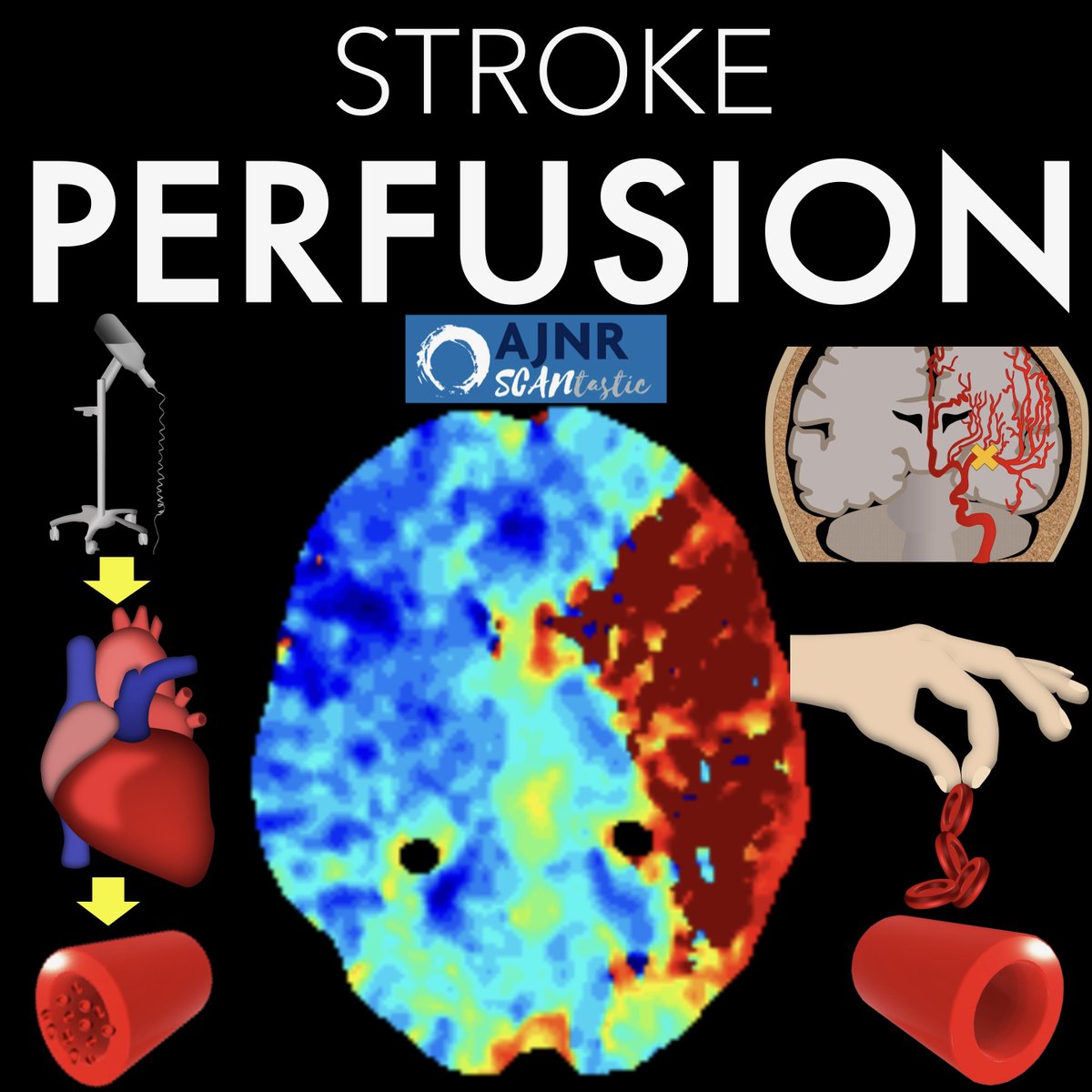
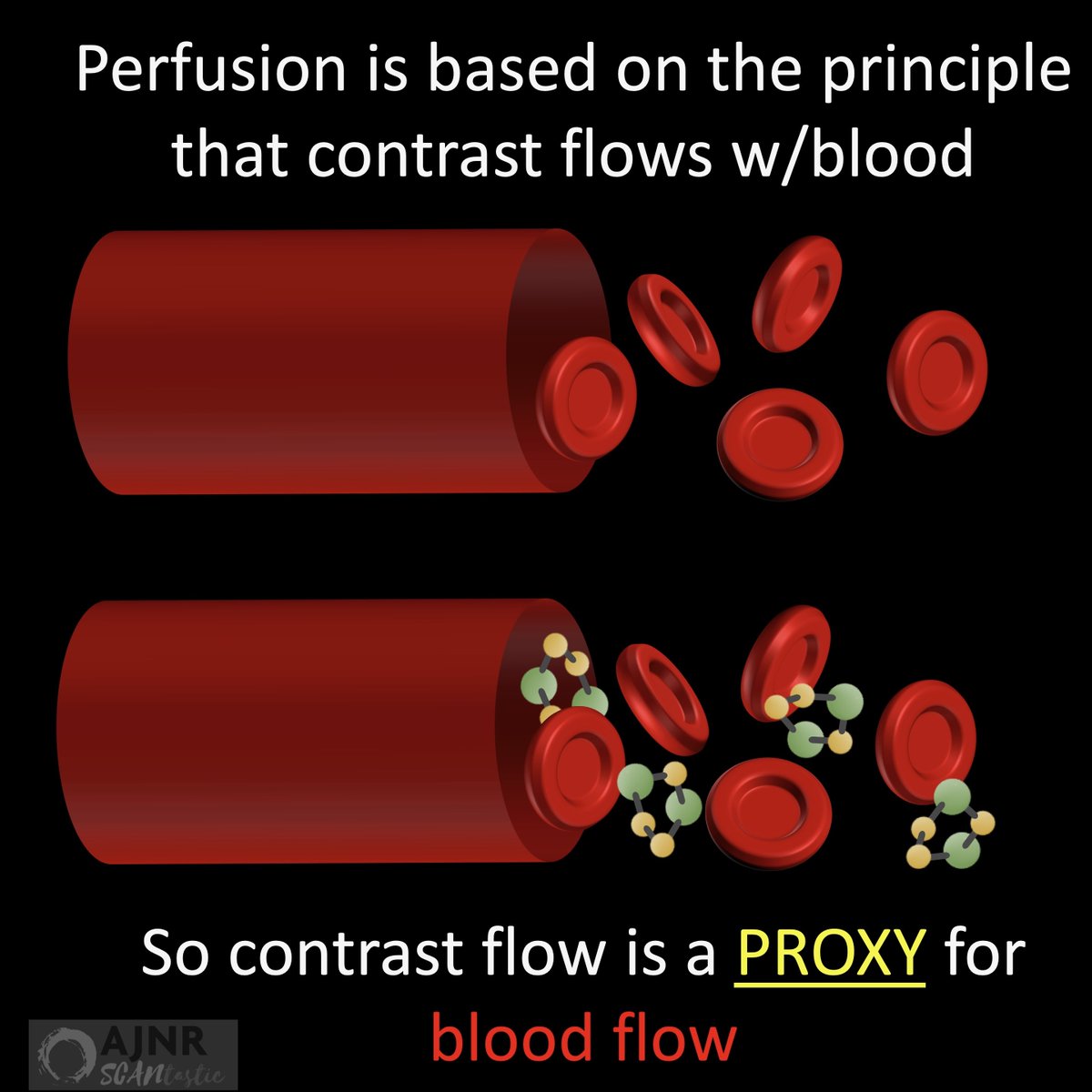
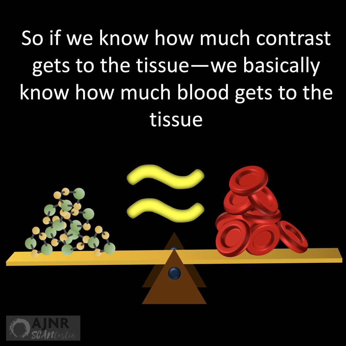
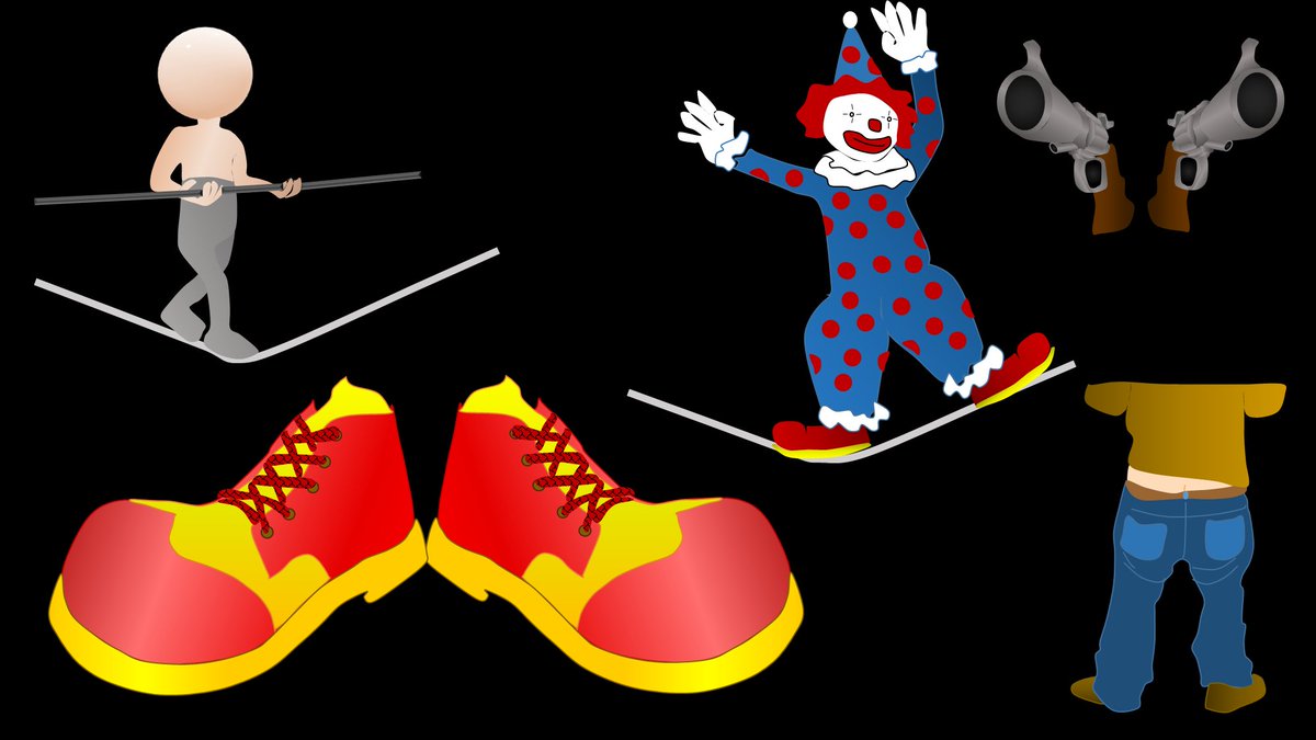
2/ When you look on the coronal plane at the tongue, the first thing you notice are two column like structures that look like a pair of jeans—genioglossus—or as I like to say “jean-ee-o-glossus.” Genioglossus is latin for jeans of the tongue, right?
3/Right below the jeans are what look like a pair of clown shoes—the geniohyoid. So you see a pair of legs going right into a pair of shoes.
4/The clown shoes look like they are balancing on a tight rope—the tight rope is the mylohyoid. The mylohyoid is easy to remember as the tight rope b/c it is often called the mylohyoid sling—a sling is like a tight rope
5/ So every time I look at the tongue on imaging, I am looking to make sure I can see my clown walking on a tight rope. Any distortion of that is pathologic.
6/ And although it’s not quite the tongue, right beneath the tight rope are two tubular looking structures pointed at you—the anterior bellies of the digastric muscles. I think they look like two gun barrels pointed at you.
7/ So next time some asks you about tongue anatomy, you can tell them about the clown on a tight rope above two gun barrels and they can say, “Aaaaah, now I get it.”
• • •
Missing some Tweet in this thread? You can try to
force a refresh
1/My hardest thread yet! Are you up for the challenge?
How stroke perfusion imaging works!
Ever wonder why it’s Tmax & not Tmin?
Do you not question & let RAPID read the perfusion for you? Not anymore!
2/Perfusion imaging is based on one principle: When you inject CT or MR intravenous contrast, the contrast flows w/blood & so contrast can be a surrogate marker for blood.
This is key, b/c we can track contrast—it changes CT density or MR signal so we can see where it goes.
3/So if we can track how contrast gets to the tissue (by changes in CT density or MR signal), then we can approximate how BLOOD is getting to the tissue.
And how much blood is getting to the tissue is what perfusion imaging is all about.
1/”That’s a ninja turtle looking at me!” I exclaimed. My fellow rolled his eyes at me, “Why do I feel I’m going to see this a thread on this soon…”
He was right! A thread about one of my favorite imaging findings & pathology behind it
2/Now the ninja turtle isn’t an actual sign—yet!
But I am hoping to make it go viral as one. To understand what this ninja turtle is, you have to know the anatomy.
I have always thought the medulla looks like a 3 leaf clover in this region.
The most medial bump of the clover is the medullary pyramid (motor fibers).
Next to it is the inferior olivary nucleus (ION), & finally, the last largest leaf is the inferior cerebellar peduncle.
Now you can see that the ninja turtle eyes correspond to the ION.
3/But why are IONs large & bright in our ninja turtle?
This is hypertrophic olivary degeneration.
It is how ION degenerates when input to it is disrupted. Input to ION comes from a circuit called the triangle of Guillain & Mollaret—which sounds like a fine French wine label!
1/I always say you can tell a bad read on a spine MR if it doesn’t talk about lateral recesses.
What will I think when I see your read? Do you rate lateral recess stenosis?
Here’s a thread on lateral recess anatomy & a grading system for lateral recess stenosis
2/First anatomy.
Thecal sac is like a highway, carrying the nerve roots down the lumbar spine.
Lateral recess is part of the lateral lumbar canal, which is essentially the exit for spinal nerve roots to get off the thecal sac highway & head out into the rest of the body
3/Exits have 3 main parts.
First is the deceleration lane, where the car slows down as it starts the process of exiting.
Then there is the off ramp itself, and this leads into the service road which takes the car to the roads that it needs to get to its destination
3/At its most basic, you can think of the PPF as a room with 4 doors opening to each of these regions: one posteriorly to the skullbase, one medially to the nasal cavity, one laterally to the infratemporal fossa, and one anteriorly to the orbit