Albert Rapp Profile picture
May 31 8 tweets 4 min read Twitter logo Read on Twitter
Data cleaning is tedious.

But it's much easier with the {janitor} package. Especially if you work with Excel files.

Here are 5 underrated features from {janitor}. #rstats
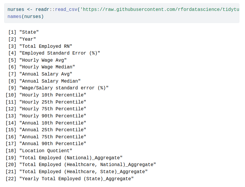
1 // Create clean names

This is absolutely the best function. It transforms column names such that they are easier to use for programming.

Left: Bad for programming
Right: Good for programming ImageImage
2 // Remove empty or constant cells from Excel files

Excel files can be messy to read in R. Lots of weird column names and empty cells.

{janitor} takes care of that for us. ImageImage
3 // Convert stupid Excel dates

Our lovely {janitor} can even convert those pesky Excel dates to something we can work with.

Check out how the hire_date column from our previous output is transformed to actual dates. ImageImage
4 // Rounding

R does not always round up numbers that end with .5

R uses Banker's rounding 🤦 🤯

Instead of implementing the rounding yourself, just use {janitor} functions. Image
5 // Find duplicates

Sometimes you need to find duplicate observations based on a set of characteristics.

In that case, get_dupes() is your friend. Image
That was our short list. I hope you'll give {janitor} a try now.

All code examples can be found in my blog at albert-rapp.de/posts/07_janit…

Let me know if you liked this thread by liking its first post below ☺️

And for more content like this, follow @rappa753. See you next time 👋
If you liked this post, you may enjoy my 3-minute newsletter too.

Every week, my newsletter shares insights on
- R & dataviz,
- Shiny and web dev

Reading time: 3 minutes or less

You can join at
alberts-newsletter.beehiiv.com/subscribe

• • •

Missing some Tweet in this thread? You can try to force a refresh
 

Keep Current with Albert Rapp

Albert Rapp Profile picture

Stay in touch and get notified when new unrolls are available from this author!

Read all threads

This Thread may be Removed Anytime!

PDF

Twitter may remove this content at anytime! Save it as PDF for later use!

Try unrolling a thread yourself!

how to unroll video
  1. Follow @ThreadReaderApp to mention us!

  2. From a Twitter thread mention us with a keyword "unroll"
@threadreaderapp unroll

Practice here first or read more on our help page!

More from @rappa753

May 19
Ever heard of logistic regression? Or Poisson regression? Both are generalized linear models (GLMs).

They're versatile statistical models. And by now, they've probably been reframed as super hot #MachineLearning.

Brush up on their math with this thread. #rstats
Let's start with logistic regression. Assume you want to classify a penguin as male or female based on its

* weight,
* species and
* bill length

Better yet, let's make this specific. Here's a dataviz for this exact scenario. It is based on the {palmerpenguins} data set. Image
As you can see, the male and female penguins form clusters that do not overlap too much.

However, regular linear regression (LR) won't help us to distinguish them. Think about it. Its output is something numerical. Here, we want to find classes.
Read 26 tweets
May 12
The best way to learn data analysis is to actually practice it.

Each week, the #tidyTuesday challenge gives you plenty of opportunity for this.

Don't know how to get started with the challenge? In case you missed it, I've put together an #rstats guide in January.
First, get the data.

Head over to the tidyTuesday's GitHub repo at github.com/rfordatascienc…

Just copy the code from the "Get the data" section. Image
Next, I suggest that you use the clean_names() function from the {janitor} package.

This will format the column names of your data set so that it's easier to work with.

Huge time saver! Image
Read 24 tweets
May 5
I used to think tables are boring.

But they can be beautiful & engaging.

Here's a nice example from @infobeautiful.

It uses many eye-catching elements but you don't need them to create a great table.

Just stick to these guidelines 🧵#dataviz A huge table describing wha...
Let's start with a not so great table and improve it.

Here's a table I would have created just a few months ago.

Not so sexy, right? Let's clean that up. Image
1. Avoid vertical lines

The above table uses waaaay to many grid lines.

Without vertical lines, the table will look less cramped.

Have a look for yourself. Image
Read 16 tweets
Apr 28
I hate code duplication. It's just a sure way to bloat code and do copy-and-paste mistakes 🙈

In Shiny, modules help me to avoid that.

BONUS: They move the app's logic to separate + reusable functions for cleaner code.

Here's how modules work. #rstats
Let's build an app that displays a scatterplot of two variables of a given data set.

Let's imagine that each data set needs its own page in our app. Here's how that could look. ImageImage
Every element of our app will need to get a unique ID. And we will need to repeat that for every data set.

For two data sets a non-modularized Shiny UI could look something like this.

Notice how I have to append "_iris" each time for the second tabPanel / data set. Image
Read 11 tweets
Apr 4
Paired bar charts suck at comparing values. The only reason they're used all the time is because they are easy to create.

But there are better alternatives that are just as easy.

Here's how to create 4 better alternatives with #rstats.
0 // Where's the code?

The code for all plots can be found at albert-rapp.de/posts/ggplot2-…

This thread walks you through the code quickly.
1 // Dot plot

Instead of using bars next to each other, why not points on the same line?

Makes comparison suuper easy.

And it takes only a geom_point() layer. Dead-simple, right?

I think it's even easier to create than a paired bar chart.
Read 15 tweets
Mar 31
Tired of lackluster visualizations that don't tell you anything?

Discover how storytelling and nuanced color use can
- transform your bar charts.
- inform readers on key insights & actions

Here's a step-by-step guide (with full code at the end). #rstats
Here's our starting point.

Note that this tutorial is a ggplot2 recreation of

(And once you've mastered the technique you can enhance this visual with advanced stats beyond comparing error rates to average.)
// Labels on y-axis

First, move the names to the y-axis.

This is important when the labels are real names instead of IDs.

No one likes to tilt their head for reading.
Read 19 tweets

Did Thread Reader help you today?

Support us! We are indie developers!


This site is made by just two indie developers on a laptop doing marketing, support and development! Read more about the story.

Become a Premium Member ($3/month or $30/year) and get exclusive features!

Become Premium

Don't want to be a Premium member but still want to support us?

Make a small donation by buying us coffee ($5) or help with server cost ($10)

Donate via Paypal

Or Donate anonymously using crypto!

Ethereum

0xfe58350B80634f60Fa6Dc149a72b4DFbc17D341E copy

Bitcoin

3ATGMxNzCUFzxpMCHL5sWSt4DVtS8UqXpi copy

Thank you for your support!

Follow Us on Twitter!

:(