Albert Rapp Profile picture
Jun 17 4 tweets 2 min read Twitter logo Read on Twitter
Need to extract days, months, years or more from time data?

Don't compute them all manually with {lubridate}. That's way too tedious.

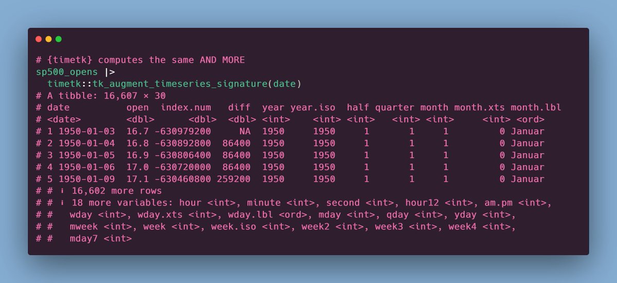
The {timetk} package has a nice function that does all the heavy lifting for you.

LEFT: {lubridate} workflow
RIGHT: {timetk} workflow
#rstats ImageImage
BONUS: Maybe you don't want use all of the stuff that {timetk} computes for you.

Here's a simple function that extracts only the parts you want.

All of the code can be found on GitHub at gist.github.com/AlbertRapp/2c9… Image
Also, shoutout to @EatsleepfitJeff for teaching me about this function from {timetk} ☺️
If you liked this post, you may enjoy my 3-minute newsletter too.

Every week, my newsletter shares insights on
- R & dataviz,
- Shiny and web dev

Reading time: 3 minutes or less

You can join at
alberts-newsletter.beehiiv.com/subscribe

• • •

Missing some Tweet in this thread? You can try to force a refresh
 

Keep Current with Albert Rapp

Albert Rapp Profile picture

Stay in touch and get notified when new unrolls are available from this author!

Read all threads

This Thread may be Removed Anytime!

PDF

Twitter may remove this content at anytime! Save it as PDF for later use!

Try unrolling a thread yourself!

how to unroll video
  1. Follow @ThreadReaderApp to mention us!

  2. From a Twitter thread mention us with a keyword "unroll"
@threadreaderapp unroll

Practice here first or read more on our help page!

More from @rappa753

Jun 10
Everybody loves colors but only few know how to use them well.

With the right guidelines, using colors becomes super easy.

Let me show you how to implement these guidelines with ggplot 🧵
#rstats
Anyone can create a stacked bar chart with ggplot.

But that can end up in a colorful & messy plot.

Let's implement a couple of guidelines from this datawrapper blog post to level up our color game blog.datawrapper.de/10-ways-to-use… Image
The key is to reduce the amount of colors and leverage the `alpha` aesthetic as well. Image
Read 11 tweets
Jun 7
Sometimes people ask me if I can do one-on-one R tutoring.

Sure I can. But then my hourly rate applies. And there are many amazing *free* resources. Want to try them first?

Here are a few that I recommend. #rstats
1 // Yet Again: R + Data Science

Find it at yards.albert-rapp.de

I'll start with one of my own bc I assume that you like my style (otherwise why ask me?)

Beware though: YARDS is a graduate-level course that I taught for math students w/ a bit of programming experience. Image
2 // R for Data Science

To me this book is like the R bible. It introduced me to the so-called tidyverse and taught me much of what I know.

This one starts out slow and is really beginner-friendly

r4ds.had.co.nz
Read 11 tweets
May 31
Data cleaning is tedious.

But it's much easier with the {janitor} package. Especially if you work with Excel files.

Here are 5 underrated features from {janitor}. #rstats
1 // Create clean names

This is absolutely the best function. It transforms column names such that they are easier to use for programming.

Left: Bad for programming
Right: Good for programming ImageImage
2 // Remove empty or constant cells from Excel files

Excel files can be messy to read in R. Lots of weird column names and empty cells.

{janitor} takes care of that for us. ImageImage
Read 8 tweets
May 19
Ever heard of logistic regression? Or Poisson regression? Both are generalized linear models (GLMs).

They're versatile statistical models. And by now, they've probably been reframed as super hot #MachineLearning.

Brush up on their math with this thread. #rstats
Let's start with logistic regression. Assume you want to classify a penguin as male or female based on its

* weight,
* species and
* bill length

Better yet, let's make this specific. Here's a dataviz for this exact scenario. It is based on the {palmerpenguins} data set. Image
As you can see, the male and female penguins form clusters that do not overlap too much.

However, regular linear regression (LR) won't help us to distinguish them. Think about it. Its output is something numerical. Here, we want to find classes.
Read 26 tweets
May 12
The best way to learn data analysis is to actually practice it.

Each week, the #tidyTuesday challenge gives you plenty of opportunity for this.

Don't know how to get started with the challenge? In case you missed it, I've put together an #rstats guide in January.
First, get the data.

Head over to the tidyTuesday's GitHub repo at github.com/rfordatascienc…

Just copy the code from the "Get the data" section. Image
Next, I suggest that you use the clean_names() function from the {janitor} package.

This will format the column names of your data set so that it's easier to work with.

Huge time saver! Image
Read 24 tweets
May 5
I used to think tables are boring.

But they can be beautiful & engaging.

Here's a nice example from @infobeautiful.

It uses many eye-catching elements but you don't need them to create a great table.

Just stick to these guidelines 🧵#dataviz A huge table describing wha...
Let's start with a not so great table and improve it.

Here's a table I would have created just a few months ago.

Not so sexy, right? Let's clean that up. Image
1. Avoid vertical lines

The above table uses waaaay to many grid lines.

Without vertical lines, the table will look less cramped.

Have a look for yourself. Image
Read 16 tweets

Did Thread Reader help you today?

Support us! We are indie developers!


This site is made by just two indie developers on a laptop doing marketing, support and development! Read more about the story.

Become a Premium Member ($3/month or $30/year) and get exclusive features!

Become Premium

Don't want to be a Premium member but still want to support us?

Make a small donation by buying us coffee ($5) or help with server cost ($10)

Donate via Paypal

Or Donate anonymously using crypto!

Ethereum

0xfe58350B80634f60Fa6Dc149a72b4DFbc17D341E copy

Bitcoin

3ATGMxNzCUFzxpMCHL5sWSt4DVtS8UqXpi copy

Thank you for your support!

Follow Us on Twitter!

:(