
Head of Insights @Cartainc | New data on startups out multiple times per week
2 subscribers
 Cash into pre-priced rounds stayed fairly steady in Q1, with the estimated final deal counts basically equal to Q4 2023
 Michigan, the recent hotspot - is that a top? Maybe a touch early to say for sure, but certainly the exponential growth is no longer there. 2/n
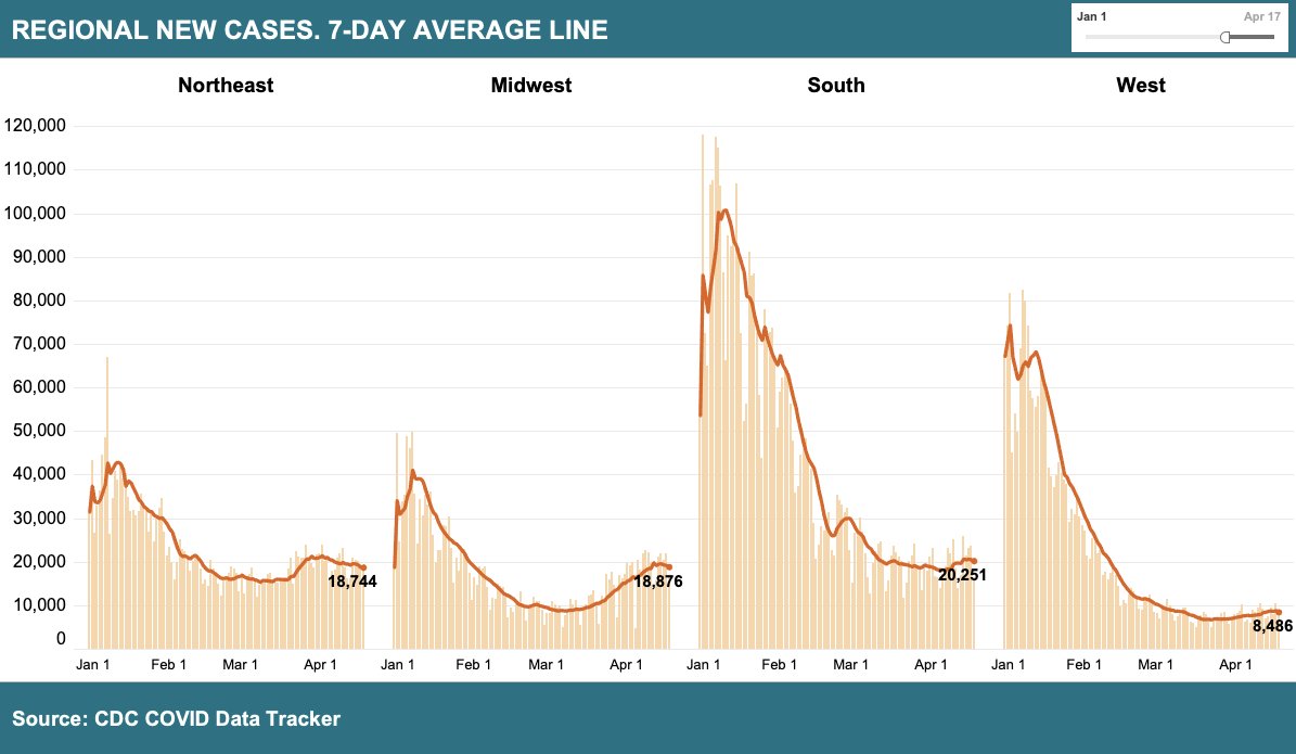
 Clearly the case rise is happening in the Northeast and Midwest. 2/5
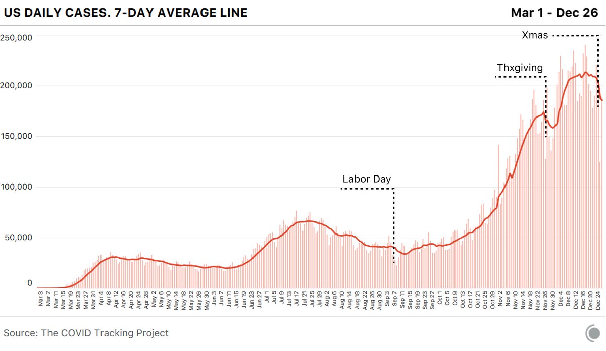 So why is that? A myriad of reasons. Some state don't report anything on a holiday, as their staff is given a well-deserved day off. People may be less likely to get a test on a holiday. Some states report a fraction of their known cases...it's messy. 2/
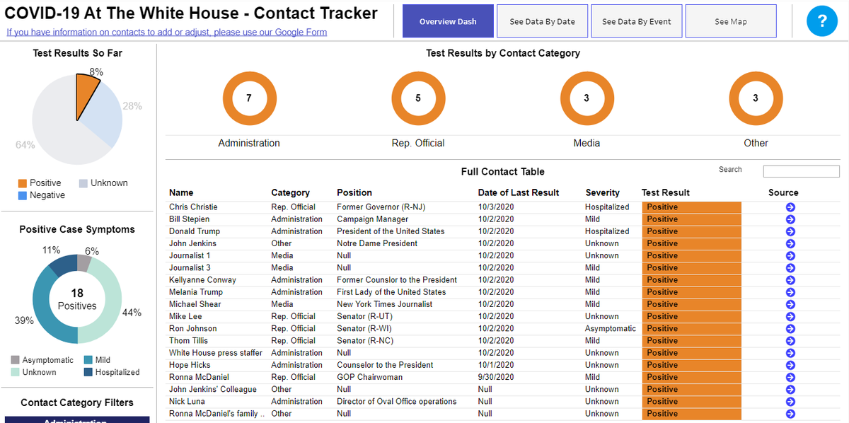 When viewed on an event basis, the SCOTUS Rose Garden is the most impactful. 47 contacts so far and there are many more unknowns.
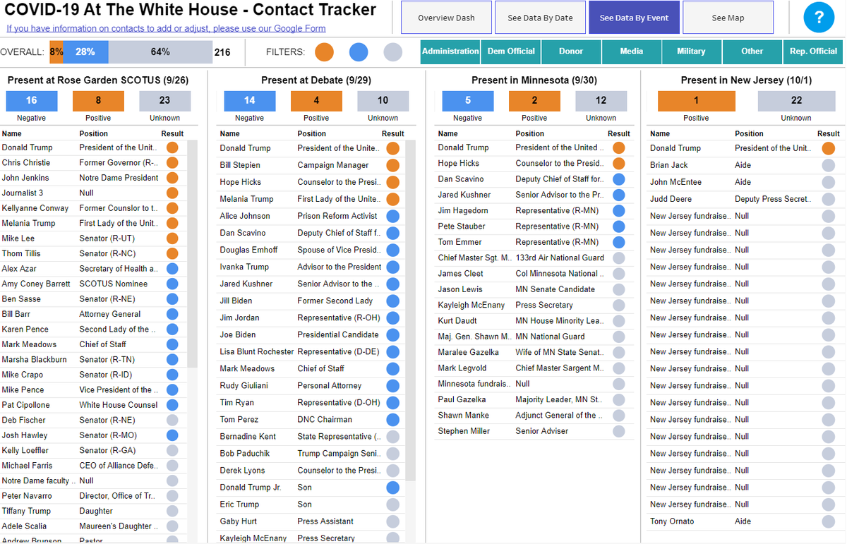
 In our previous major hotspots, cases per million people have seen precipitous falls. Testing, while not at peak levels, has not fallen as much as cases (especially outside of Florida) 2/


 Check in our original epicenter region, the Northeast. This includes: CT, MA, ME, NH, NJ, NY, PA, RI, and VT.
 Minnesota % positive 2/
 Test by week slightly exceeded last week (some real down days in testing from Memorial Day).
 2/ #COVID hospitalization over time, South and Southwest. See first tweet in thread for data explanation.
 Note - if you'd like to see your state in this format, give me a shout.
 But this drop is not universal across states. Iowa, for instance, is showing a real worrying trend. Tests are going up, but the % positive is rising alongside them. Not good.
 New York has borne the burnt this in the US, accounting for almost a third of all deaths in April. But the overall growth month to month is stunning. @justin_hart @aginnt
 Positive cases: nationally, the % of positive tests is slowing declining (as we would hope would happen as tests increase). That figure is still rising in certain states like DE and PA, however.
 In NY, the % of positive tests has begun to fall as more testing occurs. That's what we want! Obviously it's still really high, but the trend matters. @NateSilver538 has been on this for awhile. @nytimes @Noahpinion
 Hotspots - some definite positive news. Clear declines in positives cases in NY and MI, with a flatter trend in NJ. NY deaths fell to their lowest level since Apr. 2nd (...seems like a lifetime ago). Small victory, but something. 2/
 A better story in Michigan. Deaths have slowed, and positive cases have really turned. Now the focus should be ramping tests greatly. @GovWhitmer deserves some credit! Interactive: tabsoft.co/3btKLJ7 2/
 First up - the West (CA, OR, WA). Trends down with a slightly worrying rise in WA. There have (obviously) been no change to shelter-in-place orders in these states - so why the uptick in Rt? Perhaps just a lag in positive case reporting? @justin_hart @aginnt @latimes 2/
 As an example, here's Michigan's effective Rt over time. Peaks in early March around 3 and has been hovering around 1 for days now. Rt probably does lag case growth but the @COVID19Tracking data is the best we have 2/