Yesterday we discussed different plot types. But DataViz is so much more, and the fun now begins!
A plot by itself is nothing more than a piece of abstract art. Maybe most of the followers here are old enough to know of the two images what is science and what is art?
In order to become insightful, we must help our audience. We need: 1. some explanatory TEXT, 2. an explanation of all COLORS used, and 3. a suitable layout that makes reading the visualization effective.
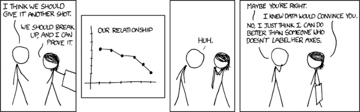
A few rules about text: Text is necessary. Nicely summed up in this comic by Randall Munroe @xkcd
Text should be legible and this depends on the font. All standard fonts work well, journals dictate fonts, so: don't experiment. (Font *is* important for numbers in tables, some have variable width for 1 and 0 - this makes reading them hard! Read more: helenajambor.wordpress.com/2019/07/04/get…
Avoid text rotation! I misplaced the paper, but research shows: every degree of rotation away from horizontal text, slows down the reading speed! In most cases making the bar a little wider, or: flipping the entire chart to horizontal bar solves this!
Also, be suuuuuper careful with abbreviations. Most of the abbreviations we use are much more domain-specific than we think! N could be sample number (biologist), Avogadro Number (chemist), or Newton force (physicist).
Be clear and use abbreviations scarcely, but: too much text isn't great either. Rule of thumb: maybe legend shouln't be bigger than the plot!
And this is def too little text!
This is a great example on why ALL CAPS IS VERY HARD TO ACTUALLY READ, SO DO NOT USE IT FOR YOUR POSTER TITLES! [sadly I don't know who made this!]
I'd love it if you guys posted a common abbreviation in your science and we see how many here get them right. I start: who knows SNR, FISH, and RNP? (don't look them up :)

• • •

Missing some Tweet in this thread? You can try to force a refresh
 

Keep Current with Looking for curators!

Looking for curators! Profile picture

Stay in touch and get notified when new unrolls are available from this author!

Read all threads

This Thread may be Removed Anytime!

PDF

Twitter may remove this content at anytime! Save it as PDF for later use!

Try unrolling a thread yourself!

how to unroll video
  1. Follow @ThreadReaderApp to mention us!

  2. From a Twitter thread mention us with a keyword "unroll"
@threadreaderapp unroll

Practice here first or read more on our help page!

More from @SfPRocur

Aug 2, 2019
Okay! Let's talk about #Podcasting! What does it entail and how can you get started?
Here is a quick overview over the technical part of podcast production!
When I chose to make the podcast, I was looking for a cheap, low-effort way for long-form communication, that wasn't blogging. And I wasn't disappointed: Podcasting has a very low entry threshold.
"Easy to learn, hard to master" is a saying from the gaming industry that comes to mind ;)
Read 26 tweets
Jul 30, 2019
How do you even start communicating science non-fiction stuff?!

I think there are 4 CORE ELEMENTS of a successful communication piece needs. And knowing those, starting to write / script / create your piece becomes much easier.
I am still @DennisEckmeier. If you missed my introdution earlier today, you can check it out here:
Later this week I want to talk about the different formats of communication that I use:
- writing: academic articles, blog posts, twitter threads ;)
- speaking: giving talks in academia
- audio: podcasting
- video: webvideos
Read 17 tweets
Jul 15, 2019
Last day with me @helenajambor on #sciviz #visualisations. Today to wrap up let's briefly discuss color and layout.
In 3 scenarios we use color. 1) to give a naturalistic representation in drawings and photos. But "natural" colors in charts quickly get awkward: it is frowned upon to use blue/boys, pink/girls color code. Also avoiding a certain color-code can be tricky, see Pew research example
2) color encodes quantities. In a heat map cells are colored by value, in microscopy images false-colours show protein enrichments, in scatterplots saturation of dots in colored to show a third observation.
Read 16 tweets
Jul 13, 2019
Today I (@helenajambor) talk about choosing a chart. There is a staggering amount of plots: subject specific ones, trendy ones, insightful, and useless ones. Which chart type to choose depends on your data. [a visualization of the diversity by Anna Vital]
We encode counts of categories (or %) by area. Easiest to read are horizontal or vertical bar charts. Less intuitive are circle plots (quantity must be AREA not RADIUS!!!). Other charts are pie's for % (hard with many categories), tree maps (always hard to read), and radar charts
Some bar charts are re-born with a fancy name, e.g. the "Manhattan plot", which really only shows high density of bars. [image from this tutorial
piperwrites.com/2018/04/04/gen…]. BTW wikipedia lists Manhattan plot as scatterplot - i disagree.
Read 11 tweets
Jul 12, 2019
Visualizations effectively communicate scientific insights. The image shows one of the oldest science vis: 200AD. It precisely and unambiguously communicates poisonous scorpions. And it saved the author a ton of text. [citation from A.Stückelberger]
While drawings have a long history, scientific schematics and charts are more recent. Maybe this one from Aristotle (300BC) could be considered a kind of early diagram. It is scribbled on the right of the text.
It describes all logic possibilities of leg positions in four-legged animals. And of course, some would not even support movement :)
Read 10 tweets
Jul 11, 2019
@helenajambor here. A little bit about visual communication. Visual information is all around us, every day, in all of our life’s aspects. And, we are pretty good at decoding it. Most of us understand that in busses seats are reserved for elderly
We also get that for charging our laptop we find a socket under the seat. Even when we are in Czech trains and have no command of Czech
And in the scientific sphere, we get that some manipulation was done with these mice. And possibly this affects their body temperature. (note: the text is harder to understand, PGE?)
Read 12 tweets

Did Thread Reader help you today?

Support us! We are indie developers!


This site is made by just two indie developers on a laptop doing marketing, support and development! Read more about the story.

Become a Premium Member ($3/month or $30/year) and get exclusive features!

Become Premium

Don't want to be a Premium member but still want to support us?

Make a small donation by buying us coffee ($5) or help with server cost ($10)

Donate via Paypal

Or Donate anonymously using crypto!

Ethereum

0xfe58350B80634f60Fa6Dc149a72b4DFbc17D341E copy

Bitcoin

3ATGMxNzCUFzxpMCHL5sWSt4DVtS8UqXpi copy

Thank you for your support!

Follow Us on Twitter!

:(