,
11 tweets,
5 min read
Read on Twitter
Today I (@helenajambor) talk about choosing a chart. There is a staggering amount of plots: subject specific ones, trendy ones, insightful, and useless ones. Which chart type to choose depends on your data. [a visualization of the diversity by Anna Vital] 
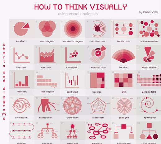
We encode counts of categories (or %) by area. Easiest to read are horizontal or vertical bar charts. Less intuitive are circle plots (quantity must be AREA not RADIUS!!!). Other charts are pie's for % (hard with many categories), tree maps (always hard to read), and radar charts

Some bar charts are re-born with a fancy name, e.g. the "Manhattan plot", which really only shows high density of bars. [image from this tutorial
piperwrites.com/2018/04/04/gen…]. BTW wikipedia lists Manhattan plot as scatterplot - i disagree.
piperwrites.com/2018/04/04/gen…]. BTW wikipedia lists Manhattan plot as scatterplot - i disagree.
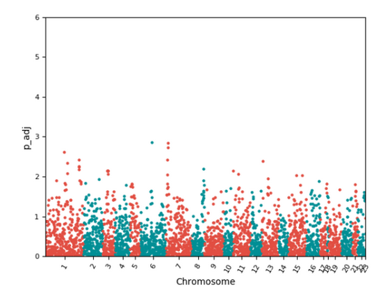
They show p values for positions along the chromosomes..
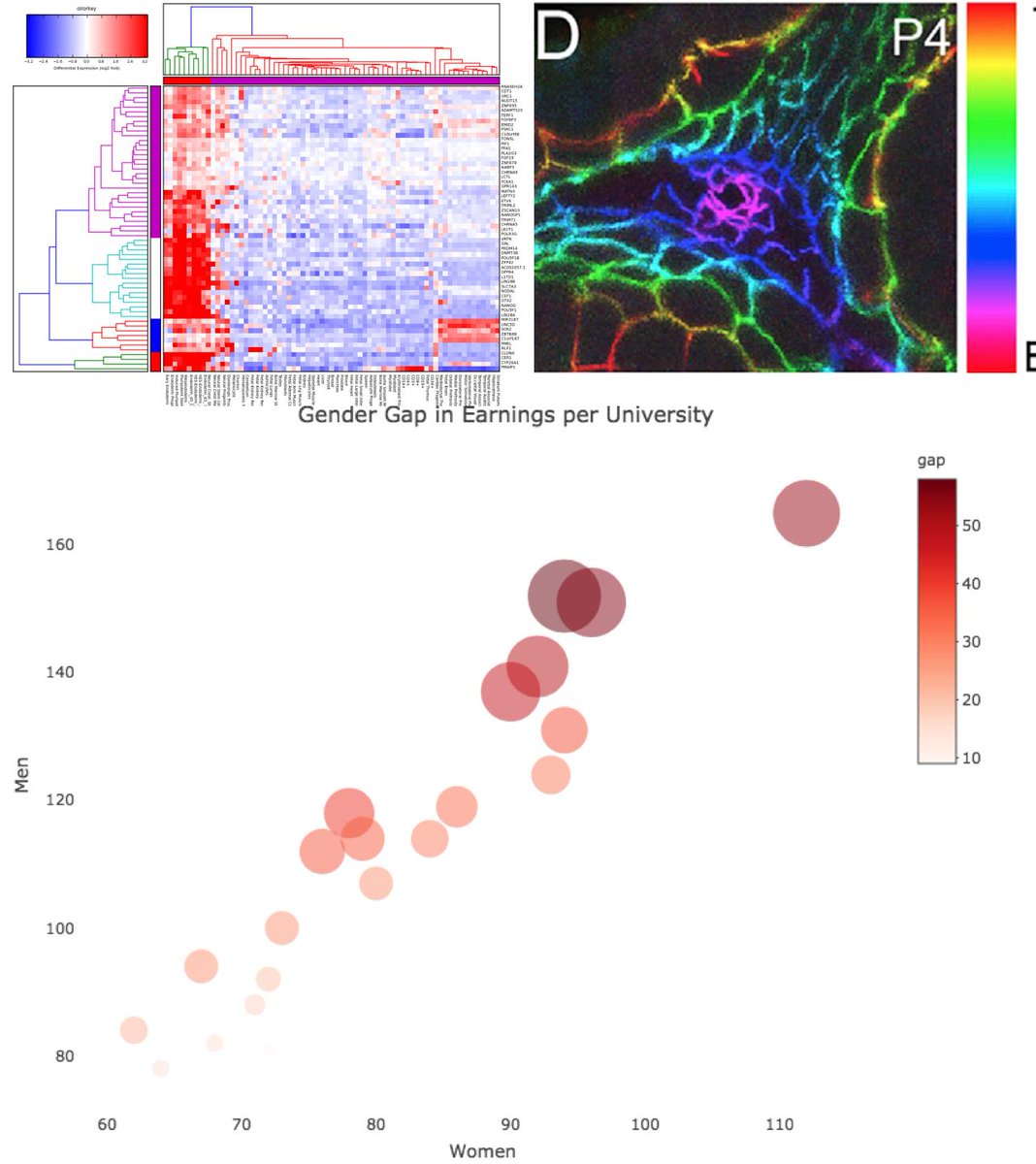
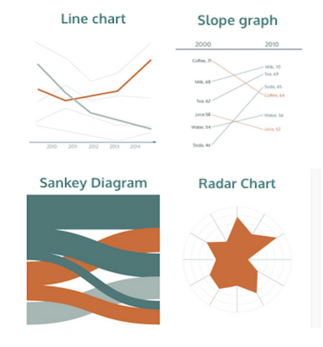
For trends & time-courses, we use line charts (hint: Time = Line!). For 2 timepoints use a slope-charts, for many categories a Sankey diagram, for cyclical data radar charts. Never invert the axis: upward line is always MORE, downward line LESS. [S.Few perceptualedge.com]
Relationships are usually shown with scatterplots. The scatterplot is the most versatile plot. We can encode a third dimension in the dot size, and a fourth in attributes such as color and shape of the dots. For hierarchical relations use phylogenetic trees & genealogies

In every other article these days you see a tSNE plot and PCA plots of some single cell data. These are effectively scatterplots that highlight multivariate data at reduced dimension. A tutorial on PCA plots: setosa.io/ev/principal-c…. {Image: unknown, irony alert}
We often have lot of data that we summarize, and we can choose from many plots. Some focus on the center (box plot), others on the distribution (violin plot, histogram). I previously wrote a little blog about distribution charts: helenajambor.wordpress.com/2018/08/09/sho…
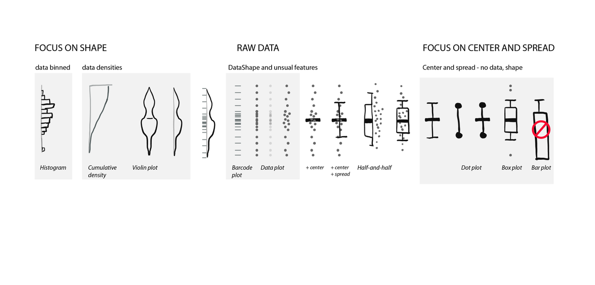
Remember: center-focused plots are great for normal distributions, but don't work for binomila etc distributions. Isn't this cute! I love plots, especially when drawn by Alison Horst!

Check out this great resource on choosing the right chart by Andrew Abela:
extremepresentation.typepad.com/files/choosing…
extremepresentation.typepad.com/files/choosing…
And this: even more exhaustive, but not so easy for beginners. it's done by the chart doctor @FT :
github.com/ft-interactive…
github.com/ft-interactive…