Between 1960 and 1970 Penguin Books underwent several revolutions in cover layout, at a time when public tastes were rapidly changing. For today's #TuesdayThoughts I look back at 10 years that shook the Penguin.
This is the story of the art of the #book cover...
This is the story of the art of the #book cover...
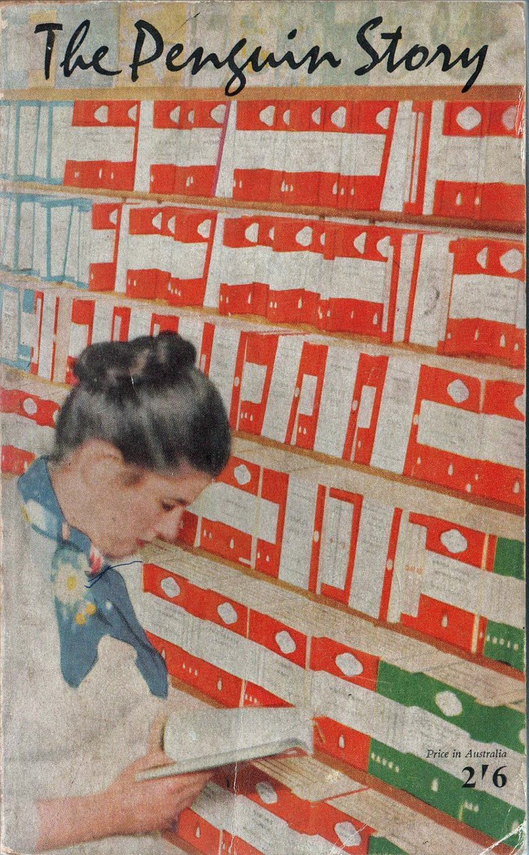
Allen Lane founded Penguin Books in 1935, aiming to bring high-quality paperbacks to the masses for the same price as a packet of cigarettes. Lane began by snapping up publishing rights for inexpensive mid-market novels and packaging them expertly for #booklovers.

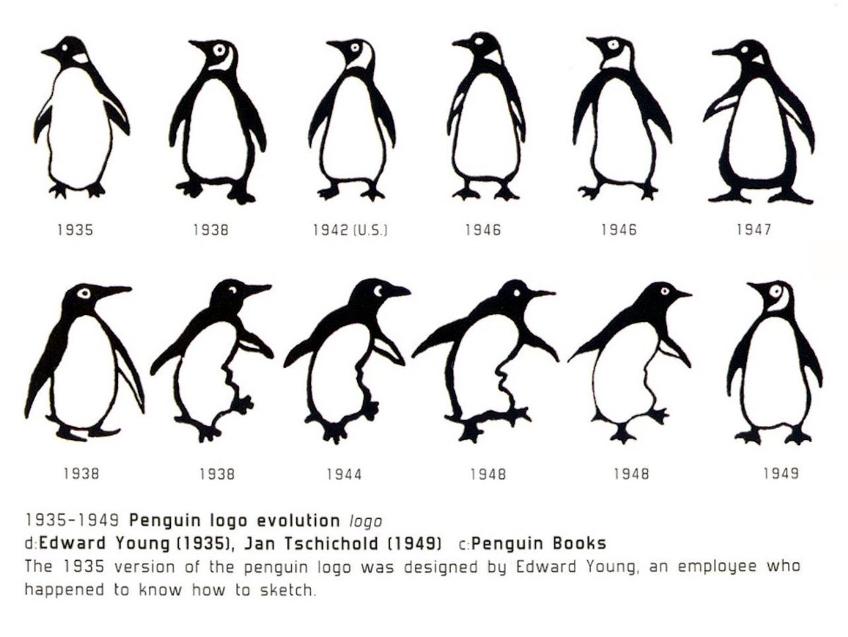
From the start Penguins were consciously designed; Lane wanted to distinguish his paperbacks from pulp novels. Edward Young created the first cover grid, using three horizontal bands and the new-ish Gill Sans typeface for the text.

Young also created the original colour code for the different genres of Penguin Books: orange for general fiction, blue for biography, red for plays, pink for travel etc. #GraphicDesign was to be a Penguin hallmark for many years.

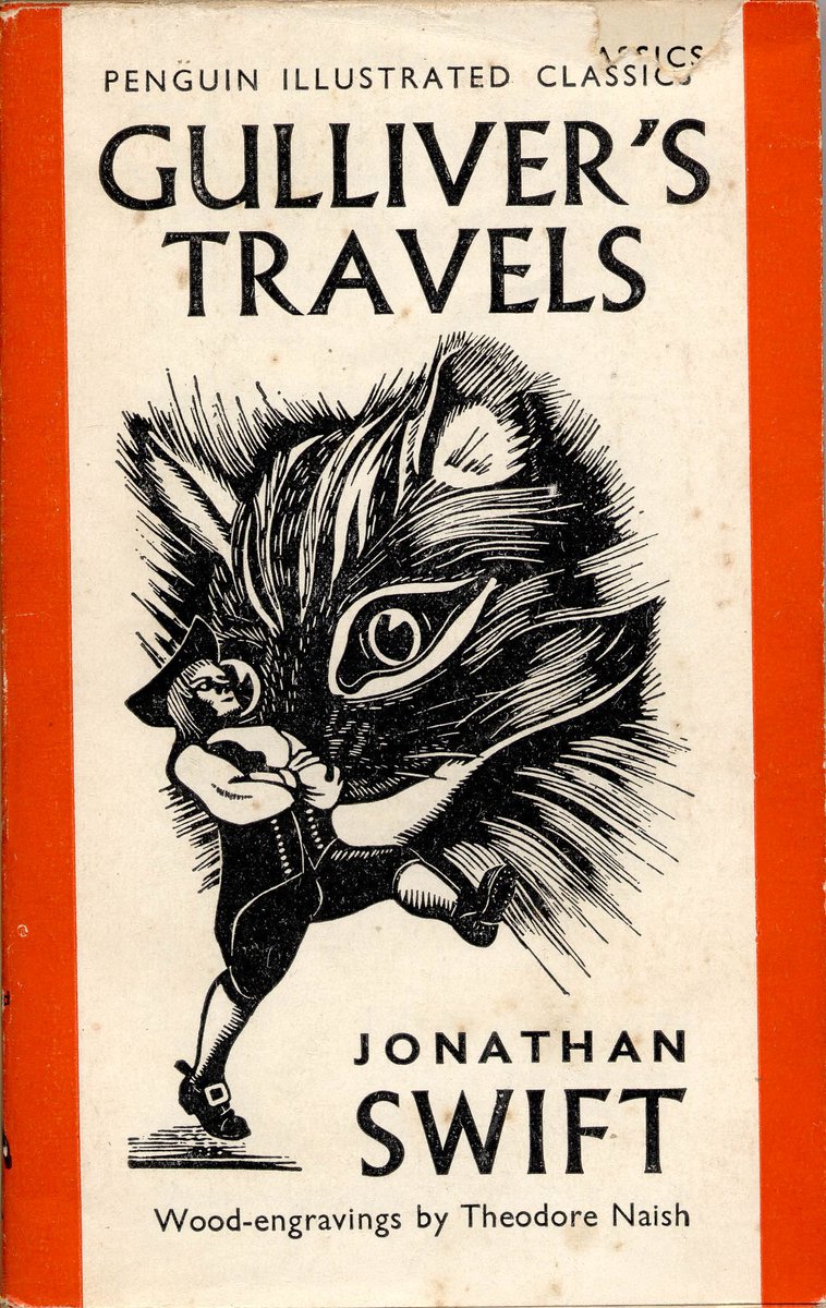
Some books did avoid using the Young grid: Penguin Illustrated Classics (1938) and the King Penguin hardback range (1939) both used cover illustration, and during the war years a range of slightly chaotic grids and typefaces were used on other titles.

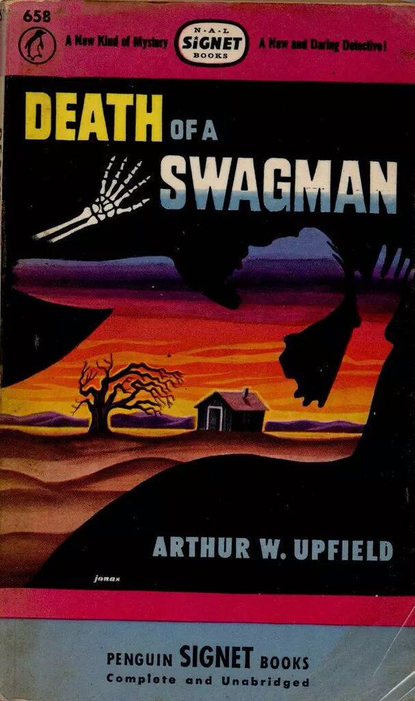
The first bolder attempts at Penguin cover design started in America, where Penguin Books Inc. commissioned Robert Jonas to create covers that could compete with Dell and Pocket Books at the news-stands.

But post-war Penguin in the UK was focussed on typography and consistency: Jan Tschichold's Penguin Composition Rules (1947) placed a premium on precise, consistent typographical standards throughout the whole book.

Tschichold's successor Hans Schmoller introduced a vertical three band grid for Penguin covers, with some space for a simple image, but #typography and consistency were still the rules: titled could be witty, but covers could not be flippant.

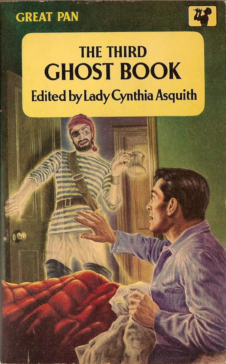
Rivals Pan and Corgi had no such qualms about using colour illustration for their covers, and with commercial pressures mounting designer Abram Games was finally allowed to 'experiment' with full colour imagery for Penguin covers in 1957.

Games's design used a small grid for the title above the illustration, and carefully commissioned artists to ensure an upmarket look. Alas fewer than 30 covers were published before the 'experiment' was abandoned due to the increasing cost of full colour printing.


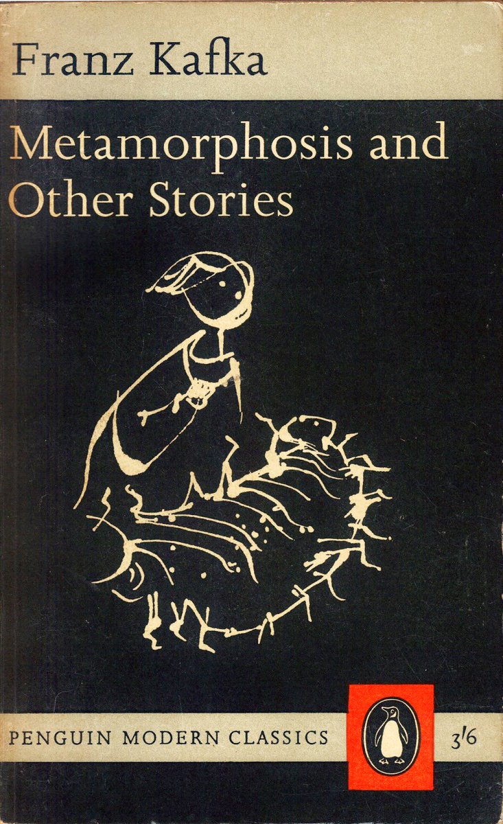
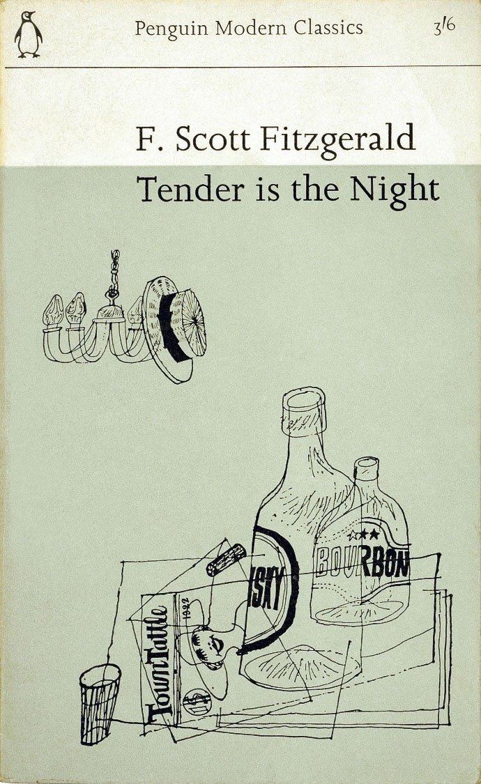
Then in April 1961 Penguin launched its Modern Classics series with a bold new look: thanks to the cost advantage of using offset lithographic printing the Modern Classics could use creative cover art as part of their brand.
That same year Chief Editor Tony Godwin brought on board Italian designer Germano Facetti. Facetti had been impressed by the design work of Romek Marber for The Economist magazine, who was later asked to look at the cover grid for Penguin's crime novel range.

The Marber Grid placed the text in the top third of the page, leaving two thirds free for illustration. Facetti was so impressed he rolled out the grid across the whole Penguin range, giving an overall visual unity to the company's publications.


Godwin's next appointment was more radical: worried by sales figures for general #fiction he hired illustrator Alan Aldridge as Art Editor for Penguin Fiction.
Out went the Marber Grid...
Out went the Marber Grid...

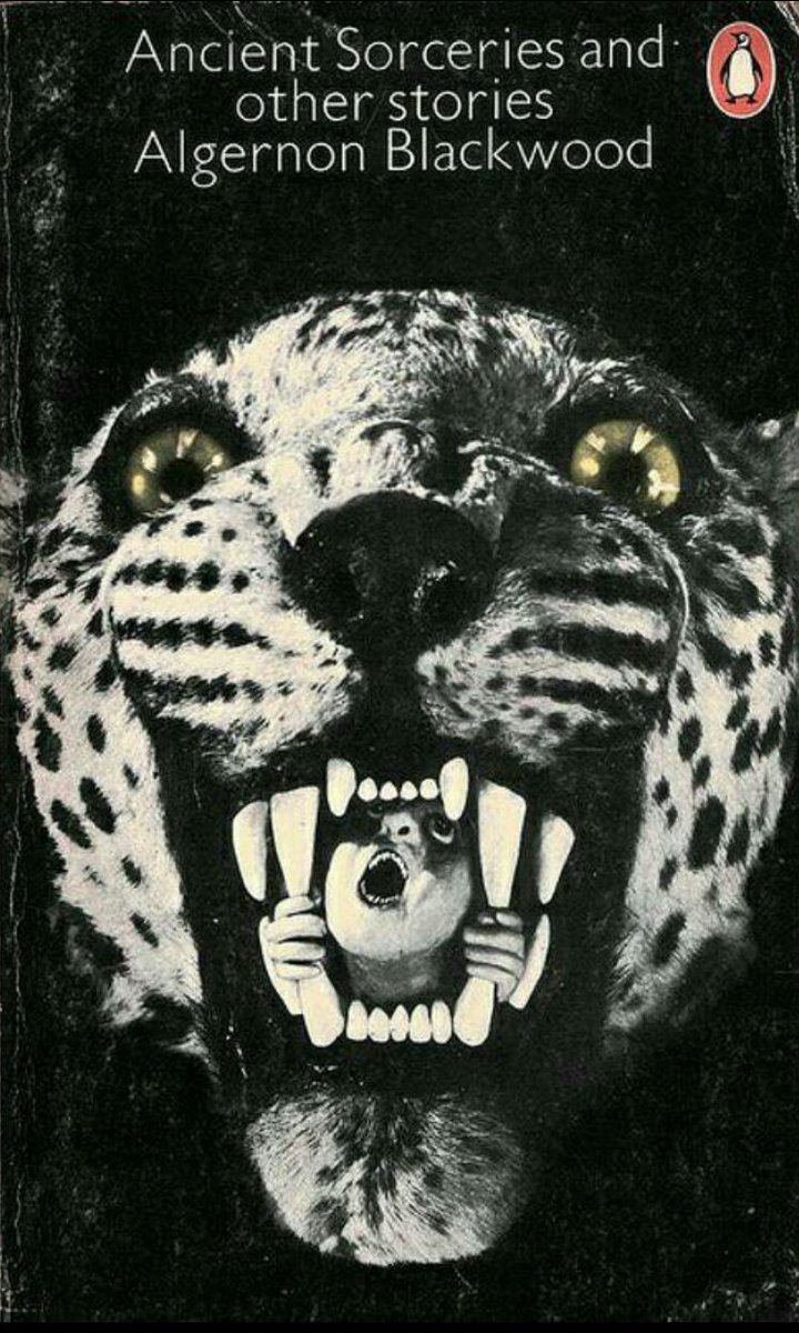
...and in came a riot! Aldridge treated the book cover as if it was a poster, and artists had a free rein to create and improvise. Only the Penguin logo in the corner told you who the publisher was.


The results of Aldridge's approach were mixed: the covers were certainly eye-catching, but at the expense of the carefully cultivated Penguin brand. Penguin had spread its wings, but would it last?

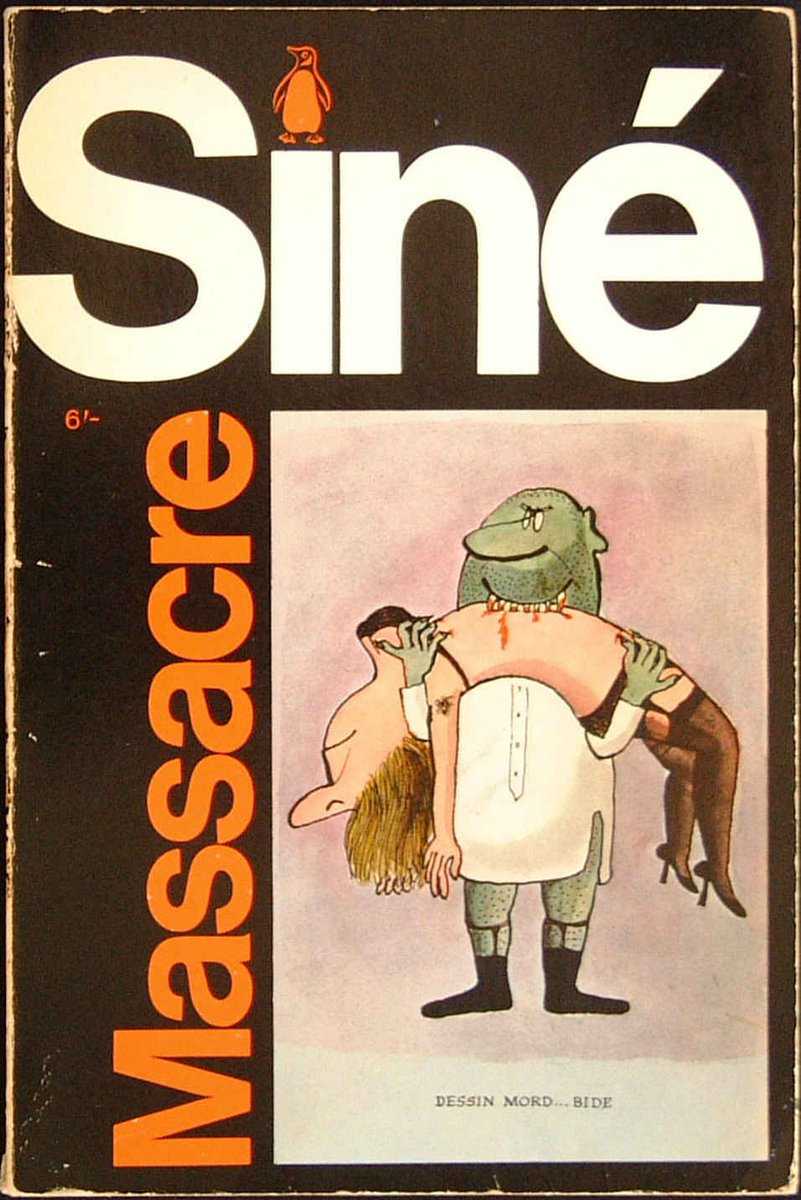
The crunch came in 1967, with Penguin's edition of Siné's 'Massacre'. Foyles refused to sell the book due to its anti-clerical cartoons. The ensuing row forced Godwin and later Aldridge to part company with Penguin.
For a while the art direction for Penguin fiction was rudderless. Novels had the words "A Penguin Book" in bold type on the cover in an attempt to re-establish some brand identity. Finally in 1968 a new Fiction Art Director was appointed.

David Pelham was a pragmatist: he re-introduced a simple grid and black spine to establish consistency across the range, but still allowed freedom for a variety of illustration styles on the cover as long as the image fitted the book's theme.
By 1970 financial concerns had prompted Allen Lane to sell Penguin to Pearson PLC, and a stronger focus on profitability was brought to the company.
It was the end of an era.
It was the end of an era.
Penguin in the 1960s is a great example of a well-known, authoritative brand trying to find it's way in a commercial world that was itself trying to adapt to the counter-culture. It had its successes and failures, but the Penguin still marches on.
Despite (or perhaps because of) the occasional creative confusion Pengun books from the 1960s are - I think - tremendously collectable: eclectic, entertaining and always a good read.
More stories another time...
More stories another time...
• • •
Missing some Tweet in this thread? You can try to
force a refresh