#CoronaVirusUK #CoronaCrisisuk
#COVID19 #CoronaVirus
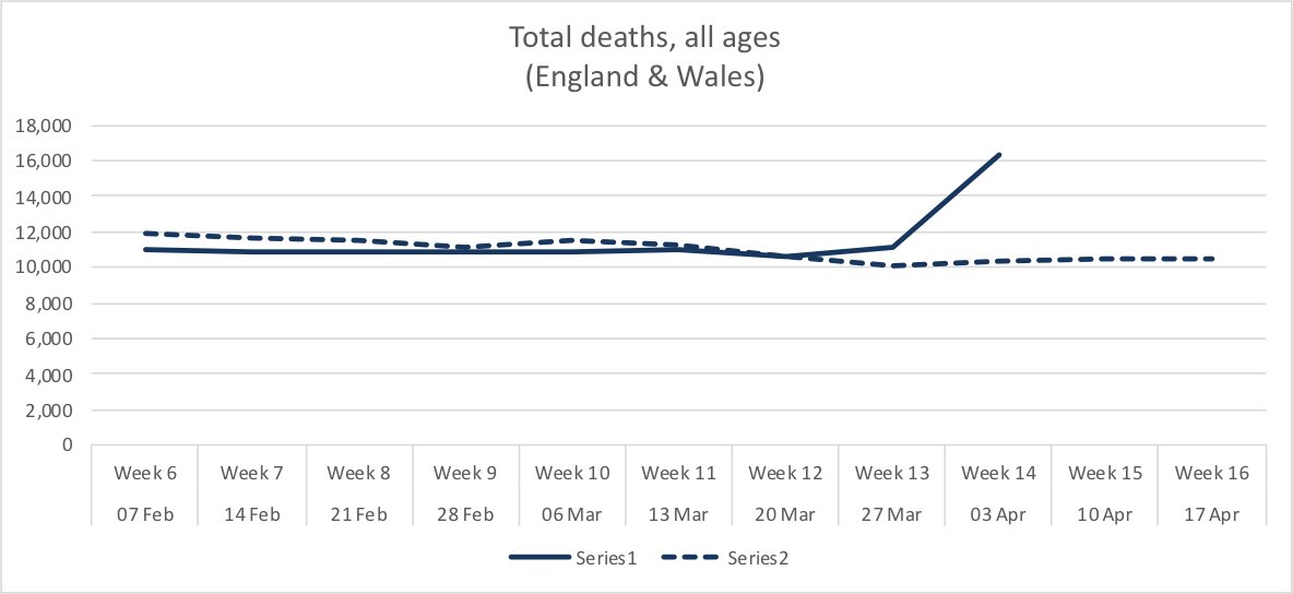
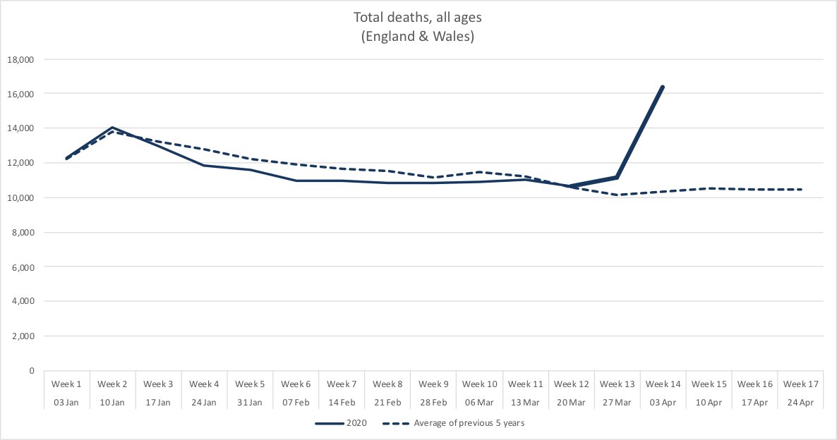
So here goes. All graphs compare total deaths in a calendar week against average deaths for the equivalent week for the previous 5 years. /3
#COVID19 #CoronaVirus
In the week ending 3 April (data fresh out today), we would have expected to lose around ten thousand people. We lost SIXTEEN thousand. /4
#COVID19 #CoronaVirus #CoronaVirusUK #CoronaCrisisuk
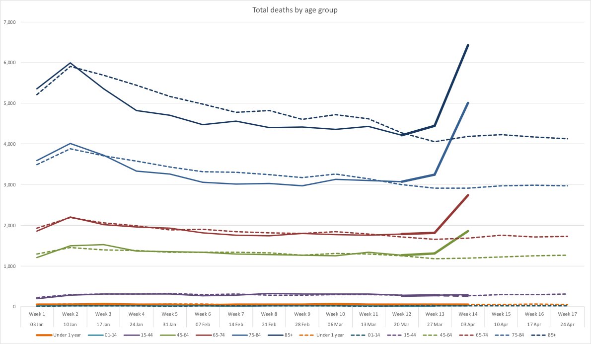
•Among people in the top two age bands (75+), deaths are up by 60%.
•They’re up 55% for ages 45-64.
•There is no noticeable change below age 45. /5
#COVID19 #CoronaVirus #CoronaVirusUK #CoronaCrisisuk
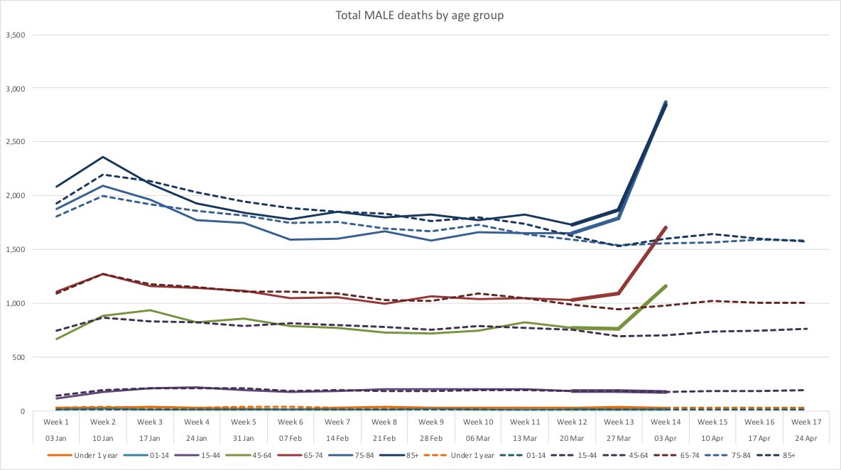
Total male deaths up by:
•85+yrs old: about 75%
•75+ year olds: 80%
•45-64 yrs old: 65%
•Below age 45: no noticeable change. /6
#CoronaVirus #CoronaVirusUK #CoronaCrisisuk
#COVID19 #coronavirusuk
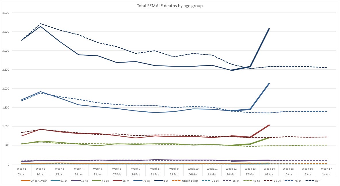
•Total female deaths up about 45% from age 45
•Within this age band, deaths are biased towards older females less than they are in men
•No noticeable change below age 45. /8
#CoronaVirus #CoronaVirusUK #CoronaCrisisuk
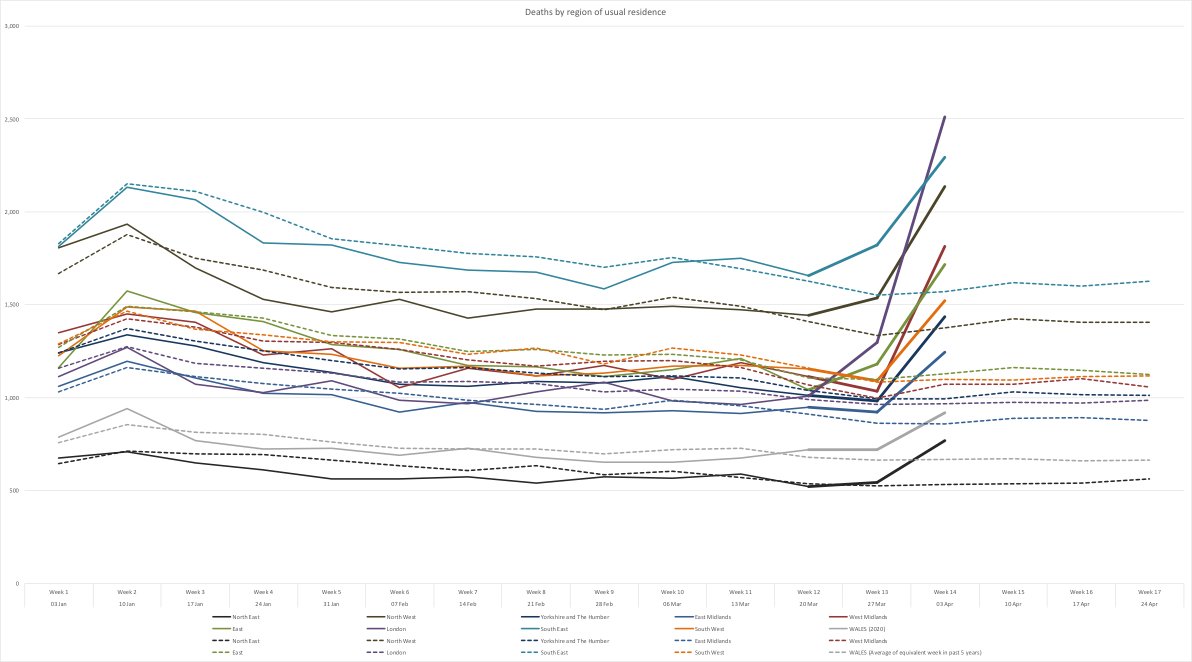
•London has far and away the greatest increase in deaths. Wk ending 3 Apr saw *two and a half times* the avg number of Londoners dying in the same week over past 5 years... /9
#CoronaVirusUK #CoronaCrisisuk
•All now show increased deaths of 35-70% on a typical value for this calendar week.
•Last week, only London and South East showed changes above 10% of the previous year’s average /10
#CoronaVirusUK #CoronaCrisisuk
Questions welcome. Follow for more. DMs open. /11 ENDS
#COVID19 #CoronaVirus #CoronaVirusUK #CoronaCrisisUK
#CoronaVirusUK #CoronaVirus #COVID19 #CoronaCrisisuk
