
WHAT IN THE FLYING A!? Over the years, many assumptions have been made about the various #Starfleet insignia worn on the original #StarTrek and beyond thru to #StarTrekSNW . Follow Us as we take a deep dive into the show’s most distinctive emblems and the intentions behind them. 
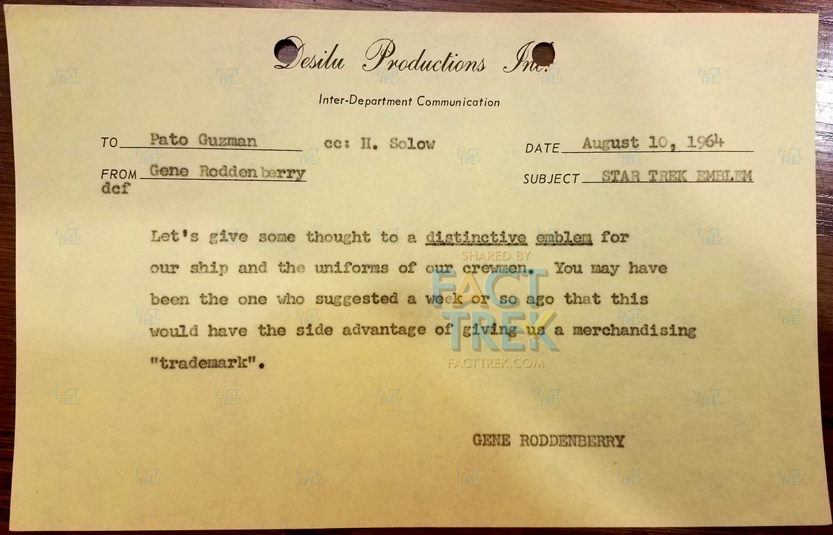
It begins with Gene #Roddenberry wanting #StarTrek to have a “distinctive emblem,” something immediately identifiable & also with merchandising potential. Here’s a memo he sent to art director Pato Guzman about the emblem on August 10, 1964 (during pre-production on pilot #1).
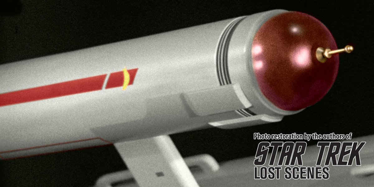
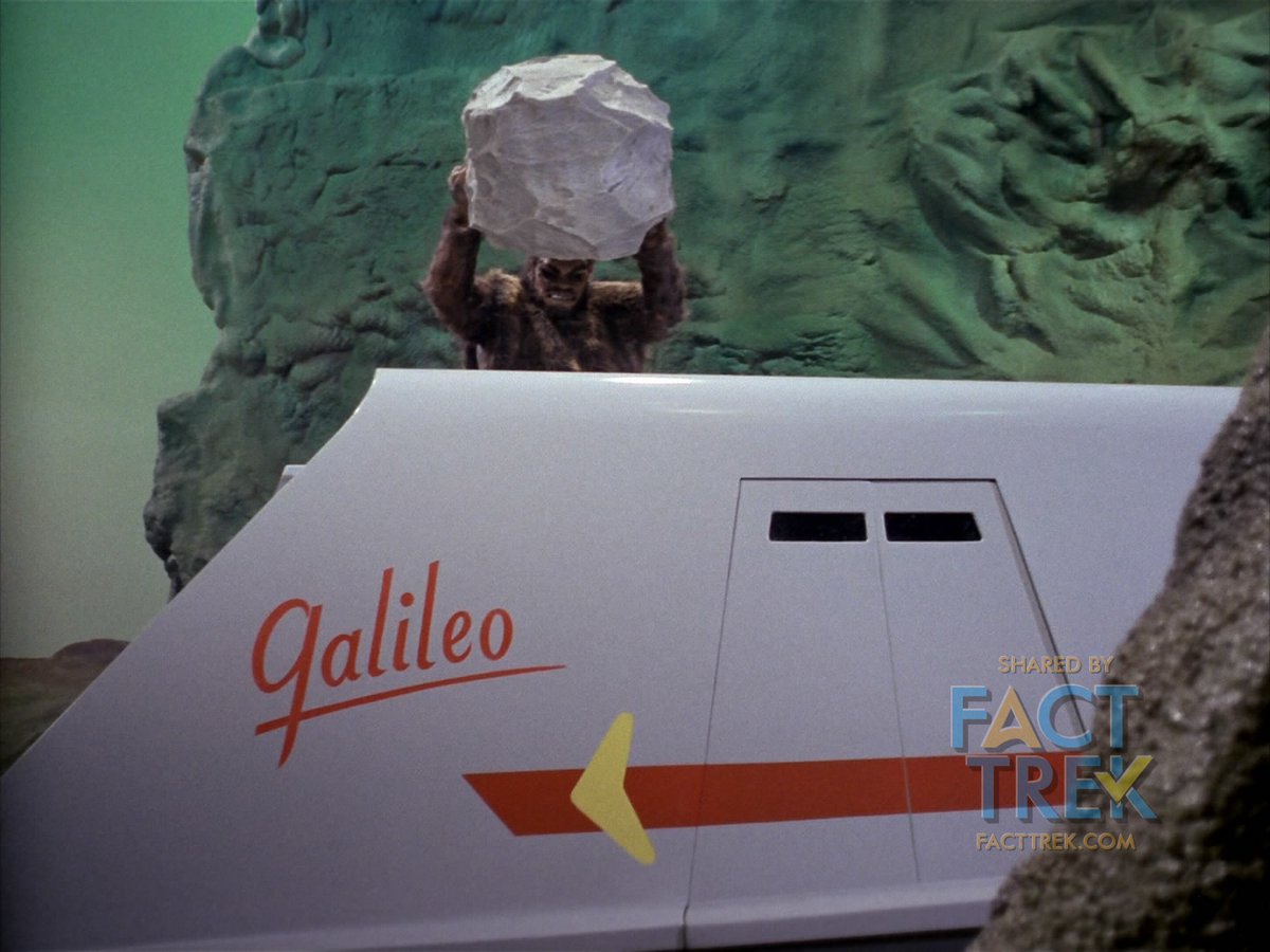
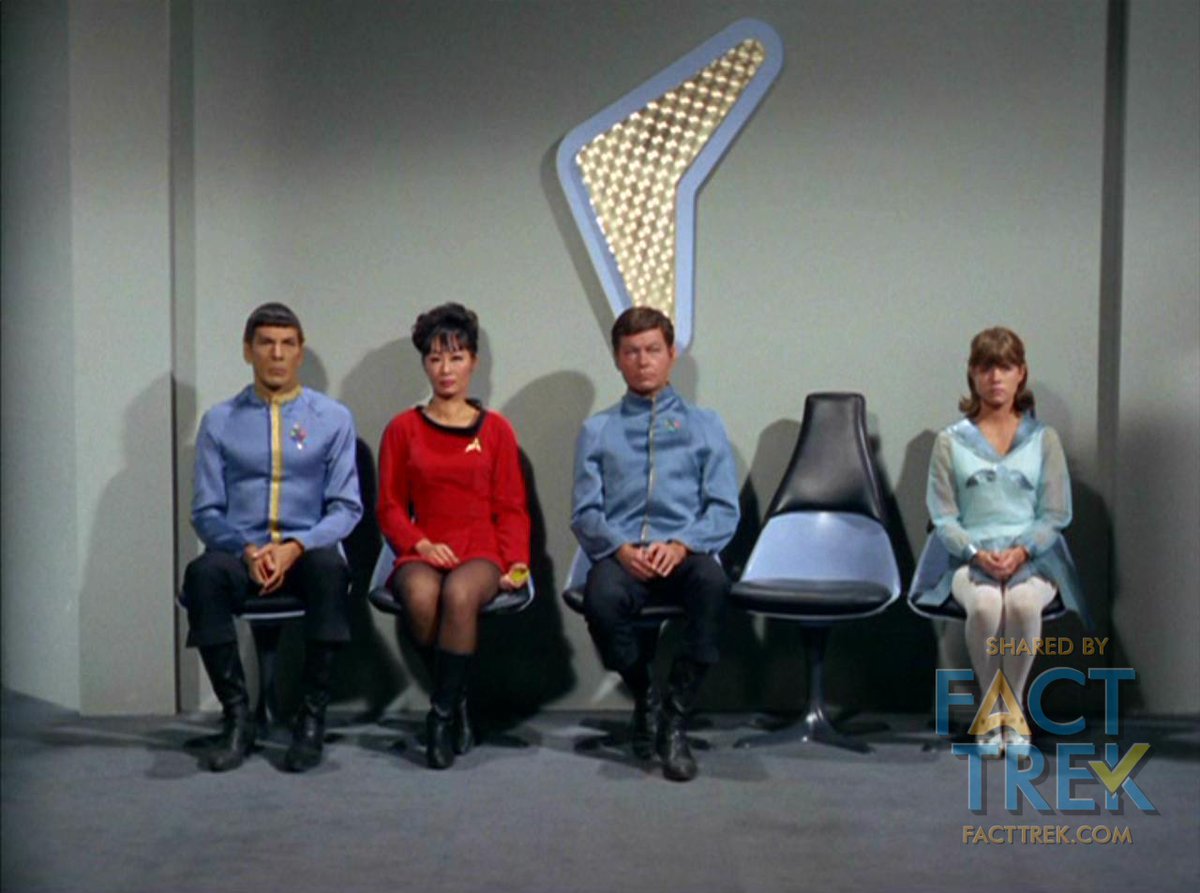
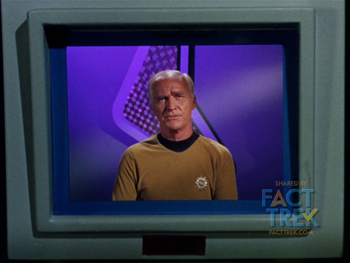
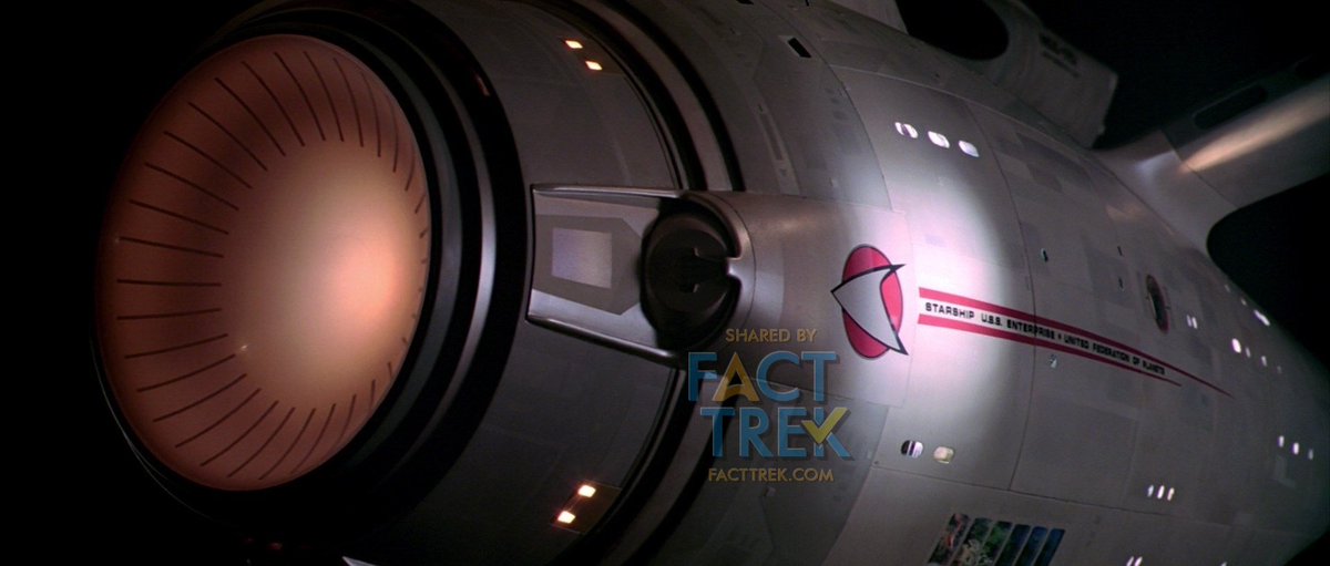
This thinking resulted in a couple of distinct #StarTrek emblems. One is the boomerang shape seen painted on the Enterprise and Galileo hulls. The boomerang also appears frequently as a piece of set decoration—most commonly behind flag officers whenever Kirk gets them on Zoom.
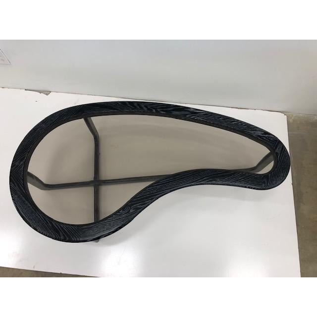
Rounded boomerangs and kidney shapes were well-established space-age design elements by the time Matt Jefferies first employed the former on the Enterprise pennants in 1964. Such rounded boomerangs appeared on The Jetsons (1962–63) over two years before the starship’s design.

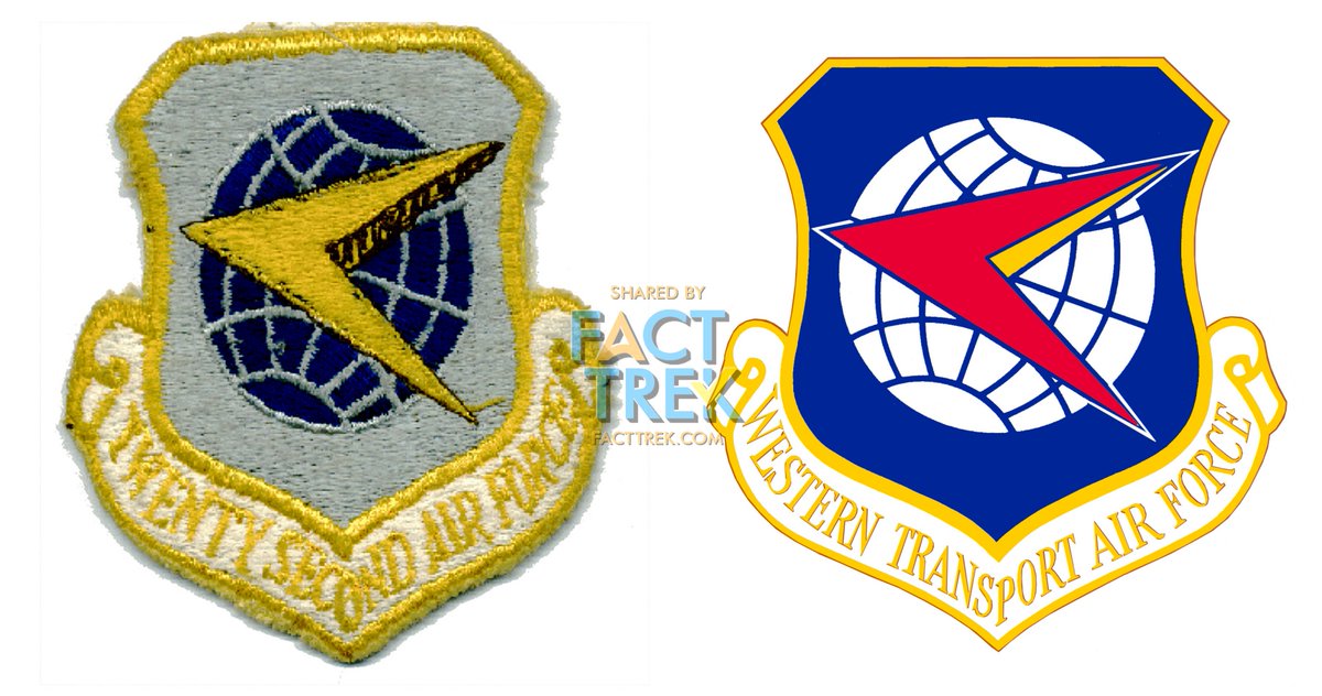
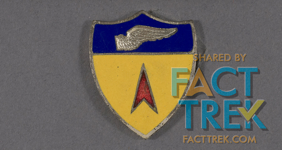
But both the #Starfleet boomerang and uniform insignia are likely based on common symbols—often called “darts”—of military air groups, as seen on the Western Transport Air Force shield, adopted c1958 and used through its re-designation as the 22nd Air Force in 1966.
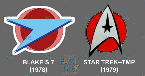
Note the resemblance of the 22nd Air Force’s dart to the Terran Federation logo from 1978’s Blake’s 7, which was likely drawn from the same sources, and which predated by over a year the use of a circle behind the dart as seen first seen in #StarTrek—The Motion Picture in 1979.
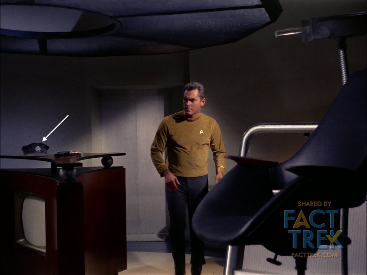
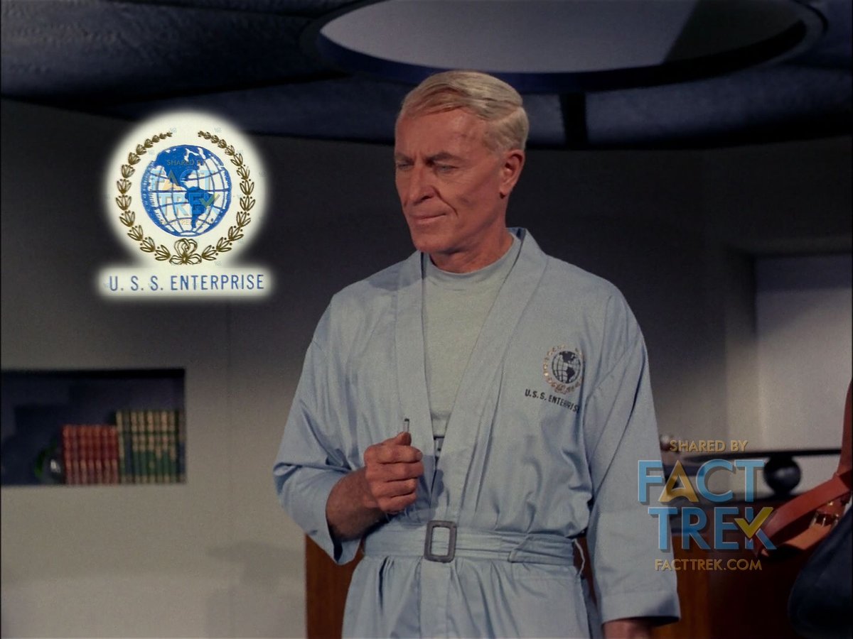
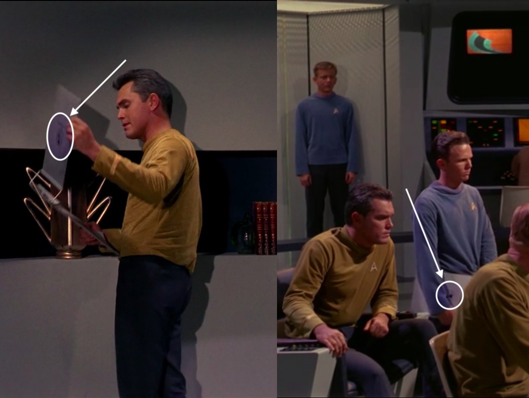
A second, barely seen emblem is what we’ll call the United Earth logo, which is embroidered in gold and dark thread on Dr. Boyce’s smock in the 1st #StarTrek pilot (“The Cage”) and smaller on the unworn hat of #CaptainPike. #StarTrekSNW
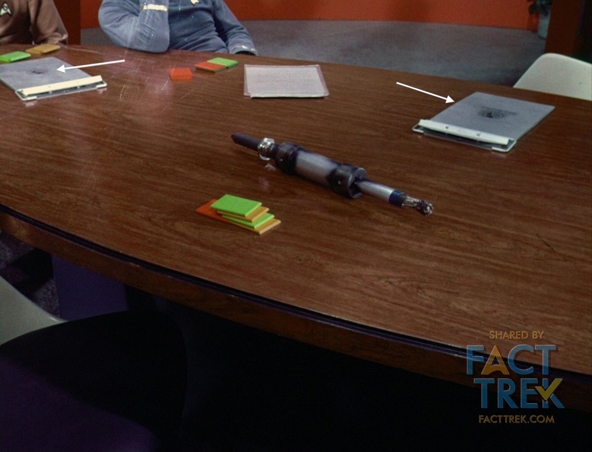
That same United Earth emblem can be glimpsed (barely) in “Where No Man Has Gone Before” on clipboard covers and on the cup Gary Mitchell levitates. Here’s one of the actual surviving decals. This photo is the real deal, NOT a reproduction. #StarTrek

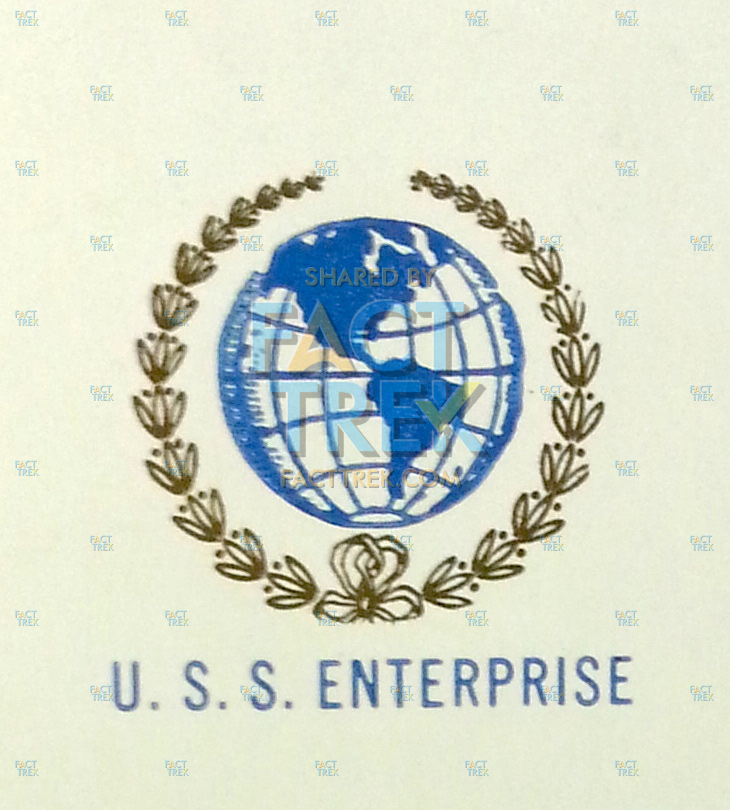
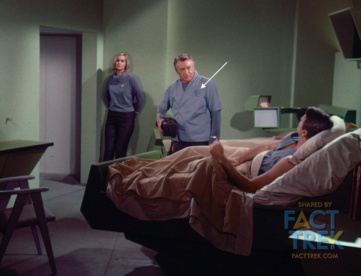
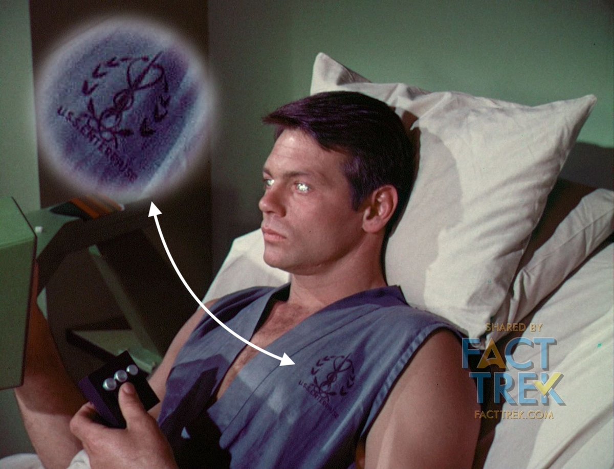
Speaking of Gary Mitchell, both his & Doc Piper’s sickbay duds feature a laurel-encircled caduceus (snakes around pole). The laurels on both it and the United Earth logo prefigure the United Federation of Planets seals in Franz Joseph’s works and subsequent #StarTrek productions.
We'd be remiss if we forgot to mention that the "United Earth" emblems also appeared on those clipboard covers in and around Captain Pike in "The Cage"... barely. #StarTrek #startrekstrangenewworlds #startreksnw (Retweet because it was not in the thread! )
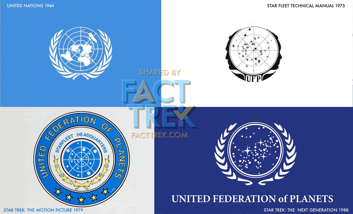
Both the “United Earth” and medical caduceus emblems are clearly inspired by the UN Logo, adopted in 1946. The United Federation of Planets logos seen in the Star Fleet Technical Manual, then ST—TMP, TNG and their descendants are obvious lifts. #StarTrek
And before we move on: take a second look at that medical caduceus Gary’s wearing. Notice that the snakes there aren’t around a staff but an elongated arrowhead shape. Now doesn’t that look familiar? Let's get to THAT shape tomorrow. #StarTrek

#StarTrek’s most distinctive emblem is the Starfleet arrowhead—which #Roddenberry called “the Flying A” in one memo. We’ve found no record of who designed the emblem*, but it appears on this (late 1964**) sketch of the 1st pilot landing jackets by costume designer Bill Theiss.
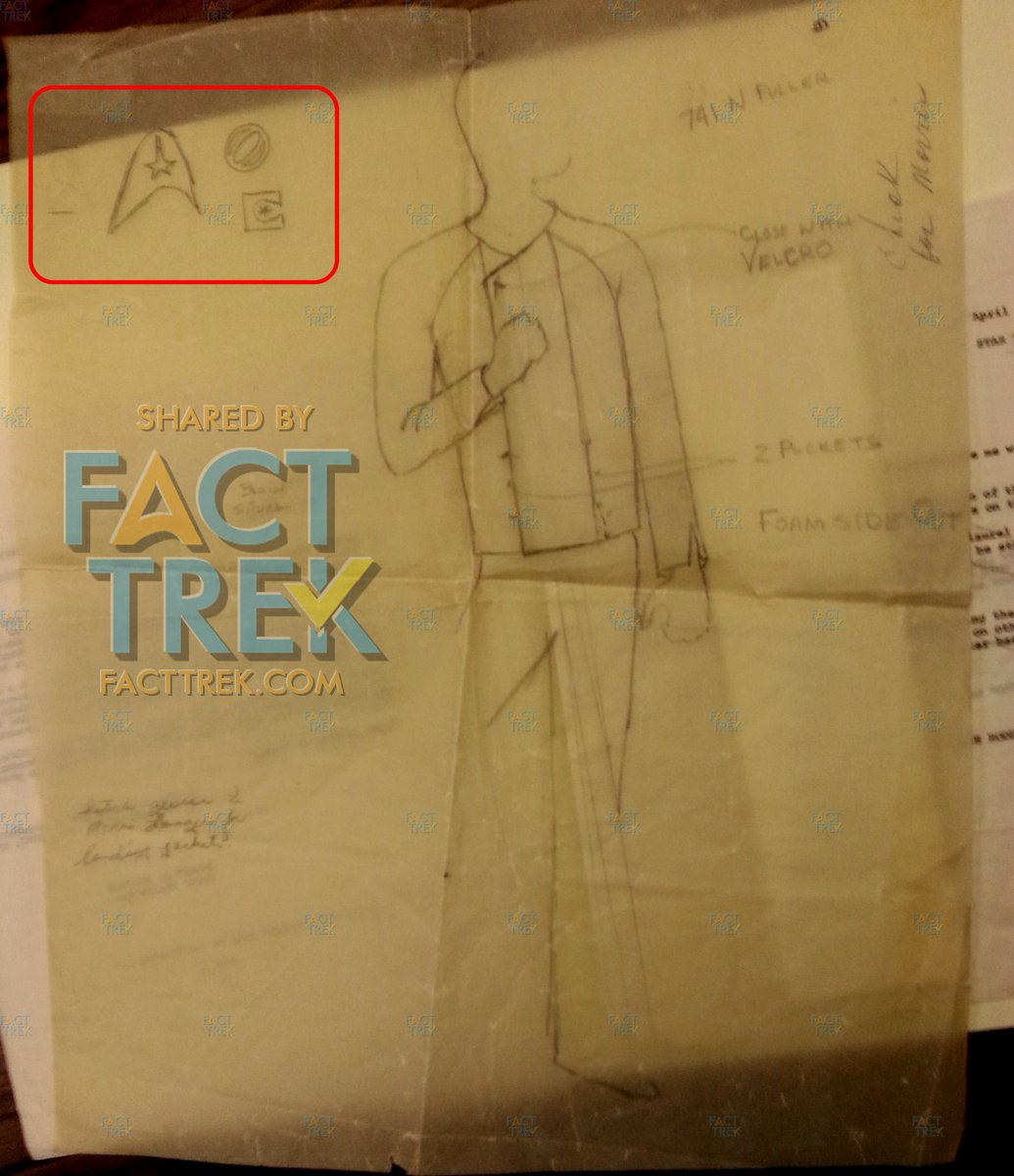
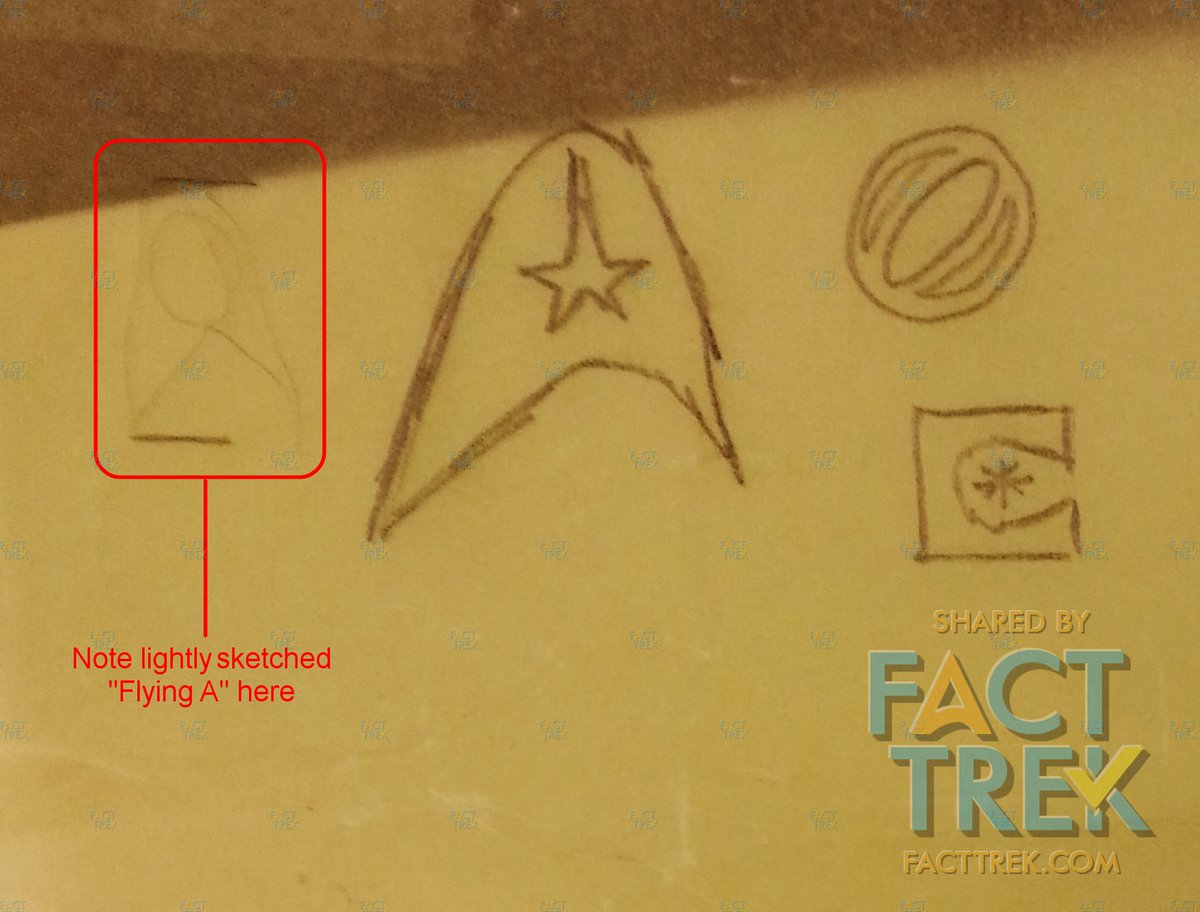
*—NOTE 1: While there is no evidence as to who suggested a delta, both #Roddenberry and designer Matt Jefferies being aviation guys suggests the idea came from one of them. Theiss was US Navy and less likely to have encountered such symbols, though it’s not impossible.
**—NOTE 2: We roughly dated this memo by correlating data from several sources: Bill Theiss was hired on the basis of a play that premiered late Sept. 1964, and filming began on #StarTrek in December, ergo we estimate this sketch was made approximately Nov.–Dec. 1964.
Like the “dart” the arrowhead/Flying A are a variation on a common aerospace symbol, often called a “delta” (Greek letter Δ), which appear in US Army Air Force emblems as far back as 1935: 29 years before the #StarTrek version was conceived. Here's one from WWII.
The day after we started this thread @jburrows' article about the origins of the US Space Force emblem and its many antecedents from WWII appeared. The influence of these on #StarTrek’s #Starfleet symbol is indisputable. Trek borrowed....didn’t invent. link.medium.com/Y97TmCqsO6
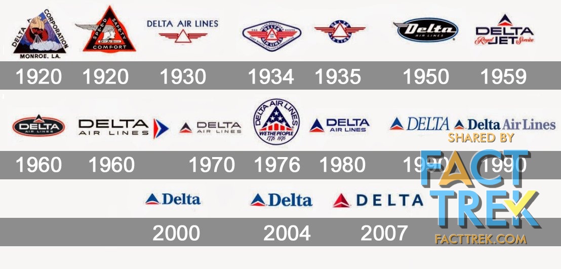
@jburrows But a “delta” as an aeronautical symbol goes back even further: check out these Delta Airlines logos from the 1920s and 30s, and notice how it starts looking like the delta of an Air Force delta/dart by 1959.
Closer to #StarTrek’s time is the NASA 1959 “meatball” device, with its red chevron symbolizing an airfoil/wing representing aeronautics (and also evoking those “darts” we mentioned previously).. Check out its history at this link: history.nasa.gov/meatball.htm
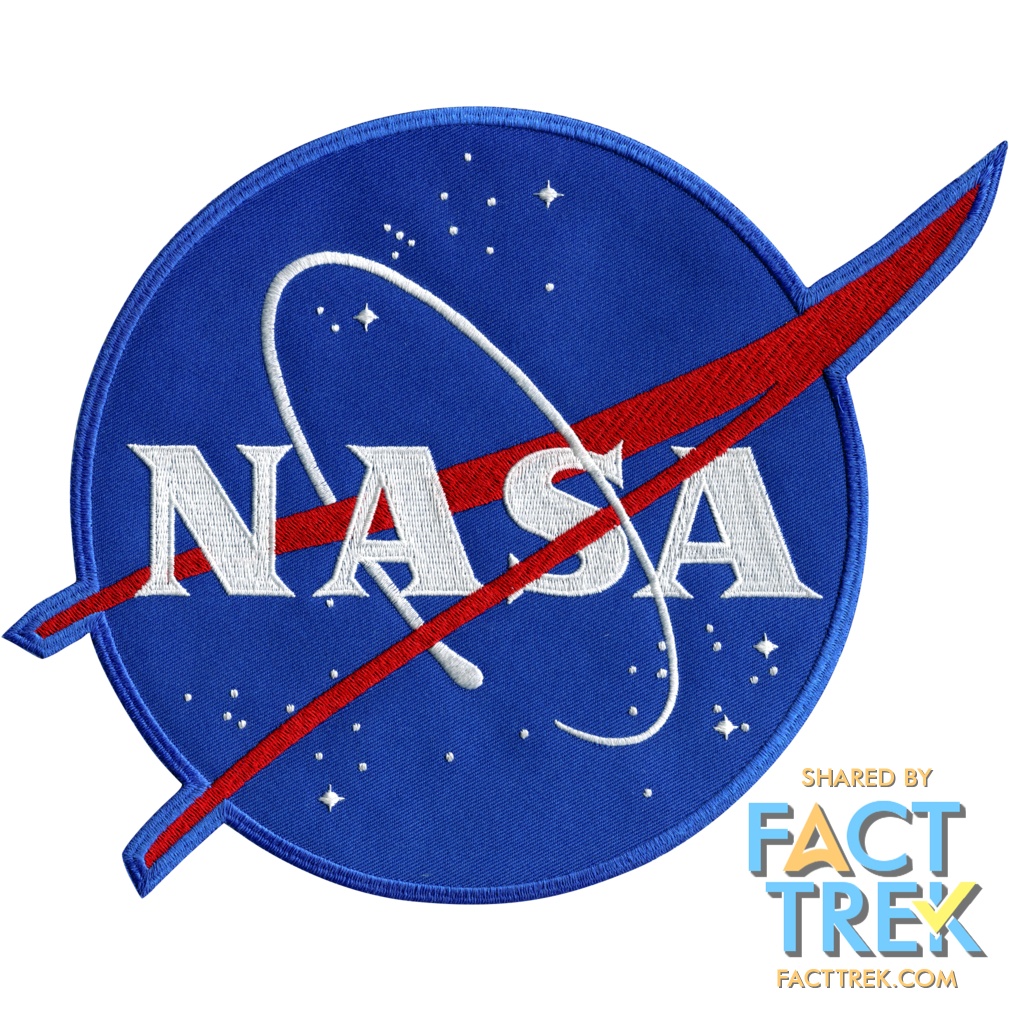
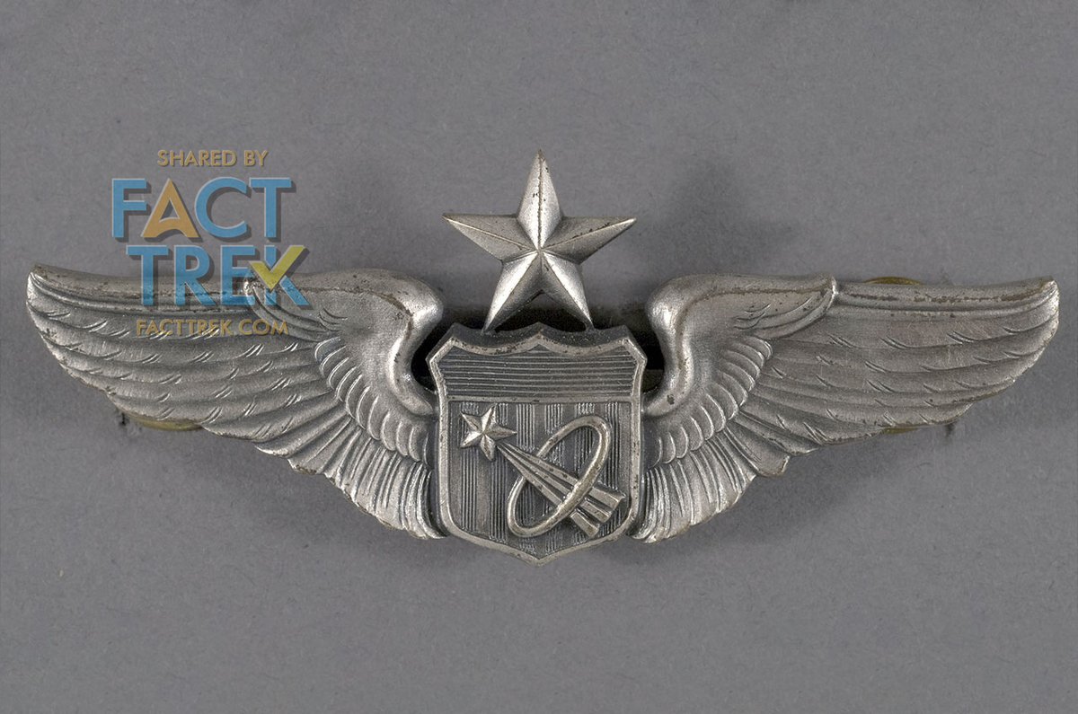
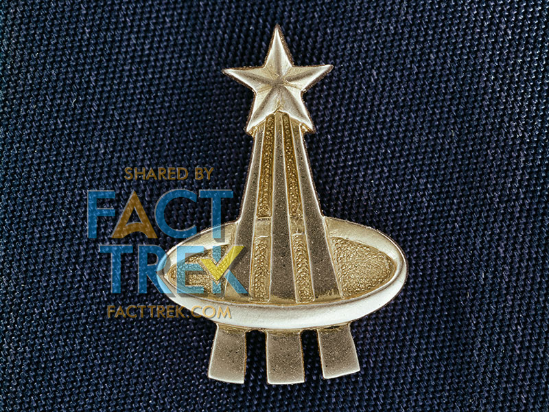
NASA’s astronaut device implies vertical trajectory complete with ellipse (see TMP to TNG badges). A 1964 press release describes “a trio of trajectories merging in infinite space, capped by a bright shining star and encircled by an elliptical wreath denoting orbital flight."

That astronaut symbol first appeared on aviation badges of the U.S. Navy and U.S. Air Force several years before #Roddenberry wrote his #StarTrek pitch. Image is a USAF example. See also: space.com/nasa-astronaut…
Tomorrow we resume our rundown of the various #Starfleet insignia.
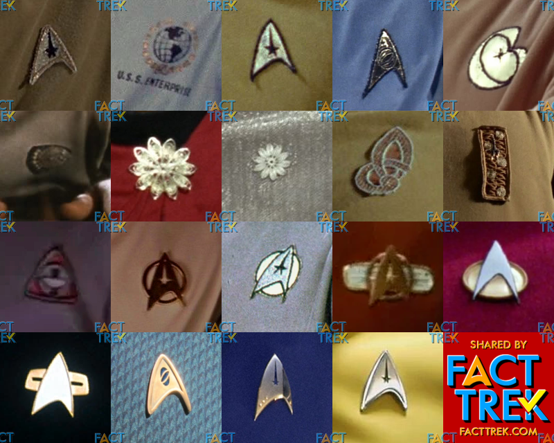
"The Flying A" saw several iterations. In pilot #1 the backing was a woven metallic fabric with a gold border. In pilot #2 the border was black. Series insignia were larger with a reflective gold backing material. Dept. emblems changed a bit between pilots & series. #startrek
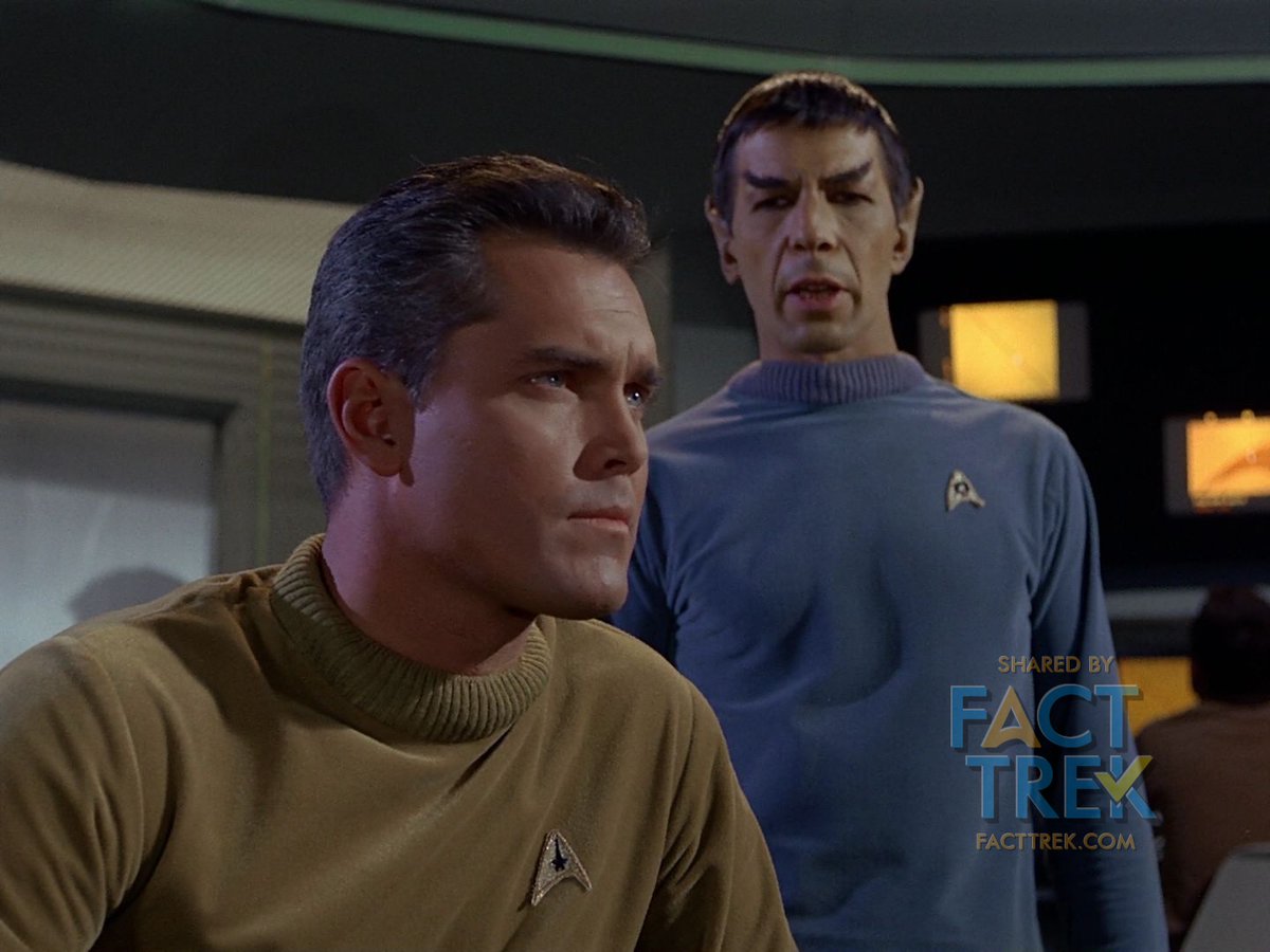
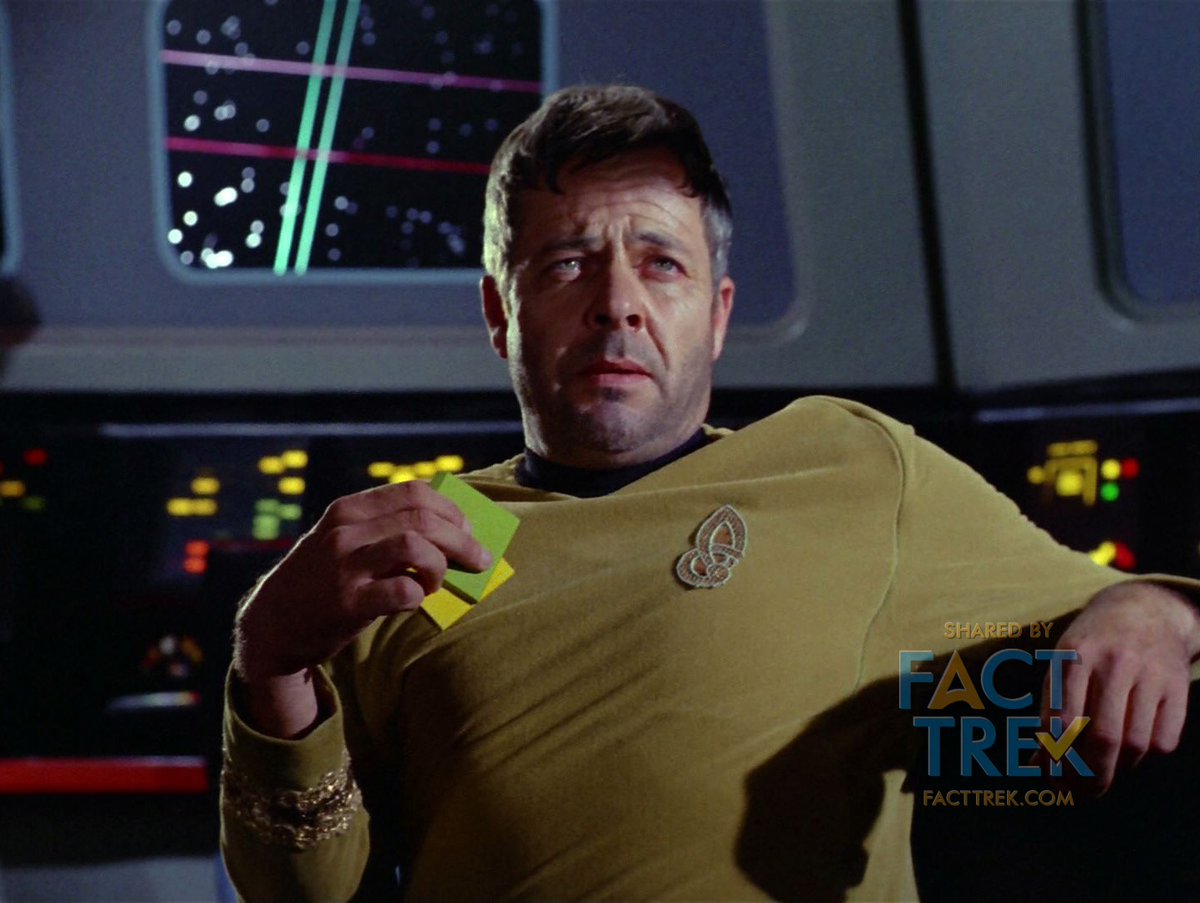
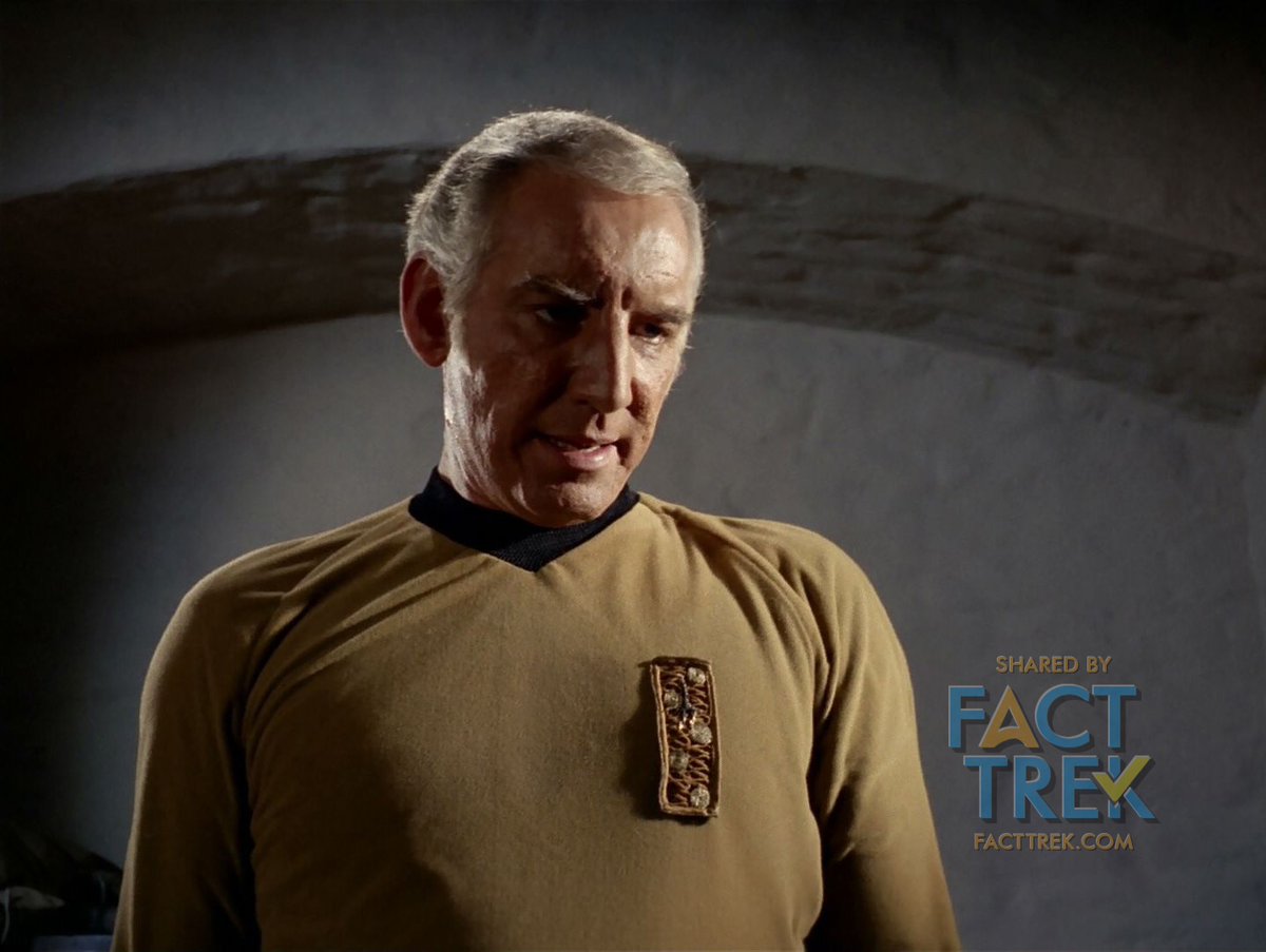
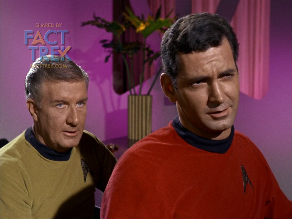
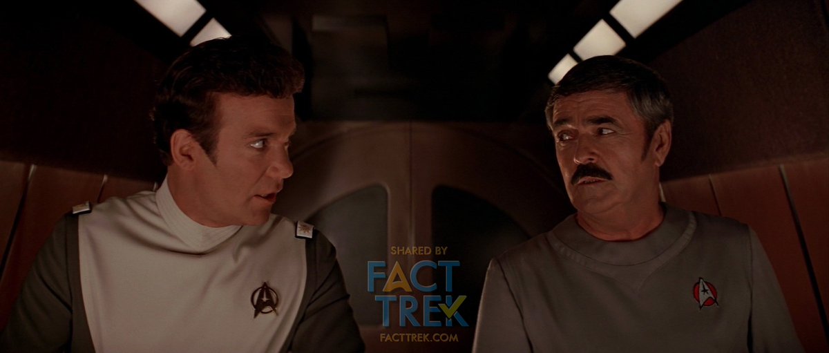
Ever since the second season, when Commodore Decker (“The Doomsday Machine”) and Captain Tracey (“The Omega Glory”) appeared wearing insignia which differed from the Enterprise crew, many fans have assumed that each ship in the fleet had its own, unique insignia. But is this so?
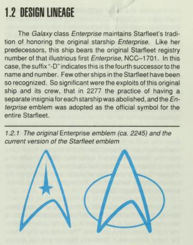
So common is the idea that each starship had a unique insignia that @ricksternbach and @MikeOkuda’s Star Trek: The Next Generation Technical Manual (1991) invented an explanation why the insignia got standardized, starting with Star Trek—The Motion Picture (1979). #StarTrek
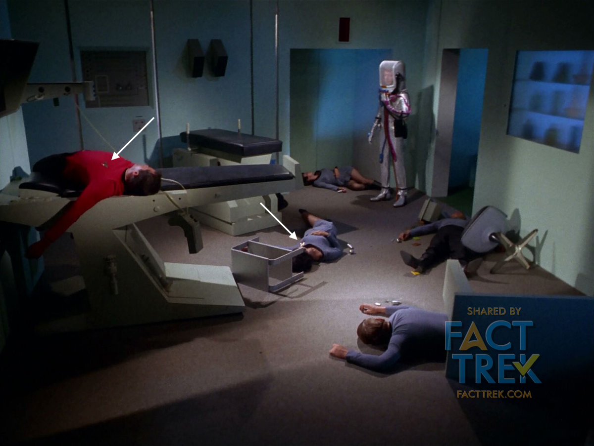
But in fact, these assumptions were a mistake caused by a production error, as called out in this memo regarding Captain Tracey in “The Omega Glory” (which began filming on December 15, 1967). All starship crew were supposed to wear the Flying A on their collective breast.
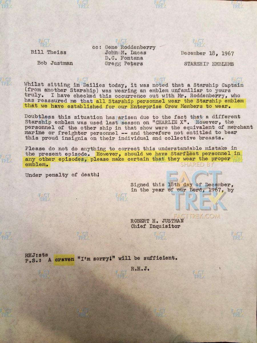
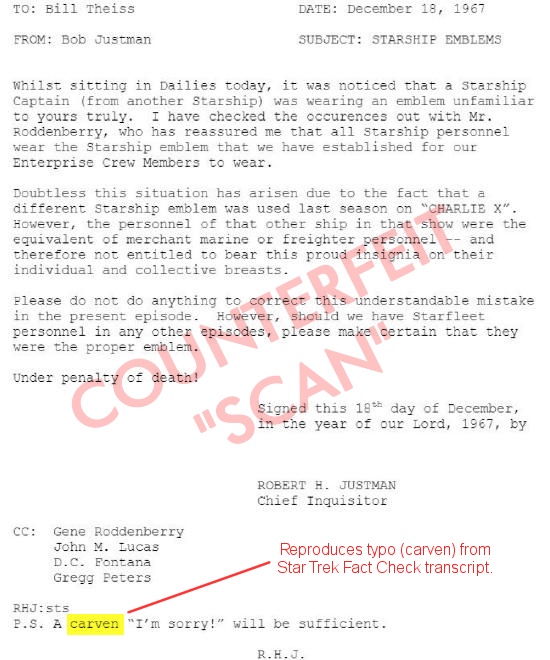
You may think you’ve previously seen a photo of this memo, but the one circulating is a counterfeit typed on a computer. It’s based on a 2012 transcript of the memo @trekfactcheck did in 2012, which featured a typo on Justman’s postscript—“carven” instead of “craven”.

(Not that this “carven” typo has been bothering him for the past eight years or anything.)
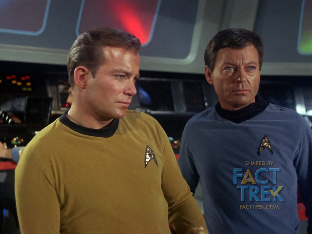
As per Justman’s memo, the Antares was not a “starship”, hence the crew’s different insignia. Commodore Decker was flag rank, and no flag officer seen in the series wears the Flying A. Of starship crew seen, only Tracey and his Chief Medical Officer of the Exeter break the rule.
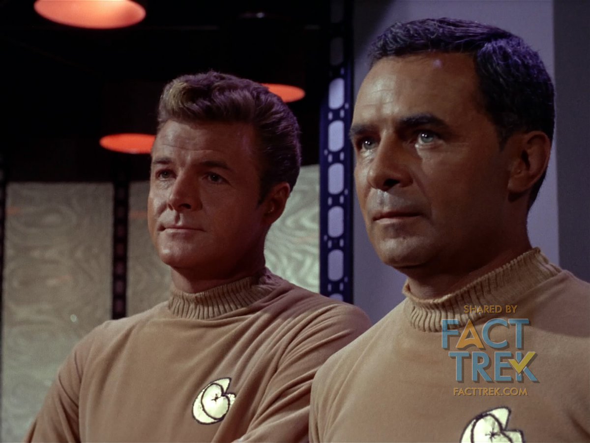
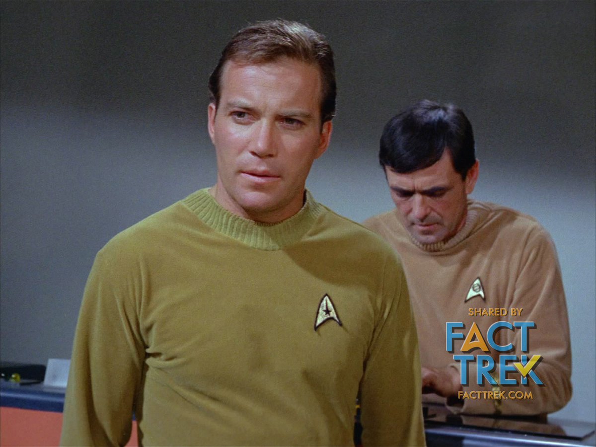
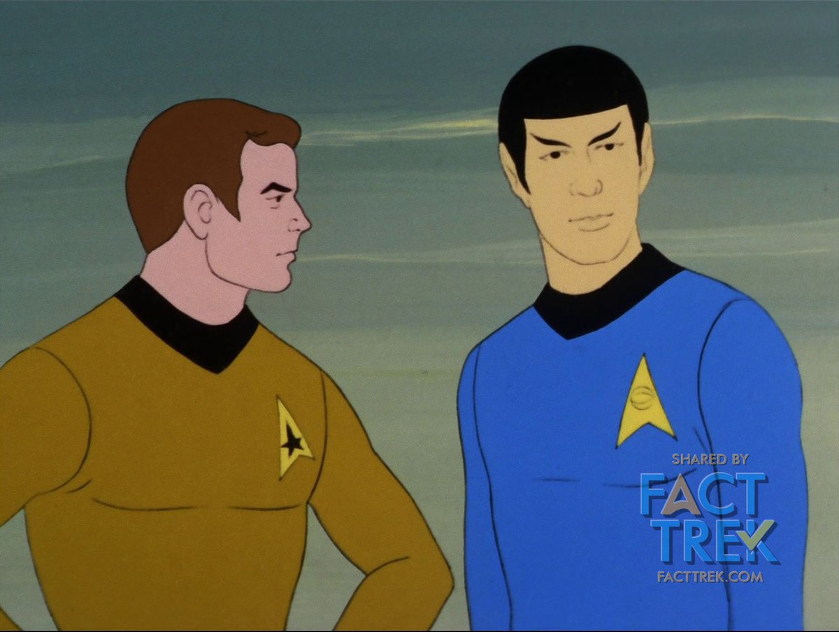
For instance, in “Court Martial”, Captain Kirk is confronted by starship officers who are presumably not from the Enterprise. They all wear the Flying A, following #Roddenberry’s dictum that all starship personnel bear the same symbol as the Enterprise crew wear. #StarTrek
In season 3’s “The Tholian Web”, the deceased crew of the Defiant wear the Flying A, too. Some fans have speculated that the emblem was deliberately obscured by director Ralph Senensky, but they're perfectly clear in several shots (albeit possibly difficult to see on a 1960s TV).
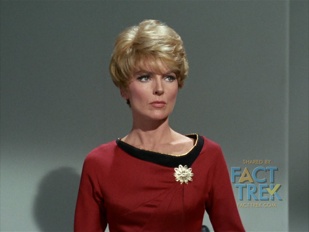
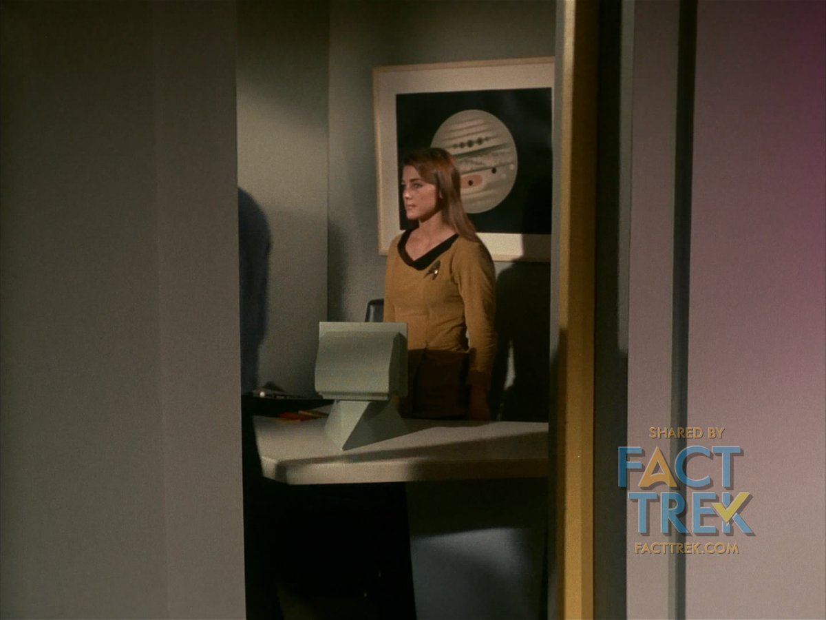
Moving from starship crews, all starbase personnel seen wear a sunburst/flower insignia—with one exception (that we know of) : in “The Menagerie” Part 1, Commodore Mendez has a briefly glimpsed aide/secretary who wears the Flying A. Another production mistake, perhaps? @StarTrek
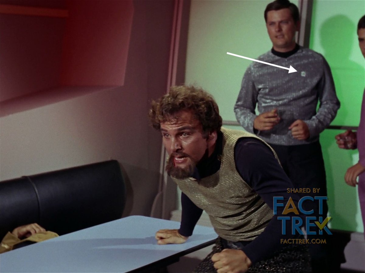
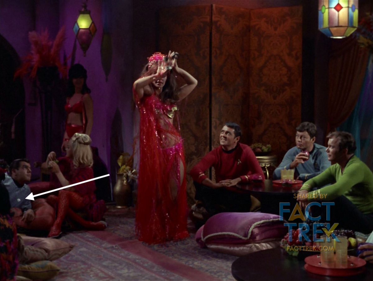
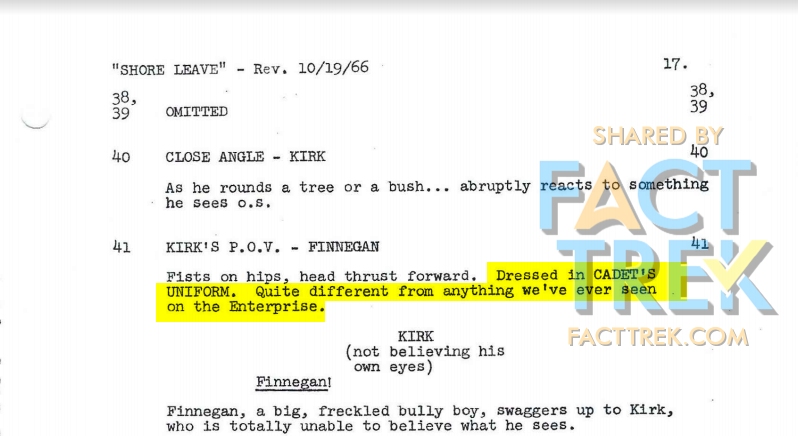
A slight variation on that #Starfleet starbase sunburst/flower insignia is the smaller pewter-colored cadet insignia worn by Finnegan in “Shore Leave”. His uniform and insignia would be reused by background players in “The Trouble with Tribbles” and “Wolf in the Fold”. #startrek

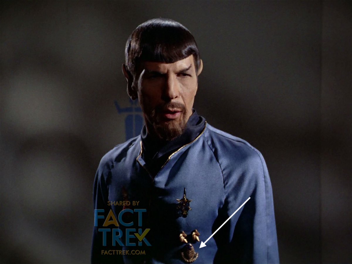
Finally, there’s the #Starfleet outpost insignia, glimpsed in “Arena” and “Balance of Terror” (serving on a Federation outpost doesn't seem to be a choice assignment, based on the fate of these poor officers). It looks like a found object, but no one’s identified it. #StarTrek
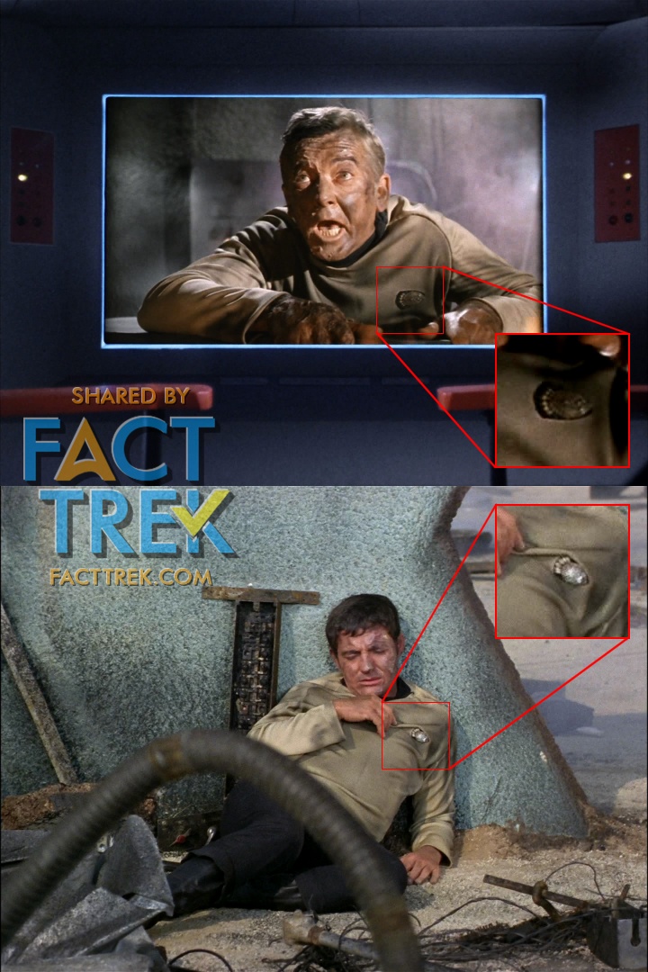
UPDATE! Fact Trek Fellow @ryantriddle pointed out that the “Outpost” insignia also appears on the mIrror universe uniforms of Spock and Bones, there a different color (gold not white), rotated 90º up or down, and without the black backing. We’ll get you a closeup shortly.
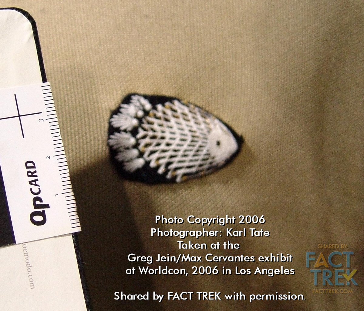
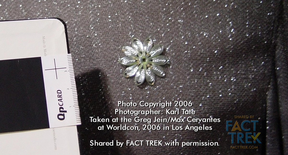
UPDATE 2! Thanks to Karl Tate, we have close-up pix of the actual "Outpost" badge, & also an example of the source item which was trimmed and rotated different ways to represent that & those worn by mirror universe Spock and Bones. Some other familiar badges here, too! #startrek
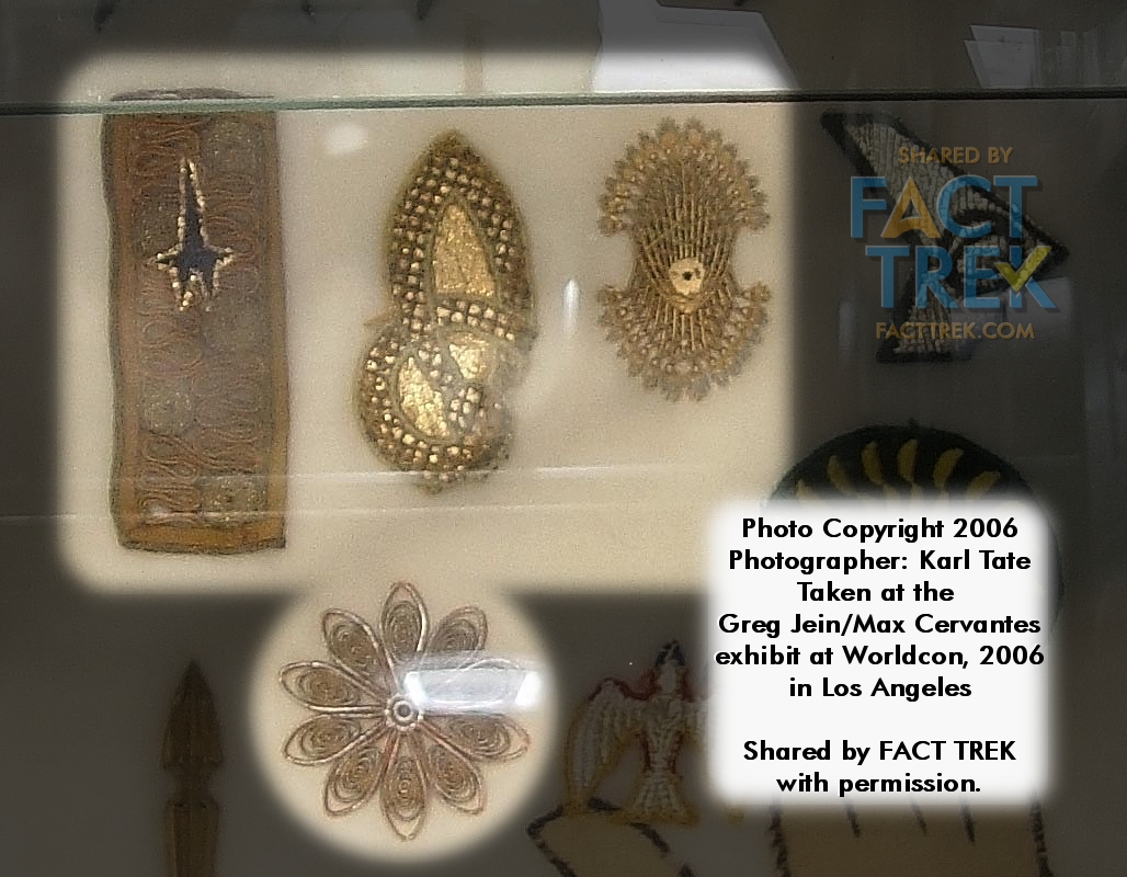
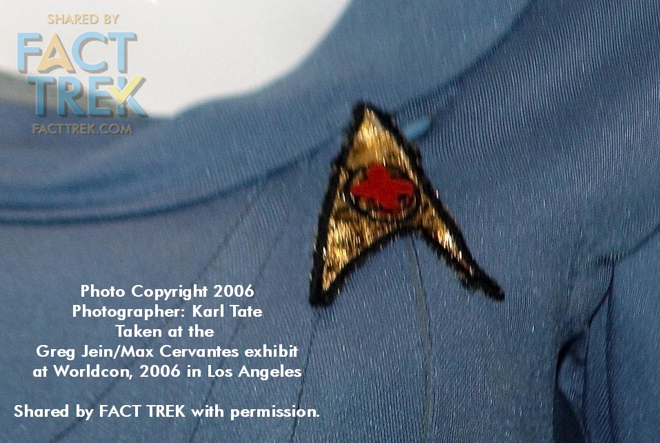
Here are a few more close-ups of various emblems courtesy Karl Tate. We thought that the United Earth emblem on Boyce's smock was embroidered, but here it's clearly printed. Here too is a better look at the cadet badge, and Nurse Chapel's red cross dept. symbol. Thanks Karl!
That’s it for #Starfleet-related insignia see on the original #StarTrek. We’ve demonstrated there’s really only a single mistake regarding the Flying A (the Exeter crew). But Star Trek didn't end with its 1969 cancellation. What about sequels & spin-offs? We’ll hit that MONDAY.

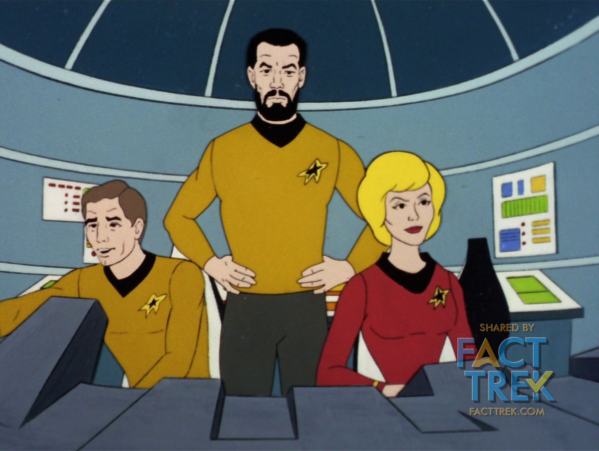
1973. The Flying A reappeared in simplified form in Star Trek Animated; larger, more angular and looking even more like the aerospace deltas that inspired it. These also preserved the various departmental insignia centered on each badge...the last show to do so til Discovery.
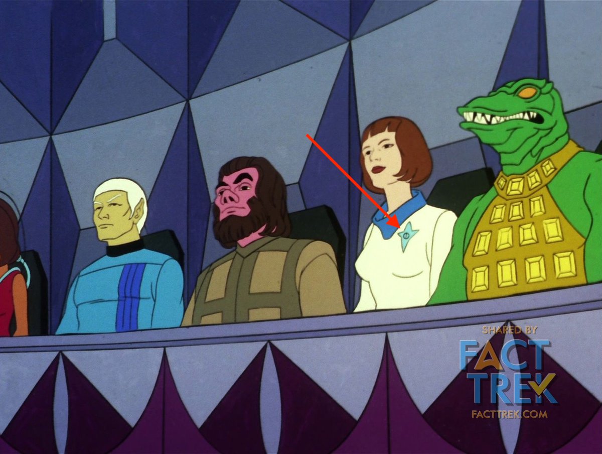
#StarTrek Animated obeyed Justman’s dictum re insignia because when we see non-Enterprise Starfleet personnel, none are “starship” crew, ergo none wear the Flying A. Neither the crew of the freighter Huron nor a woman in a white Starfleet-type outfit seen in the realm of Elysia.
1979. #StarTrek—The Motion Picture changed up the Flying A: setting it against a circle—suggesting the “orbit” ellipse on astronaut pins—and simplifying the different departmental emblems in the center to just the elongated star. The emblem appeared both as a pin and as patches.
In fact, if you look at the silhouette of the Astronaut pin and remove the star at the apex the remaining shape is a lot like that star emblem on the badges.
In #StarTrek—The Motion Picture the Flying A also replaced the Boomerang on #Starfleet ship pennants, but tipped to point forward, just like the Boomerang (minus the star symbol). The Boomerang had been cast away, but Boomerangs come back...albeit not for 26 years.
The notion of ship-specific insignia was put to bed in The Motion Picture, where—other than Epsilon 9’s badges and Bones’ caduceus—all Starfleet personnel seen, even deskbound Admiral Kirk, wear the Flying A on their collective breast...a tradition which persists 40 years later.
Whilst the TMP uniform patches replaced the 3 division logos centered in the Flying A with just the star, department/division was still indicated by the fill color of the circle around the patches (and epaulettes), but going from 3 to 6...
The TMP division colors on the emblem circles and epaulettes were:
White – Command (Kirk, Decker)
Orange – Sciences (Spock)
Green – Medical (Bones, Chapel)
Red – Engineering (Scotty, Cleary)
Gold – Operations (Uhura, Sulu)
Grey – Security (Chekov)
White – Command (Kirk, Decker)
Orange – Sciences (Spock)
Green – Medical (Bones, Chapel)
Red – Engineering (Scotty, Cleary)
Gold – Operations (Uhura, Sulu)
Grey – Security (Chekov)
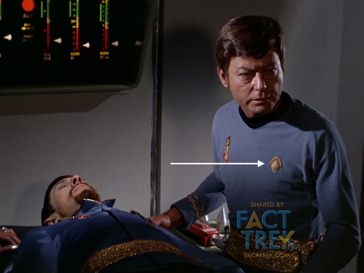
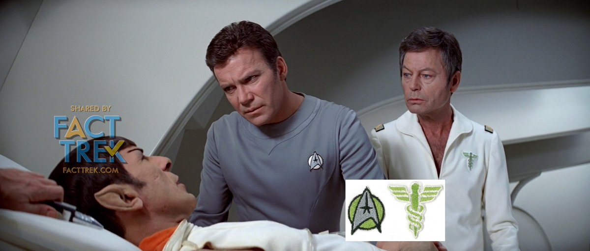
Continuing with #Starfleet emblems in Star Trek—The Motion Picture, let’s talk about the two non-Flying A uniform emblems we see clearly. Bones’ (and Chapel's) green caduceus is one, seen only in this film (replaced with a pin for The Wrath of Khan). Too bad.
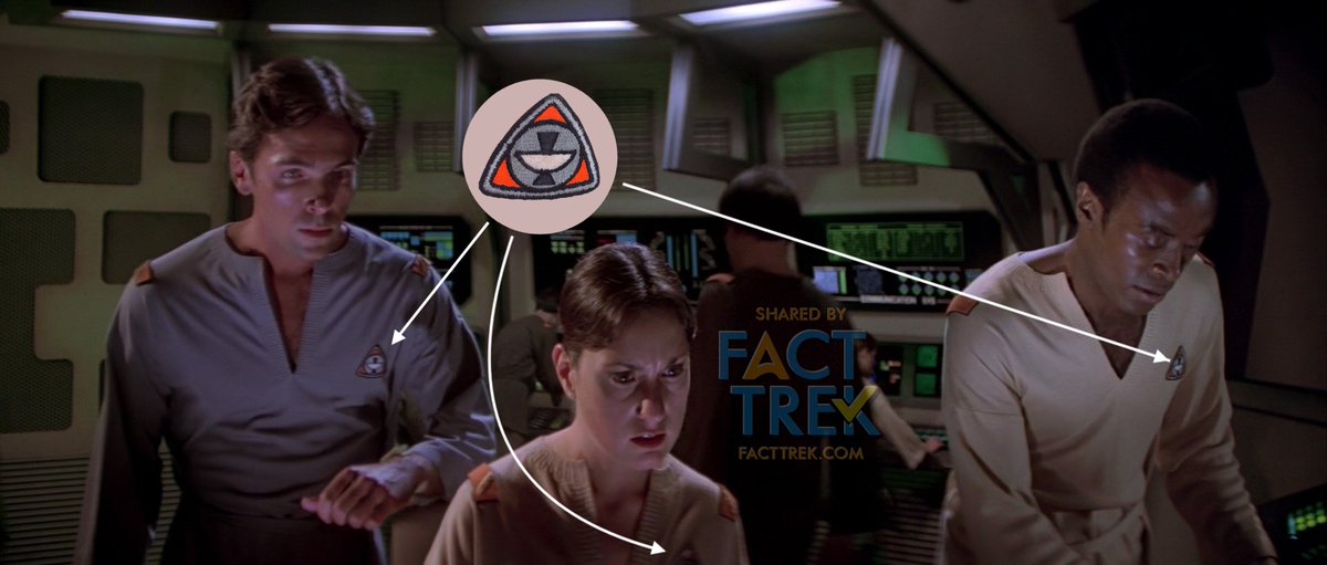
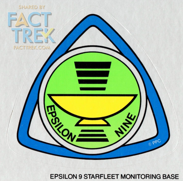
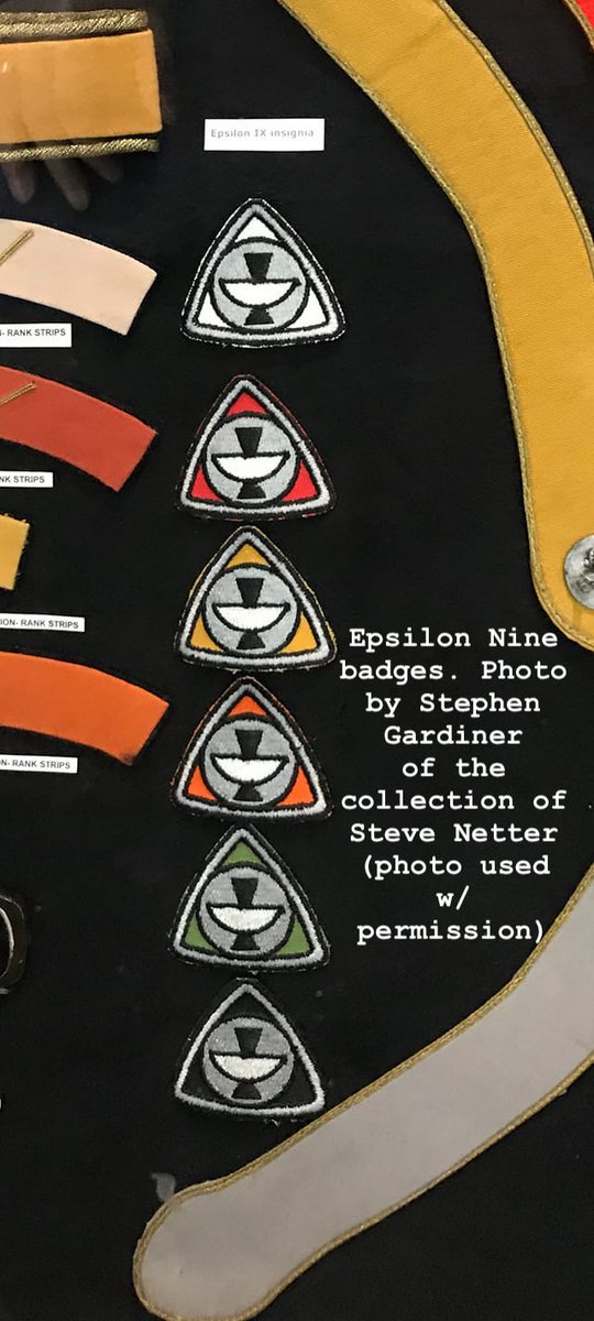
The crew of comm station Epsilon Nine aren’t called out as Starfleet and don’t wear the Flying A. Their emblems represent communications antenna dishes with signals. Signage of that emblem in the Star Trek—The Motion Picture Peel Off Graphics book gives it more detail.
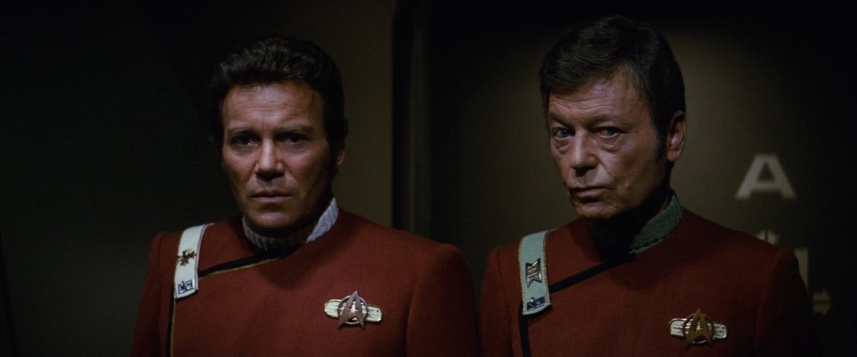
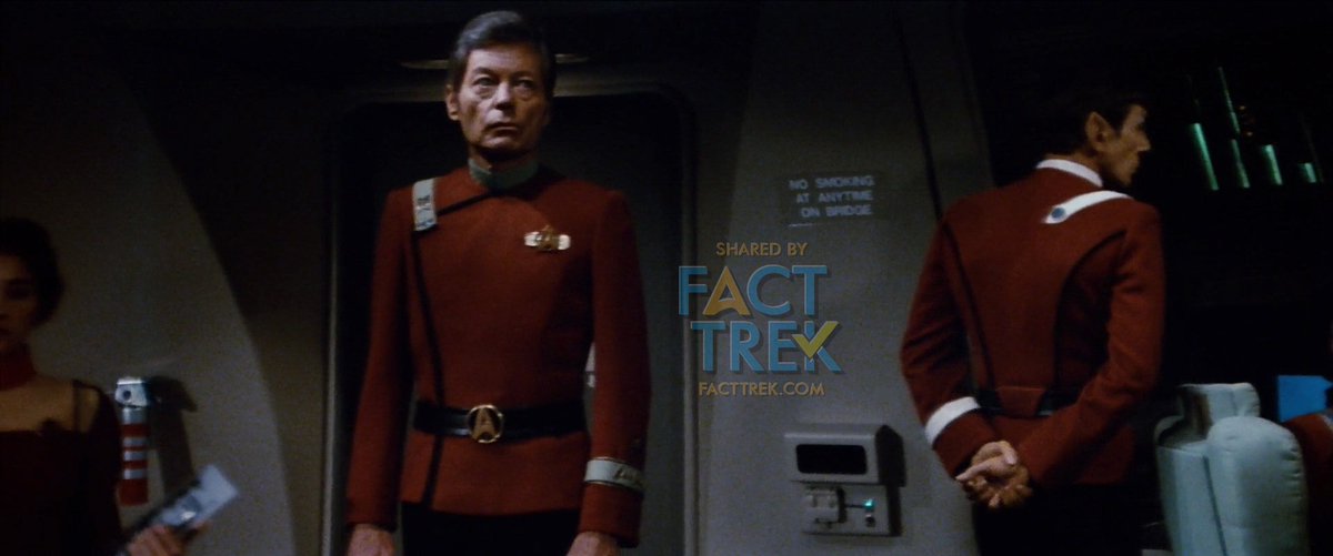
After TMP the Flying A was the de facto #Starfleet emblem. Star Trek II: The Wrath of Khan repurposed TMP’s Admiral Kirk Class A insignia pin as the standard device, in brass instead of gold, and on officers set over a bar device, with TMP patches on engineering suits, etc.
This change meant TWOK eliminated the division color from the badges (beyond the engineering suits). Those colors were indicated on other parts of the uniforms (epaulettes, shoulder straps, and armbands) and slightly changed.
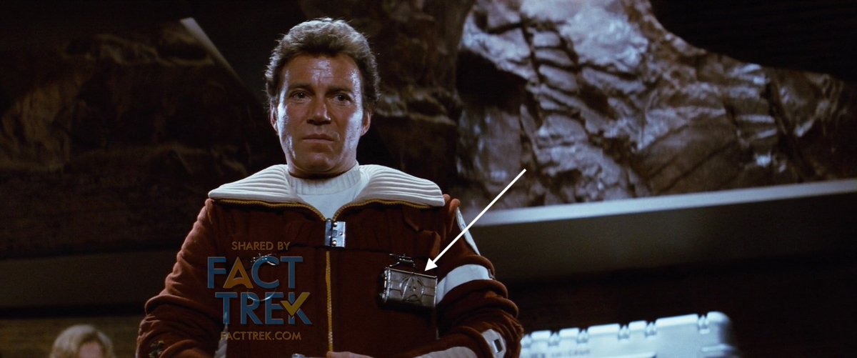
TWOK introduced another variation of the metallic Flying A, on a plate affixed to the field jackets worn by Kirk’s landing party. #startrek
As all of you following this thread already know, the Space Force logo is nothing new under the stars. In fact, Trek's logo popularized the delta as an aerospace symbol, but certainly didn't invent it. #SpaceForce
https://twitter.com/SpaceForceDoD/status/1285996573588164613
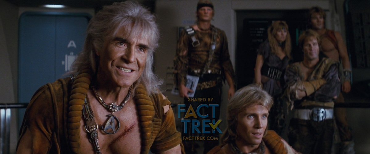
A similar but larger Flying A on a circle became the belt buckle. A broken one of them also ended up as a pendant hanging from Khan’s necklace. The remainder of the feature films featuring the original series characters stuck with these pins and buckles.
In 1987 #STTNG took the basic design of the TMP Flying A, made the circle a more NASA-like ellipse, eliminated the departmental symbol, and made a pin/device of it. This handsome design only lasted for the duration of TNG’s run and #DS9‘s first two seasons.

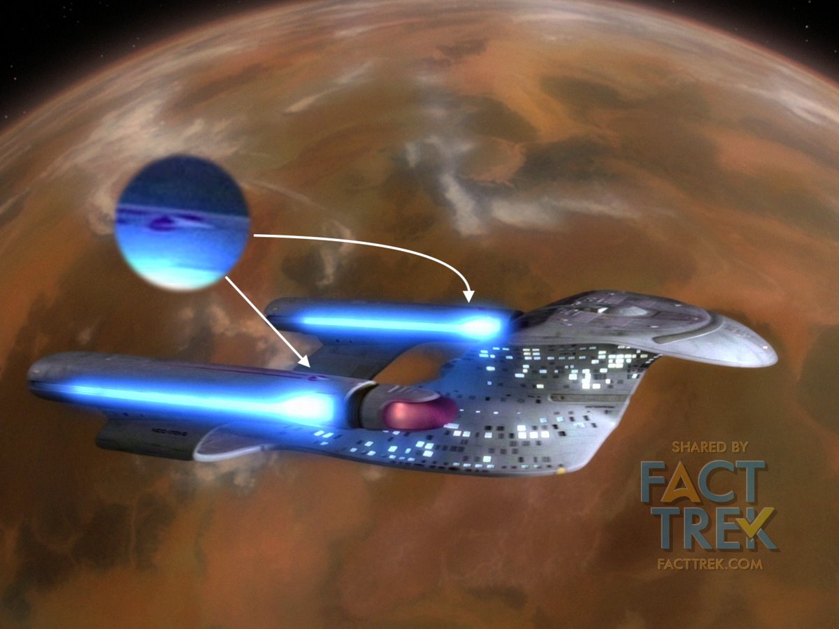
That same new-to-TNG version of the emblem also appeared on the pennants seen on #STTNG Starfleet vessels, as seen here atop the nacelles of the NCC-1701-D.
One of our follower beat us to the punch on this, so we'll let him do this bit of work for us. ;)
https://twitter.com/gnader/status/1287818469895860224
New Flying A combadges were designed for Star Trek: Generations, and adopted in #DS9’s third season, thus appearing there first. The backing shape was squared off on the sides and made partly hollow. This design carried through Voyager and appears in #Picard flashbacks.


Star Trek #Enterprise is known for breaking with tradition and giving early Starfeet no Flying A’s. Or DID they? See the tiny patches on the “enlisted” uniforms? There’s a U.S. Space Force-esque delta & 1 to 3 stripes designating Crewman, Crewman 2nd Class and Crewman 1st Class.


THE BOOMERANG COMES BACK. After being MIA for 26 years from 1975 when Star Trek Animated ended until 2001 when Enterprise premiered, a boomerang #Starfleet symbol returned. For Enterprise it was something of a hybrid of the boomerang and the Flying A. #StarTrek

With the “Kelvin” timeline films the Flying A went back to the delta basics and stripped of any backing shapes. The Kelvin crew wear simple outlined versions. Many many variations are worn by the cadets and Enterprise crew, but some restored the departmental symbols at last.


And Flying A’s abound! In both Star Trek (2009) and Star Trek Into Darkness the starship duty uniforms actually have a pattern of tiny little deltas all through them.

#StarTrekDiscovery changed the Flying A badges up, again, keeping the departmental symbols but placing the rank “pips” directly on the emblem.

And it looks like #StarTrekDiscovery is going to make yet *another* insignia for its upcoming season...rather like a delta squeezed within an ellipse.


#StarTrekDiscovery’s Captain Pike and his Enterprise crew wear even simpler, smaller Flying A’s, coming almost full circle to those first emblems in 1964. Will these be used in the upcoming Strange New Worlds? That remains to be seen.


The Flying A’s worn by Starfleet personnel in Picard harken back to a design employed in an alternate future seen in the last episode of #STTNG: an outlined delta with a pair of angled shapes at the back. Signifying…? Your guess is as good as ours.

Finally, there’s Star Trek Lower Decks. The Flying A’s there are super simplified, with barely peceptible curves and no departmental symbols. They look just about like those NX-01 Enterprise Crewman deltas...or the U.S. Space Force. We’ve come full circle…or is that orbit?

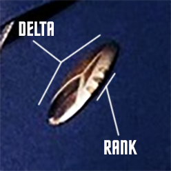
1 of 2. Finally, @MikeOkuda shared with us two notes regarding the insignia. 1. Although it has no official name: Mike said that Bill Theiss referred to the emblem on the uniform as the “arrowhead”. ...

2 of 2. @MikeOkuda "I asked Theiss if he had designed the arrowhead. He said 'yes.' I didn't ask Jefferies the same question, but he never seemed particularly interested in the symbol [...] it was never used on the sets, which might be interpreted to suggest that it wasn't his."

Arrowhead, Delta, Flying A . . . whatever you call it, it’s been around for almost 56 years and shows no sign of going anywhere...except maybe straight up.
Thanks for reading!
—30—
Thanks for reading!
—30—


• • •
Missing some Tweet in this thread? You can try to
force a refresh


