
1/ 🇸🇪- 2nd Thread where I compile my #COVID19 graphs. May included. Primarily comparing deaths all causes on national as well as regional level. Also looking at #covid19 age distribution I hope it brings some perspective. First graph next tweet+ #COVID19SWEDEN @InProportion2
2/ first graph looks at death all causes Nov - May. My focus is on 🇸🇪, for comparisons with other nordic countries I recommend @boriquagato amongst others. 2020 prel figures. Latest decade have been quite ”mild” as can be seen in this graph. Next we zoom in further on 2020+ 
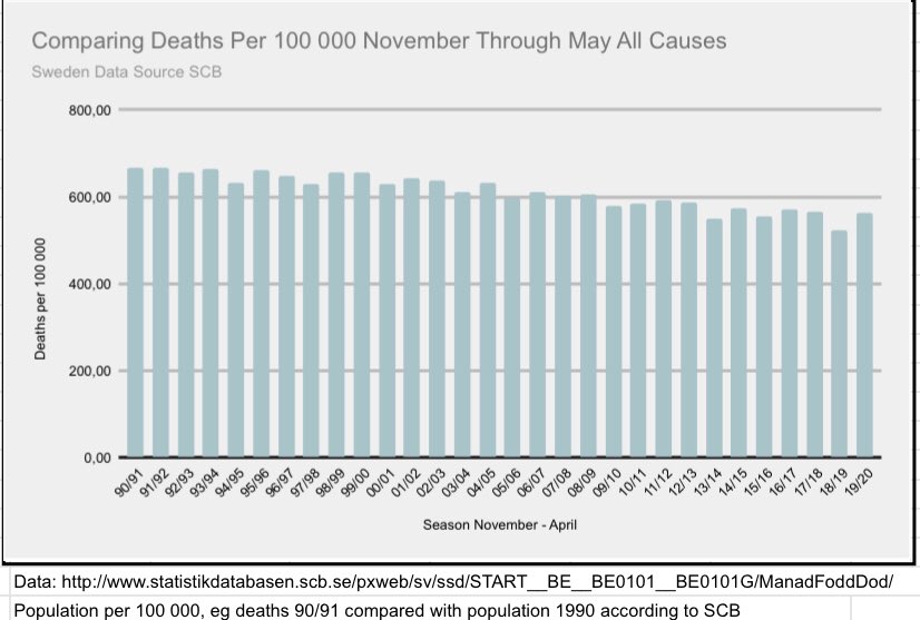
3/ In this graph we can see that 2020 rises above 2019. Keep in mind that 2019 was the year with fewest deaths since 1977. We know that #covid19 was noticed first in March so next we look at more recent months+ #COVID19sverige
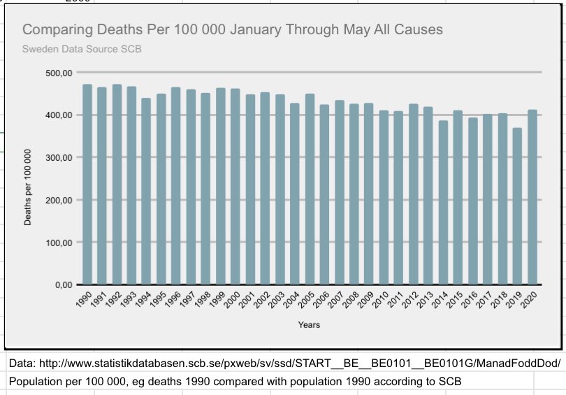
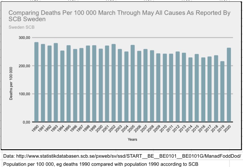
4/ as we can see Sweden is back at levels mid 2000 comparing deaths all causes 1990-2020. So we can notice #COVID19 impact on death rates. Lets looks at a per week comparison+
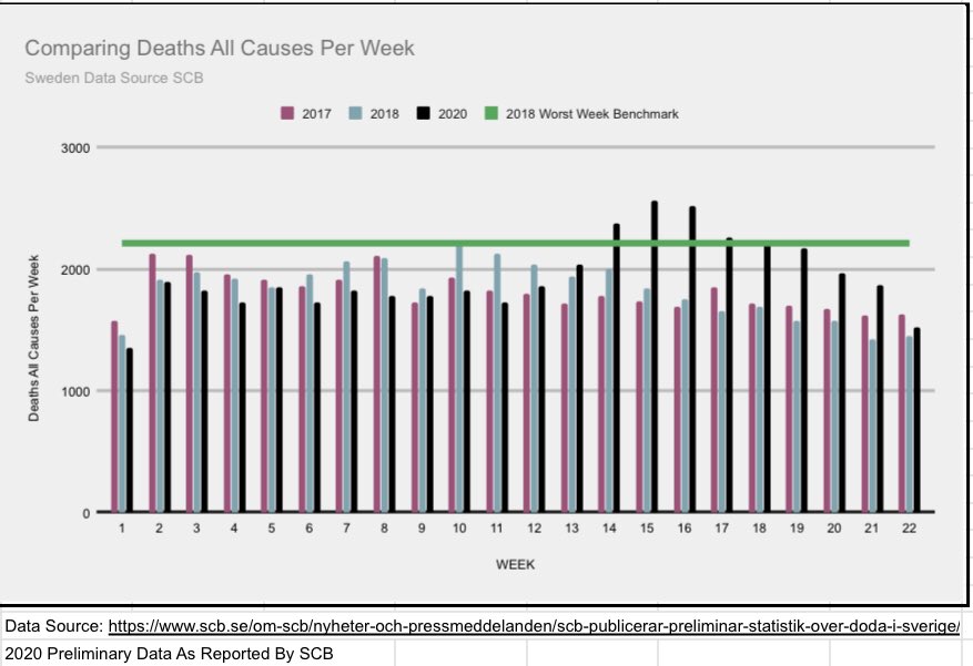
5/ comparing deaths per week all causes 2020 with 2017&2018 we see that week 14-16 was the worst but it later declined under 2018 worst week. Next comparison we see combined with #COVID19 deaths+ #COVID19SWEDEN
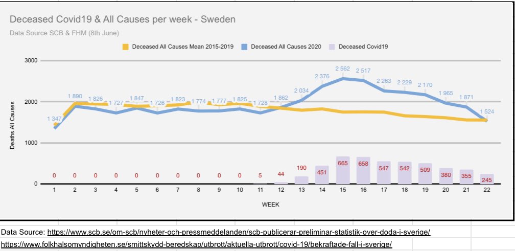
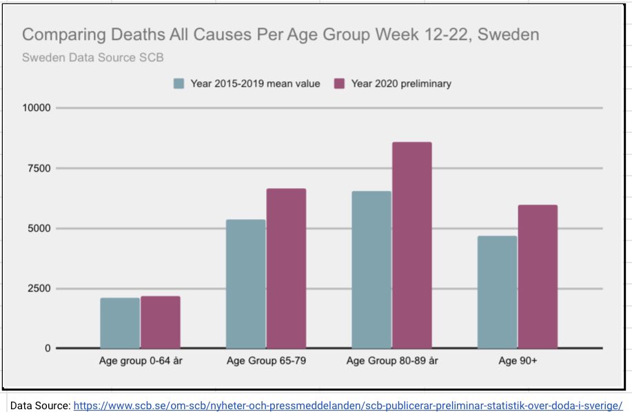
6/ as previous graph I compare per week, for further comparison per week I know @FrankfurtZack have done more on this. Here’s a comparison with 2015-2019 mean. Next lets look at individual months+
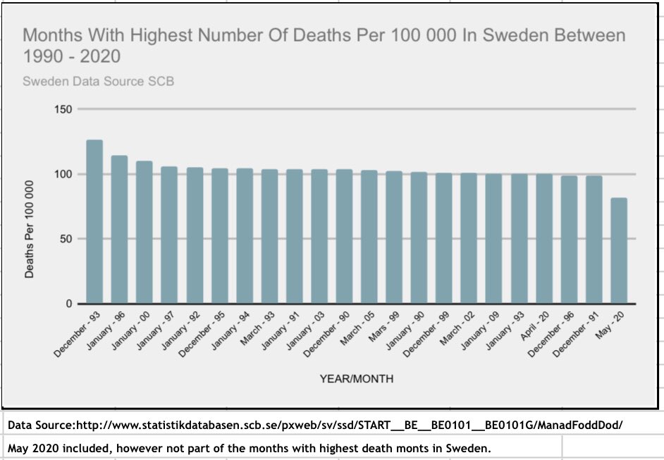
7) April 2020 is amongst the worst months since 1990 but not the worst when adj. for population growth. And May 2020 is not amongst the worst as can be seen (only showing May for comp.). We have looked at national level, lets look at age distribution+ #COVID19SWEDEN #COVID19
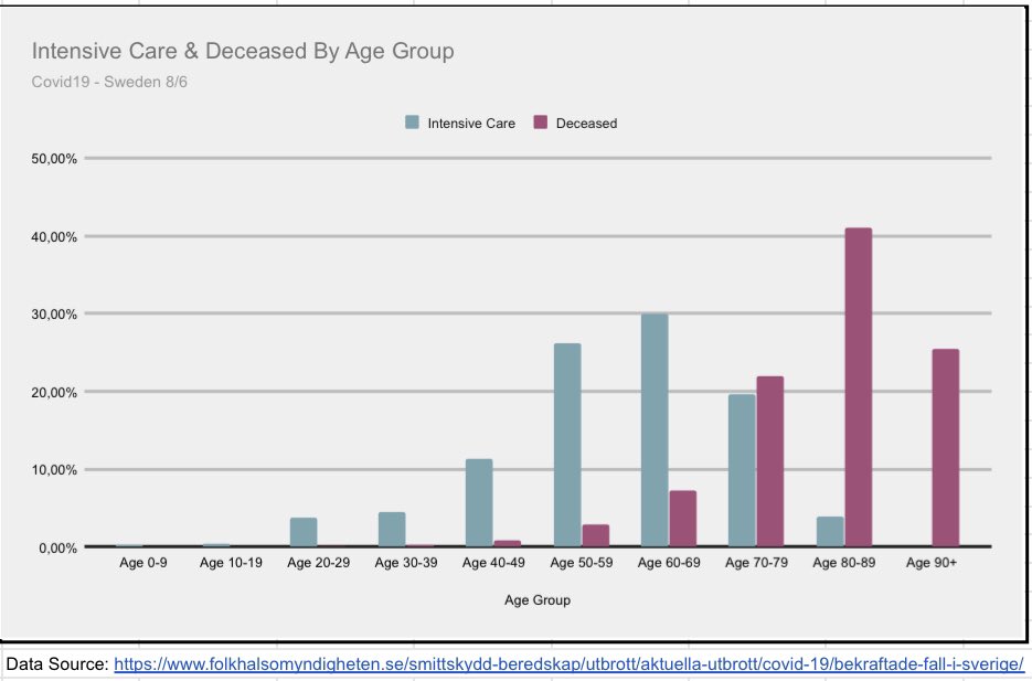
8/ in this graph we can see that +88% of #covid19 deaths has occurred in individuals over 70yrs and twice as many in age group 90+ than under 70yrs. In Sweden, only one person under 20 has died. This can be seen in deaths all causes as well+ #COVID19SWEDEN
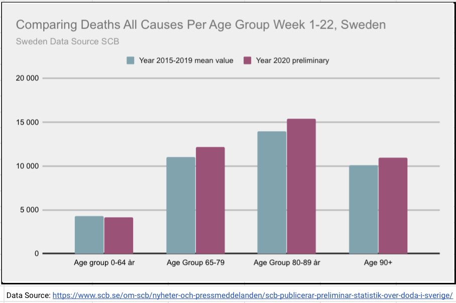
9/ In these two graphs we see that age group 0-64 is average compared with 15-19 mean value deaths all causes. #covid19 truly affects the elderly. But as @kerpen have pointed out, its even more pronounced when looking at care homes+#COVID19SWEDEN
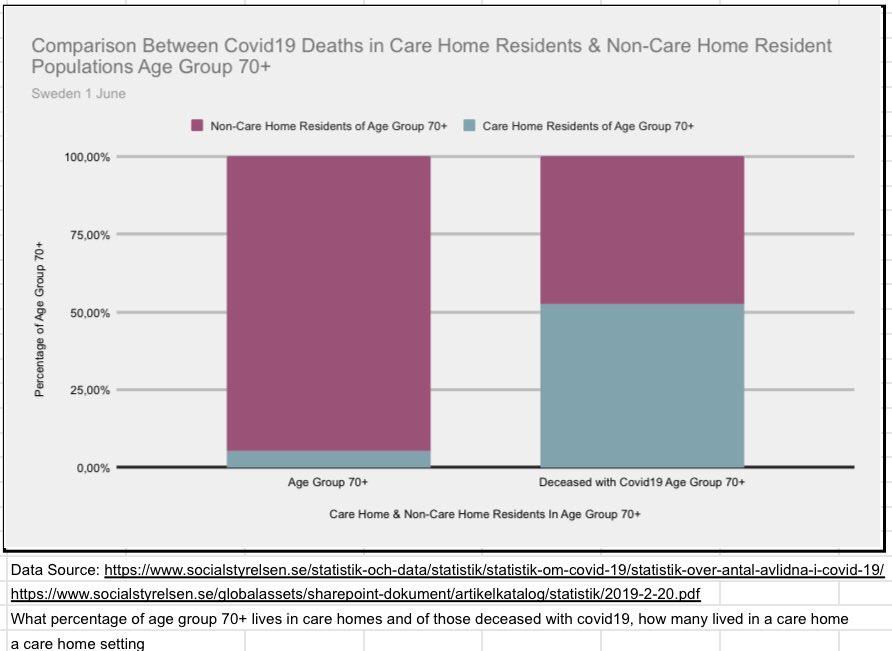
10/ age group 70+ is ca 15% of 🇸🇪 pop. Ca5% of 70+ live in a care home situation. But when we look at #covid19 deaths 70+. We see that over 50% of those are amongst care home population. And we have not included those receiving home care service+ #COVID19SWEDEN
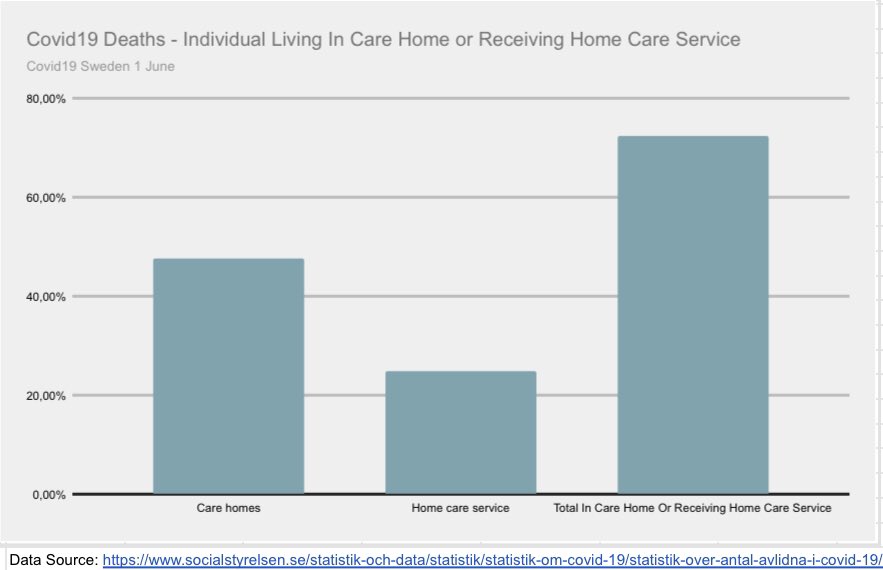
11/ when we include home care service we see that 70% of ALL #covid19 deaths occurred in this population.+ #COVID19SWEDEN
12/ as can be seen in this graph, many of the cases have had comorbidities as well. Next we look at regional impact.+

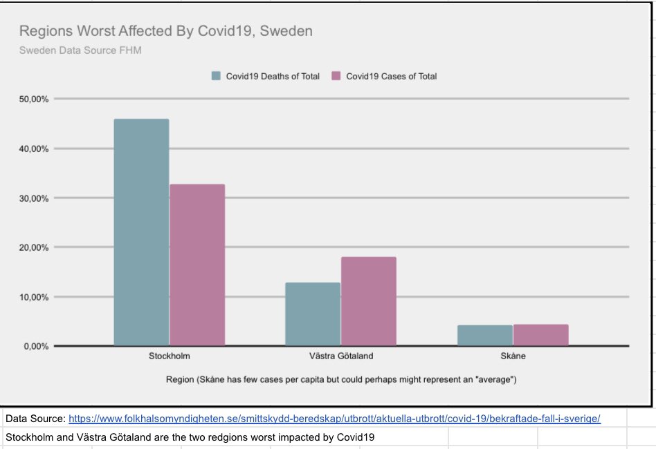
13/ Stockholm is truly the region that has seen the worst #covid19 impact, second is Västra Götaland & Skåne represent perhaps an ”average” region. With 45% of all #COVID19 deaths I will focus on Stockholm #COVID19sverige
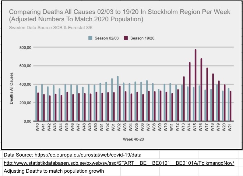
14/ First we compare Stockholm week 40-22 deaths all causes with a couple of years from 2000-present. Next we compare 02/03 to 19/20 as they look similar+ #COVID19SWEDEN
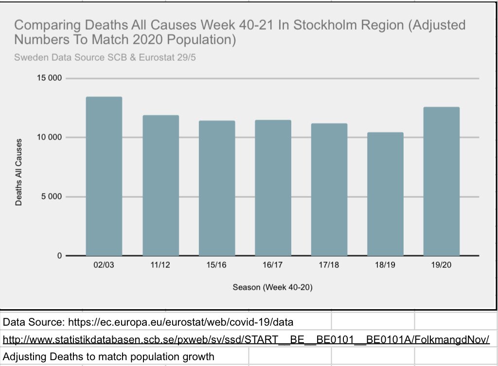
15/ here we see that 19/20 in Stockholm started of with few deaths and then spiked w14-17 when 02/03 was pretty ”steady”. But we also see the decline as could be seen in the graph showing Sweden.+ #COVID19SWEDEN
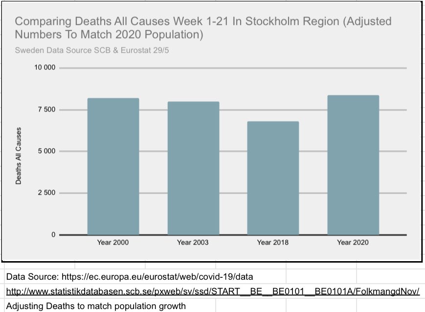
16/ In this graph we look again at Stockholm deaths all causes 2003 but also compare with 2000 and 2018 weeks 1-21. Remember that this is without strict lockdown+. #COVID19
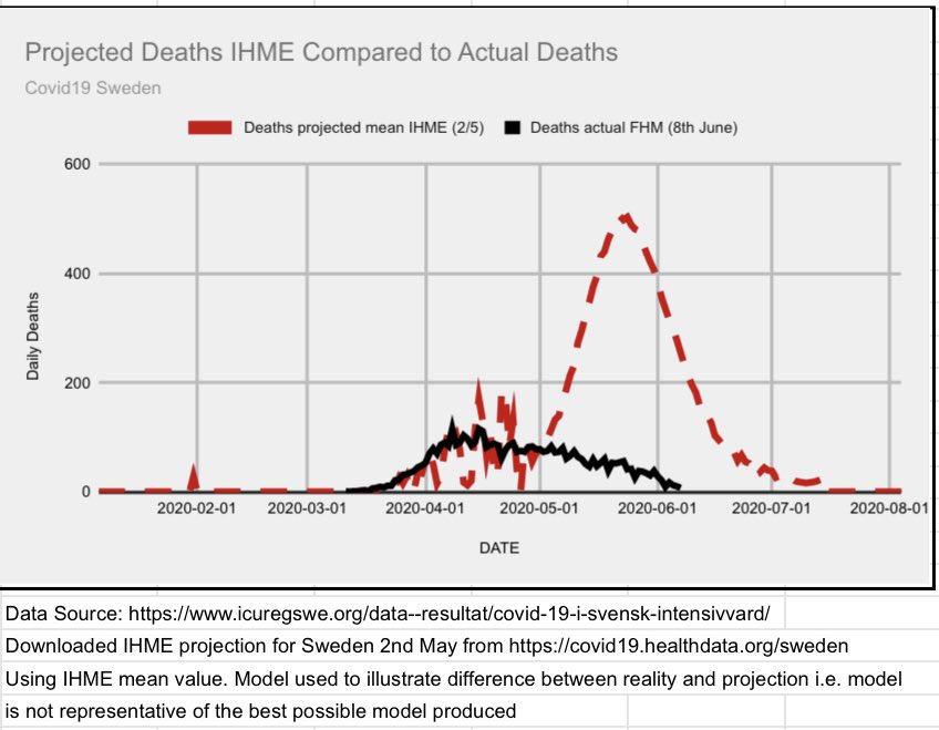
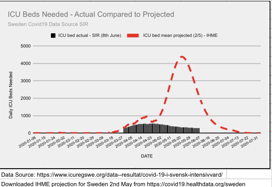
17/ to continue with lockdown theme, here I have plotted actual deaths and ICU beds needed vs IHME projections of no strict measures were imposed. @jeffreyatucker have eritrean further articles on the model topic👌🏽 last graphs will tale a look at age and extrapolate+ #COVID19
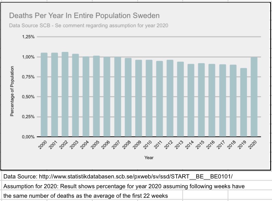
18/ If we assume that the rest of the year will per week have the same death rate as first weeks 2020, what would that look like? Well here is for the entire population and all of Sweden.+ #covid19
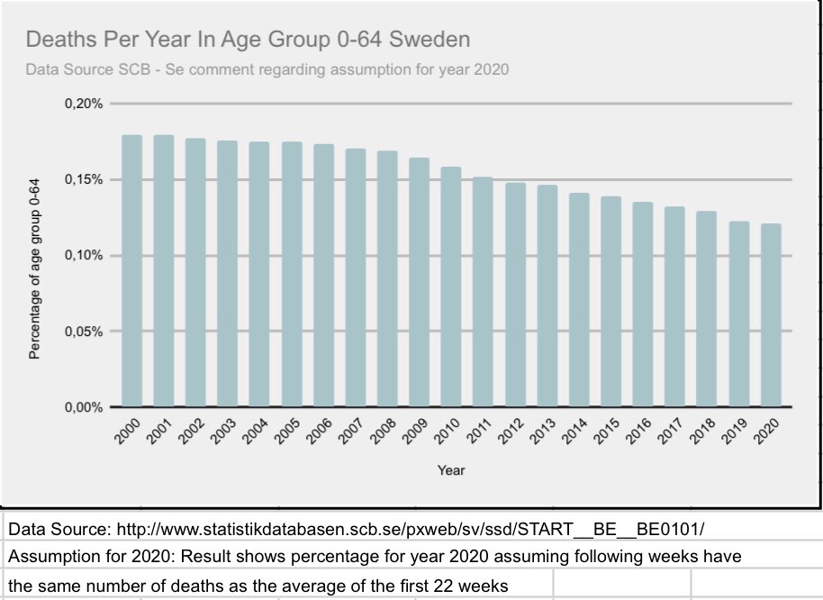
19/ this graph looks at age 0-64, same assumption as above. Even with #covid19 it looks as if this age group would do well. As mentioned before, the elderly is key here.+ #COVID19SWEDEN
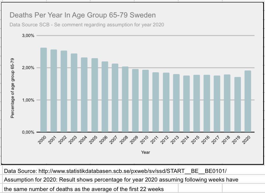
20/ Last graphs showing agenda group 65+ is shown here and we see that age group 90+ see the worst impact.+ #covid19
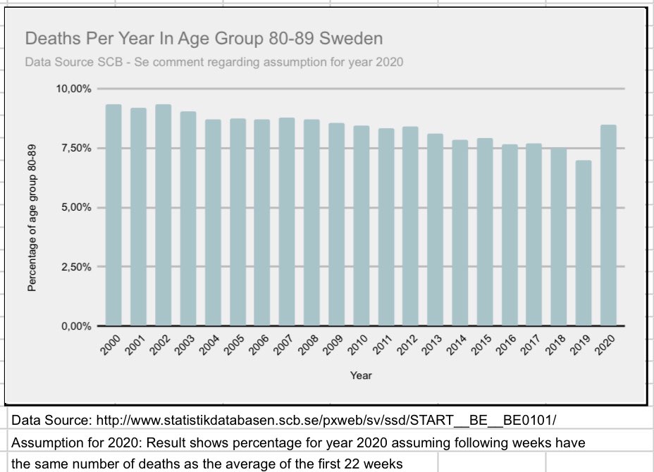
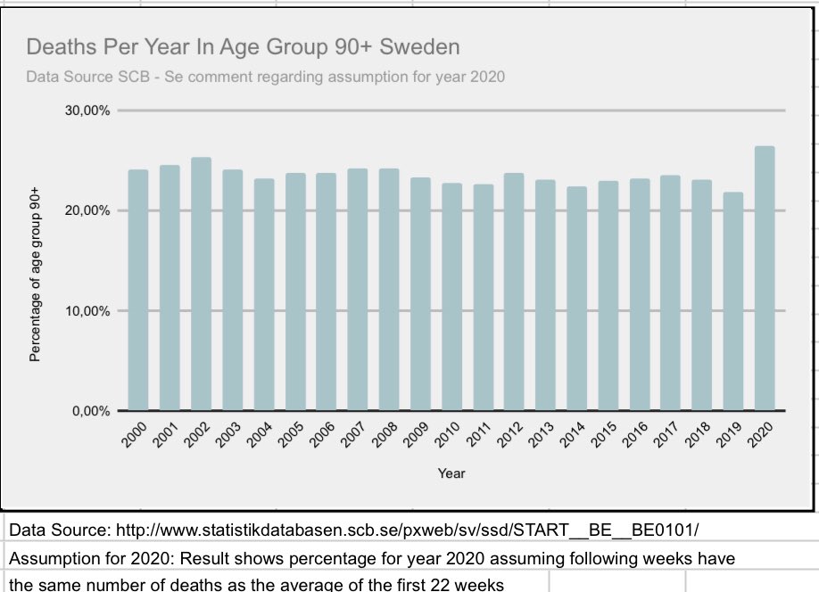
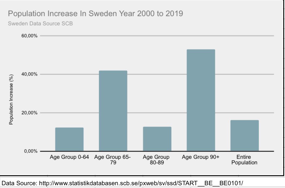
21/ to get an idea of recent population growth here’s a graph showing growth from 2000. Age geoup 90+ has seen the largest increase.+
22/ I hope these graphs gave some perspective. At least I have gained perspective by doing this. And also by following @InProportion2 @boriquagato @EffectsFacts 🇮🇹 @Zippo88lrr @AlistairHaimes @AlexBerenson and others that help shed some light on this episode/END Ask if question👌🏽


