Hey #Blocktober! I am thrilled to be able to share some behind-the-scenes looks at the Level Design in Hades.
To kick this off, check out this Elysium chamber timelapse showing my design pass through @_joannetran's art pass. 1/19
#HadesGame #leveldesign #gamedev
To kick this off, check out this Elysium chamber timelapse showing my design pass through @_joannetran's art pass. 1/19
#HadesGame #leveldesign #gamedev
You'll notice that the design kit included:
- Walls: full cover (projectiles & movement), half cover (only movement)
- Gameplay: traps, pillars, tables, urns, exits.
Temp art/lighting in the greybox was minimized to keep it clear what is a critical gameplay object. 2/19
- Walls: full cover (projectiles & movement), half cover (only movement)
- Gameplay: traps, pillars, tables, urns, exits.
Temp art/lighting in the greybox was minimized to keep it clear what is a critical gameplay object. 2/19
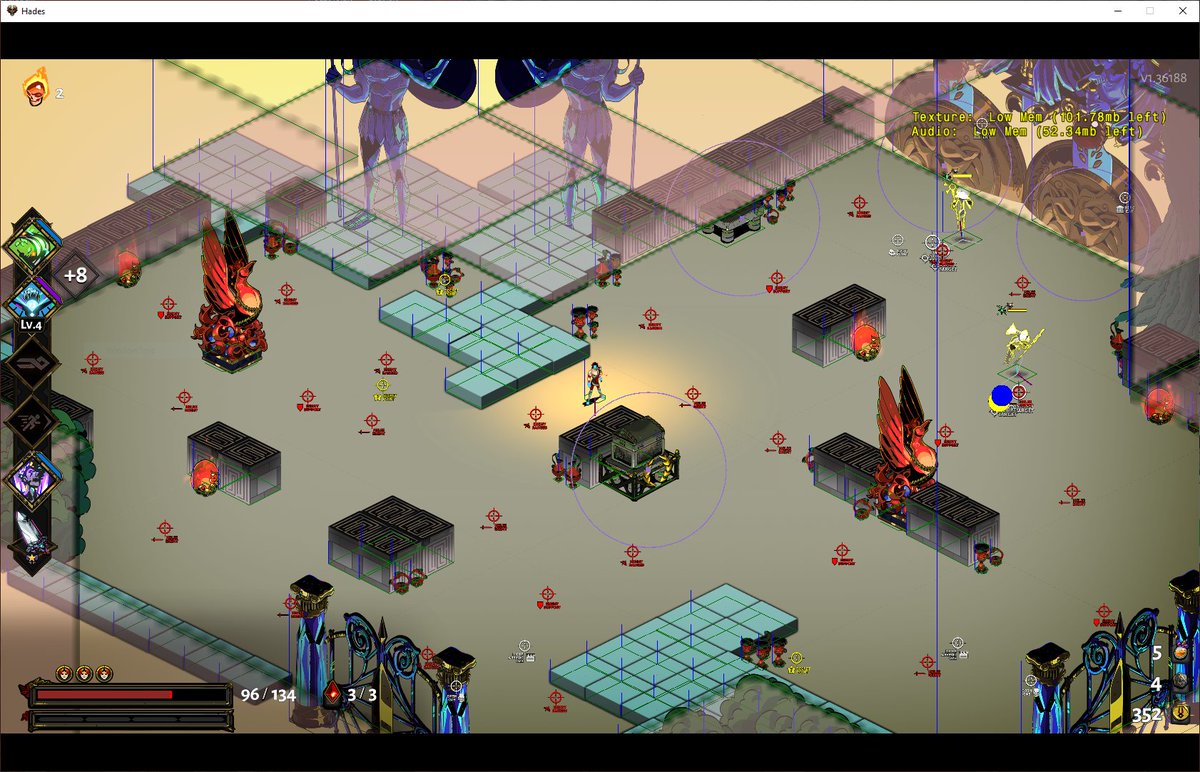
Here is a behind-the-scenes look at our Editor View, where we place all of the spawn points, script targets, etc.
Foes are categorized and prefer to spawn on spawn points of their type, though anything can spawn anywhere when needed. 3/19
Foes are categorized and prefer to spawn on spawn points of their type, though anything can spawn anywhere when needed. 3/19
Each biome had a set of design principles to guide its design.
For Tartarus, we wanted medium-sized chambers that are almost always completely walled in, making it forgiving for players learning about the Cast while providing extra Wall Slam damage. 4/19
For Tartarus, we wanted medium-sized chambers that are almost always completely walled in, making it forgiving for players learning about the Cast while providing extra Wall Slam damage. 4/19
You may have also noticed that smaller chambers tend to appear early on in biomes, and larger chambers appear later so that they are reflective of the escalating encounters. 5/19
In Asphodel we wanted to see how different we could get a biome to feel while staying within our foundational rules. The archipelago idea was enticing but took many iterations to solve the issues with player and enemy AI magma traversal. 6/19 
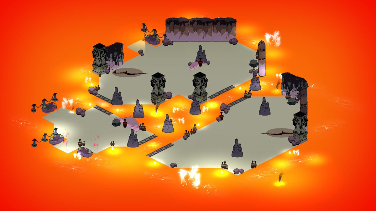
We tried many things from creating RTS-style shallow bridges to allowing enemies to walk across magma, but ultimately every enemy in Asphodel was designed to have a dedicated way of getting over magma. 7/19
We wanted Asphodel to feel vast and horizontal, which was the inspiration for the barges as well as the endearingly-named Barge of Death. I could write a whole blog about the smoke-and-mirrors it takes to pull off these illusions but for now here is a video. 8/19
Elysium was all about regeneration. Pillars, traps, and Exalted foes all have methods of respawning. For the Exalted, we tried static map locations they could go to to respawn but settled with the weapon drop, which was more dynamic. 9/19 

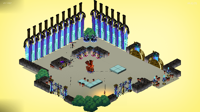
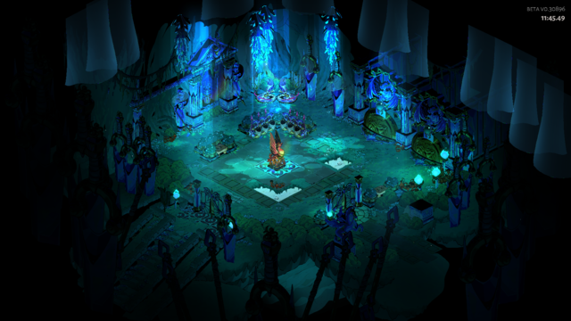
Styx is the game's labyrinth and the 'push your luck' part of the run. Each wing has a set of single-screen chambers with one-wave encounters that lead to a bigger final chamber. 10/19 

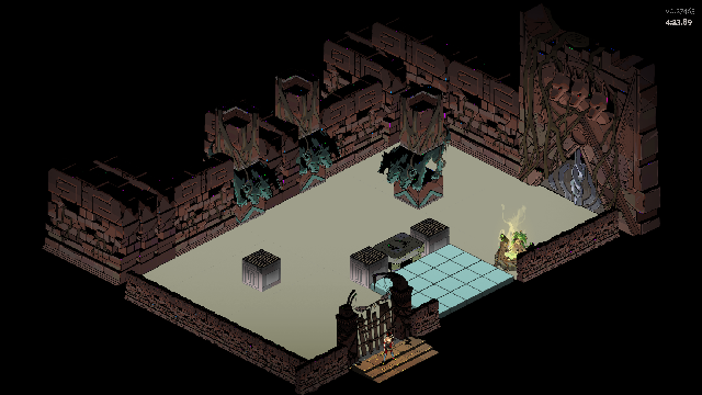
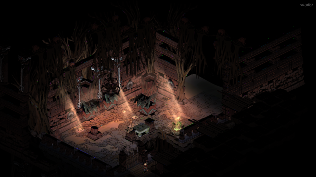
One detail that we wanted to make sure was consistent was that if you exit a chamber moving in one direction, you should enter the next chamber coming from that direction. We accomplish this by flipping the entire map to match the exit orientation. 11/19
Traps vary across the four biomes but in general we designed them to be a supplementary part of encounters. They’re always relevant without being the center of attention. They are also neutral, and can be used as a weapon against foes. 12/19
Asphodel’s traps were designed to escalate with the encounter. When entering a room it is (relatively) calm. As each wave of foes is defeated, new dangers such as magma splashes and smoke traps activate. 13/19
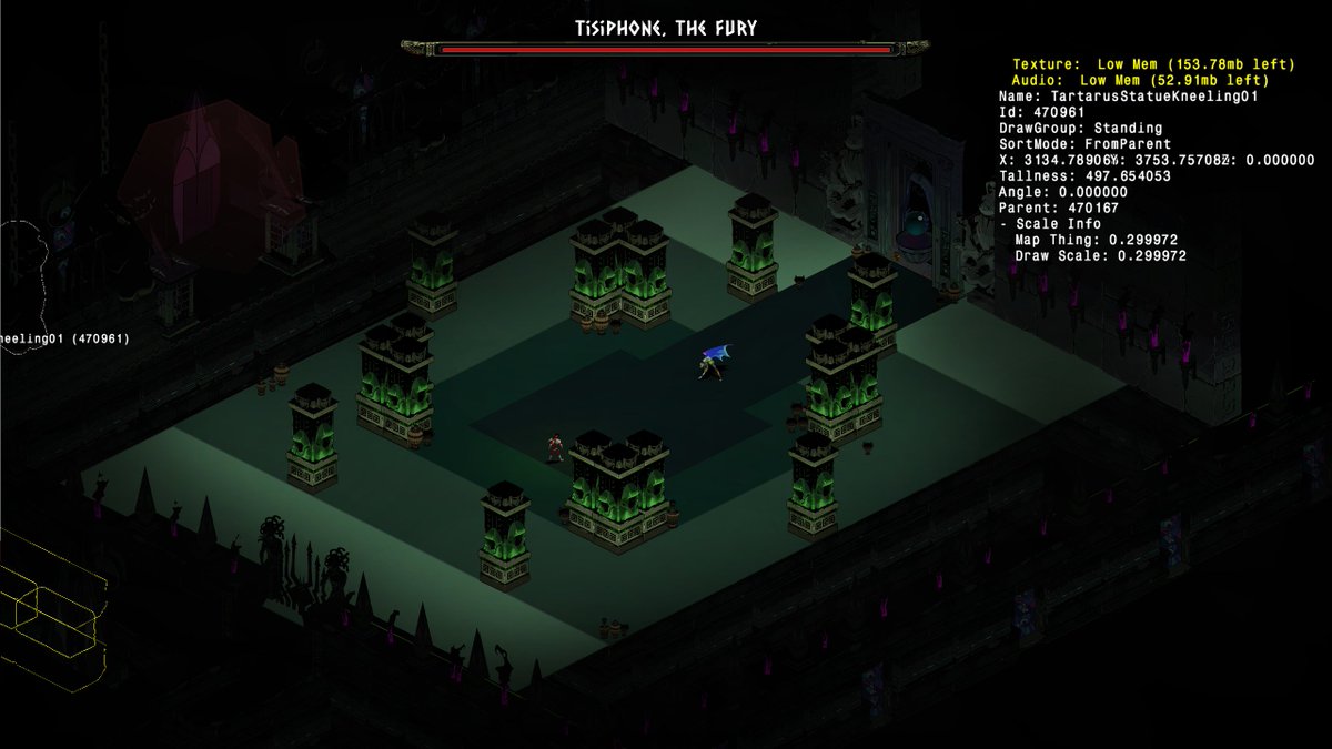
Two bosses make special use of level design. The first is Tisiphone's chamber. The chamber constricts as the fight progresses. Here is an overview of the greybox showing the map partition. 14/19 

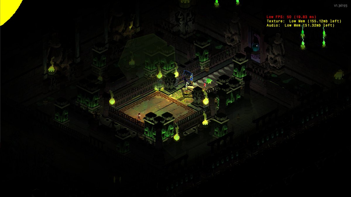
The second is the Lernie battle using Extreme Measures. It swaps the chamber but keeps him mostly the same. The alternate chamber is smaller and makes use of Asphodel's archipelago design.
I took the beautified map and reshaped it, rather than starting from a blank slate. 15/19
I took the beautified map and reshaped it, rather than starting from a blank slate. 15/19
An interesting piece of game balance that the level design influences is what chamber rewards are offered and how many exits the player gets. For instance, Tartarus has a mix of one or two exit door chambers, while Asphodel has mostly two-to-three exit options per chamber. 16/19 
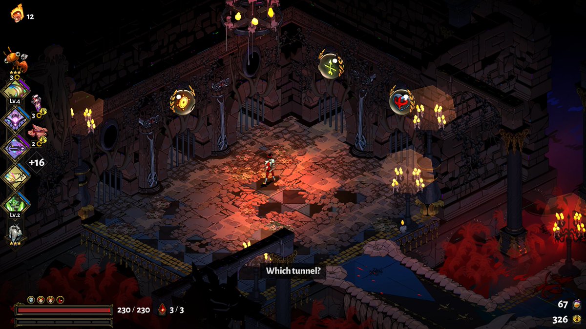
Finally I wanted to share a unique challenge. We struggled for a while on how to capture the feeling of exploration, a cornerstone of many roguelikes. We tried many things, from hiding gold in random shiny walls, to making huge rooms with doors scattered around the map. 17/19
None of these fit with the game's hand painted art, or its high speed room-to-room action pacing. Instead the design had to adapt and find smaller avenues for discovery such as gold urns, Troves, Wells, fishing points, and Chaos / Erebus gates. 18/19 
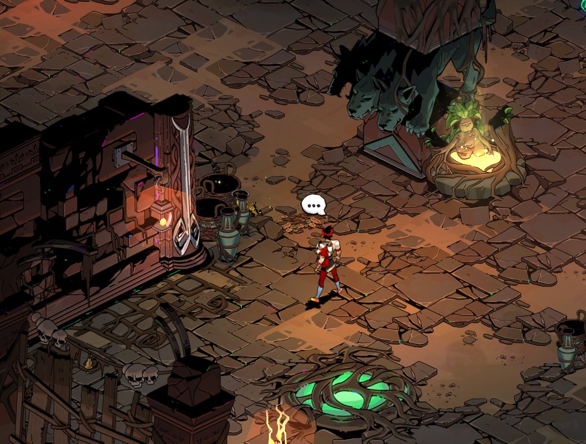
That's it for now! Hope this was an interesting quick look into Hades' level design. I love talking about this stuff and am consistently awed by the amazing work you all post in #Blocktober! 19/19
• • •
Missing some Tweet in this thread? You can try to
force a refresh


