
1. (This is a corrected version of tweet I just deleted). Some perspective on #CovidUK hospital admissions. Here's an update of another graph (using data from coronavirus.data.gov.uk) that never seems to be shown. Daily number of new covid admissions as % of new cases. 
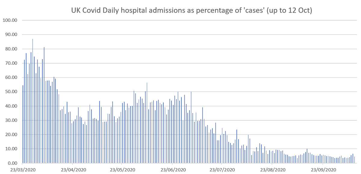
2. So 87% of 'cases' at March peak resulted in hospital admissions. Now it's just 4.6% and is actually decreasing. And that's despite: increased repeat hospital testing now (so more false positives), and hospital admissions always go up in October.
3. And note: a person entering hospital with a non-Covid condition who, for example, tests positive after 3 weeks and several negative tests, is counted as a Covid admission.
4. Finally in response to the claim that in March/April many 'cases' were not counted: the reason the data starts at 23 March is because that is when the offical 'reliable' data for both cases and admissions dates back to
5. Obviously a major explanation is that in March most of those tested were in hopsital & people outside hospital without symptoms are now being tested. But then why do we only see plots of number of 'cases' without factoring in number being tested (as I've also been doing).
6. None of this is exactly rocket science. Just download the data from coronavirus.data.gov.uk/healthcare, open in Excel and divide number of hospital admissions by number of cases
7. Also worth noting that the UK COVID hospital admissions data are inflated because the Wales figures are wrong. See probabilityandlaw.blogspot.com/2020/09/the-go…
8. I’ve been arguing since March that the number & type of people being tested + how positive cases are defined explains most of the observed data. But the data we have is so poor (especially on false positives) there is little we really know probabilityandlaw.blogspot.com/2020/10/why-we…
• • •
Missing some Tweet in this thread? You can try to
force a refresh


