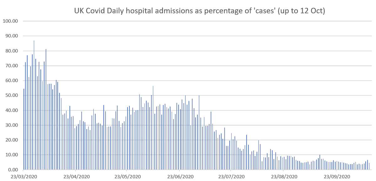
1. Some people taking issue with my earlier plot of daily new covid hospital admissions as % of new cases don't seem to understand the fundamental limitations of ALL the analyses based on the daily data provided by the government - as summarised in this graphic... 

2. They thought I didn't understand that the April peak was largely explained because then it was mainly hospitalized people being tested. As I work on CAUSAL modelling and analysis we were highlighting this very problem back in March ... theconversation.com/coronavirus-co…
We have produced numerous reports exposing the flaws of much published statistical analysis on Covid because of the failure to account of causal factors and explanations. My blog post from last week provides some context and links to much of this work. probabilityandlaw.blogspot.com/2020/10/why-we…
4. There was another reason why I did the plot showing percentage of hospital admissions - as crude as it is...... 

5. If it’s ok for government to keep showing this crude plot of ‘number of cases’ without factoring in numbers tested, then it’s equally ok to show the plot of hospital admissions as % of cases without factoring in numbers tested. Latter is actually also more informative now. 

• • •
Missing some Tweet in this thread? You can try to
force a refresh


