Trevor Bedford Profile picture
19 Oct, 13 tweets, 4 min read
Daily #COVID19 case counts are increasing in the US and we seem to hitting a third wave (or second surge if you'd prefer). Here I wanted to look at how case counts through time correlate across different states. 1/12
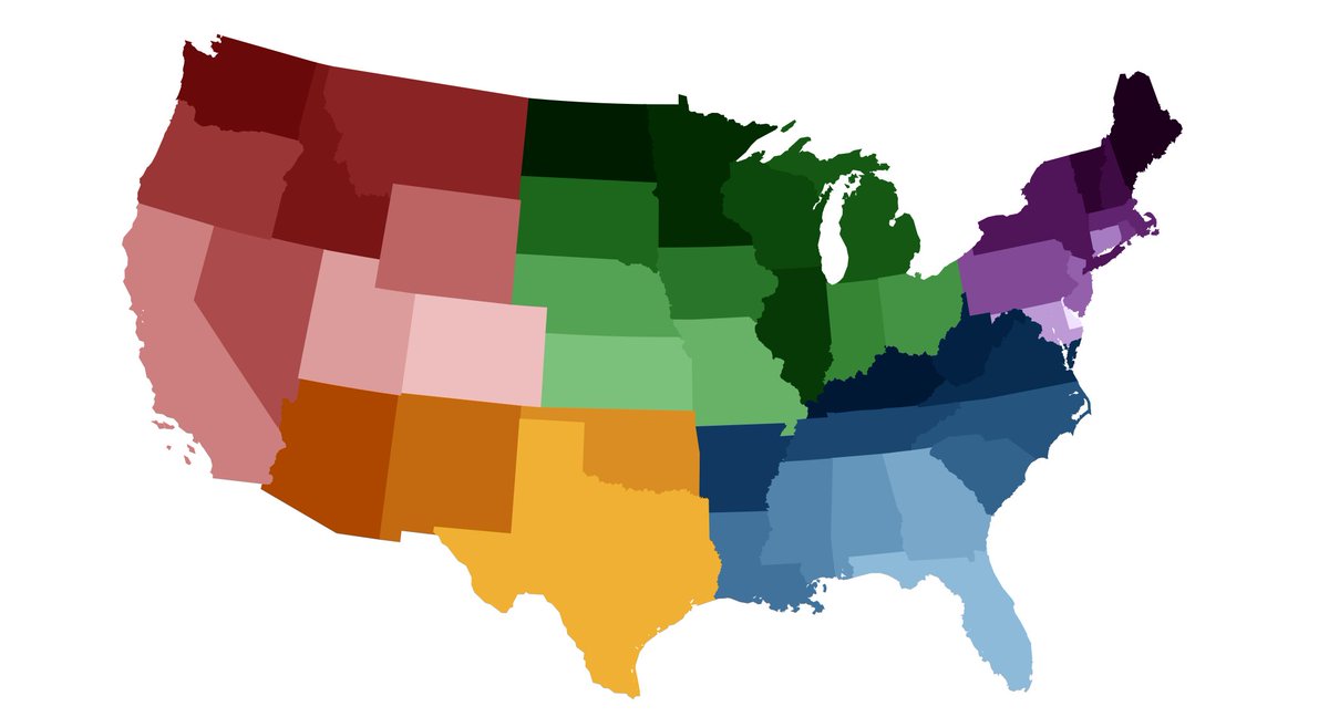
I start with a simple coloring to group states in the West (in red), the Southwest (in orange), the Midwest (in green), the Southeast (in blue) and the Northeast (in purple). Color ramp borrowed from @andersonbrito_. 2/12
Using data from @COVID19Tracking, I plot daily confirmed cases for each state since March as a stacked chart. The three crests are obvious (though not clear how large the third will end up being). Different regions are contributing to each wave to different degrees. 3/12
Keep in mind that these numbers represent reported cases and that the proportion of infections reported as cases has increased over the course of the US epidemic as testing capacity has improved. 4/12
We can look at correlations between states. For example, when case counts are high in New York they are also high in New Jersey (correlation coefficient of 0.95), while when case counts are high in New York they are low in Texas (correlation coefficient of -0.38). 5/12
If we look at all pairs of states we can construct a network diagram where each state is a node and edges connect states that have a correlation coefficient of 0.6 of higher, ie states with similar epidemic timeseries. 6/12
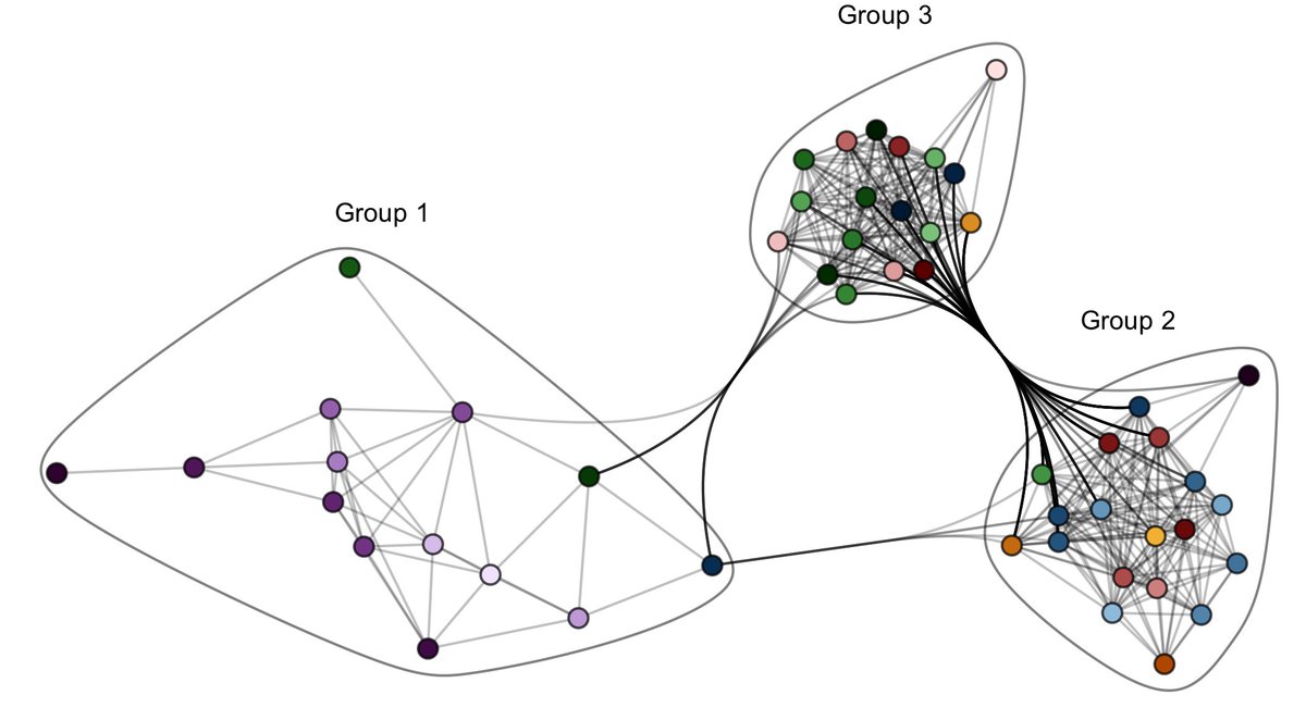
There appear to be three different "communities" in this network, or groups of states that resemble one another in their timeseries of confirmed cases. I've labelled these simply as groups 1, 2 and 3. 7/12
Network connections obviously differ based on the the threshold chosen. But I get very similar groupings at thresholds above or below the 0.60 correlation coefficient used here. 8/12
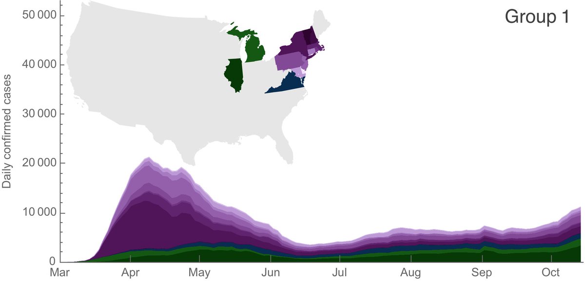
In group 1 are primarily states in the Northeast that had a first wave in March and April, followed by little summer circulation, but where case counts have been slowly creeping up in the past ~6 weeks. 9/12
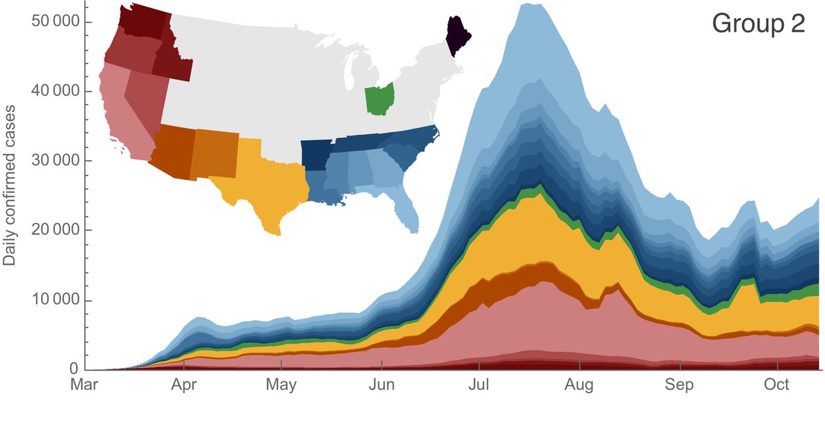
In group 2 are primarily states in the Sun Belt that were involved in the second wave, peaking in July and August. This was followed by sustained circulation but at lower levels than the summer peak. Many of these states have also been creeping up in the past ~6 weeks. 10/12
In group 3 are primarily states in the Midwest and the Mountain West that were not involved in either the first or second waves and that have seen steady increases in case counts since July. 11/12
Seasonal coronaviruses show seasonal circulation patterns. I expect that moving into fall and winter will make controlling COVID-19 more challenging, but I would generally expect continued circulation at case levels not dramatically different to those of the past months. 12/12
(Sorry to be absent these last couple months. I'll try to get back to more regular updates.)

• • •

Missing some Tweet in this thread? You can try to force a refresh
 

Keep Current with Trevor Bedford

Trevor Bedford Profile picture

Stay in touch and get notified when new unrolls are available from this author!

Read all threads

This Thread may be Removed Anytime!

PDF

Twitter may remove this content at anytime! Save it as PDF for later use!

Try unrolling a thread yourself!

how to unroll video
  1. Follow @ThreadReaderApp to mention us!

  2. From a Twitter thread mention us with a keyword "unroll"
@threadreaderapp unroll

Practice here first or read more on our help page!

More from @trvrb

9 Aug
A follow up to yesterday's controversial thread on societal behavior, population immunity and Rt to specifically address issue of what fraction of the population in Florida, Texas and Arizona may have had COVID-19. 1/16
Multiple people expressed skepticism that 20% seroprevalence in Florida is reasonable. Others thought that 20% was patently impossible due to implied crude infection fatality ratio (IFR). 2/16
This thread walks through a ballpark version of implied IFR that takes into account reporting delays in Florida, Texas and Arizona in their recent epidemic surge. Data and figures that follow from @COVID19Tracking. 3/16
Read 17 tweets
7 Aug
I wanted to discuss the degree to which population immunity may be contributing to curbing #COVID19 in Florida, Arizona and Texas, where recent surges have resulted in substantial epidemics. 1/16
After increasing dramatically in June and July, daily case counts in Florida, Arizona and Texas have begun to subside. Data from @COVID19Tracking. 2/16
This corresponds to a peak Rt of between 1.2 and 1.4 in late-May / early-June and steady reductions since this point. Declining case counts correspond to Rt < 1. Rt estimates from rt.live. 3/16
Read 17 tweets
23 Jul
With @CDCgov's update to their seroprevalence results across sites in the US, it's possible to see if with increased availability in testing whether we're catching a larger fraction of infections as confirmed cases. 1/13
The @CDCgov seroprevalence survey (cdc.gov/coronavirus/20…) tests blood samples from different sites in the US for COVID-19 antibodies. With a serosurvey, it's possible to look at the path of the epidemic in a broader fashion than what's available from PCR assay results. 2/13
By taking multiple cross-sectional samples, it's possible to see the rate at which seropositivity increases. Here I'm replotting data from the CDC dashboard (cdc.gov/coronavirus/20…) to show seroprevalence at 6 sites across 2 different timepoints for each site. 3/13
Read 14 tweets
17 Jul
A follow up to the thread two weeks ago on rising case counts and "reopening", looking at continued trajectories in states with large epidemics. 1/15
When looking at epidemic dynamics, it's worth paying close attention to how the "fundamental reproductive number" changes through time, usually called Rt. This expresses how many secondary infections a primary infection leaves on average. 2/15
Approaches like epiforecasts.io/covid/ and rt.live estimate Rt from confirmed case data. Critically, due to disease incubation period, delays in seeking testing and delays in test reporting, we don't know what Rt is at the very moment. 3/15
Read 17 tweets
3 Jul
It's abundantly clear that societal behavior strongly impacts #COVID19 spread. We saw this early on where social distancing resulted in significant reductions to epidemic spread. With the surge of cases in the south, what can we expect going forward? 1/14
With changes in behavior starting in May, we've seen a "surge" in confirmed cases of COVID-19. However, we shouldn't treat the US as a single epidemic. 2/14
Very broadly, we might consider a "Northeast US epidemic" that had a large peak in March/April, but is now mostly contained and a "South US epidemic" that is just now picking up steam. 3/14
Read 15 tweets
20 Jun
A small follow up to the "long plateau" assessment of the #COVID19 epidemic. When I tweeted this on April 30, we had ~30k daily confirmed cases and ~2000 daily deaths. This last week, we had ~24k daily confirmed cases and ~700 daily deaths. 1/10
In the past 7 weeks, daily confirmed cases have decreased to ~80% of their April 30 value, while daily deaths have decreased to ~35% of their April 30 value. Figure from @nytimes. 2/10
Testing has increased by about 2-fold in these 7 weeks. Given continually increasing testing, alongside roughly stable confirmed cases and declining deaths, we expect that the national US epidemic has been getting slowly smaller. 3/10
Read 14 tweets

Did Thread Reader help you today?

Support us! We are indie developers!


This site is made by just two indie developers on a laptop doing marketing, support and development! Read more about the story.

Become a Premium Member ($3/month or $30/year) and get exclusive features!

Become Premium

Too expensive? Make a small donation by buying us coffee ($5) or help with server cost ($10)

Donate via Paypal Become our Patreon

Thank you for your support!

Follow Us on Twitter!