
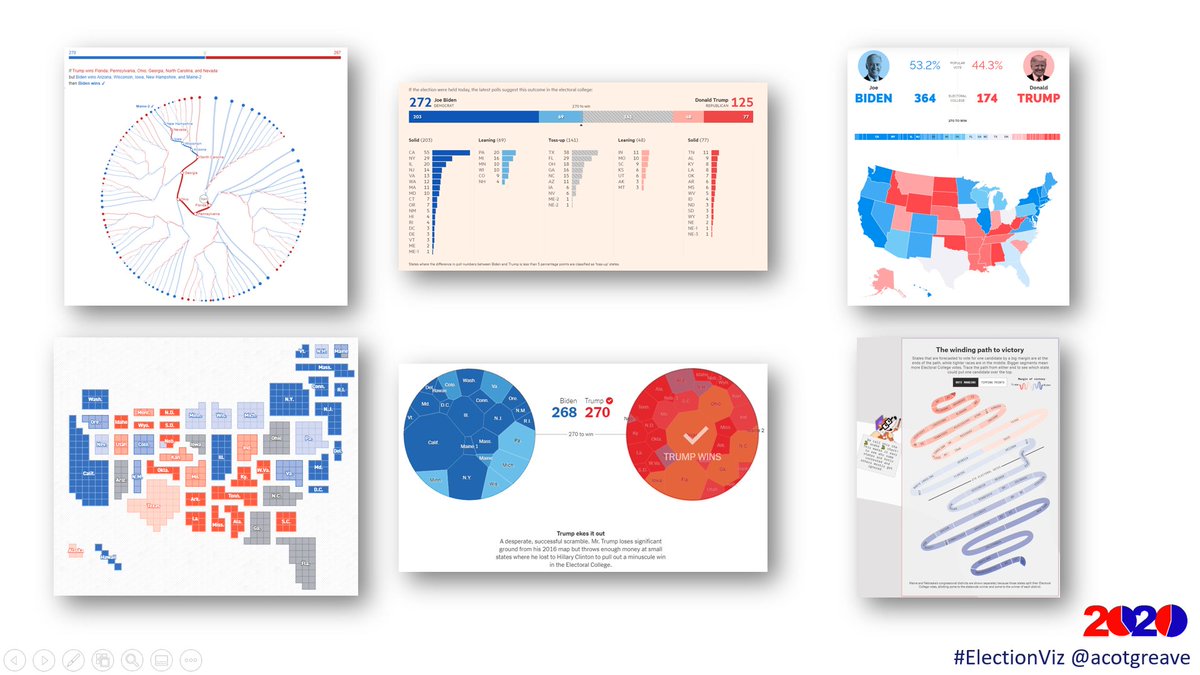
Thread: How would YOU visualize poll tracker data? You have 50 US states and a race to 270 Electoral College votes. Here's a thread of several approaches from the media, with one pro/con for each. #ElectionViz (1/11) 
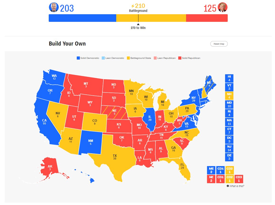
#YouGov goes for a traditional approach: stacked horizontal bar chart and standard US map.
Pro: Easy to find any particular state.
Con: Size is based on physical area, not number of electoral college votes
today.yougov.com/2020-president… (2/11)
Pro: Easy to find any particular state.
Con: Size is based on physical area, not number of electoral college votes
today.yougov.com/2020-president… (2/11)
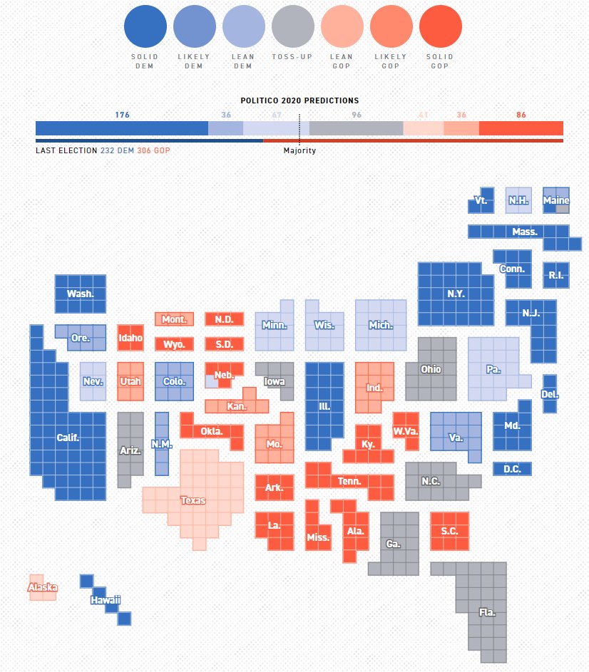
#Politico is similar but uses a tile map
Pro: each electoral college vote is the same size. States are sized according to EC. (British perspective: California gets loads of votes!)
Con: a bit harder to find a particular state. Unusual display.
politico.com/2020-election/… (3/11)
Pro: each electoral college vote is the same size. States are sized according to EC. (British perspective: California gets loads of votes!)
Con: a bit harder to find a particular state. Unusual display.
politico.com/2020-election/… (3/11)
#NYT abandons the geo-option, and positions states according to Biden/Trump lean. It also forces YOU to make the choice for the toss-up states.
Pro: engaging and forces reader to decide
Con: Hard to find a particular state.
nytimes.com/interactive/20… (4/11)
Pro: engaging and forces reader to decide
Con: Hard to find a particular state.
nytimes.com/interactive/20… (4/11)
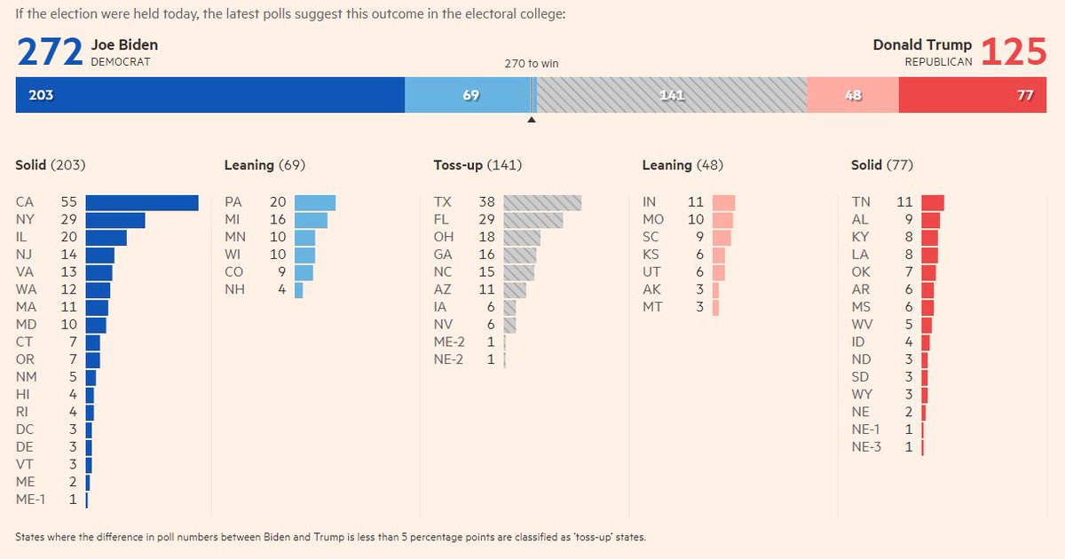
@ftdata also ignores geo and uses a horizontal bar for Electoral College race, with bars for each state
Pro: 100% "best practice" #dataviz: length and position make for super-easy interpretation
Con: the bars in the lower chart don't reveal enough that's not in the stacked bar?
Pro: 100% "best practice" #dataviz: length and position make for super-easy interpretation
Con: the bars in the lower chart don't reveal enough that's not in the stacked bar?
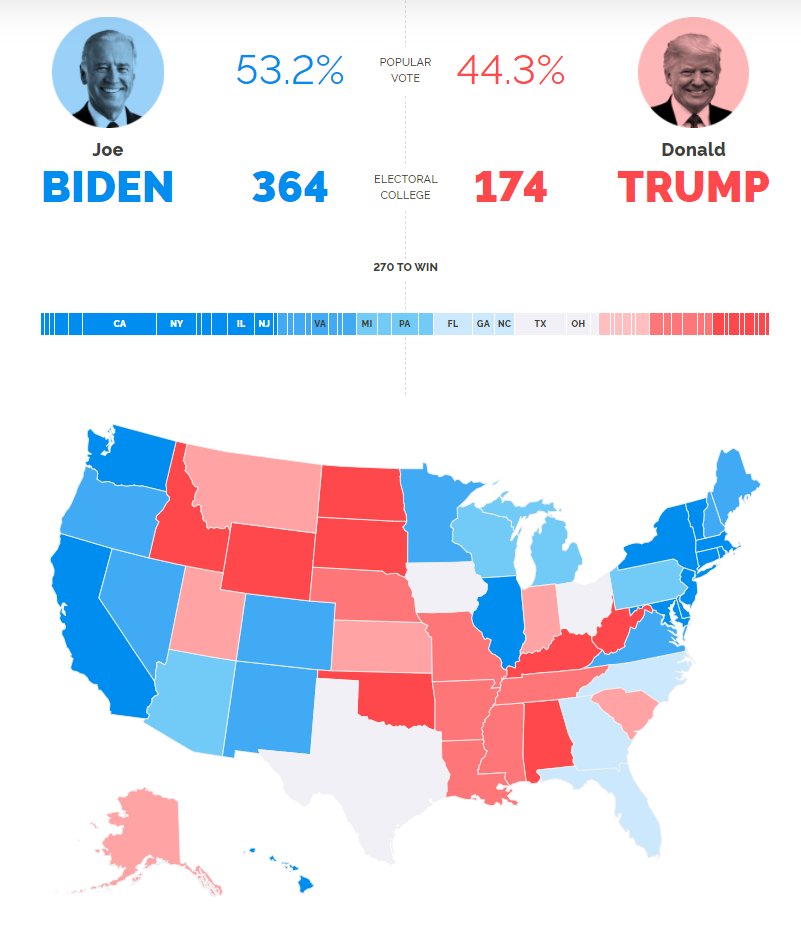
#CNN take a similar approach to YouGov and Politico with added bonus of interactivity.
Pro: separated squares on right allow you to interact with the small states
Con: Yellow? That's an unusual (and bright) choice
edition.cnn.com/election/2020/… (6/11)
Pro: separated squares on right allow you to interact with the small states
Con: Yellow? That's an unusual (and bright) choice
edition.cnn.com/election/2020/… (6/11)
@GuardianData has a novel, much more contextual approach.
Pro: Extra context makes it a more thoughtful approach. Also, I like how the stacked bar stays visible when you scroll. Nice!
theguardian.com/us-news/ng-int…
(7/11)
Pro: Extra context makes it a more thoughtful approach. Also, I like how the stacked bar stays visible when you scroll. Nice!
theguardian.com/us-news/ng-int…
(7/11)
The team at @GuardianData also have a great "card-based", context-heavy page. I like the "slow data" approach theguardian.com/us-news/2020/n… (8/11)
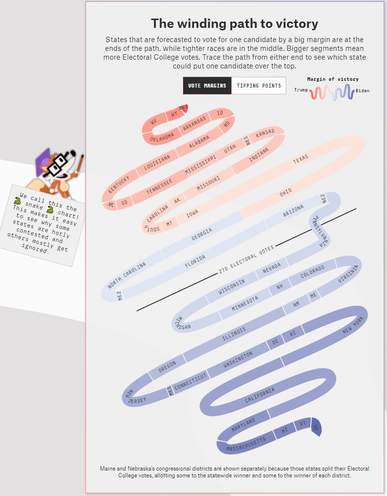
In the "unusual" category: @FiveThirtyEight (cc @wiederkehra) take a unique approach with the wonderful election snake.
Pro: Novel, engaging to lay people (perhaps?), fun.
Con: As a Brit, I found it v confusing. But I've grown to love it
projects.fivethirtyeight.com/2020-election-… (9/11)
Pro: Novel, engaging to lay people (perhaps?), fun.
Con: As a Brit, I found it v confusing. But I've grown to love it
projects.fivethirtyeight.com/2020-election-… (9/11)
Honorable mention to @kerryrodden's amazing radial decision tree.
Con: On first look I thought "uh-oh, pointless radial chart"
Pro: Post-interaction I thought: "Wow - this is so, so, good."
observablehq.com/@observablehq/… (10/11)
Con: On first look I thought "uh-oh, pointless radial chart"
Pro: Post-interaction I thought: "Wow - this is so, so, good."
observablehq.com/@observablehq/… (10/11)
How else could you do it? How do you like your poll-trackers visualized? #electionviz (11/11)
• • •
Missing some Tweet in this thread? You can try to
force a refresh


