Map Time!
So you’ve seen a lot of maps in the last few days. What maps work, which ones don’t, and how to think about them? Time for a thread ! /1
To begin, let’s go through some data visualization basics. Data visualization, is the use of graphical metaphors to represent quantities. The fact that visualization are metaphors, however, is often forgotten. 2/
Think of a scatter plot showing age vs income. Age is measured in years. Income in dollars, but in a scatter plot they are both represented in inches (a spatial metaphor!). 3/
This tells us that when it comes to data visualization there are a few metaphors at our disposal. Spatial metaphors (x,y,z), chromatic metaphors (colors, transparency), size, shapes, etc. 4/
This makes maps very constrained. Geographies have a place (x,y), a shape and a size. So if u want to honor those constraints, you are stuck with color as you only degree of freedom. Still, there is a lot that we can do here. 5/
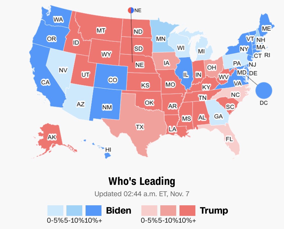
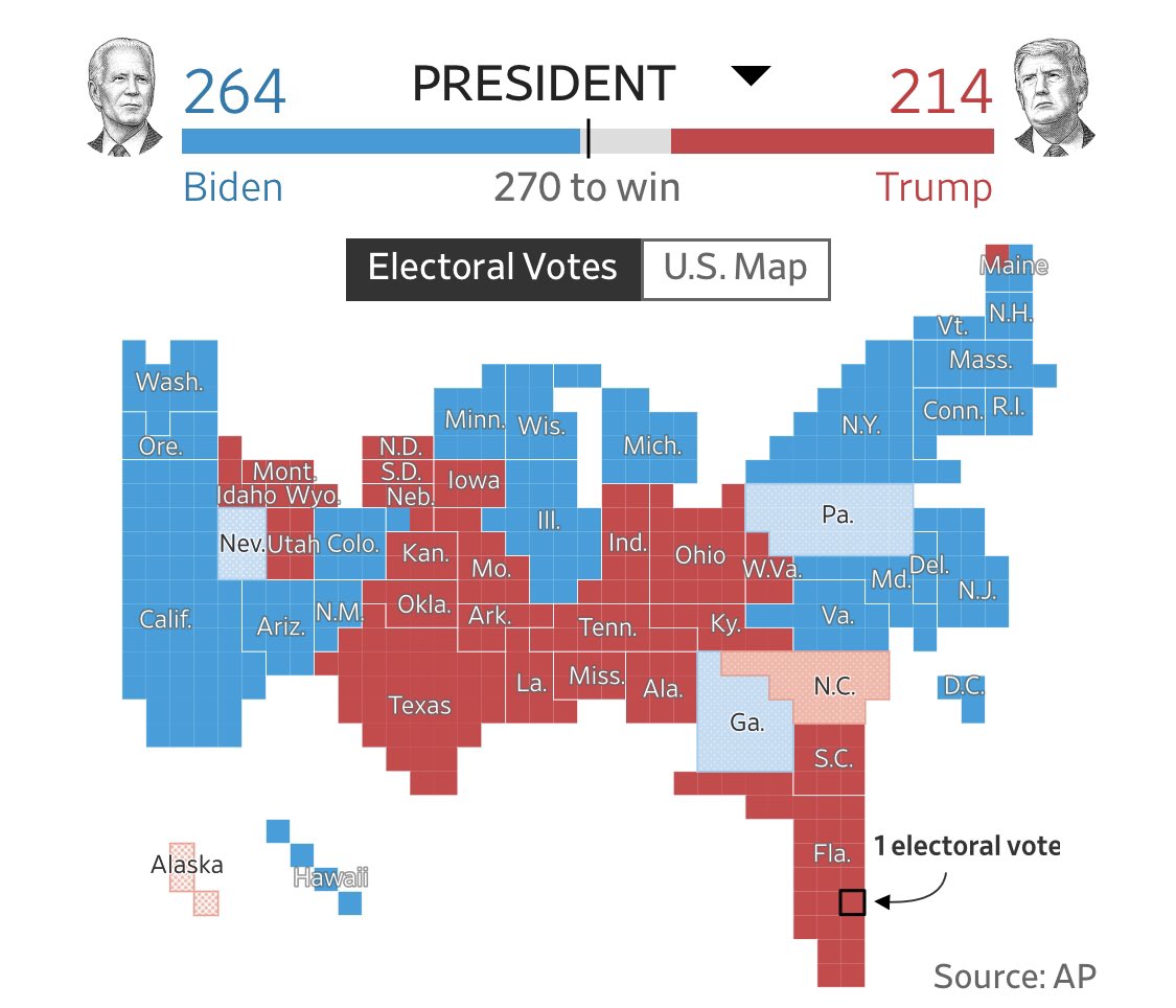
Let’s critique a straight up election map. A map like this can be misleading in two accounts. The first one is variations in population density (people vote, not land).

*Although the US is built on the idea of double majority representing people & land (eg house & senate).
The second problem is that states & counties are not purely red or blue. Texas has quite a few Democrat voters, and New Hampshire is not a strange land for Republicans. /7
A popular map trying to correct the first problem is this one. But this map is far from perfect either. On the one hand, it still binary. In LA county nearly a million people voted Republican, but the map doesn’t show that. /8
The other problem is that by keeping the position of each county, it dilutes red dots in the mountain region of the US. Those dots added together would have a higher visual impact that diluted on the white canvas (our eyes are drawn to the dense areas of the map). /9
So these two maps are quite complementary. The state map is biased towards the red, the county map is better at showing populations, but by using a binary (all red or all blue) representation, and by diluting red dots, it biases blue. /10
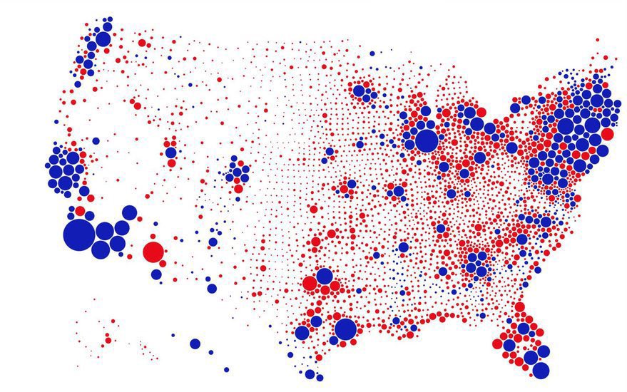
One improvement would be to split each county on a map like this into two circles. One red, and one blue. Showing votes rather than winners (I have not yet seen this version). Still, this would not fix the dilution problem. For that, we need to relax the geographic constrain./11
Once you relax geography you get weird looking maps. This Minecraft style map from the WSJ using one square per electoral college vote is good at condensing the less populated mountain region of the US. Still it is an all red or blue map. /12
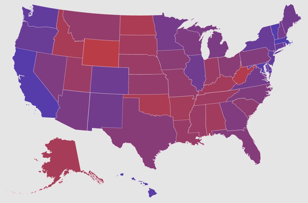
That’s why some advocate for purple, or grey maps, which use diverging color scales. Technically, in dataviz you use a diverging color scale when u are trying to show distance from a middle point (50% in this case). I would advocate here for a neutral white, black, or grey. / 13
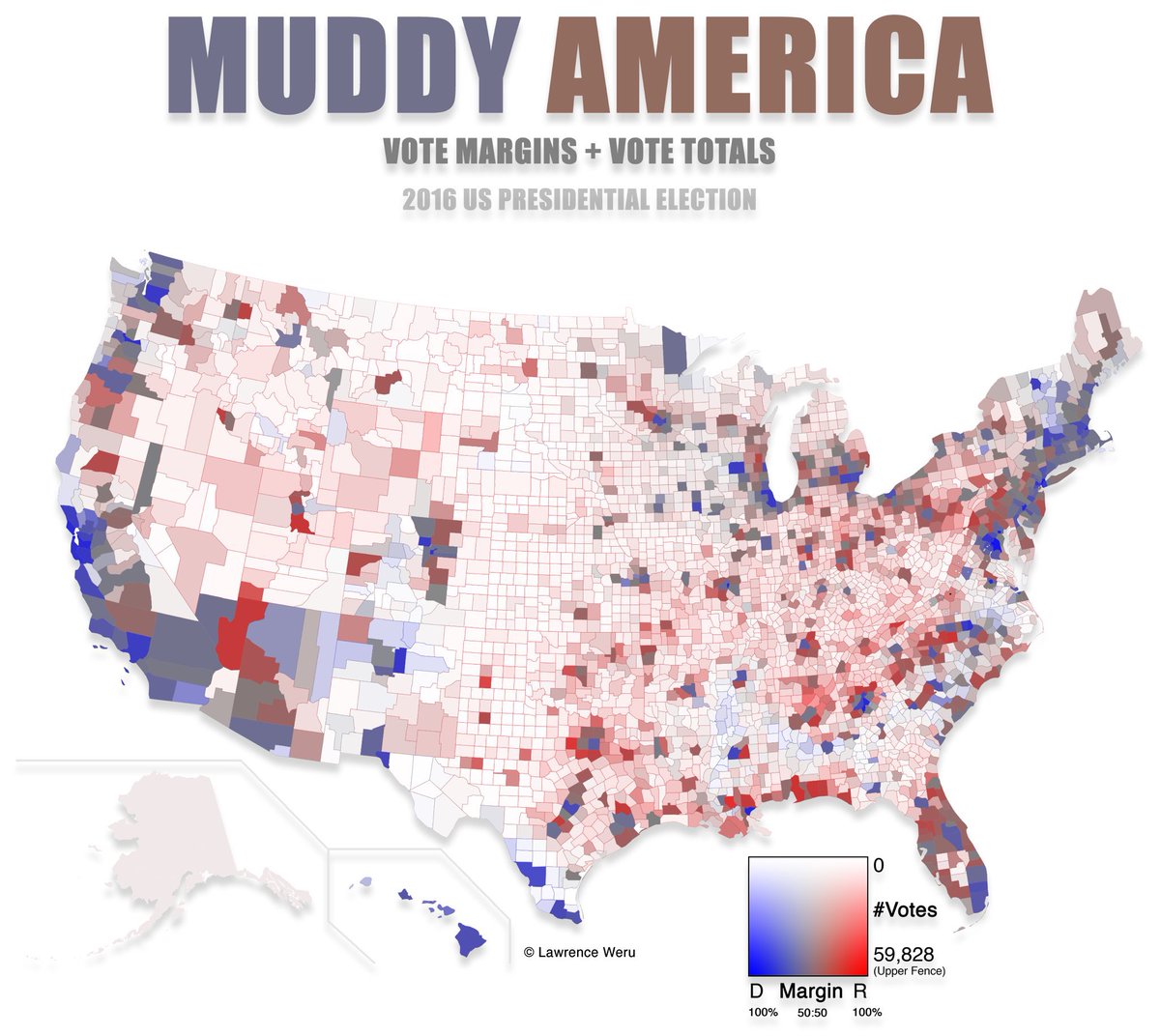
Comparing shades of purple is nearly impossible. But a white with a hint of red or blue is more clearly distinguishable. /14
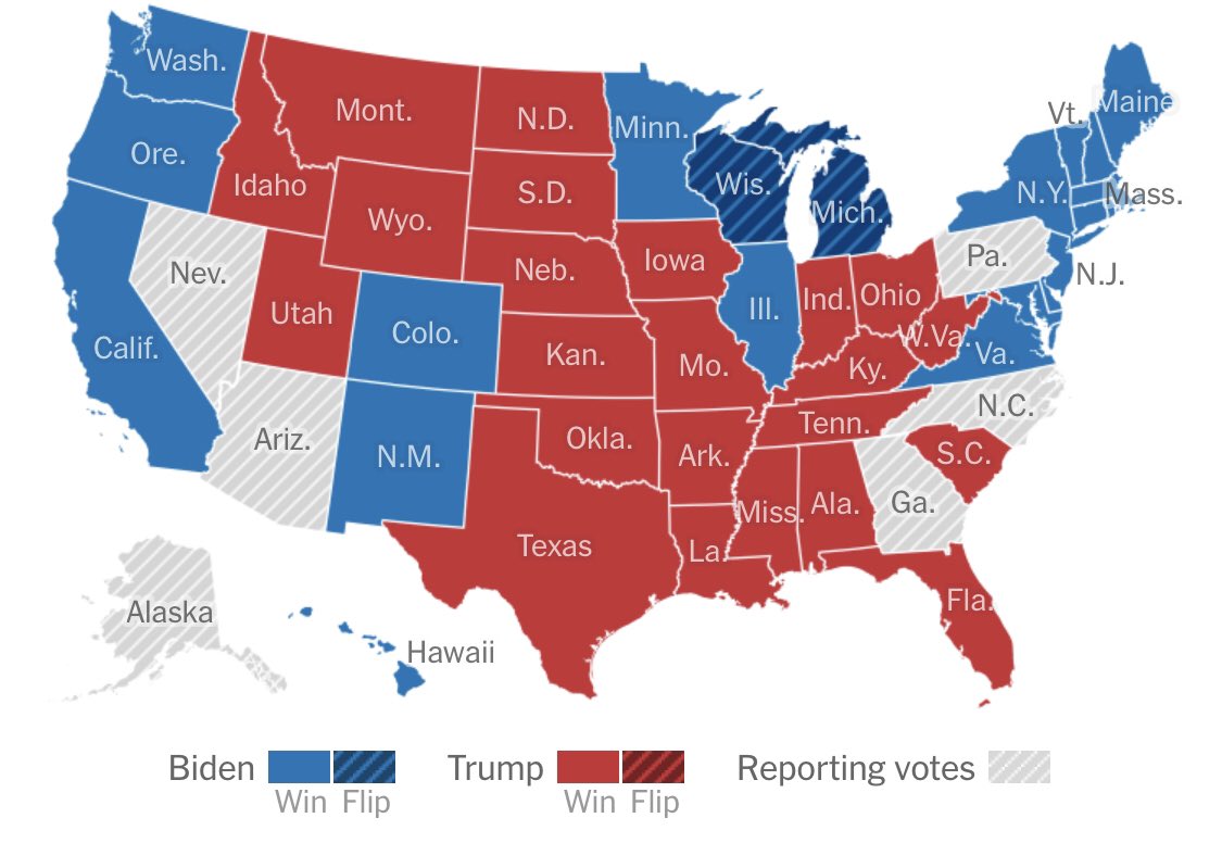
This all to show that maps can get better, but improvements are not perfection. Also, the visual representation depends on what you want to show. If you are counting the color of electoral college votes, you cannot do much better than the WSJ. /15
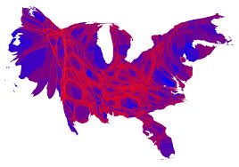
If you want to show people votes, then you need to avoid a straight up red blue divide, by either giving two separate circles to each voting population or using a diverging scale. You also want to condense the mountain region too (like in this 2016 density equalizing map) /16
Making a good map is difficult (every designer knows that you need to iterate multiple times to get a slick design). But the good news is that if you succeed in this challenge you will have something that everyone will want to see 4 years from today. /END

• • •

Missing some Tweet in this thread? You can try to force a refresh
 

Keep Current with César A. Hidalgo

César A. Hidalgo Profile picture

Stay in touch and get notified when new unrolls are available from this author!

Read all threads

This Thread may be Removed Anytime!

PDF

Twitter may remove this content at anytime! Save it as PDF for later use!

Try unrolling a thread yourself!

how to unroll video
  1. Follow @ThreadReaderApp to mention us!

  2. From a Twitter thread mention us with a keyword "unroll"
@threadreaderapp unroll

Practice here first or read more on our help page!

More from @cesifoti

5 Nov
Biden squeezing by to win the 2020 election like...

But in all earnest there are a few lessons we all need to reflect on (thread). 1/
1. The election will leave many people unsatisfied. With 71+ million votes for Biden, and 68+ million votes for Trump, this is the largest number of votes casted in a US presidential election (Biden is the most voted ever). Yet, a 270-268 victory is unsatisfying in two accounts:
It will of course be unsatisfying to the 68+ million Americans who voted for Trump. But those who voted for Biden expected a repudiation of Trump’s government & a landslide win. That didn’t happen. This is America.
Read 9 tweets
17 Oct
Today I am leaving the US.
With my family we are exploring a new life in the south of France.
I’ve been in the US for more than 16 years. I earned my citizenship & experienced many ups & downs. But I am grateful. The US was good to me in many ways ...
/1
I published 3 books & about 60 academic papers. I started a company that employs dozens of people & has clients throughout the world. I ran a lab for 9 years at one of the countries top universities. I was invited to the main stage of Ted and to Davos.
/2
I met millionaires, billionaires, movie stars, & rock stars. I had my work published in “The Times.” I hanged out with Nobel prize winners in their darkest moments. I experienced hype & betrayal. I saw the belly of the beast, from the inside, as I rose, fell, & stood up again. /3
Read 24 tweets
5 Sep
He visto este tuit varias veces. Lamentablemente, la tesis que presenta no es correcta. Holanda es un gran RE-exportador de productos vegetales, y su volumen exportador se explica por logística, no agricultura. Veamos los datos? (1/N) 🧵
oec.world/en/profile/bil…
1. Holanda si exporta muchos productos vegetales (USD 29.4B el 2018, 3ero en el 🌎), pero importa mucho (USD 21.7B, 4to en el 🌎). La población de Holanda no explica este volumen importador. Lo que pasa es que productos agr. entran a granel en los puertos y salen empaquetados.
Por ejemplo, Holanda exporta mas bananas (si, estas que no crecen en Holanda), que Mexico, Honduras, o la Rep. Dominicana! (Belgica es incluso mas bananero) oec.world/en/profile/hs9…
oec.world/en/profile/bil…
Read 10 tweets
2 Sep
La complejidad económica ha sido debatida en Chile las ultimas semanas. Lamentablemente, incluso los expertos entienden poco que es la complejidad o como se mide. Acá un hilo y un artículo aclarando varios malos entendidos. ciperchile.cl/2020/09/01/mit… (1/N)
Mito 1: La complejidad económica es equivalente a la diversificación exportadora.
FALSO!
La complejidad económica es técnicamente perpendicular a la diversificación o concentración de exportaciones.
Mito 2: La complejidad económica es una medida de las exportaciones.
FALSO.
La complejidad económica se ha estimado usando datos de empleo, patentes, salarios, etc. a nivel de municipio o estado para muchos países. Complejidad y exportaciones son cosas muy distintas.
Read 11 tweets
23 Jun
High skill migrants (e.g #H1B visa holders) are an engine of economic growth & innovation. Don't believe me? Here is a thread with some stats...
1. High skilled people are more prone to migrate, so they are hard to get an easy to lose... Image
2. About 40 percent of Fortune 500 companies in America were founded by immigrants or their children.
3. Immigrants account for half of the founders of America’s unicorns.
Read 8 tweets
10 Jun
While people's general understanding of physics is a jump from Newton to Einstein, it is important to understand that there are some very clear intermediate steps. Here, I want to focus on a huge one: Lagrangian and Hamiltonian mechanics (1/N)
Newton's greatest hit was his three laws of motion.
1. Inertia.
2. F=ma.
3. Action and reaction.
The key here is the second law, which allows you to write equations for the motion of things. For a spring ma=kx. For a falling rock ma=mgh.
Newton's equation allows you to connect the acceleration of an object (a=ẍ) with its position (x). If you solve that equation, you get the position in time (x(t)). That's great, but what equation do you need to solve? How do you figure what goes after ma=...?
Read 16 tweets

Did Thread Reader help you today?

Support us! We are indie developers!


This site is made by just two indie developers on a laptop doing marketing, support and development! Read more about the story.

Become a Premium Member ($3/month or $30/year) and get exclusive features!

Become Premium

Too expensive? Make a small donation by buying us coffee ($5) or help with server cost ($10)

Donate via Paypal Become our Patreon

Thank you for your support!

Follow Us on Twitter!