JUST ONE GRAPH IN THE DAILY MAIL - a thread.
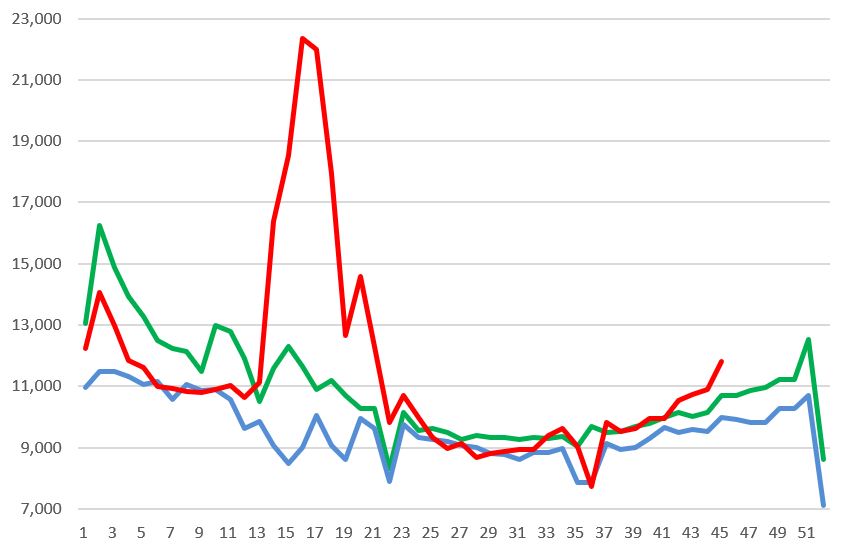
The Daily Mail published this chart. 2 things about it struck me. First, I’d seen the same data from the ONS, which sadly showed excess deaths in recent weeks – in fact higher than any time in the last 5 years. But this chart purported to show just the opposite. First, the Mail:
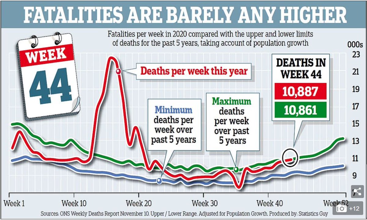
And now the ONS data. It is back above the highest levels we have seen in recent years. Given it is a lagging indicator, it may keep rising for a bit yet.
Second, the source looked very strange. Instead of just “Office for National Statistics", the source says “Statistics Guy”. Strange…
The first clue as to what is going on is that “The Statistics Guy” turns out to be a cranky Covid-denial twitter feed, run by a guy with a cartoon avatar. He advertises things like mass demonstrations against “The Great Reset” (a weird conspiracy theory, don’t ask).
The second clue is in the small print. “Adjusted for population growth”, says the Mail. Hmmm. Given that the last ONS data for UK population is for 2019, and the 2020 number isn’t out till June 2021, clearly these aren’t official stats. What are they assuming?
Cartoon avatar Statistics Guy pops up elsewhere challenging the official statistics and saying the statistics should be “Adjusted for 3.3% population growth????” (his question marks).
We can also see the original chart from Statistics Guy on his twitter (posted 13th November), which is what the Daily Mail have copied exactly. He says he has used “population growth over the past 5 years to amend the upper and lower record for each week”
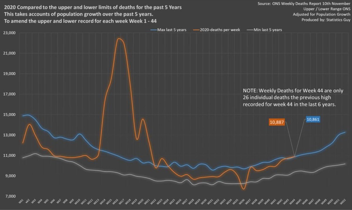
If we look at week 44, which he & the Mail highlight, he shows 10,887 deaths in week 44, which is what ONS have. But the highest it's been anytime in the last 5 years was 10164 in 2019. Statistics guy shows a maximum of 10,861, which appears in the Mail. That's a 6.86% increase.
But of course, there is no way the population has increased by 6.8% in a year. Between 2018 and 2018 it increased 0.54%. If anything we’d expect growth over the last year to be slower because of a near halt to international migration, excess deaths and so on.
It is quite strange that the graph cuts off there. The next week of data had come out on the 17th, and the Mail published on the 20th. But oddly, they chose not to publish the next week of data, which showed excess deaths rising to over 200 a day above the 5 year average. Odd.
Why am I going on about one wrong graph? Because actually it's not just one graph: in fact the papers are filled with a torrent of this kind of thing: “Hey, there’s no real coronavirus problem, we can call just get back to normal”. Sadly, it's just not true.
While everything should be questioned (that's what science is), some of the papers need to apply the same standards to covid-denial content from random people with cartoon avatars that they do to the real scientists and clinicians on SAGE.
The vaccine is coming soon, life will get back to normal. But in the meantime, we need to protect people's lives and health through a difficult winter.

END

• • •

Missing some Tweet in this thread? You can try to force a refresh
 

Keep Current with Neil O'Brien MP

Neil O'Brien MP Profile picture

Stay in touch and get notified when new unrolls are available from this author!

Read all threads

This Thread may be Removed Anytime!

PDF

Twitter may remove this content at anytime! Save it as PDF for later use!

Try unrolling a thread yourself!

how to unroll video
  1. Follow @ThreadReaderApp to mention us!

  2. From a Twitter thread mention us with a keyword "unroll"
@threadreaderapp unroll

Practice here first or read more on our help page!

More from @NeilDotObrien

16 Oct
TAKING THE GREAT BARRINGTON DECLARARTION SERIOUSLY – a thread.
1 or 2 MPs have advocated the ideas in the “Great Barrington Declaration”: that we should get back to normal, go for herd immunity, & try to shield the elderly & vulnerable. Rather than dismiss this out of hand I've tried to crunch some numbers on what it would mean in practice.
First, how many people would need to totally isolate as the virus accelerates through the rest of the population?
Read 25 tweets
7 Sep
Quick thread on our "levelling up" report today & new Taskforce.

Most people know there's a big gap in earnings and incomes between London, the SE & Scotland on the one hand and the rest of the country on the other (map below). But lots turns on how you measure things... (1/15)
My report looks at how subtly different ways of measuring performance can tell VERY different stories about what's happening in different places. (2/15)
For example, if you look at the employment rate for 16-64 year olds, London is in the middle of the pack.

But look at 16+ employment, and London (in red) is zooming ahead - pension age employment is much higher there. (3/15)
Read 15 tweets
6 Mar
Here's a strange thing. Certain types of spending, transport, R&D, housing, culture, are vital to boost productivity. Yet in Britain we spend more on these things in places where productivity is already high. @guymiscampbell and I have a report out exploring why. Thread ahoy!
First, transport. London is the big winner, followed by two other high-productivity places. Between 2007/8 and 2018/19 capital spending on transport in London was around £6,600 per head, nearly three (2.75) times the average in the rest of England (£2,400).
There are multiple reasons for this. Places with strong devolved governments (London &Scotland) have more capacity to bid. We spend a big chunk of the budget on rail, which is a big share of journeys in London, but v small elsewhere. London makes out like a bandit on rail spend:
Read 18 tweets
25 Jun 19
My Spectator piece on why we should put low and middle income families at the front of the queue for tax cuts - a quick thread (1/)

blogs.spectator.co.uk/2019/06/boriss…
Raising Higher Rate threshold benefits a bit over 4 million people.
Raising the starting rate for National Insurance would benefit 32 million people.
Cutting council tax benefits 27 million households.
We must focus on cutting the taxes people on average incomes pay.
(2/)
The CPS, polled the idea of raising the national insurance threshold to £12,000 a year – and found that 76% approved.
In contrast, raising the top rate threshold polls badly. A Populus poll found that 58% of voters said they were against, and only 21% in favour.
(3/)
Read 13 tweets
31 May 19
Here's the argument of my new paper in graph form.

First, after 9 years of difficult decisions, debt is set to fall from 83 to 73% GDP. If we reduce it more slowly or even keep it flat, that unlocks up to £190 billion to cut tax or increase spending over the next 4 years (1/)
But we can't go crazy. We just had a big increase in debt. Britain is an ageing society. Financial repression doesn't cut debt 3-4% every year as in the postwar years. As OBR has pointed out, borrowing costs are more likely to go up than down. OBR debt projection looks scary (2/)
Hence the suggestion in the paper of an expert-led Commission on Sustainable Public Services, running over the next SR period. The solutions to our long term debt problems have been discussed for years, but haven't landed. 2017 election showed how not to do it. (3/)
Read 22 tweets
15 May 19
At PMQs Corbyn claimed we are "seeing the rich get richer while the poor get poorer".

It's literally the other way round - income growth since 2010 has been strongest for poorer households because of record employment + Living Wage + tax cuts. Only fall was in top 10%. (1/)
The whole implication of Corbyn's attack was that inequality has increased. But actually it is down compared to the last Labour government, however you measure it (2/)
I welcome the IFS work on inequality, but there is currently no sign that UK levels of inequality are converging on the US. On World Bank data it looks like they are diverging (3/)
Read 4 tweets

Did Thread Reader help you today?

Support us! We are indie developers!


This site is made by just two indie developers on a laptop doing marketing, support and development! Read more about the story.

Become a Premium Member ($3/month or $30/year) and get exclusive features!

Become Premium

Too expensive? Make a small donation by buying us coffee ($5) or help with server cost ($10)

Donate via Paypal Become our Patreon

Thank you for your support!

Follow Us on Twitter!