Here is the justification document for which regions were placed into each tier from 2 December.
A walkthrough thread.
assets.publishing.service.gov.uk/government/upl…
A walkthrough thread.
assets.publishing.service.gov.uk/government/upl…

This updates the Government's prior systems, documented here:
https://twitter.com/Dr_D_Robertson/status/1321518534724358147
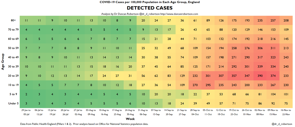
Here's the summary chart.

Data can be found at the Government data site
coronavirus.data.gov.uk
coronavirus.data.gov.uk
and the PHE weekly reports (which lag by a week in order that the latest data can come in).
Here's a commentary on today's:
Here's a commentary on today's:
https://twitter.com/Dr_D_Robertson/status/1332003909389471748
These are summarized in my heatmaps thread here:
https://twitter.com/Dr_D_Robertson/status/1332012737937944576
So, back to the Government's justification for the tiers. It appears to be based on this chart.

It's a complicated chart, so let's take a look. On the x axis (left to right), we have the case rate per 100,000 on 19 November. And on the y axis (up and down), we have the previous week's case rate. And the size of the circles show the rates in over 60s.
Compare this to the @ft analysis originally performed by @carlbaker
https://twitter.com/jburnmurdoch/status/1331951138225188865
The @ft analysis by @jburnmurdoch shows a similar analysis to the circles chart here:
https://twitter.com/jburnmurdoch/status/1331961271323942915
Back to the Government chart

At first glance, it appears that the predominant factor that has been used is the rate per 100,000 population, with tier breaks at around 80 (to go from Tier 1 to Tier 2) and 220 (from Tier 2 to Tier 3).
It is not clear why these levels have been used - for example, we have Slough separated, but Greater Manchester included, as well as Birmingham & Black Country, and North East. Not all of these are Local Authorities. It is unclear why analysis was performed on these.
Previous analysis has been performed at regional level, at Upper Tier Local Authority level, Lower Tier Local Authority level, or MSOA level (LSOAs were used briefly)
This is the heuristic used to allocate 'areas' to tiers.
The thresholds here have not been made clear, nor have how indicators have been mapped to tiers. It is not clear how 'subregions' have been identified.
It would be useful to have more detail on this.
The thresholds here have not been made clear, nor have how indicators have been mapped to tiers. It is not clear how 'subregions' have been identified.
It would be useful to have more detail on this.

We then have detailed proposals (page 9 onwards) for tiers and a justification of recommended tier level.

These were announced in a ministerial statement (which was corrected after question marks were removed from the original statement) questions-statements.parliament.uk/written-statem…
So, my questions:
- why was the analysis carried out (mainly) on upper tier local authorities
- why does North East appear to be grouped
- why is just Slough separated out
- how are the other factors e.g. positivity included
- how is the analysis different from 80/220 tier levels
- why was the analysis carried out (mainly) on upper tier local authorities
- why does North East appear to be grouped
- why is just Slough separated out
- how are the other factors e.g. positivity included
- how is the analysis different from 80/220 tier levels
Compare the North East and South East analyses:
NE grouped into only 2 analysis units
Slough treated separately.
Who decided to use combined authorities for the analysis instead of local authorities? What criteria were used?
en.wikipedia.org/wiki/Combined_…
NE grouped into only 2 analysis units
Slough treated separately.
Who decided to use combined authorities for the analysis instead of local authorities? What criteria were used?
en.wikipedia.org/wiki/Combined_…


And... why were the North East combined authorities (NE Combined Authority & Tees Valley CA) treated as the two NE units for analysis when in the South West the West of England combined authority was split up for analysis?
This seems inconsistent.
westofengland-ca.gov.uk
This seems inconsistent.
westofengland-ca.gov.uk


In order to maintain confidence in the proposed tier system, we need to ensure transparency.
We need to be clear on the weighting of the different criteria *prior* to decisions being made. At the moment, case rates appear to be most important (see boundaries added below)
We need to be clear on the weighting of the different criteria *prior* to decisions being made. At the moment, case rates appear to be most important (see boundaries added below)

We need to ensure that there is consistency in the type of geographical areas used:
- In most cases, local authorities are used
- In the north east, *combined* authorities are used
- but in the south west, a travel-to-work area is used
This can create perceived inequity.
- In most cases, local authorities are used
- In the north east, *combined* authorities are used
- but in the south west, a travel-to-work area is used
This can create perceived inequity.
There should be an objective process for defining these areas otherwise it becomes a political process e.g. Villages story in Telegraph. Risk is JBC is doing calculations on geographical areas that are set politically rather than objectively.

• • •
Missing some Tweet in this thread? You can try to
force a refresh