Ian Miller Profile picture
27 Nov, 6 tweets, 2 min read
So here’s a thread on the sleight of hand that the CDC pulled with their Kansas masks “study”

Mask mandate counties are in black, no masks in orange.

Cases in the mask counties were always higher than in the non mask counties.
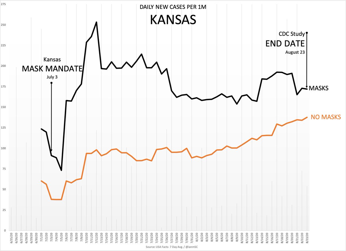
So here’s what they did. Instead of comparing the case rate growth from 7/3 when the mandate started, they chose to start on 7/9, AFTER the masked counties had seen a huge increase.

The 7-day average on 7/3 was 91 per 1M. On 7/9 it was 178 per 1M. They chose to start from 178.
What that allowed them to do was claim a 6% decrease since the mask mandate, because they got to ignore the 96% growth in the first week afterwards, giving themselves a higher baseline to start from
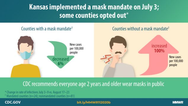
If you take the starting date of 7/3 and the ending date of 8/23, the case rate growth in the masked counties was 89%. If you start on 7/9, it’s a 6% decrease.

See how much fun it is when you choose the beginning and end dates?
So we can do that too, if you choose a start date of 7/3 and an end date of 7/12, cases in masked counties went up 178%, vs. only 158% growth in non-masked counties.
It’s another piece of atrociously bad “science” by an organization that has specialized in that all year

• • •

Missing some Tweet in this thread? You can try to force a refresh
 

Keep Current with Ian Miller

Ian Miller Profile picture

Stay in touch and get notified when new unrolls are available from this author!

Read all threads

This Thread may be Removed Anytime!

PDF

Twitter may remove this content at anytime! Save it as PDF for later use!

Try unrolling a thread yourself!

how to unroll video
  1. Follow @ThreadReaderApp to mention us!

  2. From a Twitter thread mention us with a keyword "unroll"
@threadreaderapp unroll

Practice here first or read more on our help page!

More from @ianmSC

23 Nov
Here are four Arizona counties that are all similar in population, and low density

Two have mask mandates, one never has, and one had all major cities rescind masks ending on 10/21

Since that time, Yuma has had the worst case growth despite masks & Coconino has remained high Image
Mohave and Coconino, which are relatively close, have maintained very similar growth rates, despite Mohave rescinding masks, while Yuma has far outpaced Cochise, despite both being on the Southern side

One city in Cochise has re-instated masks, but it’s not countywide
Here are the demographic breakdowns:

Yuma - Pop: 213,787 / Density: 38 per sq. Mile
Mohave - Pop: 212,181 / Density: 15 per sq. Mile
Coconino - 143,476 / Density: 8 per sq. Mile
Cochise - 125,992 / Density: 20 per sq. Mile
Read 5 tweets
13 Nov
I’ve said it before, I hear every day that masks aren’t working cause people aren’t wearing them…so I wanted to do a thread to show all the states where people aren’t wearing masks

Here we go!

First up is Ohio! No one is wearing masks in Ohio
No one is wearing masks in Michigan either
Let’s look at Utah…yup, no one wearing masks here either
Read 13 tweets
17 Oct
Ashish here, as usual, has no idea what he’s talking about and is in fact…spreading false information.

Here are the charts for the areas that Dr. Atlas referenced.

Maybe Ashish should do some research before posting incoherent junk like this tweet.
Yup, same story here too.
And some more just for fun
Read 5 tweets
2 Aug
Ok so this is a thread, but I wanted to come up with a visual way to see the difference between April in NY & NJ and today in the southern "hotspot states"

So I looked at CDC Provisional Death Counts in those areas. These will change (gray area the most), but it's still useful
I made the Y-Axis values go to the same level (8000) so you can see what happened in the Northeast vs. the south.

While there are population differences, the expected level of deaths in some of the areas are not actually that different from NYC & NJ
So with that said, here's NYC & NJ vs. Florida, which has been "the next NY" seemingly forever. ImageImageImage
Read 6 tweets
26 Jun
So Penn State does a study showing 8.7 million infections in March, which means lockdowns were months too late to matter.

CDC says cases 10x higher than reported, so ~24 million

Which means ~15.3M infections after lockdowns were in place. So uh, they don’t work.
The CDC’s 10x estimate puts iFR at ~0.5%, which is likely still way too high given their estimate is likely low given that it’s based on antibody surveys mostly conducted months ago. Not to mention T-cell immunity.

So yeah, seems like iFR is in the 0.26% range, if not lower
Which also ignores the gigantic age stratification. Wonder why this isn’t front page news!

The CDC seems to be about 2 months behind reality, so maybe there’s some hope that by August they’ll pull the placebo requirement
Read 4 tweets
26 Jun
@AZDHS @AlexBerenson Can you also explain how you repeatedly report more cases than tests in multiple areas?

Can you also explain how none of your positive test percentages make sense or add up?

It’s going to be super fun when you’ve reported 9-10 million cases of Covid with a population of 6.8M
@AZDHS @AlexBerenson It’ll be great, you’ll have 15,000 Covid hospitalizations with 7,800 hospital beds, hospitalization use will be at 85% and none if it will make any sense. Which is consistent with every single act of data of reporting you’ve done so far.
@AZDHS @AlexBerenson You could also explain how your antibody test percentage is 3% when you’ve already reported cases for ~1% of the total state population.

That means you’ve only missed ~2% of the cases in the state, which is literally impossible.
Read 5 tweets

Did Thread Reader help you today?

Support us! We are indie developers!


This site is made by just two indie developers on a laptop doing marketing, support and development! Read more about the story.

Become a Premium Member ($3/month or $30/year) and get exclusive features!

Become Premium

Too expensive? Make a small donation by buying us coffee ($5) or help with server cost ($10)

Donate via Paypal Become our Patreon

Thank you for your support!

Follow Us on Twitter!