
.@CDCgov - Why is your upper bound threshold for deaths less in 2019 than in 2020? This is extremely fishy to me.
It's overall 2.3% less for the same periods in 2019 vs 2020 or ~63k.
It's overall 2.3% less for the same periods in 2019 vs 2020 or ~63k.
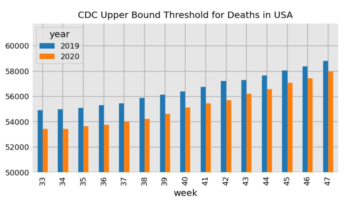
For those who want an explanation. The CDC uses this chart to estimate excess deaths, but the upper bound threshold in 2020 is 2.3% lower than it was for 2019. US population is growing.
cdc.gov/nchs/nvss/vsrr…
cdc.gov/nchs/nvss/vsrr…

The threshold grew 2.4% from 2018 to 2019 and about the same from 2017 to 2018.
This totaled threshold in millions for the first 47 weeks is:
2018: 2.67
2019: 2.74
2020: 2.67
This totaled threshold in millions for the first 47 weeks is:
2018: 2.67
2019: 2.74
2020: 2.67
If 2020 threshold grew by ~2% then then the 2020 current threshold would be at 2.8 million or 130k.
The current actual estimated deaths in 2020 is 2.91 million or only 110k above the 2.8 million threshold and NOT the 240k above the current CDC threshold.
The current actual estimated deaths in 2020 is 2.91 million or only 110k above the 2.8 million threshold and NOT the 240k above the current CDC threshold.
I would love an explanation @CDCgov! Thanks!
• • •
Missing some Tweet in this thread? You can try to
force a refresh


