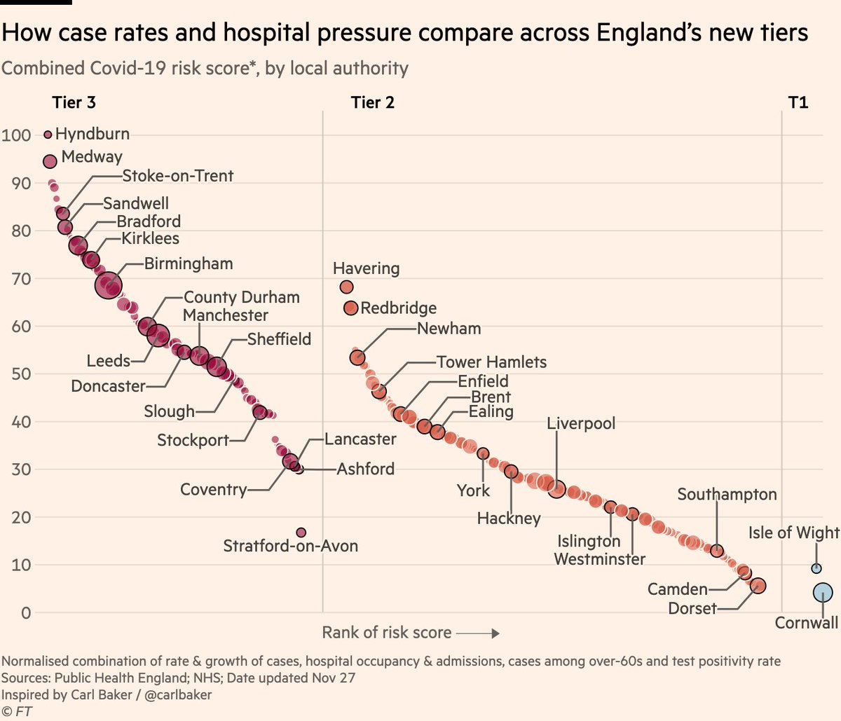
NEW: it’s expected (but not yet confirmed) London will go into Tier 3 when England’s Covid restrictions are reassessed next week, so what do the data show?

Let’s dig into all 6 metrics the govt is using.

First, new case rates:
• High in much of London, well into old T3 levels Image
But with cases, *growth rate* is also a key consideration, and this could be the big one for London.

Rates are rising in the vast majority of London boroughs, increasing by 50% per week in many places, and rising faster than almost all current Tier 3 areas. Image
Sticking to cases, government is also looking at rates specifically among those aged 60 and over.

As with the pattern in the general population, London boroughs send that Tier 2 slope steeply upwards on the left, with case rates among the 60+ well into former Tier 3 territory. Image
And lastly on cases, we can look at percentage of tests coming back positive, to make sure patterns in cases are not just reflecting different levels of testing.

Similar picture again: in several London boroughs more than 10% of tests are positive. These are concerning levels. Image
Next, we know pressure on hospitals is another important factor. First up, rates of new admissions.

London’s rising cases are a relatively recent development, so most are yet to feed into hospitals, but regrettably they will start appearing in these numbers soon. Image
And finally, we can look at total numbers of Covid-19 patients in hospital beds.

Again, London boroughs are generally some way below the national average here, but the rising trend in cases will begin pushing them up the rankings. Image
To conclude, cases and positivity are high and rising in much of London. Hospital pressure in the capital is not *yet* a concern, but it will be if those growth rates do not change.

Considering all of that together, it’s understandable that London is being considered for Tier 3.
In the spirit of transparency, here is all of the data used in these charts: docs.google.com/spreadsheets/d…

And finally, credits to @carlbaker for the chart concept, and to @VictimOfMaths for the methodology of allocating hospital data to local authorities.

• • •

Missing some Tweet in this thread? You can try to force a refresh
 

Keep Current with John Burn-Murdoch

John Burn-Murdoch Profile picture

Stay in touch and get notified when new unrolls are available from this author!

Read all threads

This Thread may be Removed Anytime!

PDF

Twitter may remove this content at anytime! Save it as PDF for later use!

Try unrolling a thread yourself!

how to unroll video
  1. Follow @ThreadReaderApp to mention us!

  2. From a Twitter thread mention us with a keyword "unroll"
@threadreaderapp unroll

Practice here first or read more on our help page!

More from @jburnmurdoch

14 Dec
NEW: the latest UK data is out, and it’s not good.

London is into Tier 3, but that’s only a small part of the wider story of UK’s looming Covid winter.

Case rates rising fast in London, SE & E, but also now rising in Midlands, NW and SW, and decline has halted in NE. Image
Regrettably, it’s also clear only tough restrictions suppress transmission.

During national lockdown, case rates either went from rising to falling, or from falling slowly to fast, in all English regions.

Since restrictions eased, all declines have either flattened or reversed. Image
The picture in Wales is even more stark:

During the 17 days of their "fire-break" lockdown, the weekly case rate fell from 295 per 100k to 184. In the first 17 days after restrictions eased, it rebounded to 301.

In the 6 days since then, the rate has increased by 45% to 440. Image
Read 15 tweets
9 Dec
NEW: could London be set for Tier 3?

@JasmineCC_95 has the story, and I’ve had a look at the latest data ft.com/content/34fda7…

The picture isn’t as clear-cut as one might think, so here’s a short thread on the key details:
At first glance, it seems pretty clear that London should go into T3. Overall, London case rates are currently roughly at the T3 average, with several boroughs showing rates that would be high even in the top tier.

but ... Image
... the question is not necessarily how case rates compare between the tiers *now*, but how current rates compare to *when tiers were introduced*

On that basis, London as a whole is still at very low end of T3 when it came in (grey circles), and most boroughs exceptionally low Image
Read 6 tweets
9 Dec
NEW: quick chart & thread to clear up some confusion following @Peston’s digging into ONS modelled estimates:

It’s true that ONS modelled incidence series has issues, and the revisions can provoke doubts.

BUT that doesn’t mean gov was flying blind when it announced 2nd lockdown
Let’s set aside that ONS series, and instead look at:
• Imperial REACT study
• Covid symptom tracker
• ONS’s model-free weighted estimates (not subject to revisions)
• The dashboard
Each as it stood when lockdown was announced.

All pointed to rapidly increasing infections
tl;dr

The way ONS models incidence can a) give a misleading shape to recent days of the outbreak, and b) cause confusion where estimated prevalence is retrospectively altered.

But there’s no doubt the virus was spreading rapidly in late October when lockdown was announced
Read 6 tweets
1 Dec
Couldn't agree more with this, from a recent @ChrisGiles_ story on economic literacy in the UK ft.com/content/938212…

Our job is to communicate clearly to people. If they are confused, that's on us much more than on them. Image
And no, this doesn't mean we should change our definition of things like unemployment and GDP to match what people [mis]understand, but it does mean we should provide explainers if we're using these terms when speaking to a mass audience.
It's the same in #dataviz. If someone doesn't understand my chart, that's mainly on me.

This is why we always included log scale explainers when sharing our trajectory trackers, for example.

We're hear to communicate, not to make pronouncements from on high and then walk away.
Read 4 tweets
27 Nov
NEW: here’s the definitive chart on which parts of England have been hard-done-by or "let off" by the new tiers.

This one combines all the metrics the govt says it’s using:
• Cases (overall rate, rise or fall, and over-60s)
• Hospital occupancy & admissions
• Positivity rate
In summary:
• Tiers seem correct for majority of places. All high-risk areas are in highest tier
• "Harsh" decisions like Stratford typically areas whose neighbours have high risk
• Outer London has been "let off", but difficult to have outer & inner London in different tiers
The question some might ask is:

If places like Stratford were bumped up a tier because of high risk in surrounding areas, why was inner London not bumped up to tier 3 where parts of outer London appear to belong?

I think there are valid reasons, but it’s worth pondering.
Read 5 tweets
26 Nov
NEW: here’s how England’s restriction tiers have changed from pre-lockdown

Tier 3 now runs from coast to coast across most of the north, plus Bristol, Kent & Slough.

Almost everywhere else is in Tier 2, except Cornwall, Scilly and Isle of Wight.
Some places might feel hard done by:

Inspired @carlbaker’s brilliant charts, here is a comparison of the latest case rates across areas in each tier.

👀 several outer London boroughs (Tier 2) have higher rates than places in Tier 3, such as Manchester, Leeds and Sheffield
Here’s our story: ft.com/content/62b566…
Read 4 tweets

Did Thread Reader help you today?

Support us! We are indie developers!


This site is made by just two indie developers on a laptop doing marketing, support and development! Read more about the story.

Become a Premium Member ($3/month or $30/year) and get exclusive features!

Become Premium

Too expensive? Make a small donation by buying us coffee ($5) or help with server cost ($10)

Donate via Paypal Become our Patreon

Thank you for your support!

Follow Us on Twitter!