NEW: the latest UK data is out, and it’s not good.
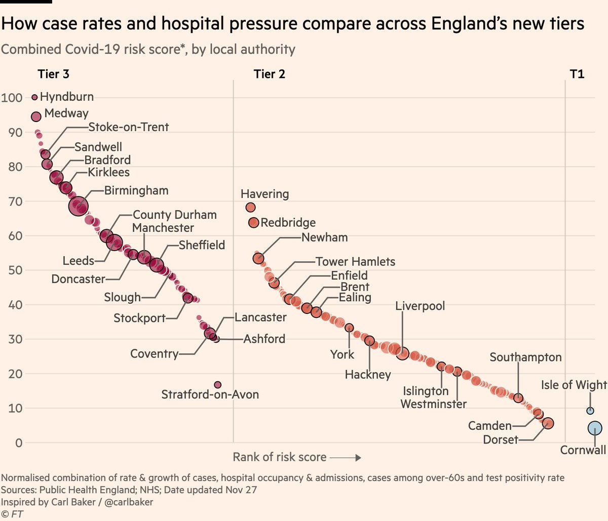
London is into Tier 3, but that’s only a small part of the wider story of UK’s looming Covid winter.
Case rates rising fast in London, SE & E, but also now rising in Midlands, NW and SW, and decline has halted in NE.
London is into Tier 3, but that’s only a small part of the wider story of UK’s looming Covid winter.
Case rates rising fast in London, SE & E, but also now rising in Midlands, NW and SW, and decline has halted in NE.

Regrettably, it’s also clear only tough restrictions suppress transmission.
During national lockdown, case rates either went from rising to falling, or from falling slowly to fast, in all English regions.
Since restrictions eased, all declines have either flattened or reversed.
During national lockdown, case rates either went from rising to falling, or from falling slowly to fast, in all English regions.
Since restrictions eased, all declines have either flattened or reversed.

The picture in Wales is even more stark:
During the 17 days of their "fire-break" lockdown, the weekly case rate fell from 295 per 100k to 184. In the first 17 days after restrictions eased, it rebounded to 301.
In the 6 days since then, the rate has increased by 45% to 440.
During the 17 days of their "fire-break" lockdown, the weekly case rate fell from 295 per 100k to 184. In the first 17 days after restrictions eased, it rebounded to 301.
In the 6 days since then, the rate has increased by 45% to 440.

Like clockwork, this resurgence is feeding through from cases into more serious metrics.
Numbers of Covid patients in hospital are rising — and accelerating — in London, SE, E & Wales, also appear to be rebounding in Midlands.
UK occupancy could easily pass mid Nov peak again.
Numbers of Covid patients in hospital are rising — and accelerating — in London, SE, E & Wales, also appear to be rebounding in Midlands.
UK occupancy could easily pass mid Nov peak again.

And this is far from a uniquely British phenomenon.
Right across Europe, declines have stalled. Positivity rates were falling in Italy, France and Austria; not any more.
They were falling fast in Belgium & the Netherlands, but are now barely falling at all.
Right across Europe, declines have stalled. Positivity rates were falling in Italy, France and Austria; not any more.
They were falling fast in Belgium & the Netherlands, but are now barely falling at all.

Again this is feeding into other metrics:
Hospital occupancy rising again in UK as a whole, and stopped falling in Netherlands.
Hospitals had emptied before autumn wave, but far from empty now. Christmas resurgence would be starting race with the virus already half a lap ahead.
Hospital occupancy rising again in UK as a whole, and stopped falling in Netherlands.
Hospitals had emptied before autumn wave, but far from empty now. Christmas resurgence would be starting race with the virus already half a lap ahead.

All of this puts the UK in a very uncomfortable position. In 9 days time, restrictions will be waived to allow households to gather for Christmas.
Data from the US shows that infections surged after Thanksgiving, with growth rates hitting their highest levels since March (!)
Data from the US shows that infections surged after Thanksgiving, with growth rates hitting their highest levels since March (!)

If the UK (or indeed any other European country) sees a marked uptick in household mixing, case are going to rise.
If cases rise among vulnerable populations, hospital beds will fill again, and will start from a much higher base than they did in either March or September.
If cases rise among vulnerable populations, hospital beds will fill again, and will start from a much higher base than they did in either March or September.
I, like many, want to gather with family at Christmas. But this is going to be really tough.
Resurgence isn’t just a London thing. It’s not just a UK thing. It’s a seasonal thing, and a restrictions-have-been-relaxed thing.
We’ll all have to make tough decisions in coming weeks
Resurgence isn’t just a London thing. It’s not just a UK thing. It’s a seasonal thing, and a restrictions-have-been-relaxed thing.
We’ll all have to make tough decisions in coming weeks
Another area where tough decisions will have to be made, is schools.
Case rates among children and the student-age population have risen especially steeply in recent weeks.
Thus far, they’re lower and rising more slowly among the elderly. Household mixing could threaten that.
Case rates among children and the student-age population have risen especially steeply in recent weeks.
Thus far, they’re lower and rising more slowly among the elderly. Household mixing could threaten that.

But the data on the role of schools in outbreaks is far from conclusive.
In most European countries, reopening schools in the spring did not spark a resurgence. In the autumn, most countries halted and reversed their outbreaks while keeping schools open.
In most European countries, reopening schools in the spring did not spark a resurgence. In the autumn, most countries halted and reversed their outbreaks while keeping schools open.


The difference now may be that with only a week or so of term remaining, decision-makers could feel the trade-off between the negatives of closed schools for kids, and the positives of reduced transmission for the vulnerable, has shifted.
Final thoughts:
I’m skeptical London resurgence due to new strain.
Strain was already known and not noted as unusually infectious. Could still be true, but UK resurgence is widespread. What of Wales?
Occam’s razor says resurgence due to relaxed restrix
I’m skeptical London resurgence due to new strain.
Strain was already known and not noted as unusually infectious. Could still be true, but UK resurgence is widespread. What of Wales?
Occam’s razor says resurgence due to relaxed restrix
https://twitter.com/firefoxx66/status/1338533710178775047
US is also in for a tough winter.
Numbers of Covid patients in hospital beds are currently rising in 36 states, and the rate of increase in accelerating in 13 of those.
Credit as ever to the wonderful folks at @COVID19Tracking for putting together this data.
Numbers of Covid patients in hospital beds are currently rising in 36 states, and the rate of increase in accelerating in 13 of those.
Credit as ever to the wonderful folks at @COVID19Tracking for putting together this data.

Links to some stories for further reading:
• Yesterday @VJMallet & @GuyChazan wrote in depth on Europe’s challenge in avoiding a Christmas resurgence ft.com/content/83c24e…
• Last week we wrote about the best evidence of schools’ roles in outbreaks ft.com/content/7e1ad5…
• Yesterday @VJMallet & @GuyChazan wrote in depth on Europe’s challenge in avoiding a Christmas resurgence ft.com/content/83c24e…
• Last week we wrote about the best evidence of schools’ roles in outbreaks ft.com/content/7e1ad5…
• • •
Missing some Tweet in this thread? You can try to
force a refresh