The ESRB & the @EBA_News published their macro scenario for the upcoming bank stress test. What does it look like? Will it finally be credible? And how important will the results be? A thread
Those are important questions, because investors have shrugged the results of the previous tests. Except for distressed banks (e.g. MPS), the results were almost useless – even the EU court of auditors heavily criticized the process.
One criticism often made is that the tests are not severe enough. The comparison with US/UK tests illustrates this (CET1 drawdowns). Of course, there can be good reasons for differences, and u can’t make a stress knowing the outcome you want…but it’s still dubious
Maybe because of the critics, this time the ESRB went all in: it’s hard to compare the GDP scenarios because this time it comes after a -7.3% recession in the EA, but here’s what the cumulated drop looks like in the new EBA scenario (including the 2020 drop). This is massive.
Another way to see this, is that it is a -12.9% deviation from the baseline, vs. -7.8% in 2018 or -7.9% in the Pre Covid 2020 scenario. The fact that it drags on for many years is also extremely important in loan loss modelling.
The other metrics are also very harsh: peak unemployment at 12.4% (vs. historical peak at 12%, and 10.3% in the EBA 2018 test), commercial real estate at -30.9% (!!!) vs. -17.7% in EBA 2018 and -23% in the ECB 2020 desktop stress.
Importantly, loan losses on CRE are not linear, because most lenders have 60%-70% LTVs, so when you start to touch that 30% drawdowns, it gets ugly very quickly…
Sovereign risk should not be too much of a headache: we’re looking at the same kind of spread widening for Spain or Italy as in 2018, and banks have increased their share of the book which is not marked to market.
On a country-by-country basis, honestly it’s ugly everywhere…except Ireland. It’s the only country for which assumptions are better than in SSM desktop test, both for GDP and unemployment.
For Aust, Ita, Ger, Neth both scenarios are worse, and for Spa, Fra, Bel & Port GDP is worse and UE a bit better.
What’s the bottom line of all this? In its desktop test, the SSM had approx 200bps of provisions in the base case and 400 in the adverse. Extrapolating suggests we’ll have around 500bps in this test.
Adding a more severe market risk (was -130bps CET1) suggest the average CET1 drawdown could be around -700bps. Comparing with the 2018 results gives a pretty clear view on which banks could show poor outcomes.
Will this ultimately have an impact in real life? A handful of banks could struggle to show they have enough capital in a stress test (precautionary recapitalization anyone?) but more importantly, this could mean that the SSM keeps playing hardball on dividend for some time…
Hey, @WSBChairman, honestly, I don’t know where you can find DeeperF***Value than here!!!
• • •
Missing some Tweet in this thread? You can try to
force a refresh
I wanted to wait for a few Spanish banks to report b4 sharing something intriguing. By now, you all know that the name of the game in EU banking is that there are simply no new NPLs because everything is deferred (government schemes, payment holidays). But is that always true?
And we all want to know what’s going to happen when reality kicks in. Interestingly, there’s one Spanish bank which apparently decided to stop pretending. If you take a casual look at it, you won’t see anything, because their NPL ratio hasn’t moved much - it's even going down
But that’ only because they did a big sale. The gross NPL entries are far more interesting - those are the real new default/NPL. And we can the first big jump since Covid.
That's a +125% rise over the past 6 quarters average.
A thread on the German data on the efficiency of the AstraZeneca vaccine because I’m reading a lot of VERY bad takes. Is there any kind of statistical significance on the 6.9% efficiency? Is it total crap? It’s not that simple as I’ll try to show.
First of all, forget the absurd “Confidence interval” – it’s useless and based on assumptions that are almost by definition false. So let’s look at this problem differently.
The basic data is this 5829 ppl in the control group, 5807 in the vaccine group, of which 319 and 341 above 65. But the major problem is this: the control group had only case over 65 (101 in total). What is the implication of this surprising number?
Paul has a funny question, so let's look at the epic short squeezes and artificial market cap created. You're in for a few surprises. 1st, we're all talking about GameStop.
Chart is for Frankfurt trading. Mkt Cap 15bn€, so +14.7bn€ since the meteoric rise.
Some of you probably remember the epic Volskwagen short squeeze created by Porsche. Full story there ft.com/content/0a58b6…
Nice chart, hey ! Price at 714€, that's 269bn€ created ! WOW.
But there is BETTER
And now we turn to my favorite babies, EU banks. Meet Bankia: it was put into "resolution" and hybrids converted 2 equity b4 the IPO. For some reason there was a massive short squeeze before hybrids could sell.
From 140 to 1.3 that's 428bn€ of paper money!
But there's BETTER
Cyprus is truly a fascinating country. Have you heard of the ESTIA scheme? What is happening there is extraordinary. A quick thread.
The general idea of the scheme is great! The purpose is "to deliver a socially acceptable and financially sustainable restructuring solution to vulnerable borrowers who have mortgaged their primary residence".
Indeed, that sounds like a great idea. But how ?
Very straightforward.
"The government subsidizes part of the repayment instalments by 1/3 of the restructured loan."
It took me a while to write this thread about the ECB’s Financial Stability Review, but that is because (thanks to @michaelsteen and his great team), I got clarifications on some important points.
A lot has been said already, so I’ll try to focus on items which are not obvious.
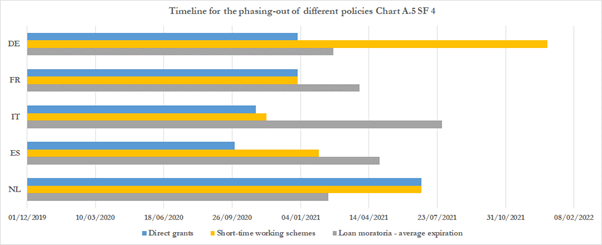
On the macro front, I will just mention this chart, which looks at the phase-out of measures I believe are the most important for GDP/Banks: in the periphery Spain looks better than Italy, in Core, Germany is stronger.
But there are dozens of other interesting charts in the report, there is just no point reproducing them here. Let’s look at banks, now.