
It took me a while to write this thread about the ECB’s Financial Stability Review, but that is because (thanks to @michaelsteen and his great team), I got clarifications on some important points.
A lot has been said already, so I’ll try to focus on items which are not obvious.
A lot has been said already, so I’ll try to focus on items which are not obvious.
On the macro front, I will just mention this chart, which looks at the phase-out of measures I believe are the most important for GDP/Banks: in the periphery Spain looks better than Italy, in Core, Germany is stronger. 
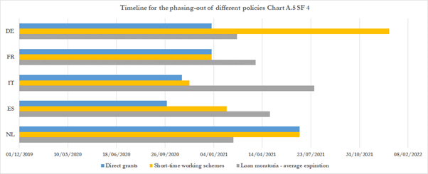
But there are dozens of other interesting charts in the report, there is just no point reproducing them here. Let’s look at banks, now.
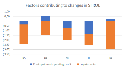
First, what happened to profitability with Covid. This chart is worrying for Italy: ITA banks took less impairments but had a huge drop in operational profits. Spain looks positioned to rebound much better. 
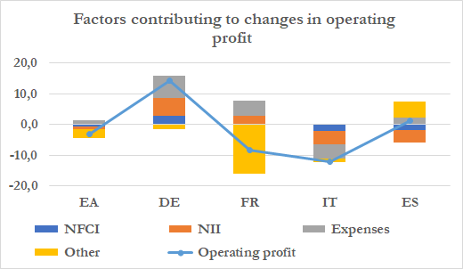
Some more granularity suggests that ITA banks have a BIG cost problem. Everywhere else, costs contributed >0 to changes in ROE. I do not see how they can escape a big M&A wave. Also very important: NII is improving in the core, not the periphery. Who is the ECB really helping? 
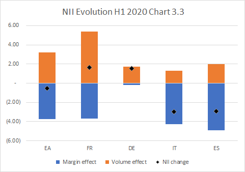
Well, this tells you the story: French & German banks have the capital to take on more volumes, ITA/SPA less so, and the margin effect is horrible everywhere. That’s negative rates for you… except in Germany, where I suspect recent ECB policy had a big impact. 
Let’s move to provisions now. The BIG unanswered Covid question is this: have banks provisioned enough or have they provisioned just what’s necessary to protect their share price? The ECB would certainly disagree with what I’m going to say, but hear me out.
They split banks in 4 groups: US listed banks, Euro listed banks, Euro SI in countries that had a major crisis and other Euro SI. Which ones would you say are more likely to book only provisions that make them look good?
If you’re cynical like me, you’d say the ranking is (from more likely to less likely) “Euro listed banks, because share price / stock comp, then Euro SI, then Euro SI which already faced a big shock so they’re more cautious, then the US because they have stricter rules”.
Well, guess what? The R^2 of provisions vs. pre provision profits is 52% for Euro listed banks vs 1.6% for US listed banks…and the R^2 ranking is exactly as expected (14.6% and 19%). 

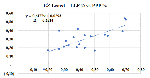
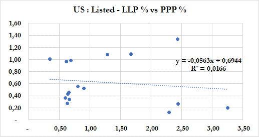
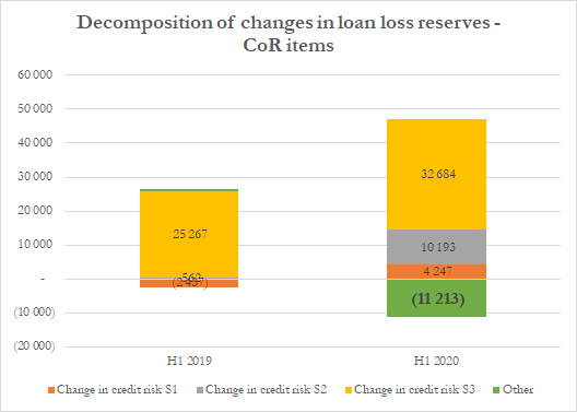
Weird, huh? Well, here’s another strange one. The ECB gives a split of loan loss reserves changes. Here is what goes into cost of risk (i.e. ex. BS changes.) 11bn€ is a hell of a lot of “Other negative provisions”, i.e. positive P&L. Especially as it’s mostly “model changes” 
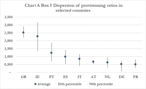
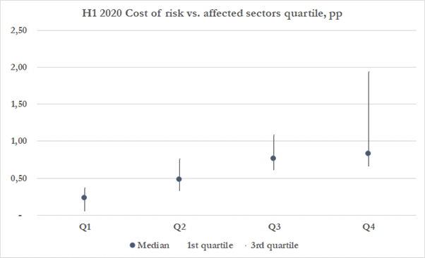
Th ECB has a few charts showing dispersion in provisioning, depending on the countries and shares of most affected sectors. I’m not a big fan of that huge bid ask on Portuguese banks – I mean, they all have more or less the same business model! 
The chart per sector is also an important confirmation that NACE codes are what matters today, but also that inside the “affected sectors”, there is a huge possible range. Like I said in earlier threads, I think e.g. the risk on manufacturing is exaggerated. 
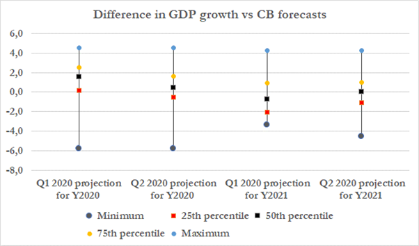
If you’re trying to guess if dividends are going to be authorized, I have another interesting chart for you: how have macro scenarios changed over time. Setting aside the outliers, one can see that the “normal” range for 2021 was around 1% in Q2. I suspect it’s even narrower now 
Apart from macro assumptions, what else can we learn from the FSR regarding future provisions?
Let’s start with corporate loans. First there is this chart about moratorium. 13.5% NFC in moratorium is a LOT more than the 9% calculated by the EBA.
Let’s start with corporate loans. First there is this chart about moratorium. 13.5% NFC in moratorium is a LOT more than the 9% calculated by the EBA.
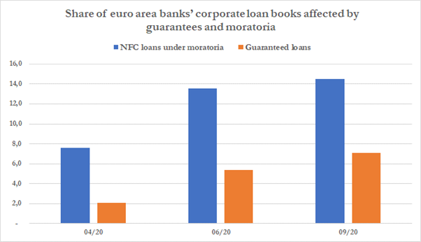
The ECB kindly explained the reasons for the difference – which I still find huge and shows that there’s a big country bias in those numbers. Unfortunately, I can’t really share more, but clearly we won’t switch from 13.5% of business not paying to 0 without some losses.
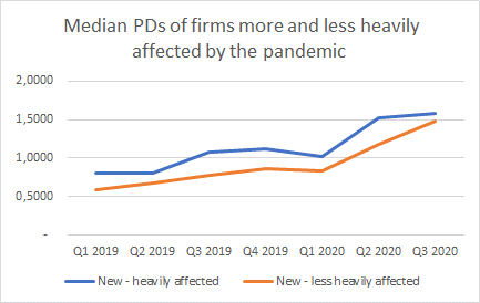
This chart is also key: it shows 1y probabilities of default for new loans. That’s a substantial increase, we’re talking +50%/+70%! 
Now, what is weird is when you compare with what the EBA publishes in terms of the PD used by banks in their internal models. Here are a few countries, with the %increase in PD at the right. This is not even remotely the same order of magnitude (and sometimes sharply negative). 
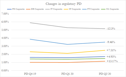
The huge discrepancy between the banks’ and the supervisors’ view on future NPL is a bit clearer now… and this also shows that maybe the countercyclical design of internal models has been a bit exaggerated…
What about household losses? This chart is almost miraculous: it shows the household debt to GDP ratio vs. the size of furlough schemes. It’s almost as if government perfectly sized and coordinated their measures ! (yeah, I know, hard to believe in the EU.) 

Obviously, one can plot the residues to that regression & find the countries that do not have enough employment support: that’s where the risk is on household debt : Spain & the Netherlands do not look good (but NL is biased because the structure of HH debt is weird there.) 

Last interesting topic, bank capital. Over H1 2020, bank capital has been stable. Why? Simply because of Quick Fix, i.e. changes in some regulatory treatments, bank guarantees… and weird models. Below: risk weight density accounts for +1pp. 
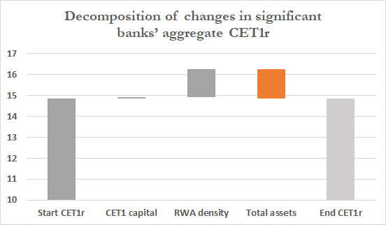
But on average, Quick Fix only explains approx. 40bps. Guarantees explain 13bps. So we are left with approx. 50bps explained by… actual lower risk? Seriously? I think we can all agree that RWAs should go up soon... this simply does not make sense. 
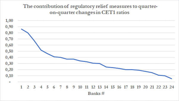
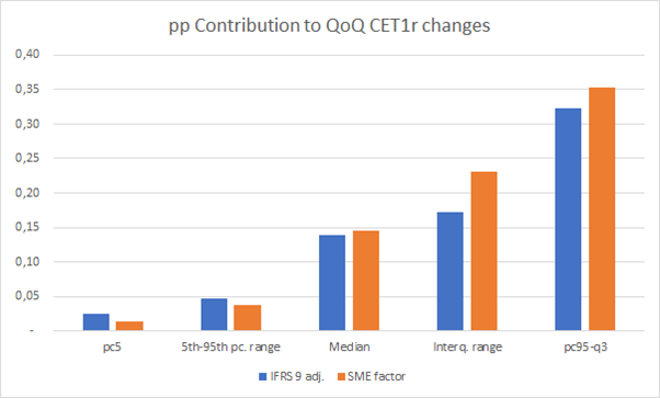
The Quick Fix impact is approx. evenly split between IFRS 9 transitional measures and lower risk weights on SME lending (which is crazy of you ask me.) 
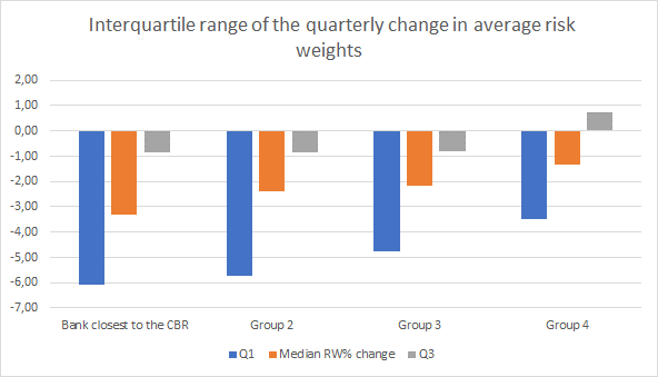
A bit worrying, is the fact that the worse the capital situation of the bank, the more it relied on lower risk weights. Honestly, if you are in the bottom left corner of that chart, it does not look good at all. And it clearly indicates some model fudging is going on. 
There’s been a lot of debate abt what the unwinding of support policies will do to CET1. This chart is particularly of concern: on the face of it, it suggests CET1 will continue to benefit until Q1 2021 (+104bps from Q3 2020!) & ultimately the 250bps CET1 support will disappear 
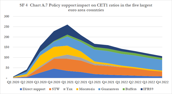
But if I’m honest I’m struggling with this chart. It’s mostly based on macro-economic models and I don’t think it’s a genuine description of what will actually happen. I also don’t know what it looks like beyond 2022.
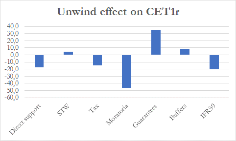
I’d also point out that the CET1r change over the Q3 2020 – Q4 2022 period is only 50bps… so not a big deal. And it’s mostly explained by moratoriums phasing out (& a bit of IFRS9 which is mechanical), which makes sense. 
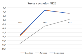
I think the stress scenario included in the FSR is a more relevant way to assess what’s going to happen. For various reasons, the adverse scenario does not appear hugely interesting (if only because of the vaccine!) so I’ll focus on the baseline.
The baseline is actually important, because the GDP scenario is almost an exact copy of the current consensus! So, if the consensus is correct & the model is accurate, that baseline scenario should tell you what’s going to happen to EU banks over the next 2 years! A crystal ball! 
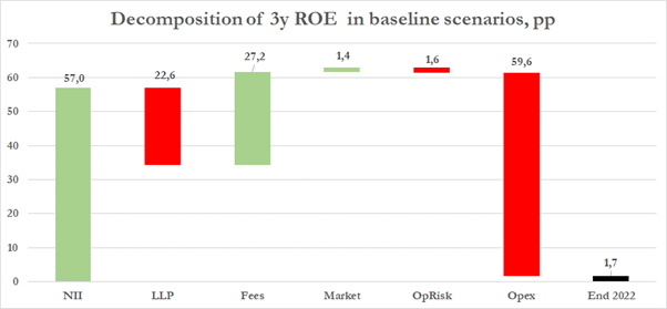
And I have two charts for you. The first is depressing. The ECB believes the cumulative ROE of banks over 3 years (2020-2022) will be… 1.7%. Yiiiikes. That’s ugly. NII does not even cover costs! No wonder the ECB is worried about bank profitability if that is their baseline… 
CET1 is more resilient, though, but there’s still a drop of 130bps, mostly explained by RWA inflation which will not surprise you if you’ve read this thread! 
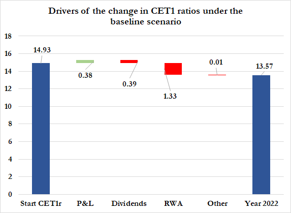
Don’t overthink it (because it’s mostly a model assumption, not a policy choice) but the scenario includes 39bps of dividends ! YEAH ! the crowd goes wild!
That’s all, but this must end with a gigantic THANK YOU to the @ecb for this work, because it’s truly a fantastic report & I’ve only covered a small part of it here.
(Go get your vaccine)
(Go get your vaccine)
• • •
Missing some Tweet in this thread? You can try to
force a refresh


