Which metric is a better predictor of the severity of the fall surge in US states?
1) Margin of Democrat victory in Nov 2020 election
or
2) % infected through Sep 1, 2020
Can you guess which plot is which?
1) Margin of Democrat victory in Nov 2020 election
or
2) % infected through Sep 1, 2020
Can you guess which plot is which?
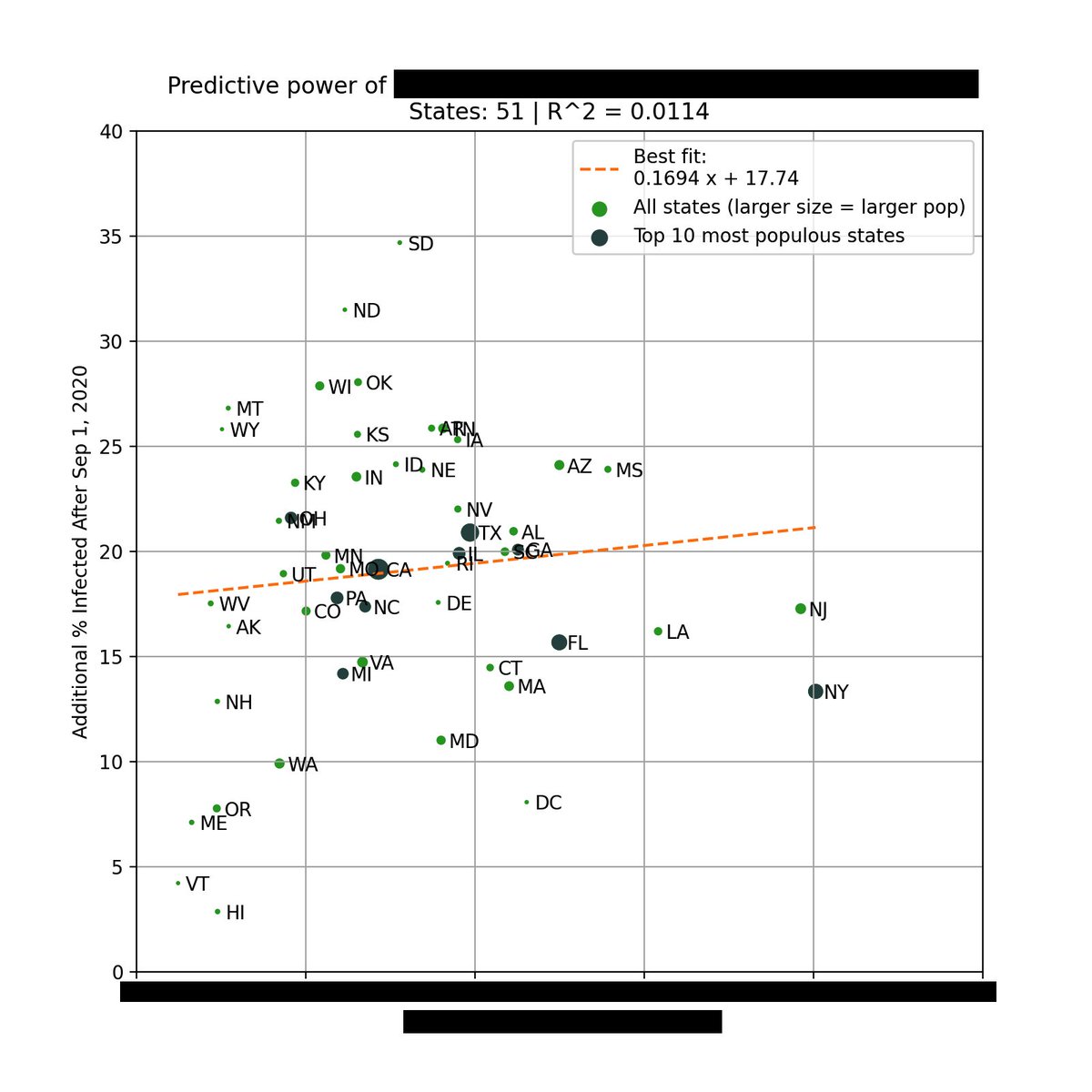
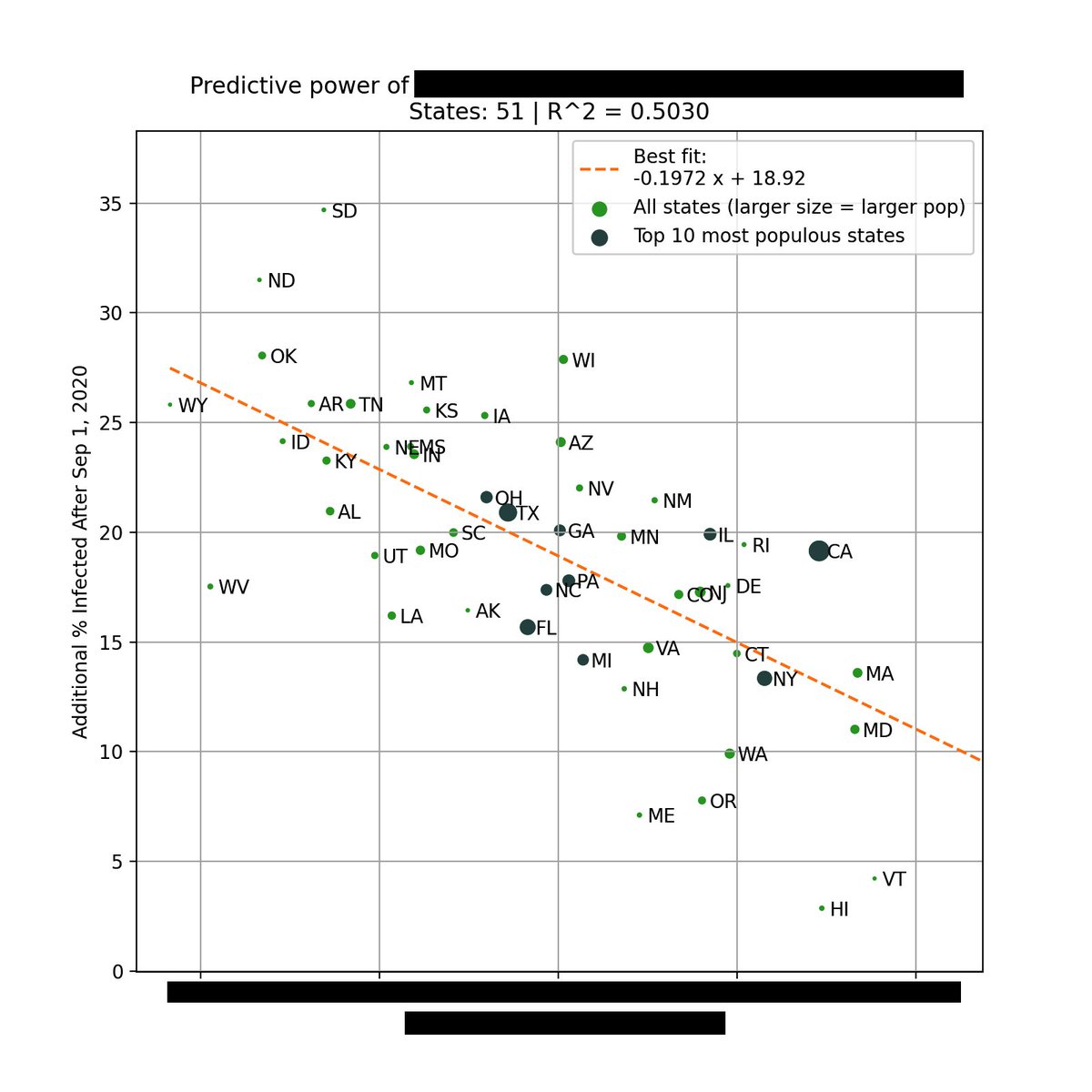
The left plot is based on the % infected through Sep 1, 2020. You can see that there is very little correlation with the % infected since Sep 1.
However, there is a *strong* correlation when using the margin of Biden's victory (right).
Infections % from covid19-projections.com.
However, there is a *strong* correlation when using the margin of Biden's victory (right).
Infections % from covid19-projections.com.


This is the strongest single variable I've seen in being able to explain the severity of this most recent wave in each state.
Not past infections / existing immunity, population density, racial makeup, latitude / weather / humidity, etc.
But political lean.
Not past infections / existing immunity, population density, racial makeup, latitude / weather / humidity, etc.
But political lean.
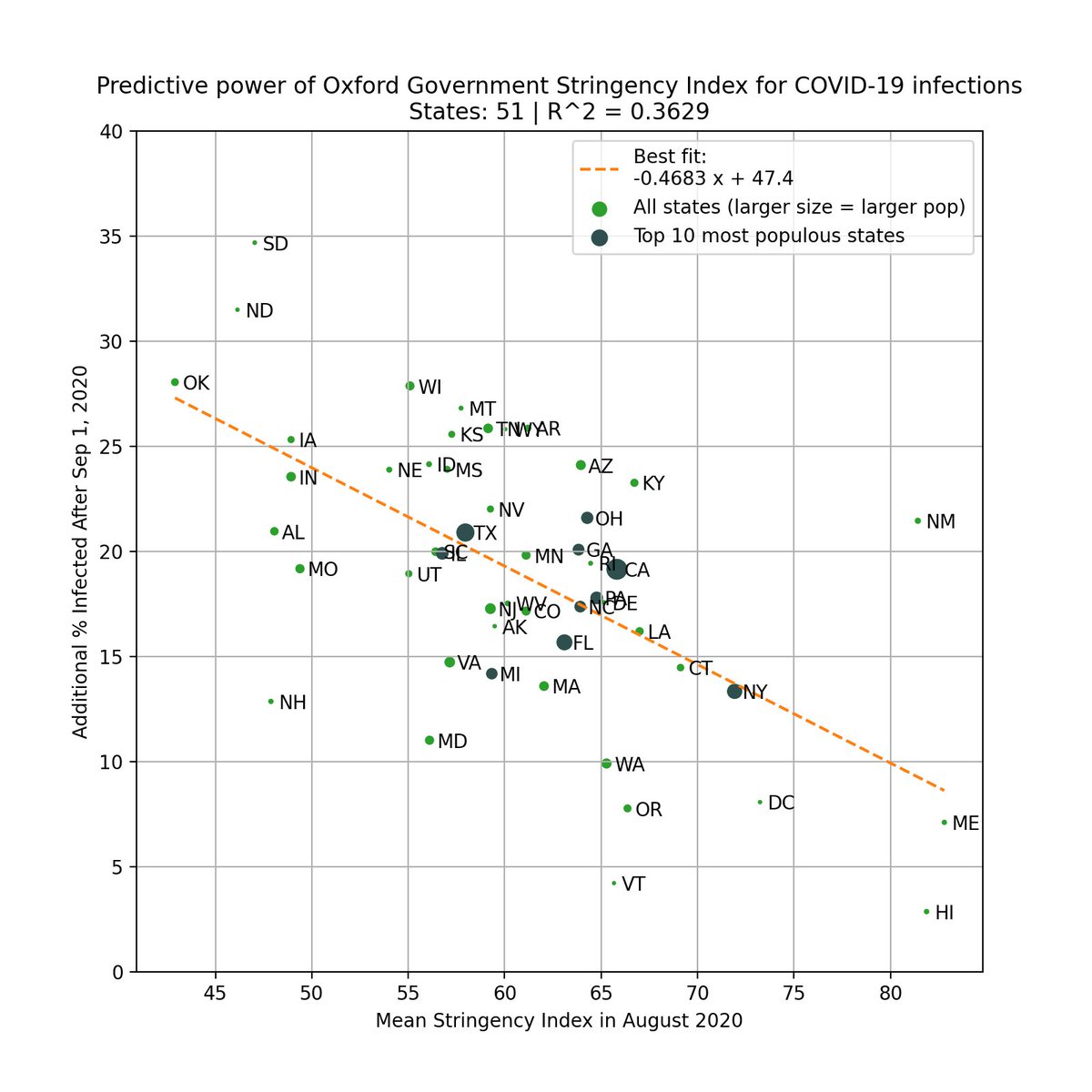
One can argue that states that lean Democrat are more likely to implement restrictions/mandates.
This is valid, so we test this by using the Government Stringency Index made by @UniofOxford.
We also see a correlation, but it's weaker (R^2=0.36 vs 0.50).
bsg.ox.ac.uk/research/resea…
This is valid, so we test this by using the Government Stringency Index made by @UniofOxford.
We also see a correlation, but it's weaker (R^2=0.36 vs 0.50).
bsg.ox.ac.uk/research/resea…
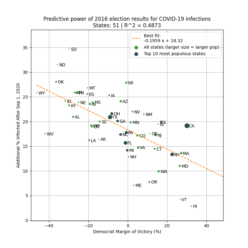
To avoid look-ahead bias/confounding variables, here is the same analysis but using 2016 margin of victory as the predictor. Similar results.
This basically says that 2016 election results is a better predictor of the severity of the fall wave than intervention levels in 2020!
This basically says that 2016 election results is a better predictor of the severity of the fall wave than intervention levels in 2020!
For completeness, here is the correlation between political leaning and intervention levels for all 50 states (R^2 = 0.30).

In the coming months/years, you will see lots of published research incorrectly attribute causal relationship between level of intervention and severity of the fall wave.
But the reality is that political leaning is a heavy confounding variable, and we must be cognizant of this.
But the reality is that political leaning is a heavy confounding variable, and we must be cognizant of this.
Rather than judging a state's pandemic response in a vacuum based on raw cases/deaths, we should instead look at how states expect to do given the demographics.
If we were to use the plot above, then states like WV/ME/VT outperformed expectations, while SD/WI/CA underperformed.
If we were to use the plot above, then states like WV/ME/VT outperformed expectations, while SD/WI/CA underperformed.
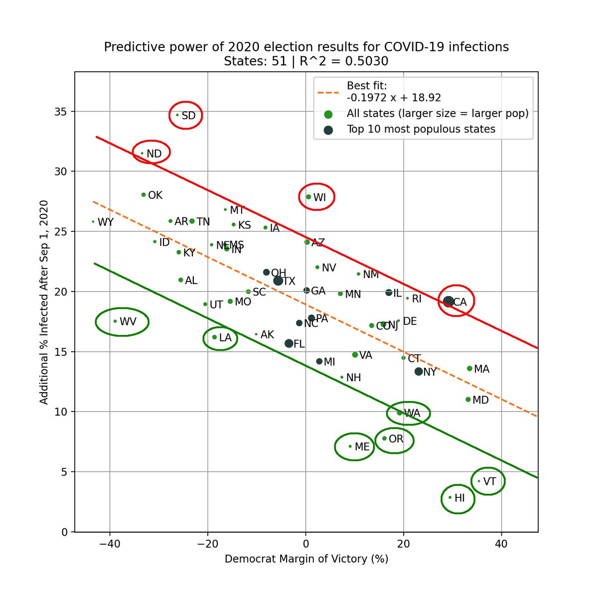
(Of course, we probably need a more complex model with more variables to do a better "expectations" analysis)
For some more single variate correlation analysis, see my thread from last month:
For some more single variate correlation analysis, see my thread from last month:
https://twitter.com/youyanggu/status/1347266544946929665
Caveat: just because correlations may be "baked in" does not mean that we should just give up and do nothing.
Rather, it's important to tamper expectations. Interventions and restrictions will help, but unless we can change political beliefs, there seems to be a very real limit.
Rather, it's important to tamper expectations. Interventions and restrictions will help, but unless we can change political beliefs, there seems to be a very real limit.
Here's the raw infections data so anyone can replicate these findings: github.com/youyanggu/covi…
Election data: cookpolitical.com/2020-national-…
If anyone finds a stronger explanatory variable, please let me know.
Election data: cookpolitical.com/2020-national-…
If anyone finds a stronger explanatory variable, please let me know.
I'll end here. Here's a final takeaway:
It's human nature to want to feel like we can control the future. This applies to everyone, including policy makers and public health experts.
But this pandemic has taught us that sometimes, there is a limit to what we have control over.
It's human nature to want to feel like we can control the future. This applies to everyone, including policy makers and public health experts.
But this pandemic has taught us that sometimes, there is a limit to what we have control over.
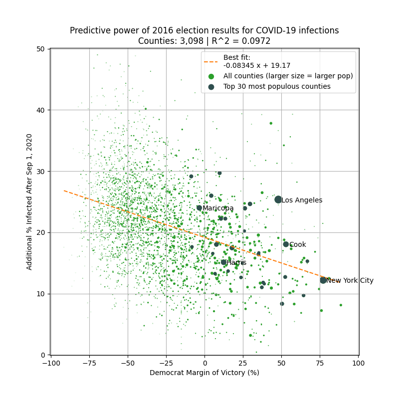
Update: A follower suggested incorporating county-level election results (from github.com/tonmcg/US_Coun…).
Here are the results (2016 left, 2020 right). The correlation is decent given 3000+ data points.
It'd be hard to find another explanatory variable with stronger correlation.
Here are the results (2016 left, 2020 right). The correlation is decent given 3000+ data points.
It'd be hard to find another explanatory variable with stronger correlation.

Update #2: Another suggestion was to look at deaths, so here it is.
Left plot is total deaths in the pandemic. Right plot is total deaths since Sep 1, 2020. No correlation on left, decent correlation on right.
Left plot is total deaths in the pandemic. Right plot is total deaths since Sep 1, 2020. No correlation on left, decent correlation on right.


Update #3: Had some good convos regarding this with @Afinetheorem, @WesPegden & others. Spatial correlation is another confounding factor. Obviously we need more than a Twitter thread to prove any causal relationships, but my main purpose was to show an interesting correlation.
• • •
Missing some Tweet in this thread? You can try to
force a refresh