A @CDCgov report in Jan concluded that "university counties with in-person instruction experienced a 56% increase in incidence".
They only examined 21 days before/after classes start.
Since then, those counties saw a much lower incidence vs counties w/remote instruction.
🧵
They only examined 21 days before/after classes start.
Since then, those counties saw a much lower incidence vs counties w/remote instruction.
🧵

You can see above that counties with in-person instruction had a ~50% higher incidence in the weeks after classes start than remote counties, consistent with the CDC report.
But during the peak in Dec/Jan, counties w/in-person instruction actually had a ~50% *lower* incidence.
But during the peak in Dec/Jan, counties w/in-person instruction actually had a ~50% *lower* incidence.
Contrary to what many believe, remote instruction did not decrease county-level incidence during the fall surge, when compared to in-person instruction.
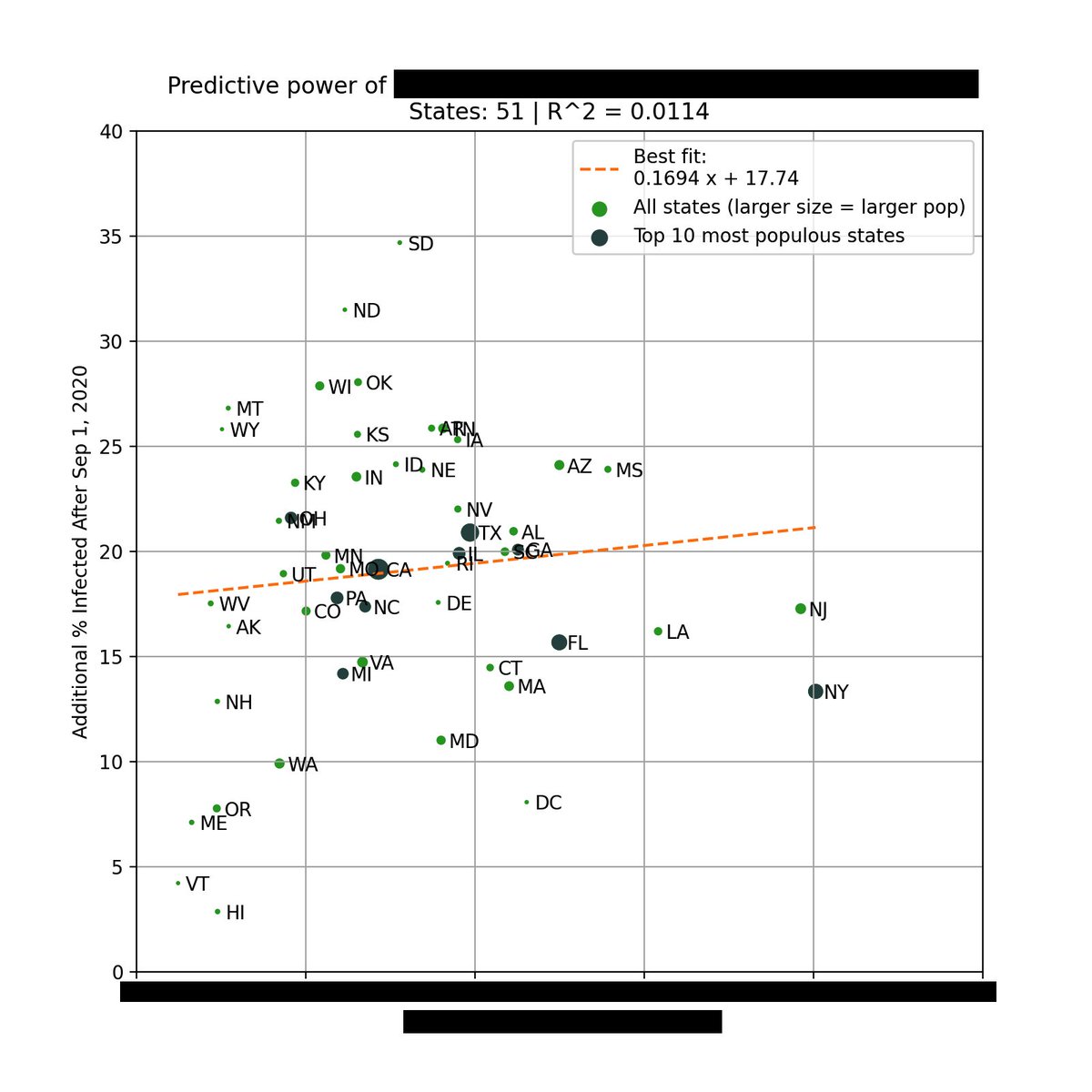
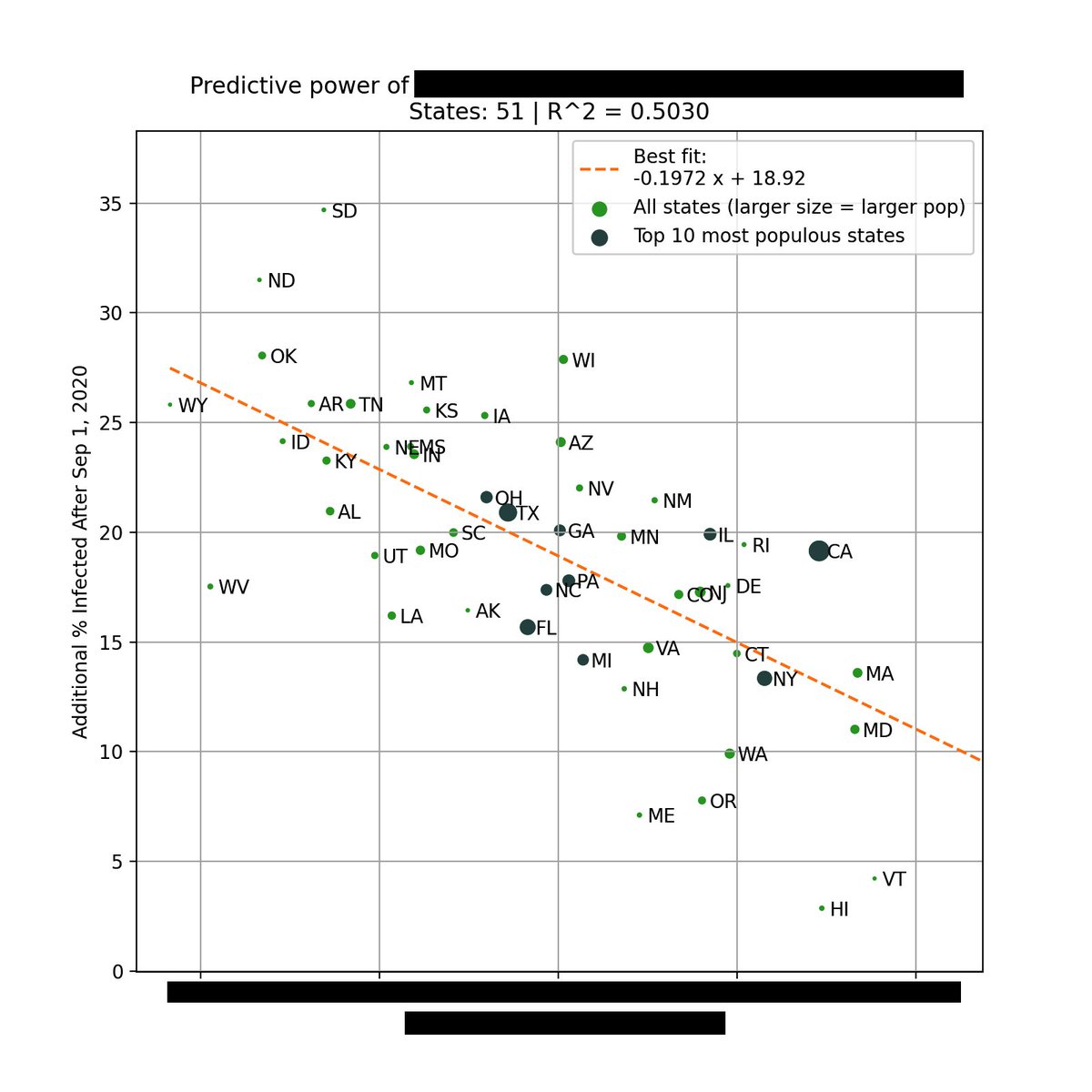
Below is a breakdown based on total cases per capita.
Below is a breakdown based on total cases per capita.

Below is the CDC report with their original results. It was published in January but only uses data up until September.
cdc.gov/mmwr/volumes/7…
cdc.gov/mmwr/volumes/7…
Due to possible geographical bias, the CDC added a "matched analysis" where in-person university counties were matched with non-university counties based on geographic proximity & population.
Here, in-person counties also saw a slightly higher initial incidence that tapers off.
Here, in-person counties also saw a slightly higher initial incidence that tapers off.

There are a lot of data quality issues with the original unmatched analysis, which is why I believe the matched analysis is the best method to view these results.
For ex, the unmatched analysis had 70% of remote learning counties located in a single state, skewing the results.
For ex, the unmatched analysis had 70% of remote learning counties located in a single state, skewing the results.
The CDC did not do publish their analysis on deaths, so we will take a look.
In both the matched and unmatched analysis, university counties with in-person instruction had a lower peak than university counties with remote instruction or non-university counties.
In both the matched and unmatched analysis, university counties with in-person instruction had a lower peak than university counties with remote instruction or non-university counties.


If you look at total deaths, the pattern also holds. Counties with in-person instruction currently have the lowest total death rate.


Between deaths and cases, deaths is probably the more important metric, since it's more correlated with the strain on our healthcare systems.
Spikes in cases, especially those concentrated on young adults on college campus bubbles, should not be an automatic cause for concern.
Spikes in cases, especially those concentrated on young adults on college campus bubbles, should not be an automatic cause for concern.
What happened here is similar to the CDC study on mask mandates. Short-term correlations do not necessarily lead to long-term causal relationships.
They should not be used to set/influence policy, especially one as important as education.
They should not be used to set/influence policy, especially one as important as education.
https://twitter.com/youyanggu/status/1339306972189843456
Unfortunately, I've seen too many people cite data and sources that support their personal beliefs on school openings, and ignore data and sources that counter their beliefs.
Whether this is done intentionally or not, it is a dangerous precedent.
Whether this is done intentionally or not, it is a dangerous precedent.
Of course, this analysis is difficult to repeat for primary and secondary schools.
But given what we know about transmissibility by age, the data is promising that in-person schooling, when done correctly, is not a primary driver of community transmission.
But given what we know about transmissibility by age, the data is promising that in-person schooling, when done correctly, is not a primary driver of community transmission.
I want to thank the CDC for graciously providing me the county groupings needed to replicate and extend this analysis.
I really appreciate their commitment to open data sharing.
I really appreciate their commitment to open data sharing.
To conclude, the data does not support the claim that in-person instruction at colleges and universities lead to increased COVID-19 incidence and deaths in the long run.
Existing debates about schools seem to be more driven by politics than science, unfortunately.
Existing debates about schools seem to be more driven by politics than science, unfortunately.
Update: Some individuals have responded that most schools were closed after Thanksgiving, which is valid. But that still doesn't explain why counties with remote instruction had a higher wave.
We can then also pose this question:
We can then also pose this question:
https://twitter.com/youyanggu/status/1363930527389130758
In the context of the above findings, I think claims like the one below need a citation.

• • •
Missing some Tweet in this thread? You can try to
force a refresh