C Ups Profile picture
15 Mar, 4 tweets, 3 min read
City of #Toronto Covid-19 Hospitalization Update, March 15.
#COVID19Ontario
City of #Toronto Covid-19 Hospitalization Update, March 15.
#COVID19Ontario
City of #Toronto Covid-19 Hospitalization Update, March 15.
#COVID19Ontario
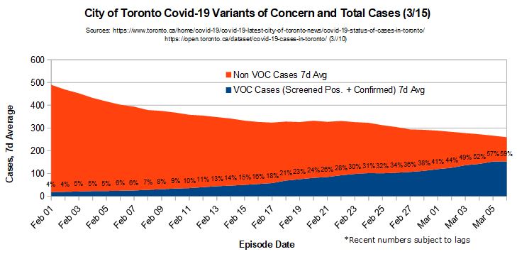
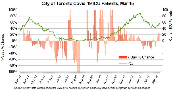
City of #Toronto Covid-19 Hospitalization Update, March 15. Graphic from Toronto covid montoring dashboard, updated mar 10.
#COVID19Ontario

• • •

Missing some Tweet in this thread? You can try to force a refresh
 

Keep Current with C Ups

C Ups Profile picture

Stay in touch and get notified when new unrolls are available from this author!

Read all threads

This Thread may be Removed Anytime!

PDF

Twitter may remove this content at anytime! Save it as PDF for later use!

Try unrolling a thread yourself!

how to unroll video
  1. Follow @ThreadReaderApp to mention us!

  2. From a Twitter thread mention us with a keyword "unroll"
@threadreaderapp unroll

Practice here first or read more on our help page!

More from @C_Ups17

16 Mar
1/ City of #Toronto Covid-19 variants of concern. 7 day average of cases screened for spike mutation plus confirmed variants of concern as a portion of overall cases, by episode date.
#COVID19Ontario
2/ The chart above is the best representation of the status of VOC that I can produce with public data. It comes from Toronto's Covid Status of Cases page. They have a chart showing screened and confirmed voc cases by episode date. I combine this with cases by episode date...
3/ from their public covid case dataset. It is important to use episode date because the cases announced as screened + for spike mutation, and confirmed as voc on a given day, are not necessarily (in fact rarely) cases from the same day. From watching these numbers closely...
Read 6 tweets
23 Nov 20
1/ Covid-19 disproportionately affects the elderly, right?
A large majority of deaths are in LTC and other elderly, right?
So, you'd expect that 2020 would show a greater % of overall deaths in older age groups, right?
But that's not what we've seen...
#COVID19Ontario
2/ The proportion of deaths in Ontario up to August is THE SAME as it usually is. Check out the chart. There was a larger difference between '16-'17 than '19-'20. Does that make any sense?
The next chart shows why...
#COVID19Ontario
3/ Deaths in the elderly surged over normal levels during the peak of the first wave. And then, proceeded to drop below normal levels in the Summer. Could one say that those elderly who died, simply died several weeks earlier than they would have without Covid? #COVID19Ontario
Read 12 tweets

Did Thread Reader help you today?

Support us! We are indie developers!


This site is made by just two indie developers on a laptop doing marketing, support and development! Read more about the story.

Become a Premium Member ($3/month or $30/year) and get exclusive features!

Become Premium

Too expensive? Make a small donation by buying us coffee ($5) or help with server cost ($10)

Donate via Paypal Become our Patreon

Thank you for your support!

Follow Us on Twitter!