My “don’t panic” tweet from yesterday got a lot of traction – but today I’m going to recover my corona-centrist credentials by being more concerned. Again, this is mostly a story about LFDs and schools, and I’m not quite sure yet what to make of it. 1/n
Let’s start by looking at the short-term growth rates in different age groups, so we know where to drill down. They show a clear spike in 5-9 and 10-14 year olds, and maybe a hint of upwards pressure in their parents (35-40s). Cases are falling nicely in the over-80s. 2/n
Looking at the 5-9 year olds, we can see the spike on the 15th March which has then tailed away since – so as per my recent tweets, I’m getting less worried about this. We need to keep an eye on it, but it’s not an obvious problem right now. 3/n
Also just checking in on the 15-19 year olds, this looks fairly stable and benign 4/n
The more concerning chart is actually the 10-14 year olds, where there is a very clear spike in Sunday’s specimen data. This is an odd age group since we have a mix of primary kids (10-11) who aren’t getting LFD tested and secondary kids (12-14) who are. 5/n
Digging a bit further into the data, I *think* (but not 100% sure yet) the main issue is in the slightly older, LFD-tested kids. Certainly there is a spike in Sunday & Monday’s LFD-recorded positive cases – but sadly we don’t have an age breakdown of this. 6/n
Now, this also corresponds to a spike in the number of LFD tests, so perhaps we shouldn’t be too worried – it may just be the continued effect of the shift to home-testing, which is changing the weekly pattern of when tests are being taken. 7/n
But the reason why I’m a bit more cautious today is that the positivity rate for Monday has shifted upwards – to c. 0.15% compared to 0.10% last week, or a 50% increase. That’s slightly concerning, and I’d like to see how that trend evolves. 8/n
(incidentally, please ignore the positivity spikes on Saturdays - there are complex technical reasons why it does that, and for the purposes of this discussion, it's best ignored. there are not many schools-related LFDs done on Saturdays) 9/n
So, a trend to watch. A possible reason why positivity *might* have increased is if parents and teenagers are being more diligent in recording the positive tests than they are the negative ones (whereas we trusted schools to do both). 10/n
So, this isn’t definitely a problem, but it could turn into one. And remember: an increase in cases in children isn’t a major issue in itself, it only becomes one if it “leaks” into other age groups. And there’s not much evidence of that happening at this stage. /end
• • •
Missing some Tweet in this thread? You can try to
force a refresh
I’ve spent a lot of time over the last 2 days going through the most recent paper thelancet.com/action/showPdf… from the Warwick modelling group that feeds into SAGE, and trying to work out why it predicts a large exit wave, when my model (mostly) doesn’t. My conclusions are: 1/12
1. Their model in fact doesn’t guarantee an exit wave: with fast vaccine rollout (4m per week) and high (85%) transmission blocking, and either high (85-95%) vaccine uptake or high (94%) protection vs. severe disease, there is no material exit wave - see the orange line 2/12
2. Their choice of central assumptions is (imo) consistently on the pessimistic side. In fact, my central assumptions frequently correspond closely to their “optimistic” upside scenario. To avoid a very long thread I’ve built a table that compares their assumptions to mine 3/12
As it’s the weekend, I’m allowed to have some fun. So here’s the latest in my series of spurious-but-interesting political/covid correlation analyses. Last time we had: vote Labour, get covid. This time it’s: vote Conservative, get vaccinated! 1/n
(and please don’t @ me, I do realise why this is). In fact please take this as a subtweet of other analysis showing that vax rates are negatively correlated with covid infection levels, deprivation, or non-white ethnicity: if it’s not corrected for age, it’s meaningless. 2/n
Of course, what’s happening is that the vaccination rate is a near-perfect (92% correlation) proxy for average age. And the Conservative vote % is also strongly correlated (69%) to the average age of the constituency. 3/n
Lots of people asking: what does your model say about the delayed vaccine schedule? Can we still unlock on the planned dates?? So here goes with an emergency model update. Summary: don’t panic, it will be OK. 1/n
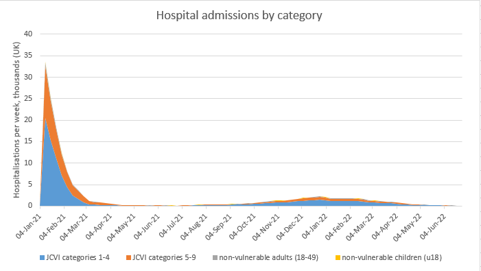
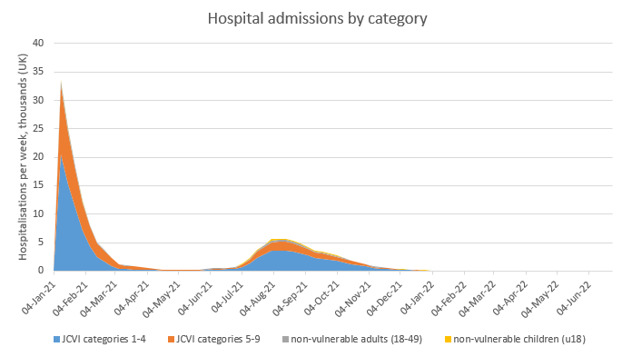
So just a reminder of my current model ‘base case’ (with R0 for the new variant now set to 4, following comparison with the Warwick/Imperial models). This has a relatively small ‘exit wave’ next winter, with ~10k deaths. 2/n
If we knock 10m doses out of the vaccine schedule in April (reducing my expected 4m per week estimate to 2m per week), we get a slightly stronger and earlier ‘exit wave’. But total deaths after March are not much higher at ~13k. 3/n
As an addendum to this earlier post, some have asked whether similar analysis is available for hospitalisations and deaths, and if so, does it show the same pattern? Happily, I looked at this at the weekend, and the answer is: yes and no. 1/10
To start with, a quick note on methods. To compare cases, deaths and hospitalisations on the same chart we are constrained to use age groups for which hospital data is readily available i.e. 18-64, 65-84 and 85+. So I’ve used the (mostly unvaccinated) 18-64 group... 2/10
… as a benchmark for the other two groups, creating deviation charts similar to my earlier ones for cases. See below for the new charts for cases, admissions and deaths. But it will be more useful to compare the different data for the same age group on the same chart 3/10
Big cause to celebrate in my deviation graphs this evening: over-80s cases have fallen to *half* their January rate, over and above the effects of lockdown on all age groups. I think we can say confidently that vaccines have been the major driver of that additional fall. 1/10
Another way of looking at this: in the second half of January, before vaccination effects started to bite, over-80s consistently accounted for 5.8% of total covid cases. In the 7 days to 12th March, they averaged 2.9% i.e. half their previous value. 2/10
As regular readers will know, there are reasons to believe that the actual vaccine effect could be larger than that 50% fall e.g. due to higher-risk behaviour by those who have been vaccinated, and due to the weaker impact of lockdown on cases in the over-80s. 3/10
Another quick ‘model update’ thread: it’s good news on vaccine uptake, but I also take a look at the Warwick & Imperial models, and explore a scenario with higher R0 that generates a (small-ish) fourth wave next winter. 1/n
Starting with the good news, the real-life experience and polling data on vaccine update keeps getting better, so I’ve updated my model to reflect this: now assuming 95% take-up in all high-risk categories (JCVI 1-9) and 90% in other adults. 2/n
(note I’m still assuming 5% dropout on the second dose, which may be wrong – I’d welcome any insights or links to data on how this is going – but to be honest, it’s not that material to the outcomes) 3/n