Big cause to celebrate in my deviation graphs this evening: over-80s cases have fallen to *half* their January rate, over and above the effects of lockdown on all age groups. I think we can say confidently that vaccines have been the major driver of that additional fall. 1/10 Image
Another way of looking at this: in the second half of January, before vaccination effects started to bite, over-80s consistently accounted for 5.8% of total covid cases. In the 7 days to 12th March, they averaged 2.9% i.e. half their previous value. 2/10
As regular readers will know, there are reasons to believe that the actual vaccine effect could be larger than that 50% fall e.g. due to higher-risk behaviour by those who have been vaccinated, and due to the weaker impact of lockdown on cases in the over-80s. 3/10
But even if it’s only a 50% effect from the first dose (so far), that’s still a good start and many lives saved. Just to note that I calculated the effect in two different ways, one using the over-80s case numbers as a % of the total cases, and another using the … 4/10
… over-80s compared to the 20-49 year olds - just in case the movements in other vaccinated age groups, or in school-age children, were causing distortions. Helpfully, I get exactly the same result from both methods. 5/10 Image
Looking at the subgroups within the over-80s, we can see that the over-90s are already below 45%, with the 80-89s hovering a bit above 50% 6/10 Image
And in the 70-somethings, we see that the 75-79s are also nearing the 50% mark (actually at 50.4%), and the 70-74s still around 60%. So, with the help of a bit of rounding, we can extend our headline to say that the 75+ cases have also halved, in relative terms. 7/10 Image
In the 60-somethings, both groups continue their downward trend, although with some way still to go. 8/10 Image
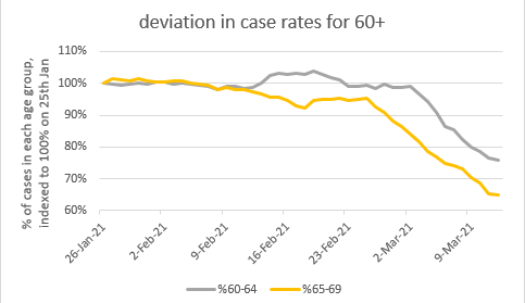
And we can see the start of a deviation in the 50s as well. This is a bit too early to be the effect of JCVI cohorts 8 & 9 (50-54 & 55-59) who are being vaxxed now – instead I think it’s cohort 6 (the “at risk” or “vulnerable” group) which contains a lot of 50-somethings. 9/10 Image
So that’s all good news as far as I can see. I’m just going to indulge myself by posting these curves again, and letting it sink in. Without vaccines, probably at least twice as many 75+ year olds would be catching covid as are doing so right now. /end Image

• • •

Missing some Tweet in this thread? You can try to force a refresh
 

Keep Current with James Ward

James Ward Profile picture

Stay in touch and get notified when new unrolls are available from this author!

Read all threads

This Thread may be Removed Anytime!

PDF

Twitter may remove this content at anytime! Save it as PDF for later use!

Try unrolling a thread yourself!

how to unroll video
  1. Follow @ThreadReaderApp to mention us!

  2. From a Twitter thread mention us with a keyword "unroll"
@threadreaderapp unroll

Practice here first or read more on our help page!

More from @JamesWard73

17 Mar
Lots of people asking: what does your model say about the delayed vaccine schedule? Can we still unlock on the planned dates?? So here goes with an emergency model update. Summary: don’t panic, it will be OK. 1/n
So just a reminder of my current model ‘base case’ (with R0 for the new variant now set to 4, following comparison with the Warwick/Imperial models). This has a relatively small ‘exit wave’ next winter, with ~10k deaths. 2/n Image
If we knock 10m doses out of the vaccine schedule in April (reducing my expected 4m per week estimate to 2m per week), we get a slightly stronger and earlier ‘exit wave’. But total deaths after March are not much higher at ~13k. 3/n Image
Read 13 tweets
16 Mar
As an addendum to this earlier post, some have asked whether similar analysis is available for hospitalisations and deaths, and if so, does it show the same pattern? Happily, I looked at this at the weekend, and the answer is: yes and no. 1/10
To start with, a quick note on methods. To compare cases, deaths and hospitalisations on the same chart we are constrained to use age groups for which hospital data is readily available i.e. 18-64, 65-84 and 85+. So I’ve used the (mostly unvaccinated) 18-64 group... 2/10
… as a benchmark for the other two groups, creating deviation charts similar to my earlier ones for cases. See below for the new charts for cases, admissions and deaths. But it will be more useful to compare the different data for the same age group on the same chart 3/10 ImageImageImage
Read 11 tweets
3 Mar
Another quick ‘model update’ thread: it’s good news on vaccine uptake, but I also take a look at the Warwick & Imperial models, and explore a scenario with higher R0 that generates a (small-ish) fourth wave next winter. 1/n
Starting with the good news, the real-life experience and polling data on vaccine update keeps getting better, so I’ve updated my model to reflect this: now assuming 95% take-up in all high-risk categories (JCVI 1-9) and 90% in other adults. 2/n
(note I’m still assuming 5% dropout on the second dose, which may be wrong – I’d welcome any insights or links to data on how this is going – but to be honest, it’s not that material to the outcomes) 3/n
Read 18 tweets
28 Feb
I think we can be confident now that cases in the 70-74 age group are on their way down to join their friends in 75-79 and 80+ (maybe not falling quite as quickly as 75-79 did - but there's more in the 70-74s so it will take a bit longer to vaccinate them) 1/5 Image
(also noting that 70-74s are in category 4 alongside the clinically extremely vulnerable, a total of ~4.4m people which is nearly double the ~2.3m in category 3, which was just the 75-79s) 2/5
Looking back at the 80+ in more detail, there's no real "new news" here - all progressing to plan 3/5 Image
Read 5 tweets
25 Feb
Model Update Klaxon: the good thing about publishing model results is that everyone tells me why they think the model is wrong – mostly constructively, and quite often I agree with them. So I’ve changed a few things, and it’s really good news. (thread)
Most of the updates today are to do with children, which hasn’t been a big focus of my modelling, as I was much more worried about what was going on with the over-50s. But it’s starting to become more relevant as we begin to ‘flirt’ with the herd immunity threshold (HIT). 3/n
Read 18 tweets
25 Feb
Although they don't change much day-to-day, I never get bored looking at these charts, because of the positive message behind them. and is that the first sign of the 70-74 line accelerating downwards? (just at the right time, 3 weeks after the peak vaccinations started) 1/n
and here's more boring data, with the sub-groups of 80+ all now consistently showing case rates (as a % of the all-ages total) >25% lower than they were in late January 2/n
some have asked me: why is the deviation not larger, when we know (from PHE/PHS published data) that the vaccines are more than 25% effective, and take-up has been nearly 100% in these age groups? And I think the answer is: 3/n
Read 5 tweets

Did Thread Reader help you today?

Support us! We are indie developers!


This site is made by just two indie developers on a laptop doing marketing, support and development! Read more about the story.

Become a Premium Member ($3/month or $30/year) and get exclusive features!

Become Premium

Too expensive? Make a small donation by buying us coffee ($5) or help with server cost ($10)

Donate via Paypal Become our Patreon

Thank you for your support!

Follow Us on Twitter!