Over a year ago StatCan released the first set of CHS data that showed frighteningly high rates of forced moves in BC. @LausterNa and I dug into recently released PUMF data to add context, see how this varies within BC, and how it has changed over time. doodles.mountainmath.ca/blog/2021/03/2…
This is a follow-up on this over a year old post that looked at forced moved (and other data) from the CHS when the first tables were released. The PUMF data we got now allows to paint a fuller picture. doodles.mountainmath.ca/blog/2019/11/2…
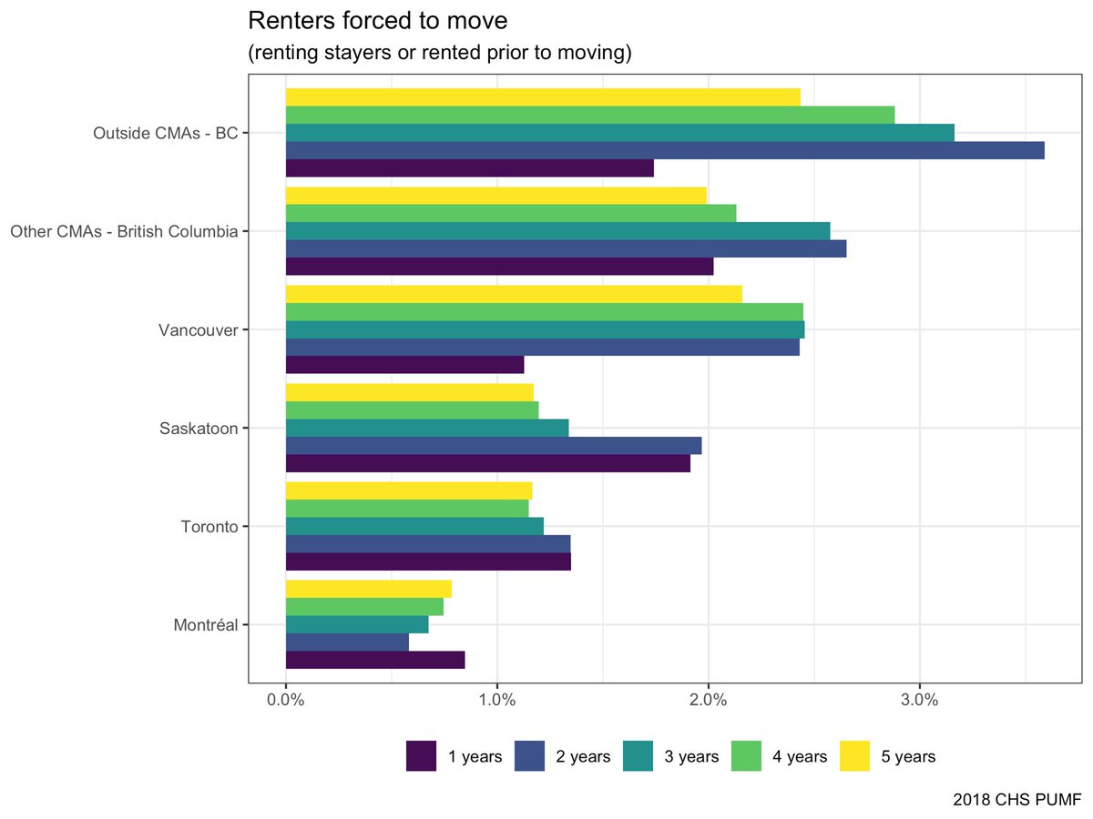
What can be learned about forced moves from PUMF data? Firstly, instead of looking a share of moves that are forced, we can look at risk of forced moves in the past year. And Vancouver comes out in the middle of the pack.
That’s surprising, what’s going on? Two things. Firstly, there are comparably few choice moves in Vancouver, people are stuck in place and don’t move as much as people to in other CMAs. That makes for smaller denominators when looking at share of moves that are forced.
Secondly, to get a well-defined risk from the data we look at moves in the past year. We can try to exponentials that risk to roughly compare to moves over 5 years, and we notice that risk of forced moves dropped sharply. This may be the effect of NDP tenant protections. Yay!

• • •

Missing some Tweet in this thread? You can try to force a refresh
 

Keep Current with Jens von Bergmann

Jens von Bergmann Profile picture

Stay in touch and get notified when new unrolls are available from this author!

Read all threads

This Thread may be Removed Anytime!

PDF

Twitter may remove this content at anytime! Save it as PDF for later use!

Try unrolling a thread yourself!

how to unroll video
  1. Follow @ThreadReaderApp to mention us!

  2. From a Twitter thread mention us with a keyword "unroll"
@threadreaderapp unroll

Practice here first or read more on our help page!

More from @vb_jens

31 Mar
New preprint with BC N501Y screening data is out! First time I have seen proper VOC data out in public. Data is old now, but let's take a look what we can learn about data up to week 9, so end of February. medrxiv.org/content/10.110…
Before we go there, the preprint also has this neat summary of the point-prevalence study that @PennyDaflos also wrote about. The data in the preprint is about the left branch, N501Y screening. Positive results are presumed to be VOC. In BC that will be B.1.1.7 in most cases. Image
There are also some (small) false positives. This shows 1% prevalence of VOC at the beginning of February. This is still news because our PHO has still not corrected this after repeatedly claiming prevalences was 0.1%, and did not correct this even when asked directly.
Read 10 tweets
30 Mar
It's Monday, and BC got 4 days worth of data after skipping Friday's update and the usual weekend data blackout. (What pandemic?) And as expected, it's looking bad. The trend is at almost 900 daily cases now.
Vancouver Coastal has now overtaken Fraser with the highest case incidence, and cases are also clearly rising in Island and Interior Health Authorities.
North Shore Garibaldi has the highest incidence in cases, but it's not the only health region with steep increases.
Read 7 tweets
28 Mar
Hey, my favourite Vancouver single family lots are for sale! Lots of stories behind these lots, they have been tossed back and forth between investment companies over the years. The proposed homes look awful and are likely just an attempt to avoid the EHT. squamishchief.com/real-estate-ne…
These lots have featured prominently on the @ahvancouver walking tours of Vancouver's worst zoning. The biggest of the three lots is Vancouver's largest non-sub-dividable RS lot at almost 3 acres in size.
Apart from this being a prime example of how functionally useless some of Vancouver's zoning is, there are great stories connected to those lots. @ahvancouver dug up a lot of neat history, and @ron_usher has great stories about recent investors (and attempted scams).
Read 4 tweets
3 Mar
Lots of discussions on changing the vaccine dose scheduling in BC. I don’t know much about this, so I asked a friend who are directly involved in research and development of (COVID) vaccines. My takeaway:
1. Vaccine trials have a short first/second does schedule, mostly because it accelerates trials and has lower attrition.
2. When asked, vaccine manufacturers will always point to schedule from trails as recommended protocol for liability reasons.
3. We don’t have direct evidence that stretching the time between doses to 4 months is equally effective (after second dose).
4. We have some evidence that first dose already grants a high level of immunity, at least short term.
Read 8 tweets
3 Mar
Today we got 4 days of COVID data plus corrections for a couple days before that. The recent increase in cases is now well established, with a recent flattening in the increase. Will that reverse and continue to increase, or go back to decreasing trend? We shall see.
The big question is what caused this? A super spreader event (triva night?) after which we will see declines again? Variants of concern? Probably too early for such a sharp rise, we would expect to see a rise like this this later this month, not now.
Fraser and Vancouver Coastal are driving the recent trend, Interior has come down nicely and Northern also seems to wiggle their way down. Island is still on their path of slow increases.
Read 6 tweets
31 Jan
A rater niche and slightly geeky look at trend lines in general and COVID-19 case trends in particular. I got nerd-sniped a while back by @chadskelton to write this up, and also had discussions with @tom_cardoso and @robroc about this. doodles.mountainmath.ca/blog/2021/01/3…
TL;DR: Trend lines are an important tool to filter noise from signal. Moving averages is one way to do this, but it's not good at removing noise and introduces a data lag. Using methods like STL that can account for the weekly pattern and don't add extra data lag are preferable.
Moving average trend lines do have the advantage that they are simple to understand, but get misleading when they are artificially shifted to the right to obscure the data lag. This problem is particularly acute when overlaid over case counts as for example in this graph.
Read 5 tweets

Did Thread Reader help you today?

Support us! We are indie developers!


This site is made by just two indie developers on a laptop doing marketing, support and development! Read more about the story.

Become a Premium Member ($3/month or $30/year) and get exclusive features!

Become Premium

Too expensive? Make a small donation by buying us coffee ($5) or help with server cost ($10)

Donate via Paypal Become our Patreon

Thank you for your support!

Follow Us on Twitter!