Victor Profile picture
15 Apr, 5 tweets, 2 min read
There are 4 basic design principles you need to know

👇
1. Contrast

By using contrast you can control users' focus. Ways of making an element stand out:

1. Color
2. Shape
3. Size
4. Proximity / Distance

Remember: No contrast / Too much contrast is bad!
2. Alignment

When your elements are aligned, nothing looks out of place.

It doesn't mean that an element cannot be out of order if you want to focus the user on it, but most elements should be usually aligned.

A typical way to achieve that is using grids or columns.
3. Repetition

In other words - consistency.

If you have a button element, it should look similar on all pages = repeated over pages.

It doesn't mean it cannot have a different size or color.
But it also shouldn't end up with 100 different colors and sizes.
4. Proximity

Related elements should be grouped together.

Group elements that should go together & set up the proper spacing between elements.

P.S. Did you know that proximity is more "powerful" than contrast?

At first, we see groups, then - elements that stand out.

• • •

Missing some Tweet in this thread? You can try to force a refresh
 

Keep Current with Victor

Victor Profile picture

Stay in touch and get notified when new unrolls are available from this author!

Read all threads

This Thread may be Removed Anytime!

PDF

Twitter may remove this content at anytime! Save it as PDF for later use!

Try unrolling a thread yourself!

how to unroll video
  1. Follow @ThreadReaderApp to mention us!

  2. From a Twitter thread mention us with a keyword "unroll"
@threadreaderapp unroll

Practice here first or read more on our help page!

More from @vponamariov

16 Apr
9 Tricks to control user attention 😈👇
1. Motion

It is a proven method of getting user attention for a short period of time.

An awesome example I like very much is how @JoshWComeau used this fellow guy gently jumping in when you read his blog article.

He got thousands (!) of subscribers just because of this trick
2. Size

One of the basic ideas for moving user attention to the thing you want is simply increasing its size.

The bigger the object is, the more attention it gets. Image
Read 10 tweets
13 Apr
How to make this with CSS only 👇
1 / 8

First, you need an SVG that has TWO parts:

- Line
- Arrow

For drawing such curves you can use any vector editor. I used @sketch.

Tutorial on how to do this: sketch.com/docs/vector-ed…

Arrow is a simple triangle.
2 / 8

Next, after you exported SVG, you can go to jakearchibald.github.io/svgomg/ in order to remove clutter from the SVG.

Btw, this is a nice hint: you can significantly reduce the size of SVG by using this awesome tool from @jaffathecake
Read 9 tweets
12 Apr
How to design almost any UI element.

A curated list of 58 articles 👇
Buttons.

7 Basic Rules for Button Design by @101babich
uxplanet.org/7-basic-rules-…

Button Design
uxdesign.cc/button-design-…

Cheatsheet for buttons by @TessGadd
uxdesign.cc/ui-cheat-sheet…
Text fields.

UI cheat sheet: text fields (Awesome article! 🤩)
uxdesign.cc/ui-cheat-sheet…

Text fields & Forms design — UI components series
uxdesign.cc/text-fields-fo…

The Anatomy of Input Field
uxplanet.org/the-anatomy-of…
Read 22 tweets
8 Mar
Consistency matters, they say...🤔

Starting from today, I'll post one UI tip per day for the next 50 days!

Follow this thread 👇

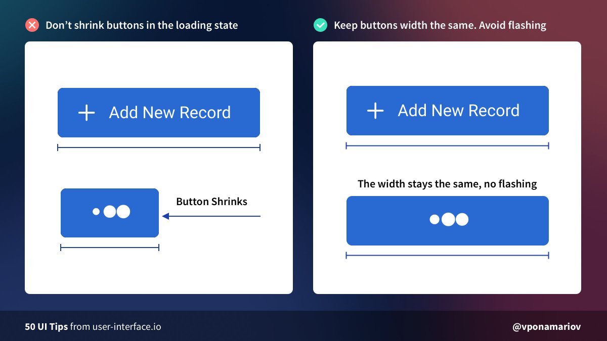
💡Tip #01 - Set the fixed width of your buttons if they have a loading state

Otherwise, they'll shrink when loading, and it looks terrible. Image
💡Tip #02 - Don't hide tips if it's unnecessary

Developers tend to hide tips under icons/tooltips/popups.

In this case, your users will be forced to hover every icon to read the tip.

It'd be better to show tips right away, if possible. 😊 Image
💡Tip #03 - Show progress bars for complex forms

They help users to identify which step they are on AND how many steps are left (!)

The latter will increase conversion of completing the form because of the "Goal Gradient Effect".

Further reading:

Image
Read 7 tweets
4 Mar
I sold Pingr.

One of the hardest tweets for me.

Lessons below 👇
Some stats

🔸Time spent: ~14 months
🔸Hours spent: ~1000
🔸Number of users: ~560
🔸Number of paying users: ~20
🔸Number of lifetime deals sold: ~20
🔸Total traffic: ~23K
🔸Revenue: negative
🔸Price: I cannot disclose the price, but it covered my development time fully
1 / Listen to others but make your own decisions. After I posted on Reddit, I decided to change my pricing model, but it turned out to be a mistake. I listened to others.

When a user asked me for something, I immediately started doing it.

Make your own decisions.
Read 14 tweets
2 Mar
I've been merciless 👿 when I was reviewing your designs.

Now it's time to look at good examples ☺️

Let's start with @PlausibleHQ

Here is my UI/UX review👇 Image
Look at how social proof should be done 🤩

🔸Real testimonials, no fake people
🔸Links to Twitter profiles
🔸The design look balanced
🔸Stats are not fake, which feels like the service is reliable and not making up things

Well done 💪 Image
Have a sign-up form?

Show me:

🔸Is there a free trial?
🔸Fields I should fill
🔸Possible constraints (e.g. password rules)
🔸What will be the next steps?
🔸Log in link, if I've already signed up Image
Read 4 tweets

Did Thread Reader help you today?

Support us! We are indie developers!


This site is made by just two indie developers on a laptop doing marketing, support and development! Read more about the story.

Become a Premium Member ($3/month or $30/year) and get exclusive features!

Become Premium

Too expensive? Make a small donation by buying us coffee ($5) or help with server cost ($10)

Donate via Paypal Become our Patreon

Thank you for your support!

Follow Us on Twitter!