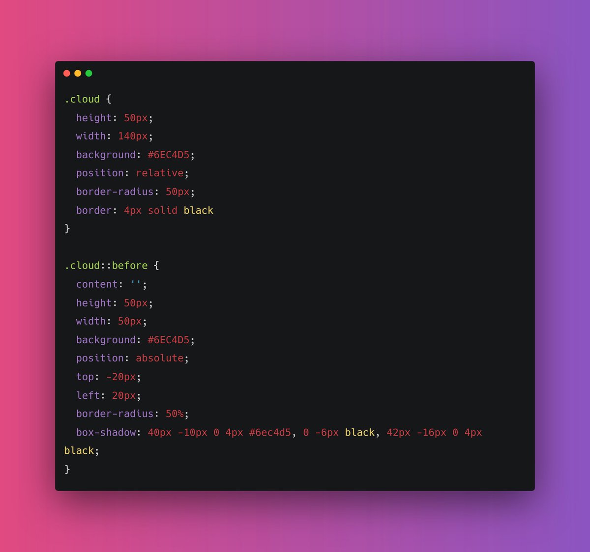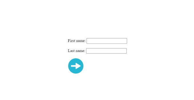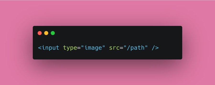
CSS is an amazing and unique language that servers a great purpose. We can make our website visually good using CSS. It describe the presentation of web pages, including typography,. layouts, color etc...
{ 2 / 27 }
{ 2 / 27 }
First and foremost
The characterstic of a great website is it's color scheme. Forget about everything and learn about background and color properties initially.
The colors are something from which users interact first whenever they visit your webpage
{ 3 / 27 }
The characterstic of a great website is it's color scheme. Forget about everything and learn about background and color properties initially.
The colors are something from which users interact first whenever they visit your webpage
{ 3 / 27 }
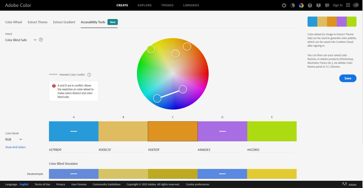
There are a lot of great color palette out there using which you can generate pleasant color schemes
Check this great tool for generating accessible colors
color.adobe.com/create/color-a…
{ 4 / 27 }
Check this great tool for generating accessible colors
color.adobe.com/create/color-a…
{ 4 / 27 }
Don't think that background property is just for setting the solid color. Background is a shorthand property for background-image, background-position etc..
{ 5 / 27 }
{ 5 / 27 }
Box model is one of the most important concept of CSS. It's not so tough to learn. The box-model covers
- Height
- Width
- Padding
- Border
- Margin
{ 6 / 27 }
- Height
- Width
- Padding
- Border
- Margin
{ 6 / 27 }

Height and width property are pretty intuitive. These are used to set fixed height and width to the element
I suggest to give a look at max, min-width and max, min-height properties as well (we will cover these further in this thread)
{ 7 / 27 }
I suggest to give a look at max, min-width and max, min-height properties as well (we will cover these further in this thread)
{ 7 / 27 }
Proper and uniform separation of elements is something that can give your webpage a appealing look. Margin and padding can do this for you.
Give this article a short read for Definitive guide of padding and margin
uxengineer.com/padding-vs-mar…
{ 8 / 27 }
Give this article a short read for Definitive guide of padding and margin
uxengineer.com/padding-vs-mar…
{ 8 / 27 }
Border are used to set the color, width and style to elements. You can learn it in 5 min😄
Some good border selection can give your element a good pleasant look
{ 9 / 27 }
Some good border selection can give your element a good pleasant look
{ 9 / 27 }
Moving forward, typography is an essential thing of web page. A good font can make your webpage and establish a strong visual hierarchy, provide a graphic balance to the website, and set the product's overall tone.
You can add free fonts from Google's official site
{ 10 / 27 }
You can add free fonts from Google's official site
{ 10 / 27 }
There are five basic classifications of fonts:
1. serif
2. sans serif
3. script
4. monospaced
5. display
Give this article a read for more detailed explanation
{ 11 / 27 }
1. serif
2. sans serif
3. script
4. monospaced
5. display
Give this article a read for more detailed explanation
{ 11 / 27 }

fonts.google.com (Download free fonts from here)
You just need to look at few fonts properties. For ex,
🔹 font-family
🔹 font-weight
🔹 font-size
{ 12 / 27 }
You just need to look at few fonts properties. For ex,
🔹 font-family
🔹 font-weight
🔹 font-size
{ 12 / 27 }
Alright moving further, We have CSS positioning.
From here, a bit tricky CSS starts. Using CSS positioning you can change the position of you element. This might seems bit tough but you can learn it in 2-3 days
{ 13 / 27 }
From here, a bit tricky CSS starts. Using CSS positioning you can change the position of you element. This might seems bit tough but you can learn it in 2-3 days
{ 13 / 27 }
I have already written a detailed thread on CSS positioning, If you're interested check it out
{ 14 / 27 }
https://twitter.com/Prathkum/status/1355830282247692288?s=20
{ 14 / 27 }

Up to this point you have some decent knowledge of styling your website. It would be great if you learn about a layout system now.
Flex and Grid
Grid is little bit tough to master but flex isn't
{ 15 / 27 }
Flex and Grid
Grid is little bit tough to master but flex isn't
{ 15 / 27 }
I have covered both the layout systems in my other threads. Check them out
Flex:
Grid:
{ 16 / 27 }
Flex:
https://twitter.com/Prathkum/status/1379881164912099334?s=20
Grid:
https://twitter.com/Prathkum/status/1374652212928987137?s=20
{ 16 / 27 }
We have covered almost everything upto this point except one thing.
📌 Responsive Web Design
This is the most trickiest part let's cover it in detail 👇🏻
{ 17 / 27 }
📌 Responsive Web Design
This is the most trickiest part let's cover it in detail 👇🏻
{ 17 / 27 }
In order to make a RWD, you just need to consider one thing.
"Ability of content to fit inside any device that look good and it will be for user to interact with that"
{ 18 / 27 }
"Ability of content to fit inside any device that look good and it will be for user to interact with that"
{ 18 / 27 }
Few quick points 👇🏻
1️⃣ Use meta viewport element
2️⃣ Don't use large fixed width
3️⃣ Use <picture> tag
4️⃣ Responsive text size
5️⃣ Try to use layouts
6️⃣ Media Queries are saviour
7️⃣ Use "auto" in media
{ 19 / 27 }
1️⃣ Use meta viewport element
2️⃣ Don't use large fixed width
3️⃣ Use <picture> tag
4️⃣ Responsive text size
5️⃣ Try to use layouts
6️⃣ Media Queries are saviour
7️⃣ Use "auto" in media
{ 19 / 27 }
1️⃣ First and foremost thing in order to make RWD is <meta> viewport element.
It forces page to follow the screen-width of the device.
{ 20 / 27 }
It forces page to follow the screen-width of the device.
{ 20 / 27 }

2️⃣ The second important point to note is that don't use large fixed width or height element.
It can cause trouble. Let's say an element having width 500px but user is viewing on a device having width smaller than 500px
In such cases, use min-width or max-width
{ 21 / 27 }
It can cause trouble. Let's say an element having width 500px but user is viewing on a device having width smaller than 500px
In such cases, use min-width or max-width
{ 21 / 27 }
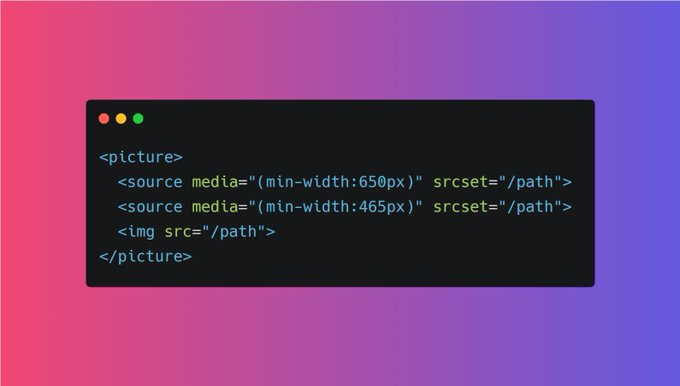
3️⃣ Use HTML <picture> tag
The HTML <picture> element allows you to define different images for different browser window sizes.
{ 22 / 27 }
The HTML <picture> element allows you to define different images for different browser window sizes.
{ 22 / 27 }
4️⃣ Responsive text size
Although you can make text responsive using media queries but you can also use "viewpoet" width as well.
h1 {
font-size: 10vw;
}
{ 23 / 27 }
Although you can make text responsive using media queries but you can also use "viewpoet" width as well.
h1 {
font-size: 10vw;
}
{ 23 / 27 }
5️⃣ Try to use Layouts
Using Grid or Flex layout always beneficial in order to make a web page responsive. Both these layout are not hard to learn. Try to use them
{ 24 / 27 }
Using Grid or Flex layout always beneficial in order to make a web page responsive. Both these layout are not hard to learn. Try to use them
{ 24 / 27 }
6️⃣ Media Queries are saviour
Media query is a rule to include a block of CSS properties only if a certain condition is true. It is very useful in order to make a RWD.
{ 25 / 27 }
Media query is a rule to include a block of CSS properties only if a certain condition is true. It is very useful in order to make a RWD.
{ 25 / 27 }

7️⃣ Use "auto" in media
Almost 99% a web page contains images or videos. And in order to make them responsive, use "auto"
If the width property is set to a percentage and the height is set to "auto", the image will be responsive
{ 26 / 27 }
Almost 99% a web page contains images or videos. And in order to make them responsive, use "auto"
If the width property is set to a percentage and the height is set to "auto", the image will be responsive
{ 26 / 27 }
Great!! I think that's pretty much it in order to give you a quick overview. If you have any doubts, feel free to drop a comment below
If you like this thread, a retweet means a lot ❤️
{ 27 / 27 }
If you like this thread, a retweet means a lot ❤️
{ 27 / 27 }
• • •
Missing some Tweet in this thread? You can try to
force a refresh
