Read some great articles on Spotify's user-friendly interface.
Here are 8 notable UX decisions it makes🧵
Here are 8 notable UX decisions it makes🧵

1/ Dark mode (which Spotify was been using since early days)
◻️ White text on dark background is easier on the eyes
◻️ Visual comfort = more browsing
◻️ The color scheme is a major contrast to Apple Music
◻️ White text on dark background is easier on the eyes
◻️ Visual comfort = more browsing
◻️ The color scheme is a major contrast to Apple Music
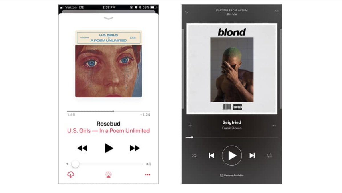
2/ Mobile player more spacious vs. Apple Music
◻️ Apple (L) has the volume control, which crowds the screen
◻️ Spotify (R) has *no* volume control (most people control mobile volume with side phone button)
◻️ Apple (L) has the volume control, which crowds the screen
◻️ Spotify (R) has *no* volume control (most people control mobile volume with side phone button)
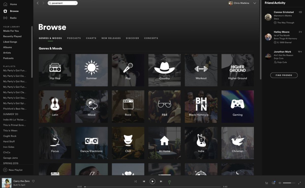
3/ Mobile optimization
◻️ Browse feature rolled into Search as the primary navigation tool
◻️ Sub-tabs are laid out as high-contrast cards
◻️ Cards are optimal for mobile screen real estate
◻️ Browse feature rolled into Search as the primary navigation tool
◻️ Sub-tabs are laid out as high-contrast cards
◻️ Cards are optimal for mobile screen real estate

4/ Interactive buttons
◻️ Primary (green) and secondary (ghost outline) buttons easy to navigate
◻️ Buttons "pop" when you hover, indicating interactivity
◻️ Change in text and color states communicate changes
◻️ Primary (green) and secondary (ghost outline) buttons easy to navigate
◻️ Buttons "pop" when you hover, indicating interactivity
◻️ Change in text and color states communicate changes
5/ Visual hiearchy
◻️ Spotify uses size, color and positioning to orient users
◻️ Top left is the artist and the content is categorized into easy to navigate "Songs", "Albums". Playlist".
◻️ Page includes a list of other related "arists" in case search is wrong
◻️ Spotify uses size, color and positioning to orient users
◻️ Top left is the artist and the content is categorized into easy to navigate "Songs", "Albums". Playlist".
◻️ Page includes a list of other related "arists" in case search is wrong

6/ Consistent design language
◻️ Artists are always in circular frames
◻️ Songs and albums always in square frames
◻️ This consistency allows users to navigate platform more "intuitively" and interact almost sub-consciously
◻️ Artists are always in circular frames
◻️ Songs and albums always in square frames
◻️ This consistency allows users to navigate platform more "intuitively" and interact almost sub-consciously

7/ Discovery
◻️ Spotify is constantly giving you reccomendations based on: 1) collaborative filtering (which tracks your behaviour and others); 2) text NLP and 3) audio analysis
◻️ Its Discover Weekly playlist is a music streaming staple
◻️ Spotify is constantly giving you reccomendations based on: 1) collaborative filtering (which tracks your behaviour and others); 2) text NLP and 3) audio analysis
◻️ Its Discover Weekly playlist is a music streaming staple

8/ Spotify year-end Wrapped = viral masterstroke
◻️ Turn a user's streaming stats into shareable social content
◻️ Instead of choosing traditional colors (red), Spotify picks "uncommon colors" (pink, neon) which are fun, have no emotional association and are attention-grabbers
◻️ Turn a user's streaming stats into shareable social content
◻️ Instead of choosing traditional colors (red), Spotify picks "uncommon colors" (pink, neon) which are fun, have no emotional association and are attention-grabbers

9/ Follow @TrungTPhan for other business threads and really dumb memes
https://twitter.com/TrungTPhan/status/1388861558529302532?s=20
10/ Sources
Spotify: uxdesign.cc/ux-ui-analysis…
Wrapped: medium.com/throughdesign/…
Apple vs Spotify: usabilitygeek.com/ux-case-study-…
Spotify: uxdesign.cc/ux-ui-analysis…
Wrapped: medium.com/throughdesign/…
Apple vs Spotify: usabilitygeek.com/ux-case-study-…
• • •
Missing some Tweet in this thread? You can try to
force a refresh