There used to be little correlation between crypto and global markets in general. But the sell-off in Nasdaq futures overnight does look (very and unusually) correlated to the breakdown in crypto space
[here illustrated with BTC (green) and ETH(yellow), vs Nasdaq (white)]
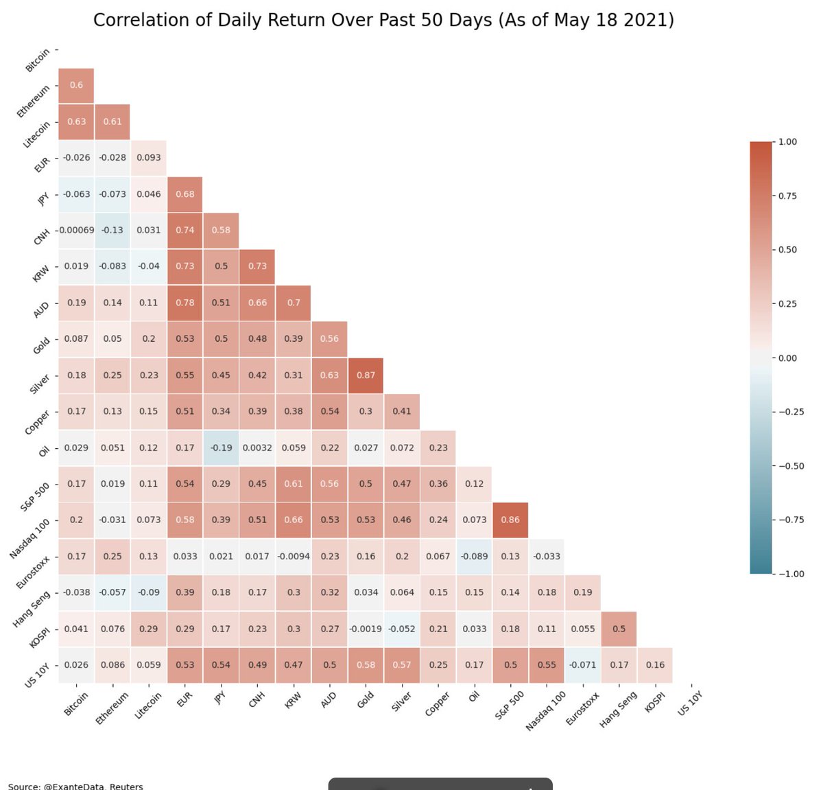
We should probably add Nasdaq to this matrix @WBegole . Will be interesting to track...
for example, BTC has a marginal positive correlation to SPX and ETH has a marginal negative correlation to SPX over the last 20 days. Hence, the co-movement is something new, which will only be picked up in backward looking correlations (and risk management) over time.
Here is an expanded matrix with Nasdaq now included (no historical correlation to crypto showing yet)
we will automate an update on @exantedata going forward, as this is interesting to monitor
The debate about bitcoin now reminds me of a wedding I went to in 2006.
A beautiful wedding that was ruined by a discussion about the US housing market.
It went like this...
1/ Back in 2007, I was at a fantastic wedding in LA. The dinner was outdoors, in spectacular weather, with a unbelievable view to the ocean. All was going well, until the discussion touched on the US housing market.
2/ I was working as an economist at Goldman Sachs at the time, and the fundamentals of the housing market looked shaky. I argued, after being asked about my opinion, that the US housing market could be in a bubble. That was a mistake.
My tweet from yesterday has generated A LOT of debate. In fact, almost 1 million people have looked at the basic chart I circulated (showing with EU catching up to the pace of vaccine administrations the US first achieved in March).
It has also generated some misinterpretation. I did not mean to imply that any country was ‘winning’ against any other country. In this battle, it is all countries against the virus, and we should all celebrate when more countries join the winning side.
In terms of what it means to be ahead, clearly it is not just about a good pace for a few days. It is about the speed at which you can reach a critical level of overall immunity in the population; at which put the virus will be on a sustained declined (including after reopening).
Here is an important chart. It has changed a fair bit over the past month, and I am not sure everybody has internalized it.
The EU is closing the gap to the US in terms of vaccine administrations.
I know the EU has somewhat higher population and the J&J pause may have impacted the US numbers more (and temporarily), and that demand may be an increasing issue in the US.
But the numbers are what the numbers are in the aggregate, and the EU roll-out has accelerated notably.
Further, the EU roll-out can probably accelerate further, as J&J comes fully online and Pfizer/BioNTech scales up deliveries more.
Some argue that showing 2023 rate liftoff at the March 17 FOMC would be counter-productive, and that it would be better to manipulate the dots lower to strengthen the forward guidance.
Is lying sound central bank communication?
On the one hand, the Fed is trying hard to be accommodative, and the new core element in the Fed's framework is not to be preemptive, and instead wait for realized (inflation) outcomes, before embarking on tightening. Hence, you want low dots.
On the other hand, some FOMC participants may indeed think that inflation will hit their objective (2%, and on a path to exceed it) within the forecast horizon. Hence, you can argue, within the framework, that it is logical then to show 2023 lift-off in that scenario.