City of Toronto - The proportion of cases (positive test results) resulting in death (yellow line).
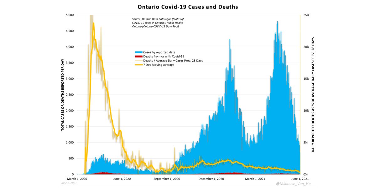
City of Toronto cases, hospitalizations, deaths.
Greater Toronto - The proportion of cases (positive test results) resulting in death (yellow line).
Greater Toronto cases, hospitalizations, deaths.
GTA cases, hospitalizations, and deaths, indexed to values 1 year earlier. The black line (index = 100) is where we were 365 days ago (all values indexed to values on that date).

(Below black bar = lower than one year ago today; Above black bar = higher than one year ago today)
Cases by GTA region.
Deaths by GTA region.
Hospitalizations by GTA region.

• • •

Missing some Tweet in this thread? You can try to force a refresh
 

Keep Current with Milhouse Van Houten 🗽🇨🇦

Milhouse Van Houten 🗽🇨🇦 Profile picture

Stay in touch and get notified when new unrolls are available from this author!

Read all threads

This Thread may be Removed Anytime!

PDF

Twitter may remove this content at anytime! Save it as PDF for later use!

Try unrolling a thread yourself!

how to unroll video
  1. Follow @ThreadReaderApp to mention us!

  2. From a Twitter thread mention us with a keyword "unroll"
@threadreaderapp unroll

Practice here first or read more on our help page!

More from @Milhouse_Van_Ho

4 Jun
Mortality in Canada (thread):

Here we have the total number of deaths in Canada and its regions over the past ten years. Image
Here we have the same chart you saw above now expressed as a rate per 100,000 people. Generally, a flatter trend in death rates would suggest that population growth may be a key factor driving growth in total deaths. Image
Looking at the past decade nationally, we see that it's natural for deaths in one year to exceed deaths in the previous year (blue line > 0%). Note that a year of low or negative growth is often followed by a year of much higher growth. Image
Read 16 tweets
2 Jun
Ontario - The proportion of cases (positive test results) resulting in death (yellow line). (Daily reported deaths divided by average daily cases over prior 28 days.)
Ontario covid-19 cases, deaths, and testing.
Weekly all-cause deaths and deaths with/from Covid-19 in Ontario, 2010-2021 (subject to Statistics Canada reporting delay for all-cause deaths.)
Read 15 tweets
2 Jun
La proportion de cas entraînant la mort (décès enregistrés par jour / cas quotidiens moyens au cours des 28 derniers jours) (ligne jaune).
Nombre total de cas et de décès liés à Covid-19 au Québec.
Cas cumulés en pourcentage des décès cumulés (taux de mortalité clinique) (ligne jaune).
Read 8 tweets
28 May
2020/2021 seasonal comparison: Ontario and Québec covid-19 cases.

This is an index chart in which daily values are displayed proportionate to their values on April 1 of the respective year (2020 or 2021). (Above black bar = higher than April 1 values.)
2020/2021 seasonal comparison: Ontario and Québec covid-19 deaths.

This is an index chart in which daily values are displayed proportionate to their values on April 1 of the respective year (2020 or 2021). (Above black bar = higher than April 1 values.)
2020/2021 seasonal comparison: Ontario and Québec covid-19 hospitalizations.

This is an index chart in which daily values are displayed proportionate to their values on April 1 of the respective year (2020 or 2021). (Above black bar = higher than April 1 values.)
Read 6 tweets

Did Thread Reader help you today?

Support us! We are indie developers!


This site is made by just two indie developers on a laptop doing marketing, support and development! Read more about the story.

Become a Premium Member ($3/month or $30/year) and get exclusive features!

Become Premium

Too expensive? Make a small donation by buying us coffee ($5) or help with server cost ($10)

Donate via Paypal Become our Patreon

Thank you for your support!

Follow Us on Twitter!

:(