There’s something a bit odd in that CO-CIN data I tweeted on Monday, showing shorter stays in hospital more recently. The problem is, if I use the full dataset to predict the number of inpatients, I get more than there actually were in wave2. 1/n
Let’s try that to start with, using a model scenario (I’ll bring in real data in a bit). I’m taking the worst scenario from my recent model update, which has very similar peak hospitalisations to the actual peak in Jan 2021. 2/n
I can run that admissions curve through a simple model which combines it with the CO-CIN data for length of stay, and predicts what the inpatients curve would have been. In fact I get two curves: one using the “recent” data (yellow), and one for the whole dataset (blue): 3/n
The new data (yellow) produces peak inpatients just shy of 30k, very similar to the peak weekly hospitalisations, and implying an average stay of around 1 week. The older data (blue) has peak inpatients nearly 50k, with a longer average stay. 4/n
The odd thing is that the actual peak inpatients in wave 2 were just under 40k, midway between these two curves. I wondered if the shape of wave 2 was having an impact on this, so I replaced my model scenario with the actual admissions from wave 2: 5/n
But we get very much the same pattern with the actual data: the recent CO-CIN data gives us the yellow curve, with peak inpatients of ~30k. The full CO-CIN data gives the blue curve, with peak inpatients of ~50k. Neither matches the actual (grey) curve with peak ~40k. 6/n
So what to make of this? I’m not really sure, and welcome insights/suggestions particularly from those with insight into the hospital system. I would expect the full CO-CIN data (blue) to match the actuals (grey) more closely than it does (maybe with some variation). 7/n
It may be that I’m modelling it wrong, but I’ve double-checked and it looks OK. It may be that the CO-CIN data for some reason isn’t representative of the whole system, and is biased to longer stays e.g. if it’s excluding some patients who don’t stay in for very long. 8/n
Or it may be that things happened during the Dec/Jan peak that didn't happen at other times e.g. stronger discharge management - but this doesn't come through very strongly in the shape of the curve. 9/n
In any event, while there is a shorter average stay in the more recent data (yellow), this analysis suggests we should be cautious about assuming there’s a big benefit in reducing peak inpatient load – the reduction may be more like -25% (vs. grey) not -40% (vs. blue). /end
• • •
Missing some Tweet in this thread? You can try to
force a refresh
As you can imagine, I’ve been trying for the last few days to work out what’s going on in the case data, and why it is that our models haven’t predicted the take-off in cases over the last week. I think I’m starting to get my head around it, but it’s a work-in-progress. 1/n
In essence I think we’re still thinking too much in terms of national averages, and not quite recognising that this is a wave composed of a number of local/regional outbreaks, which are concentrated in specific age groups. This has a number of implications for modelling. 2/n
In particular I want to focus on the age-group dynamic, because I think this has been under-recognised, and has led to a couple of specific problems with the models. Let’s take a quick look at the growth rate by age group in the most recent case data: 3/n
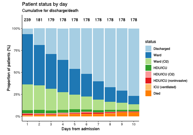
thanks to the person who pointed me towards this report: assets.publishing.service.gov.uk/government/upl… (you know who you are!) - lots of interesting data. In particular it does support the anecdotal evidence that average length of stay in hospital is shorter in recent admissions: see this chart 1/3
...and compare to the older data in the chart below. So after 10 days, about 75% have been discharged in the recent data, compared to 40% in the older data. (but note deaths are lower in the recent data, which slightly offsets the benefits for hospital bed occupancy). 2/3
what's not entirely clear to me is whether this is just the result of a lower average age of patients being admitted - see below- (and would reverse if more older cases arrived), or whether it says something more fundamental about the progression of covid disease with Delta. 3/3
Model update klaxon!! I’ve spent a while this weekend refitting my model to current data and trends, and as a result I’ve changed my mind on at least 3 things – and also got closer to a policy recommendation for Step 4 re-opening scheduled for 21st June. Thread follows: 1/n
First to note a few assumptions:
-Baseline controls and cautious behaviour (e.g. continued WFH) are assumed to continue after 21st June, until the end of 2021, and to reduce R by ~25%
-I’ve adjusted my vaccination schedules to more precisely match current supply estimates 2/n
– with thanks as always to @PaulMainwood for his insights on this.
-In particular, now that we have MHRA approval for 12-15 year olds to receive Pfizer, I’ve assumed that 12-17s get their first doses in September (& second doses in November) 3/n
I think the age dynamics of the current case growth are interesting, particularly as they have shifted in the last week or two. Growth is now very clearly dominated by the 20-30s, while growth in school-age children has tailed off: 1/6
If we look more closely e.g. at 5-9 year olds, we can see that tailing off of growth. I’m not 100% sure why this has happened, it seems slightly early for a half term effect, so maybe local PH efforts and bubble closures are having an impact? &/or parents being vaxxed?? 2/6
Meanwhile the growth in 20-24s is pretty dramatic, doubling in just under a week, and now back to levels not seen since February: 3/6
A few thoughts on yesterday’s PHE data: overall, the report is a bit of a mixed bag. Of the three significant bits of news, one is positive, one negative, and the other neutral. But you might not get that impression from the reaction here on Twitter or in the media. 1/n
Let’s take the negative first: we now have data suggesting that the new variant (Delta) is more likely to lead to people being admitted to hospital – perhaps 2.5 times more likely than when infected with the old Alpha variant. 2/n
That’s clearly bad news, and will have an impact on model projections for Step 4. But it’s not necessarily a complete disaster: if we can control the spread of the virus, then it doesn’t matter what the hospitalisation ratio is, because very few people will be catching it. 3/n
Some thoughts on where we are, in the form of a “zigzag” thread where I offer alternating good and bad news, and end on a question mark. Let’s start with some bad news: 1/11
This morning’s threads from @alexselby1770 and @TWenseleers, as well as last week's PHE data on secondary attack rates , are all pointing towards ~70% higher transmission for the Delta variant (B.1.617.2) vs Alpha (B.1.1.7) 2/11
BUT (good news) my previous analysis showed 55-60% higher R0 wasn’t a disaster, and could be kept under control with a combination of baseline controls and cautious behaviour (eg. continued WFH). A quick model run suggests 70% isn't very different. 3/11