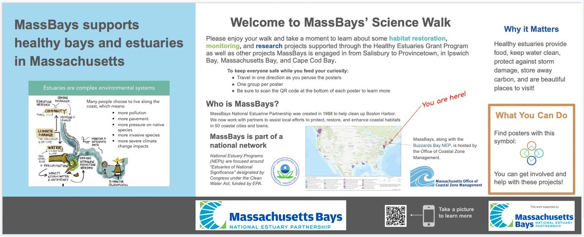
Here's a second poster from @AcheleKelpfish for review!
Part of this project: mass.gov/orgs/massachus…
🧵1/10
Part of this project: mass.gov/orgs/massachus…
🧵1/10

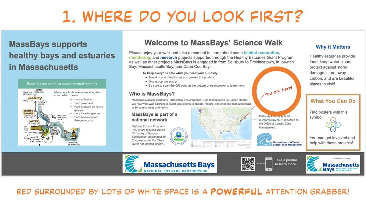
One of the most powerful ways that we make sense of complex documents like this is by PLACEMENT of elements.
We treat things close together as RELATED.
⭕⭕
⭕
We think the first two circles are related because they are close left to right. 2/10
We treat things close together as RELATED.
⭕⭕
⭕
We think the first two circles are related because they are close left to right. 2/10
But now...
⭕ ⭕
⭕
We think the two left circles are related because they are close up and down. 3/10
⭕ ⭕
⭕
We think the two left circles are related because they are close up and down. 3/10
The effect of placing two text blocks close together is VERY strong. 💪 It influences how we think about the order to read things.
In this poster, I'm not sure the cues the poster is sending about reading order are super clear. 4/10
In this poster, I'm not sure the cues the poster is sending about reading order are super clear. 4/10

The poster's center has six "blocks" of text and images: three across, two down.
The text in the top CENTER block ⬆ is closest to the text in the top RIGHT block. ↗ Top right block is closest to bottom right. ↘
5/10
The text in the top CENTER block ⬆ is closest to the text in the top RIGHT block. ↗ Top right block is closest to bottom right. ↘
5/10

But that order leaves out the bottom left ↙ and bottom center ⬇!
The heading ties bottom left ↙ and bottom center ⬇ go together, so maybe I am supposed to zig zag? 6/10
The heading ties bottom left ↙ and bottom center ⬇ go together, so maybe I am supposed to zig zag? 6/10

But when I go in and try to make sense of the text, I think I am supposed to read across in ROWS.
We also expect consistency! The rightmost section of the poster, "Why it matters" is a column, which also adds to the "Which way to go" ambiguity. 7/10
We also expect consistency! The rightmost section of the poster, "Why it matters" is a column, which also adds to the "Which way to go" ambiguity. 7/10

When you're in the thick of creating a bog document like this, it's easy to think the logical order of the words will dictate reading order.
But we see the larger context - the "blocks" of text and images - LONG before we ever get to sentences or words. 8/10
But we see the larger context - the "blocks" of text and images - LONG before we ever get to sentences or words. 8/10
Like the poster in an earlier thread (
Does everything HAVE to be aligned? No. It often looks cleaner, more organized, more purposeful, though. Those are good things 🤗 to be! 9/10
https://twitter.com/iamscicomm/status/1403424661866795017), there are elements that don't align.
Does everything HAVE to be aligned? No. It often looks cleaner, more organized, more purposeful, though. Those are good things 🤗 to be! 9/10

I want to thank @AcheleKelpfish for her willingness to share this work! Hope it helps! 10/
• • •
Missing some Tweet in this thread? You can try to
force a refresh