A huge thanks to everyone at the FT who made this possible. Both the rest of the brilliant data/visuals team, and the editors and reporters across the rest of the FT who really *get* the power of data journalism more than any other newsroom I've encountered.
We're not in the business of making charts to dress-up stories. We make charts that *are* the stories.
Finally a big thanks to the judges and jury who I know spend weeks and weeks poring over all the entries. That's a lot of time looking at log scales 😅
A few special mentions:
• @carolinenevitt's work with the FT colour palette makes it very easy to produce gorgeous charts. She's probably the most important but least visible member of the FT dataviz operation
• The changes @theboysmithy has made to our workflows and tooling in recent years have totally transformed what we're able to do, and in what timeframe. It's pretty special being part of a setup where everything just ... works
• @martinstabe is another unsung hero of our Covid coverage. Every day I use datasets that he and @OliEllTay have spent months painstakingly compiling and cleaning
• My chart-improver-in-chief @sdbernard, who never fails to spot those small tweaks that elevate a graphic to the next levek
And last but arguably most of all, UK news editor @andrewparker, who has backed me to bring data reporting to the front line of the FT over the last 18 months
OK now I have pizzas to make. Thanks for the kind words, folks!
• • •
Missing some Tweet in this thread? You can try to
force a refresh
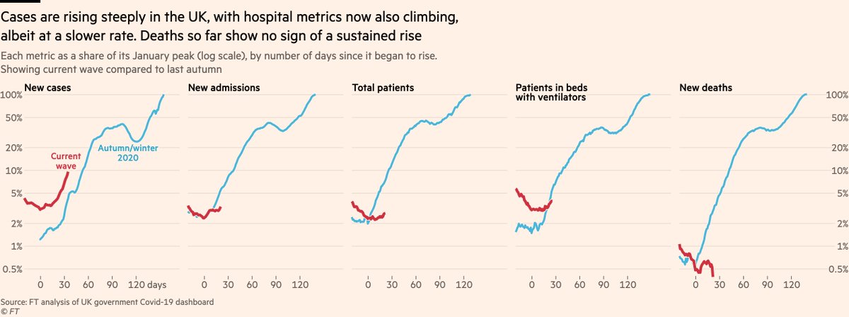
Thread: first up, that core data: UK admissions, patients & ventilator bed numbers now all climbing
An obvious initial point to make: whilst the rate of increase in cases is just as steep as it was last autumn, the hospital metrics are climbing more slowly.
This is good news (!), but it comes with nuances that point in both an optimistic and pessimistic direction.
The pessimistic: until recently admissions in Wales and Northern Ireland were falling steeply, which was countering rises elsewhere and making UK totals flatter than they would otherwise be.
In the last week, admissions have risen in every UK region but one: the East of England.
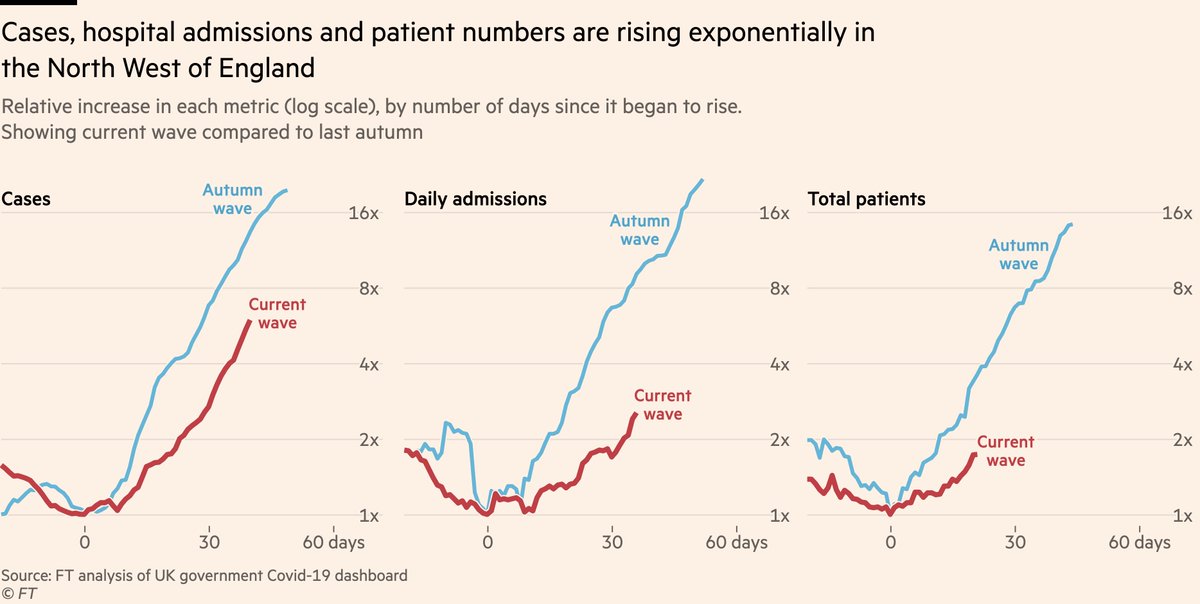
Let’s take a closer look at that chart
• Cases have been rising at a similar rate to previous waves for some time now
• What’s new is hospital admissions now undeniably following suit. In North West, admissions rose by 30% in week ending May 30th. Since then they’ve climbed 40%
This is despite vaccines that offer good protection against hospitalisation, so what’s going on?
As ever, age breakdowns tell the story. Hospital admissions remain low and flat among mostly-double-dosed older groups, but the increase is coming among younger adults.
Some notes:
• Remember, antibody neutralisation is not the same as vaccine efficacy. 5.8-fold reduction in the former does not mean the same thing for the latter
• This paper shows a 2.2-fold reduction in neutralisation for Delta relative to Alpha (5.9 / 2.6). PHE data so far points to a ~10% drop in VE for Delta vs Alpha after two doses of Pfizer, so you can see how the two numbers are on very different scales
A side note: I’ve seen it said that the media is putting a positive spin on things despite SAGE members and other experts being much more worried.
This is a surprise to me, since the people we speak to for our reporting and quote in our articles are SAGE members and experts 🤔
We probably spent 20+ hours each reporting these stories, running well into Friday night and Saturday. This involved speaking to experts in immunology, epidemiology and broader public health, including the very people who did the analysis on vaccine efficacy and transmissibility.
I get why some think there’s not sufficient alarm. 150k have died in the UK, and a reluctance to act early has played a part.
But to accuse us of spinning when we’re working our asses off to get data & expert comment to the public as quickly as possible, is quite something.