There's a lot to getting your navigations right in terms of #UX, #accessibility & #uidesign
Check out my very first thread! (This will be in video format tomorrow on my youtube channel 'DesignCourse')
🧵👇
Check out my very first thread! (This will be in video format tomorrow on my youtube channel 'DesignCourse')
🧵👇

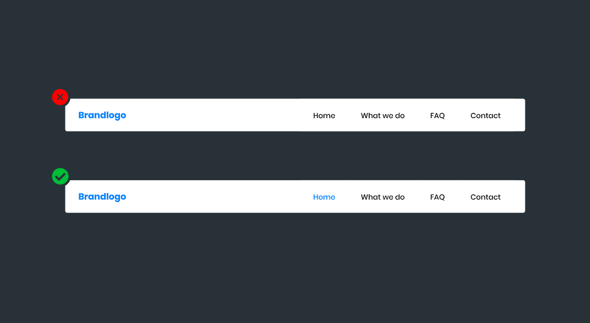
1. Differentiate between the logo and navigation.
👉 This helps avoid confusion and allows the user to clearly identify where the navigation exists on the navbar.
👉 This helps avoid confusion and allows the user to clearly identify where the navigation exists on the navbar.

2. Design an Active State
👉 This gives a visual indicator to the user that they're on a particular page. You can achieve an active state through making the link bold, changing the background color, and/or adding an icon or border.
👉 This gives a visual indicator to the user that they're on a particular page. You can achieve an active state through making the link bold, changing the background color, and/or adding an icon or border.
3. Include a 'home' link & link the logo to the home page.
👉 From @NNgroup , "To minimize homepage-navigation confusion, offer both clickable logos and actual Home links." src: nngroup.com/articles/homep…
👉 From @NNgroup , "To minimize homepage-navigation confusion, offer both clickable logos and actual Home links." src: nngroup.com/articles/homep…

4. Differentiate between primary and secondary navigations.
👉 Establishing a typographic visual hierarchy for a primary and secondary navigation will help users quickly discern between the two navs.
👉 Establishing a typographic visual hierarchy for a primary and secondary navigation will help users quickly discern between the two navs.

5. Differentiate between regular nav items and dropdown nav items.

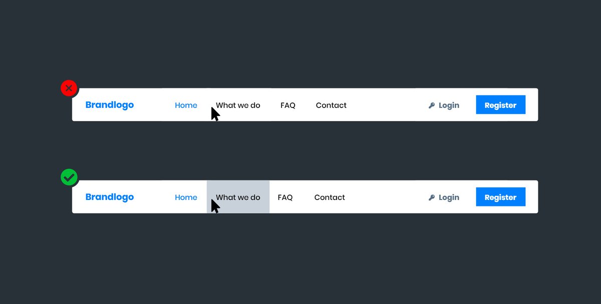
6. Provide hover states
👉 Hover states indicate to the user which link they're about to click. You can change the background, link color, underlining the link, and/or adding an icon/border.
👉 Hover states indicate to the user which link they're about to click. You can change the background, link color, underlining the link, and/or adding an icon/border.
7. Ensure acceptable contrast ratios
👉 Aim to satisfy at least a 4.5:1 contrast ratio based on the text color and the background. There are many tools for checking contrast! "Stark Contrast" plugin for Adobe XD/Figma, as well as the built accessibility tools in Chrome/Firefox.
👉 Aim to satisfy at least a 4.5:1 contrast ratio based on the text color and the background. There are many tools for checking contrast! "Stark Contrast" plugin for Adobe XD/Figma, as well as the built accessibility tools in Chrome/Firefox.

8. Only use hamburger menus when needed
👉 A hamburger menu requires extra work from the user to access your nav items. If you have the space, use it!
👉 A hamburger menu requires extra work from the user to access your nav items. If you have the space, use it!

9. Stick to known patterns for logo and nav placement
👉 By far, the most common pattern for logo and navigation placement is a right aligned navigation with the branding on the left.
👉 By far, the most common pattern for logo and navigation placement is a right aligned navigation with the branding on the left.

10. Make sure nav items are accessible with focus states
👉 By default, browsers add an outline when navigation items are tabbed. If frontend developers set 'outline: none;', ensure you design an alternative focused state to notify users which nav items are focused with keyboard
👉 By default, browsers add an outline when navigation items are tabbed. If frontend developers set 'outline: none;', ensure you design an alternative focused state to notify users which nav items are focused with keyboard

11. Make sure nav items are easy to tap
👉 Avoid making nav items too small, too close (or too far) apart.
If you enjoyed this, enter your email to be notified when designcourse.com is launched in a few months. It's going to be juicy!
👉 Avoid making nav items too small, too close (or too far) apart.
If you enjoyed this, enter your email to be notified when designcourse.com is launched in a few months. It's going to be juicy!

• • •
Missing some Tweet in this thread? You can try to
force a refresh